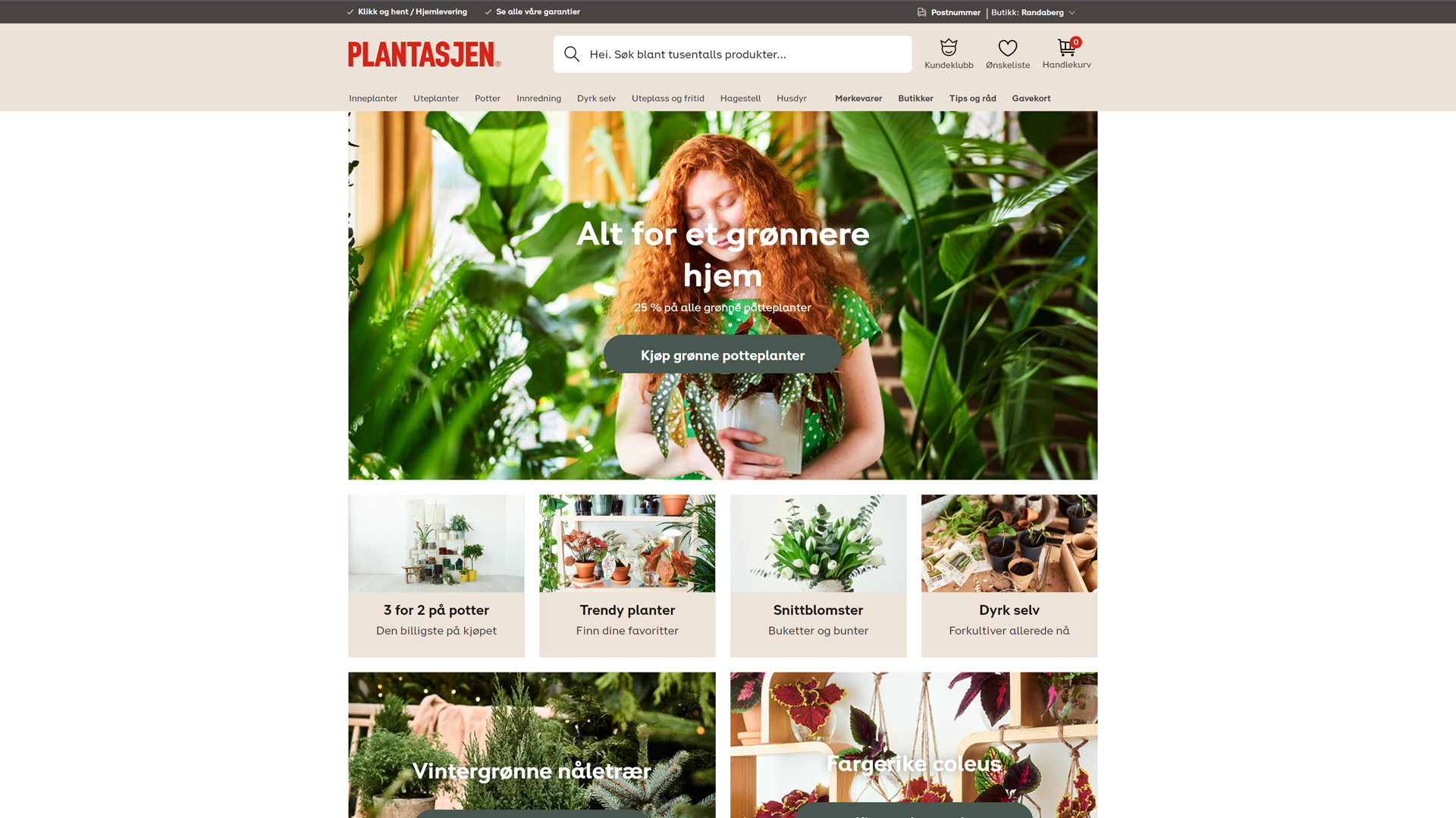
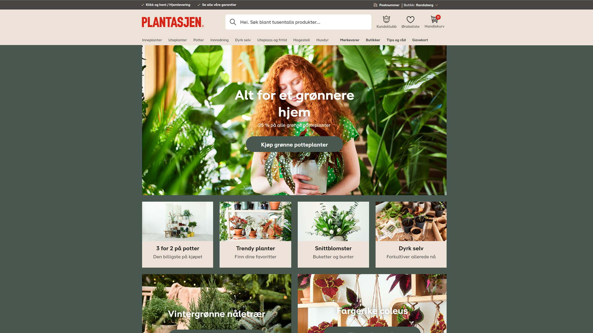
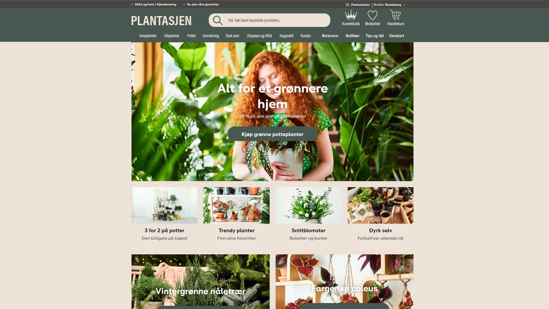
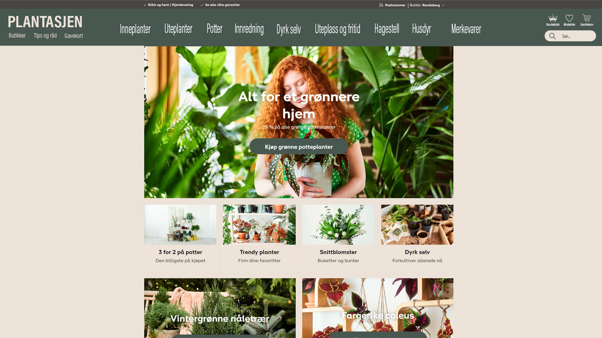
Copy the exact content from a homepage of a website of your choice. Now redesign this homepage in three different ways. Each design should evoke a different emotional response from viewers. You can choose what you would like these emotional responses to be.
Please upload this activity to your WordPress blog along with a short paragraph where you explain the look and intent of each of the three designs.
I chose to copy plantasjen.no and redesign this site. To be honest I didn’t used as much time as I should have done because I’ve been sick the last week and haven’t had energy to use a lot of time on it.
So here is the original design and the three redesign I made. I kept the colors that was already on the page. But I styled it three different ways with the colors.


