Practical assignment (observation and analysis)
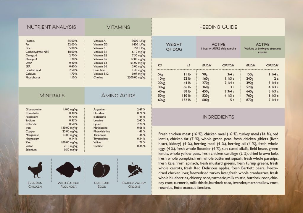
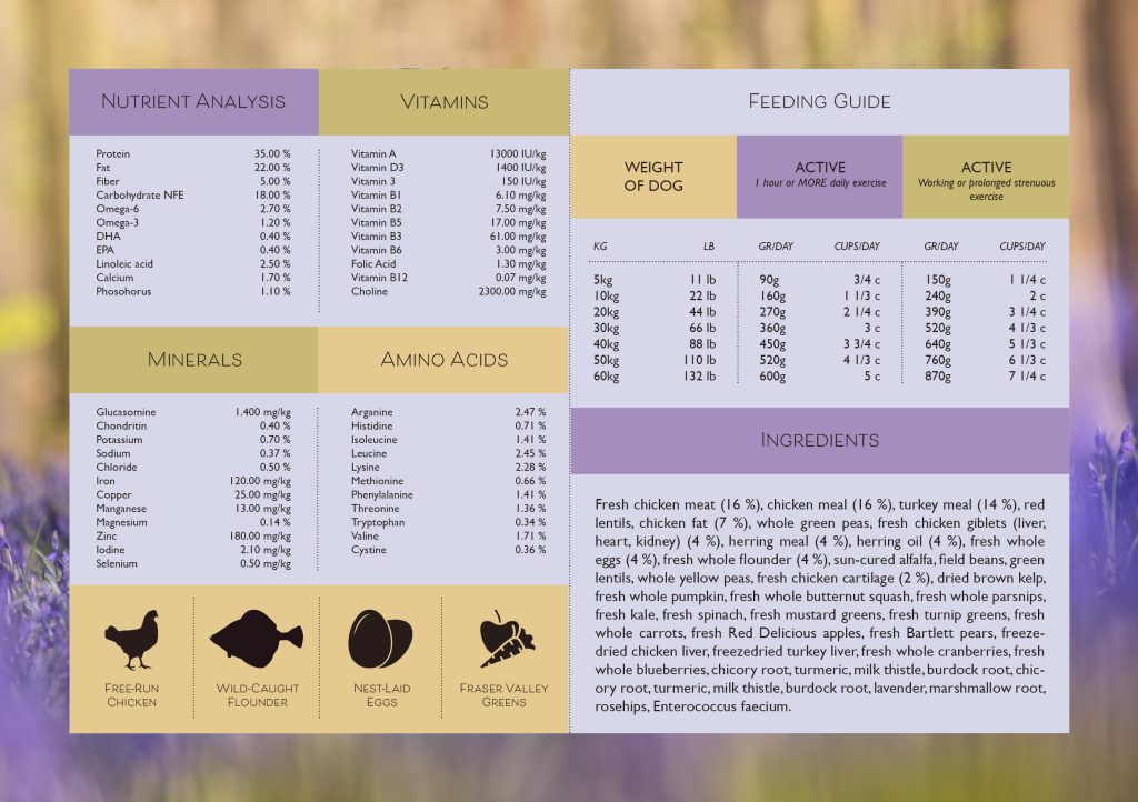
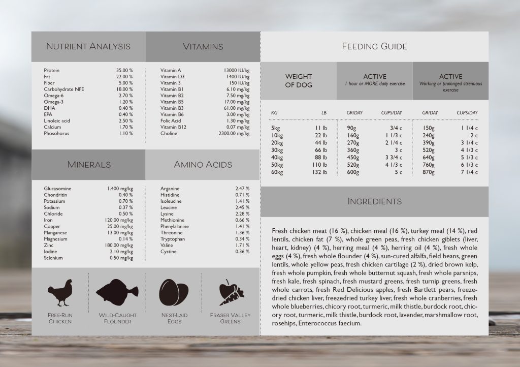
1. Illustration of infographic
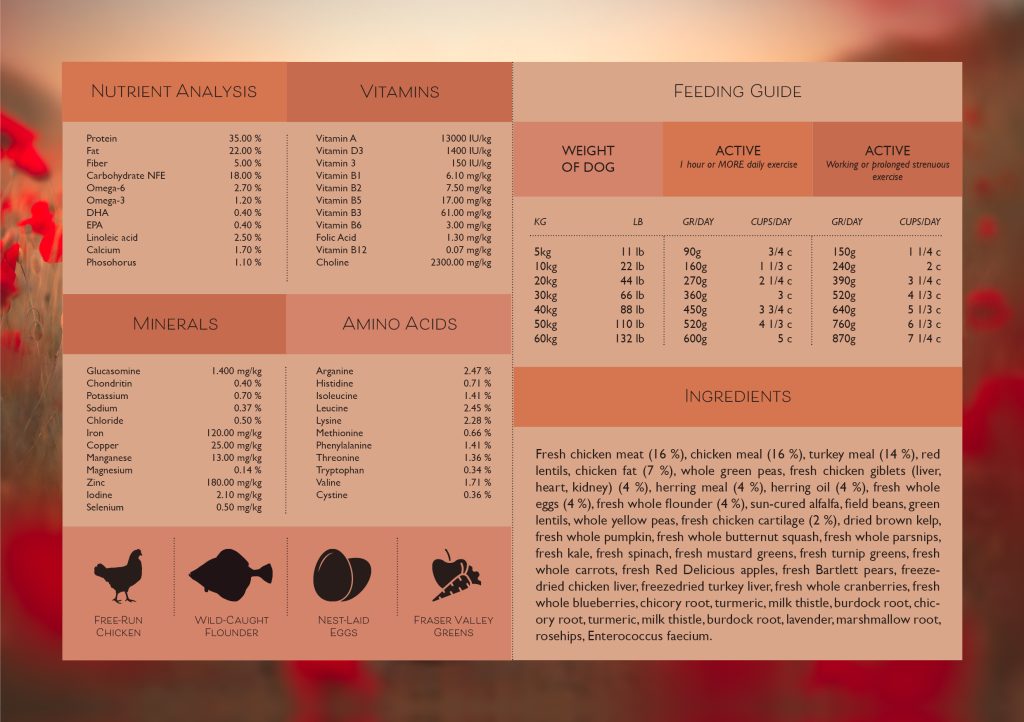
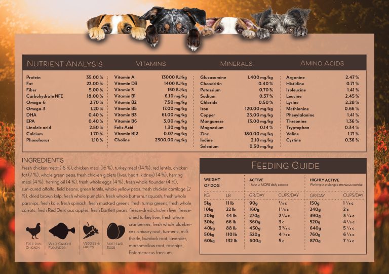
I started to search for other brands so I could see what info other used on the infographic and what color scheme they used for it. The text I used is from an Canadian brand called Acana.
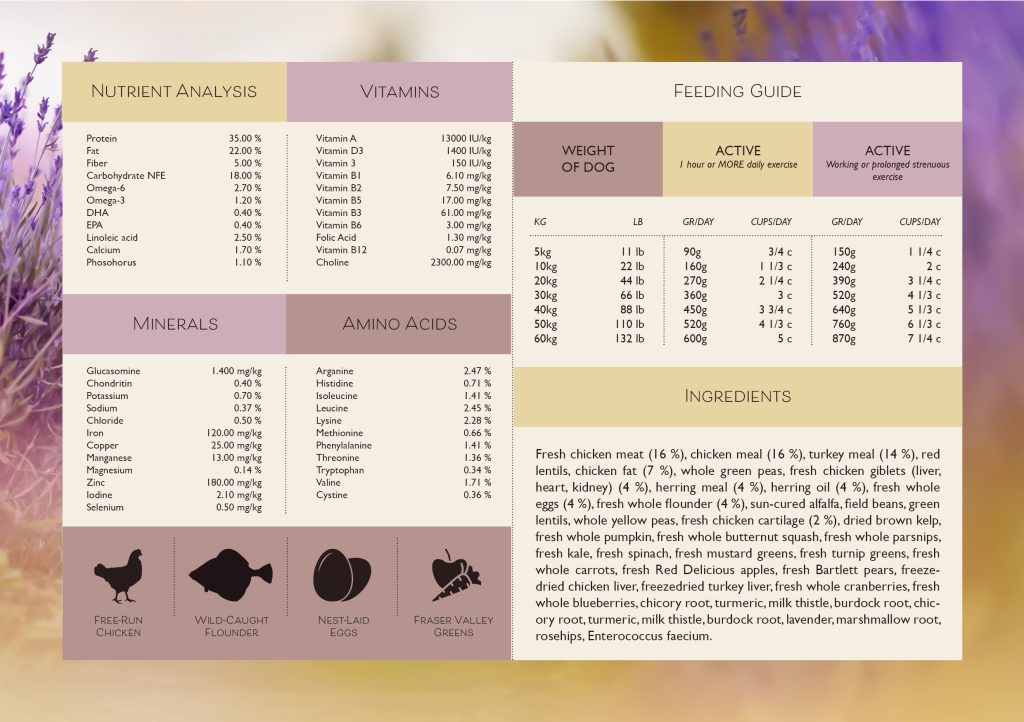
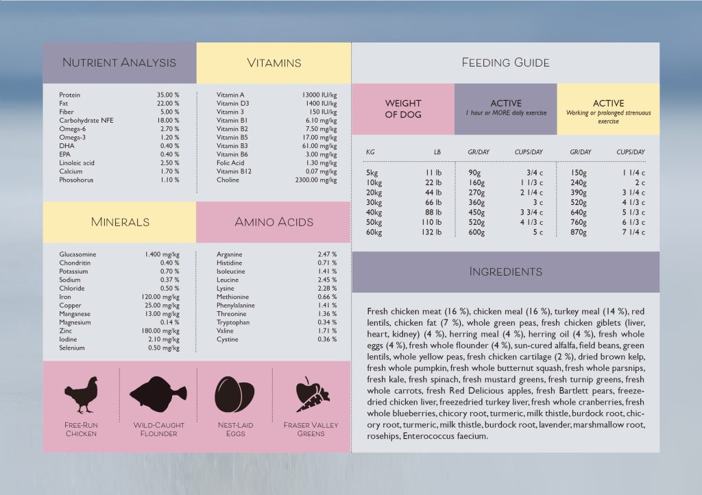
I wanted the infographic to contain ingredients, nutrient analysis and a feeding guide. I did make the nutrient analysis illustration pretty long but I since I copied the text from acana I didn’t know what to leave out. But after moving everything around on the a5 sheet I found a good way to show it. And I also wanted to show all of the vitamins, minerals and amino acids.
The ingredient list is clean and simple, I also chose 4 icons that shows a small amount of info that the ingredients is wrapped around.
And I wanted the feeding guide to be similar to the nutrient analysis so it would work good together. On this guide I have a column with weight of the dog, how much the serving size is pr day if the dog is active and one column that show how much if the dog is highly active.
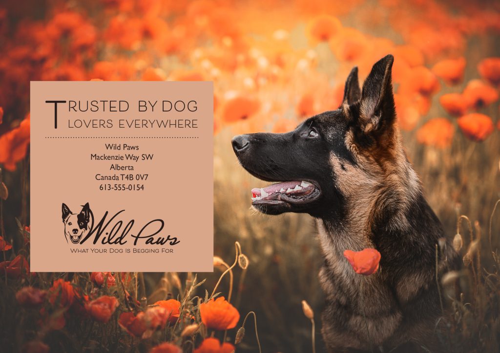
I wanted the background on the infographic to work with the rest of the brochure so I chose photo with a poppy field, and I also found a photo of 4 dogs that would fit perfectly over the infographic.
The color I chose was a beige(ish) and brown color. I want the design on everything to be very natural and clean.

2. Design of brochure
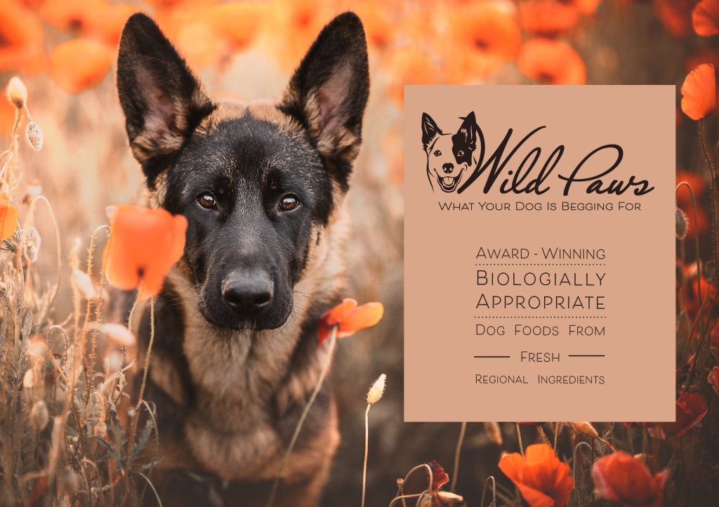
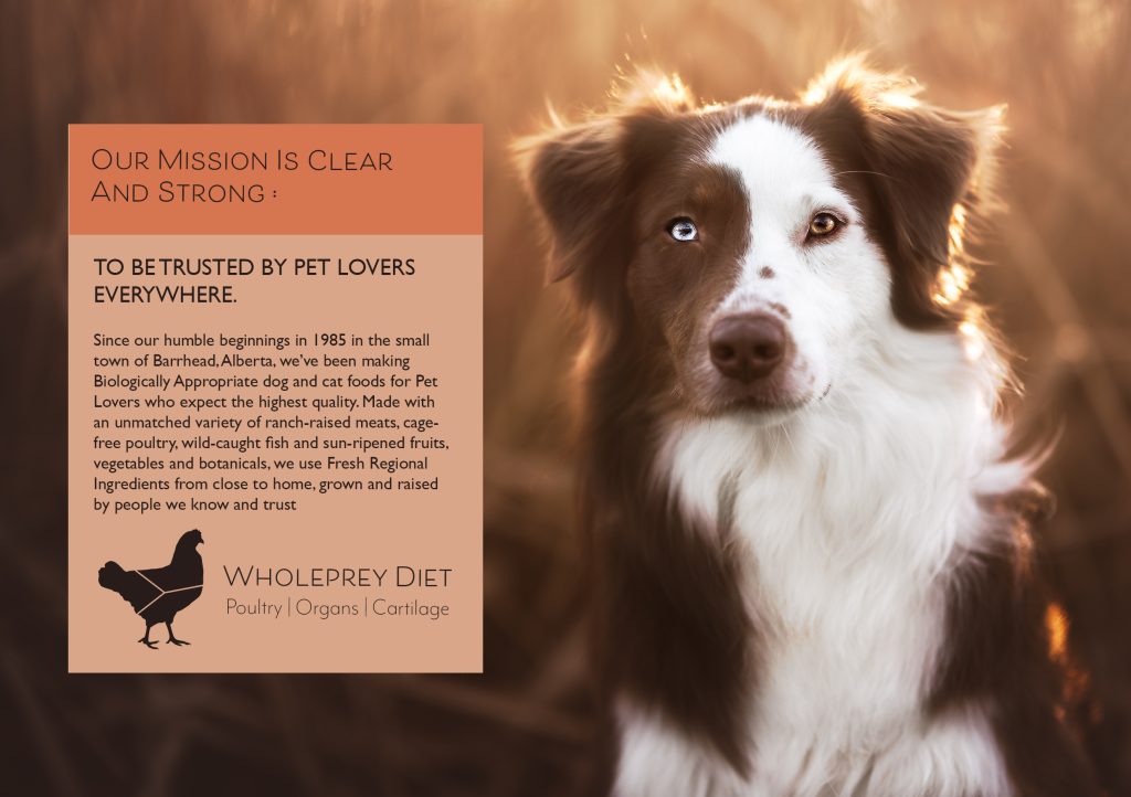
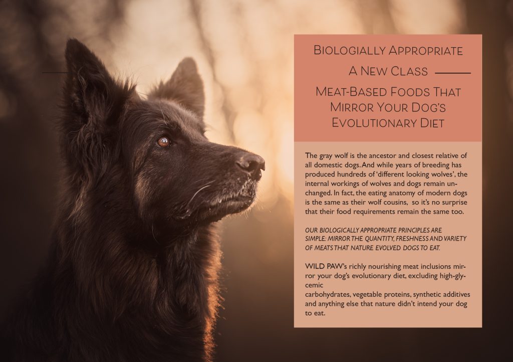
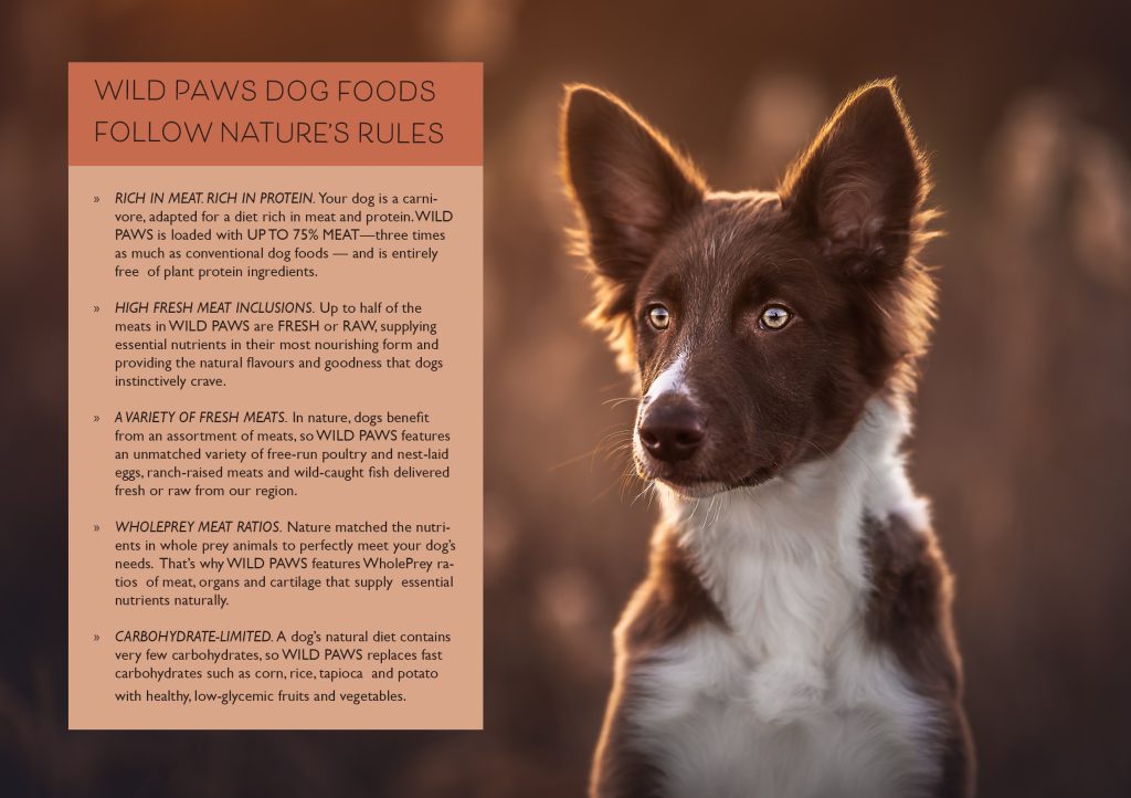
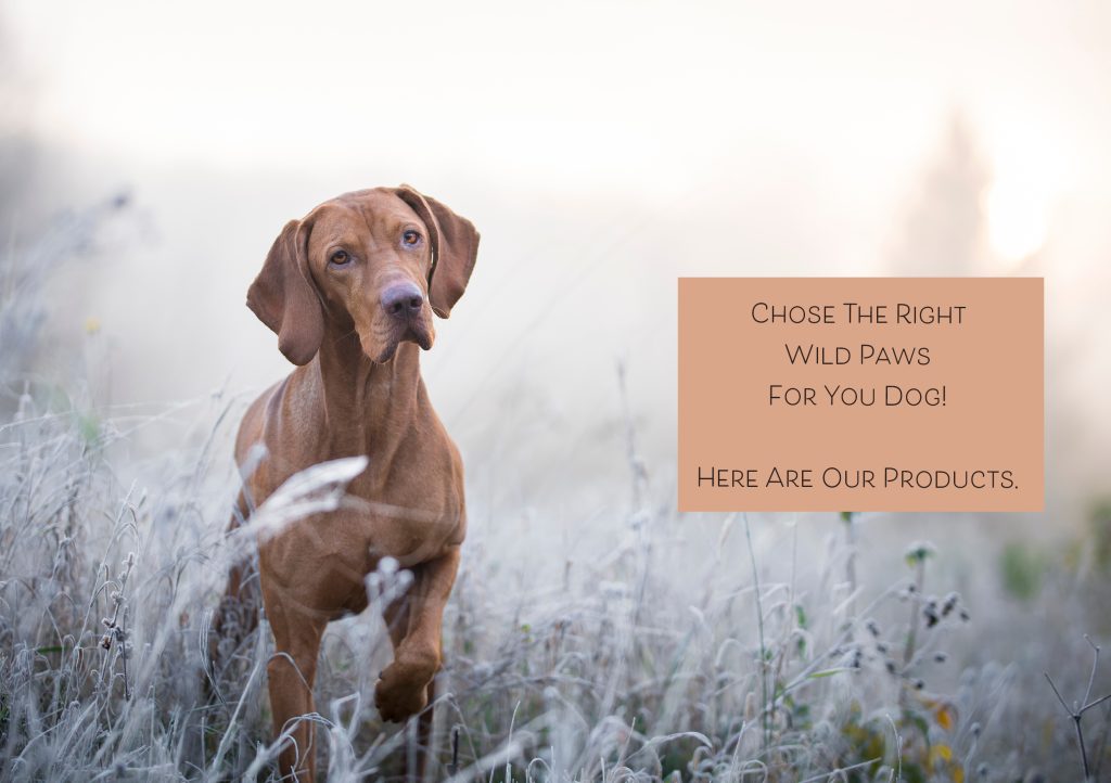
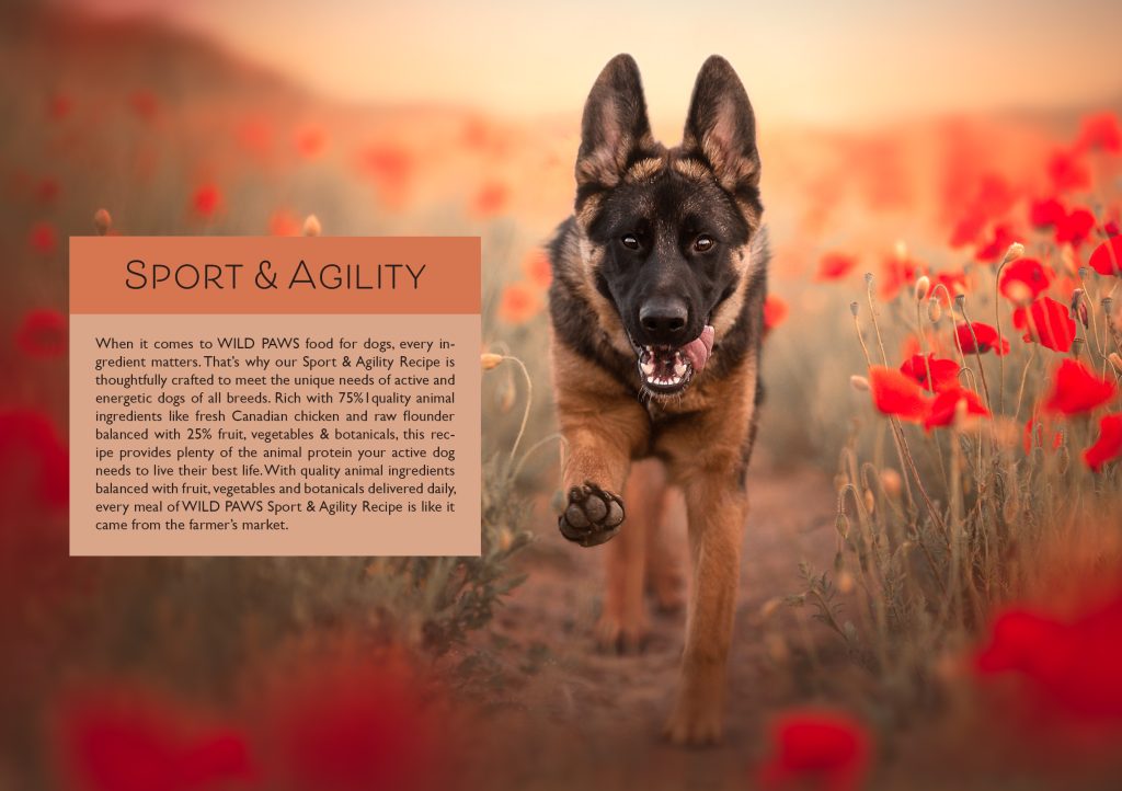
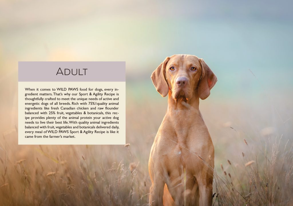
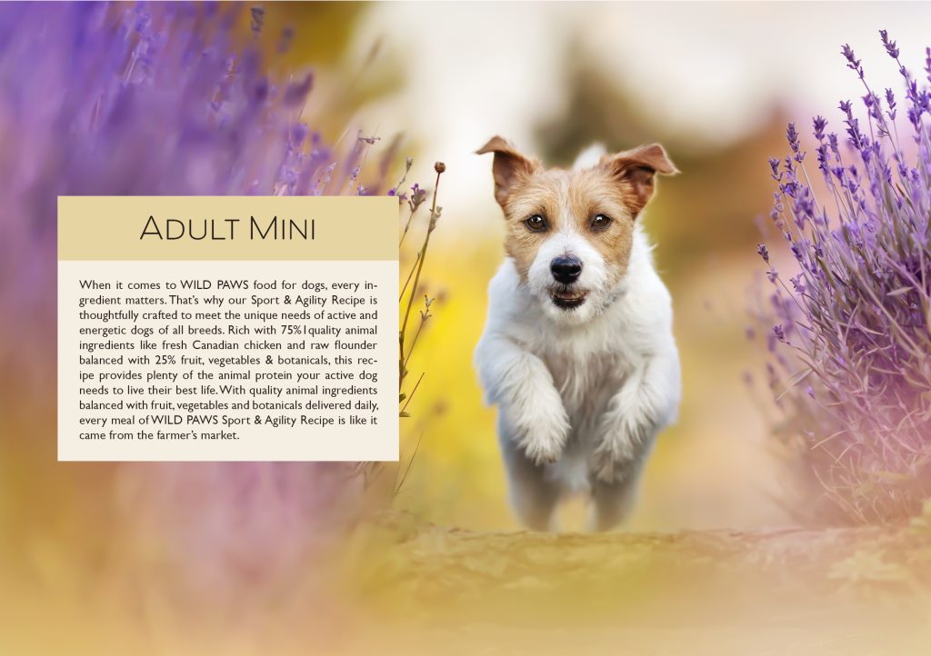
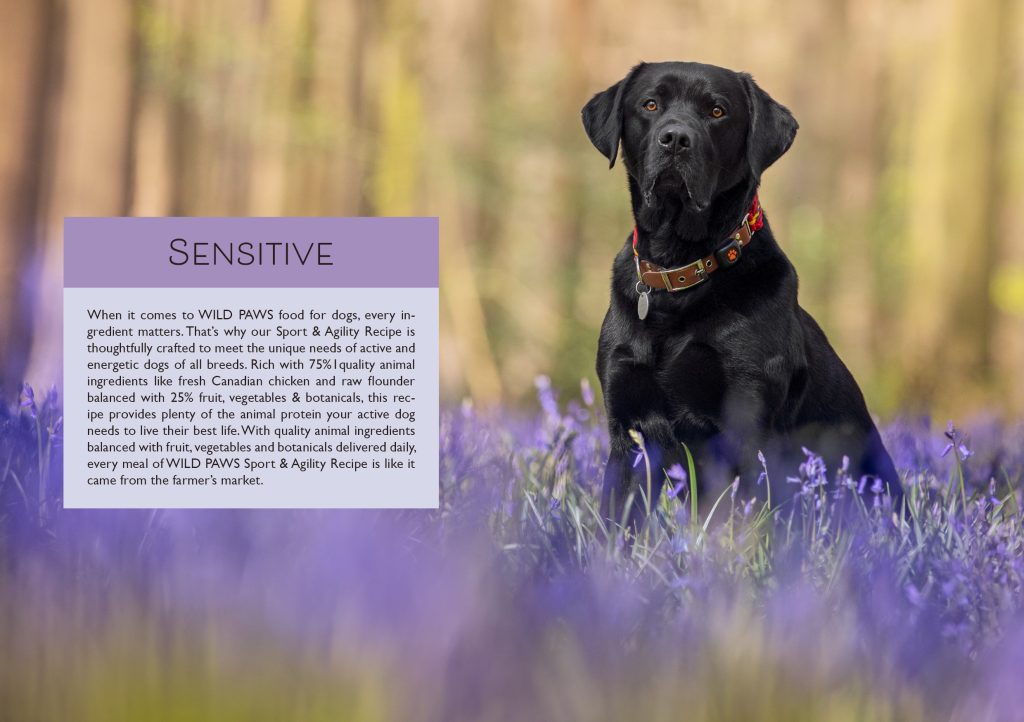
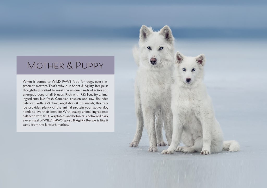
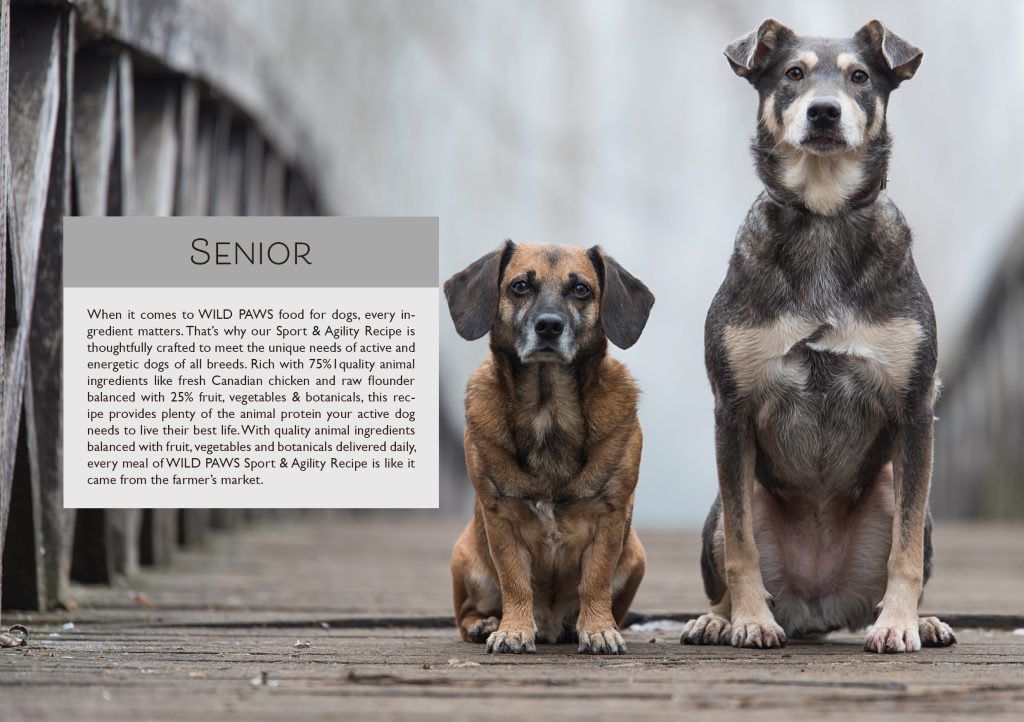
For the brochure I have used the same color scheme as the infographic. I found some pretty photos of some dogs with the right color and mood that I though would work really well in the brochure. I used one photo for each page in the brochure and then I used text/info blocks on each page to join everything together. The brochure is also A5 in size(A5 lying when its folded).
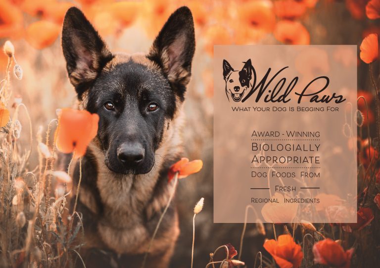
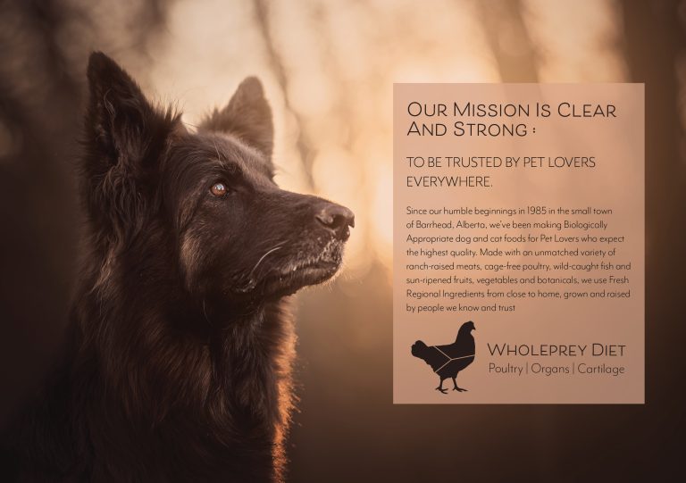
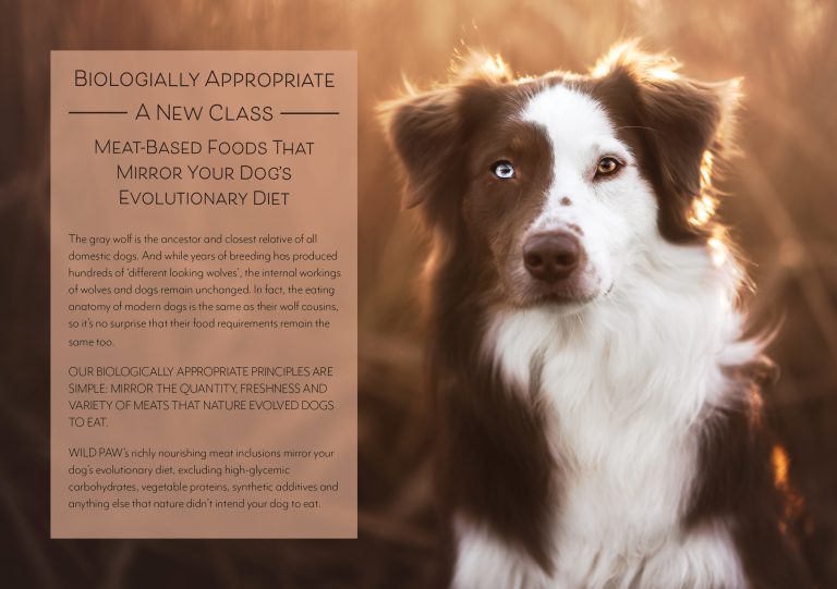
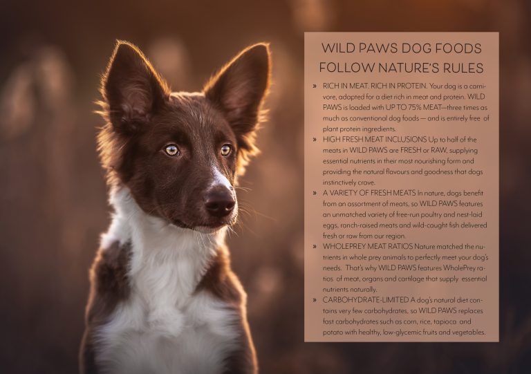
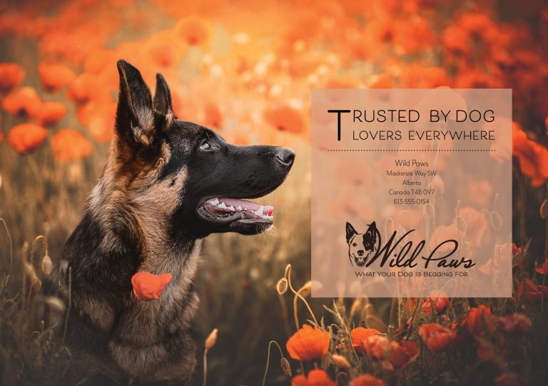
After this week LT where I made the packaging design I changed the brochure, added some pages. “Sport&Agility” is the main design that I made, but I felt like making more types of food, like adult, puppy, senior etc. So I put these inside of the brochure as well.

