LT. 3.1 Styling Images
The Task
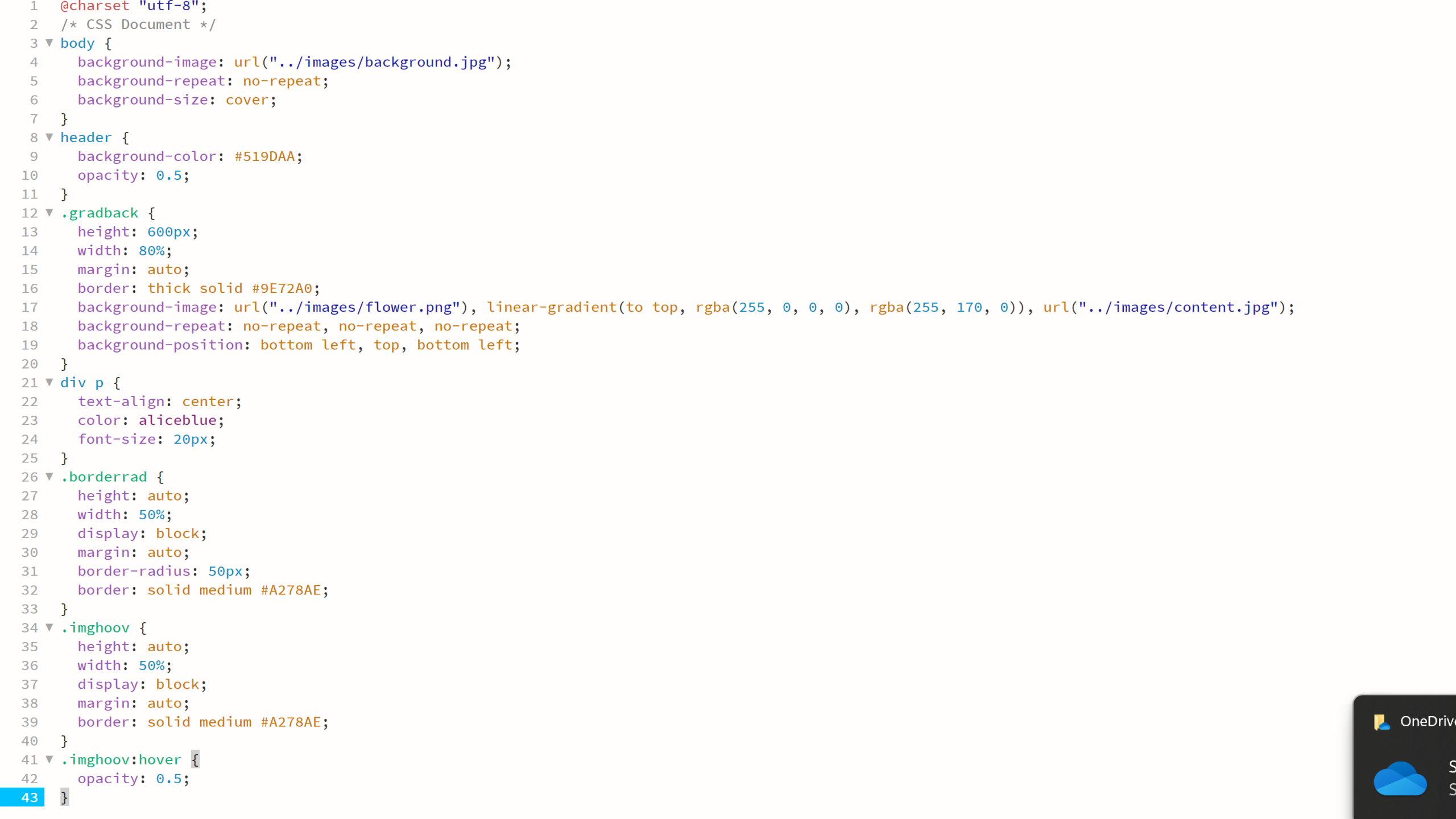
You need to create an HTML and CSS document for this lesson task. Use one root folder containing separate CSS and image folders. Find three images you can use; one will be used as a background and one as part of the content, while the third should be a simple png with a transparent background.
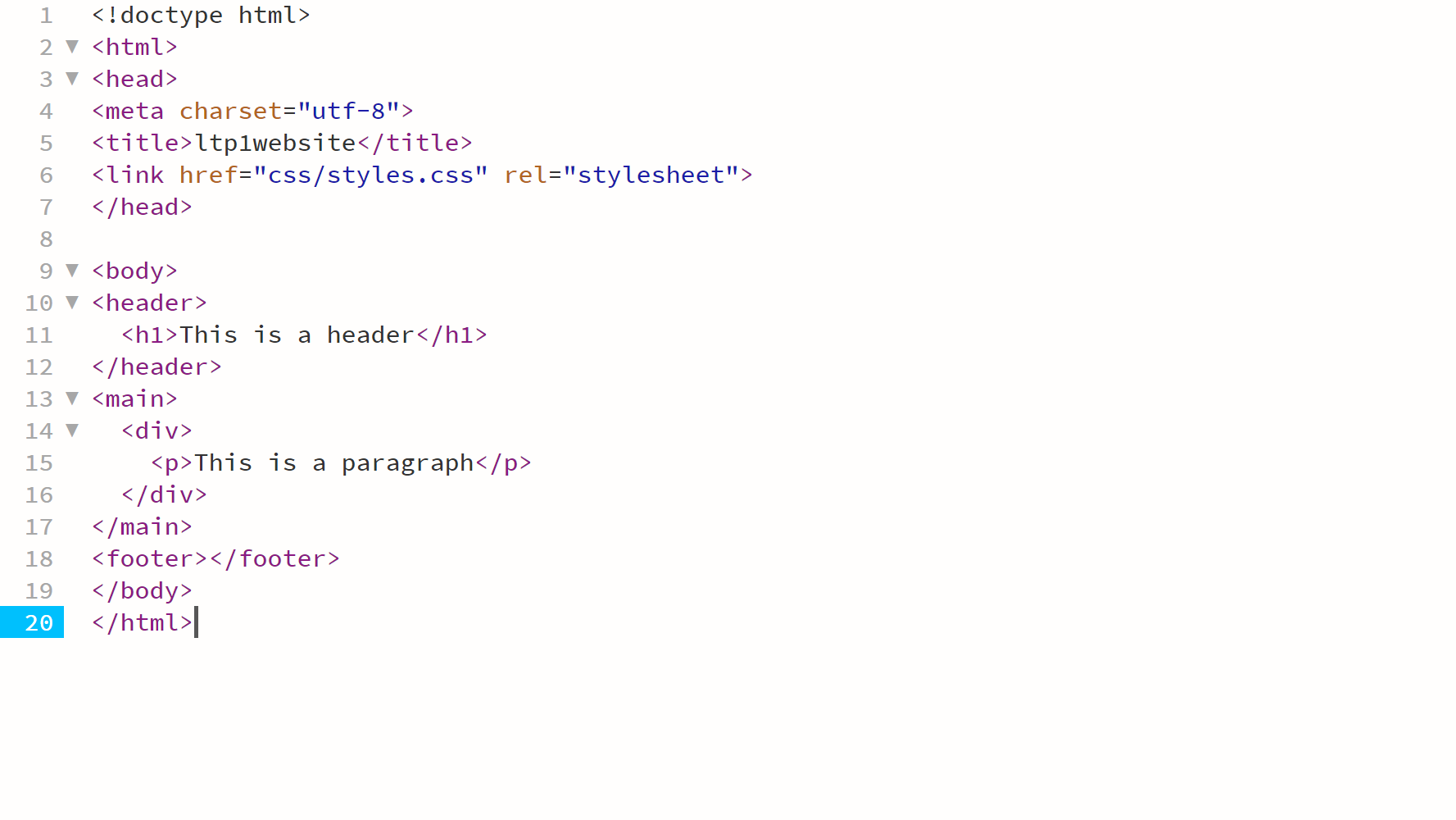
Link the styles.css file with the HTML document using the property inside the section of the HTML document.
Part 1
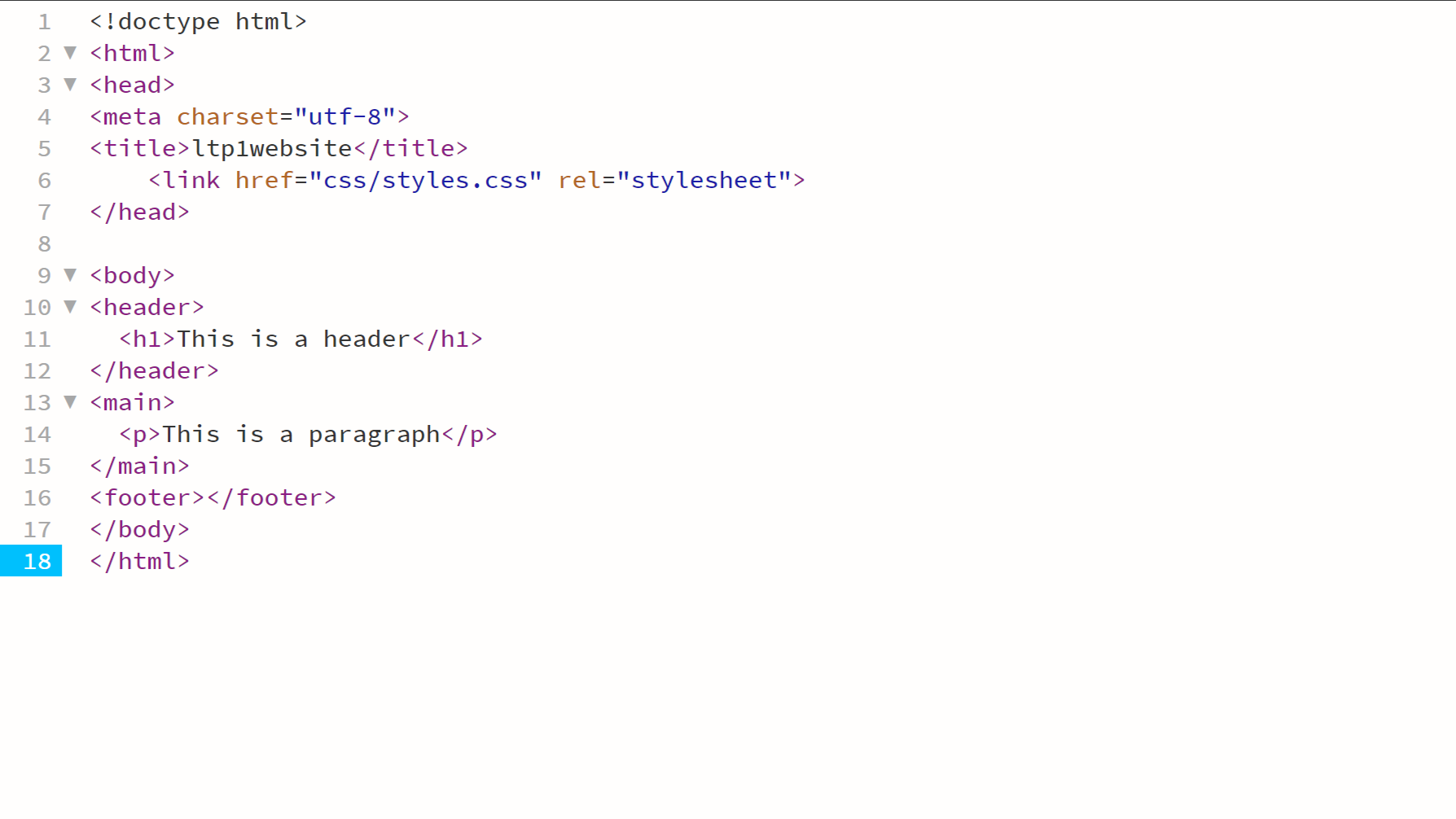
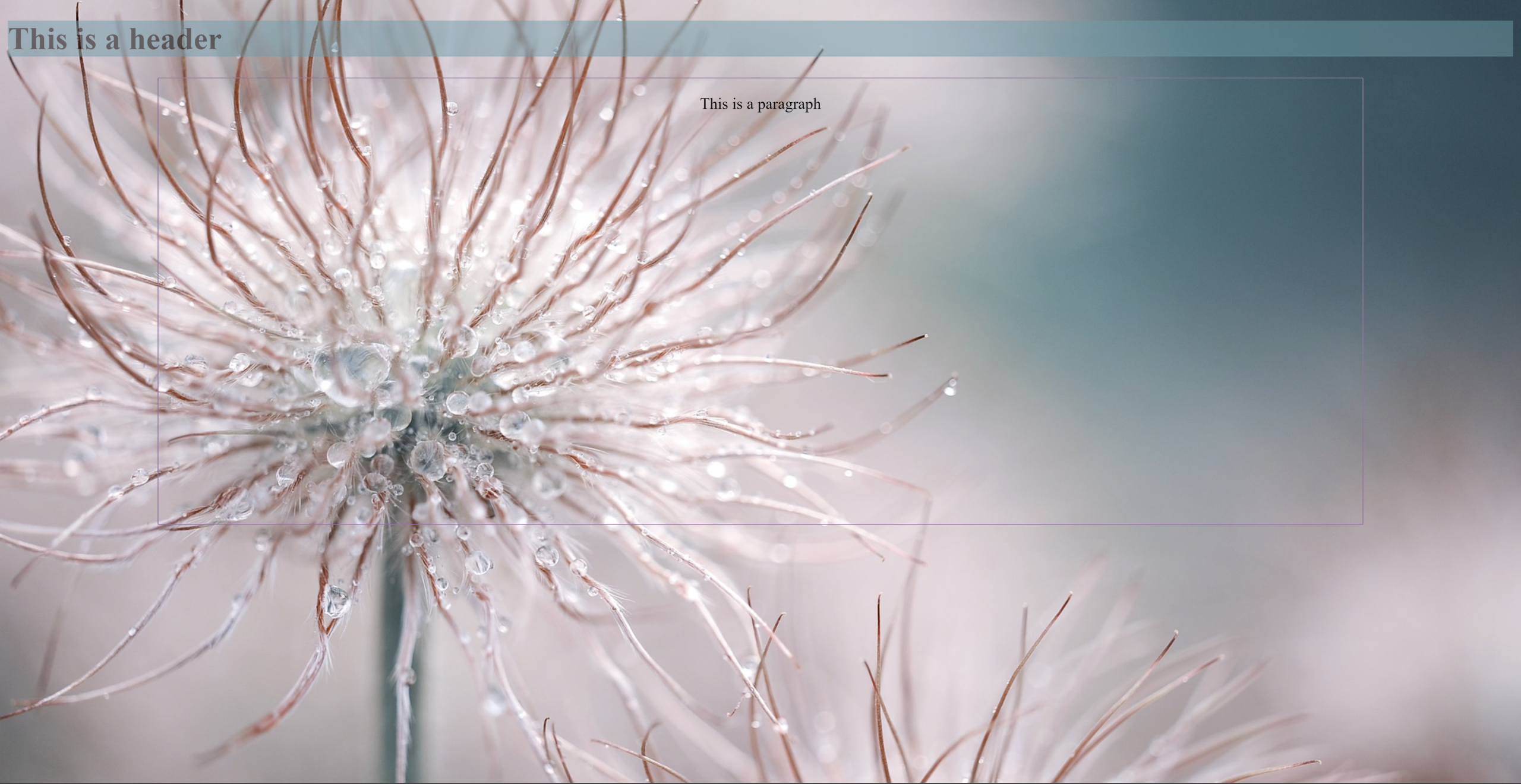
Create a basic structure for the HTML document with a <body> containing a <header>, <main> and <footer> section. Insert a <h1> element into the <header> section and a <p> element with text inside the <main> section.
Using CSS, apply the following to the HTML page:
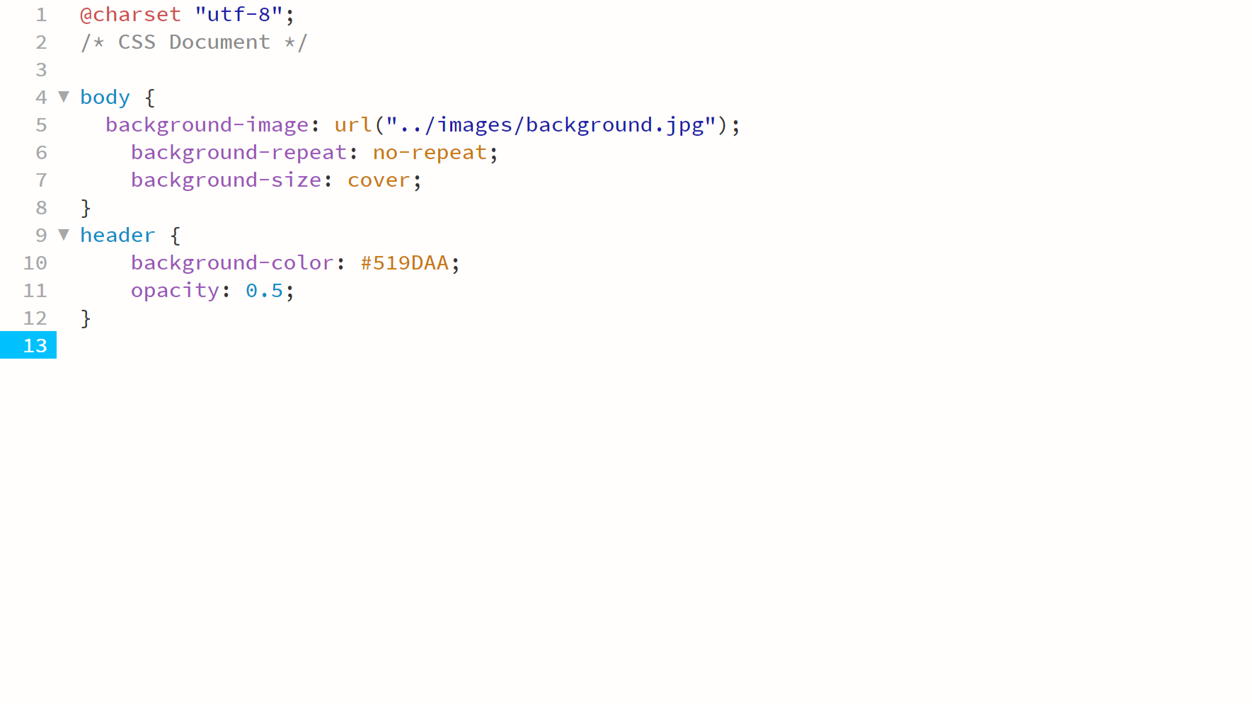
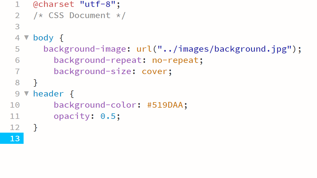
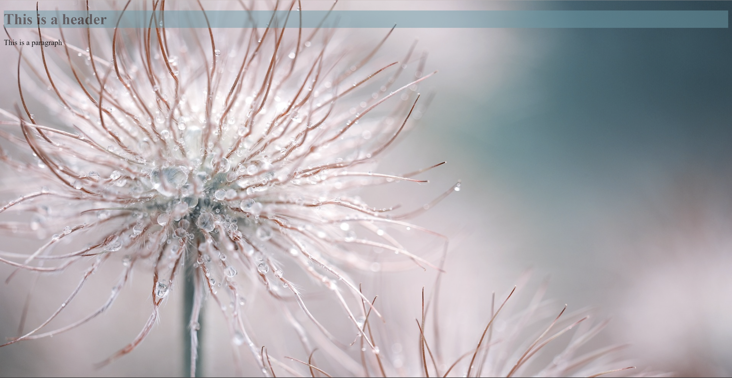
- A background image for the <body> section;
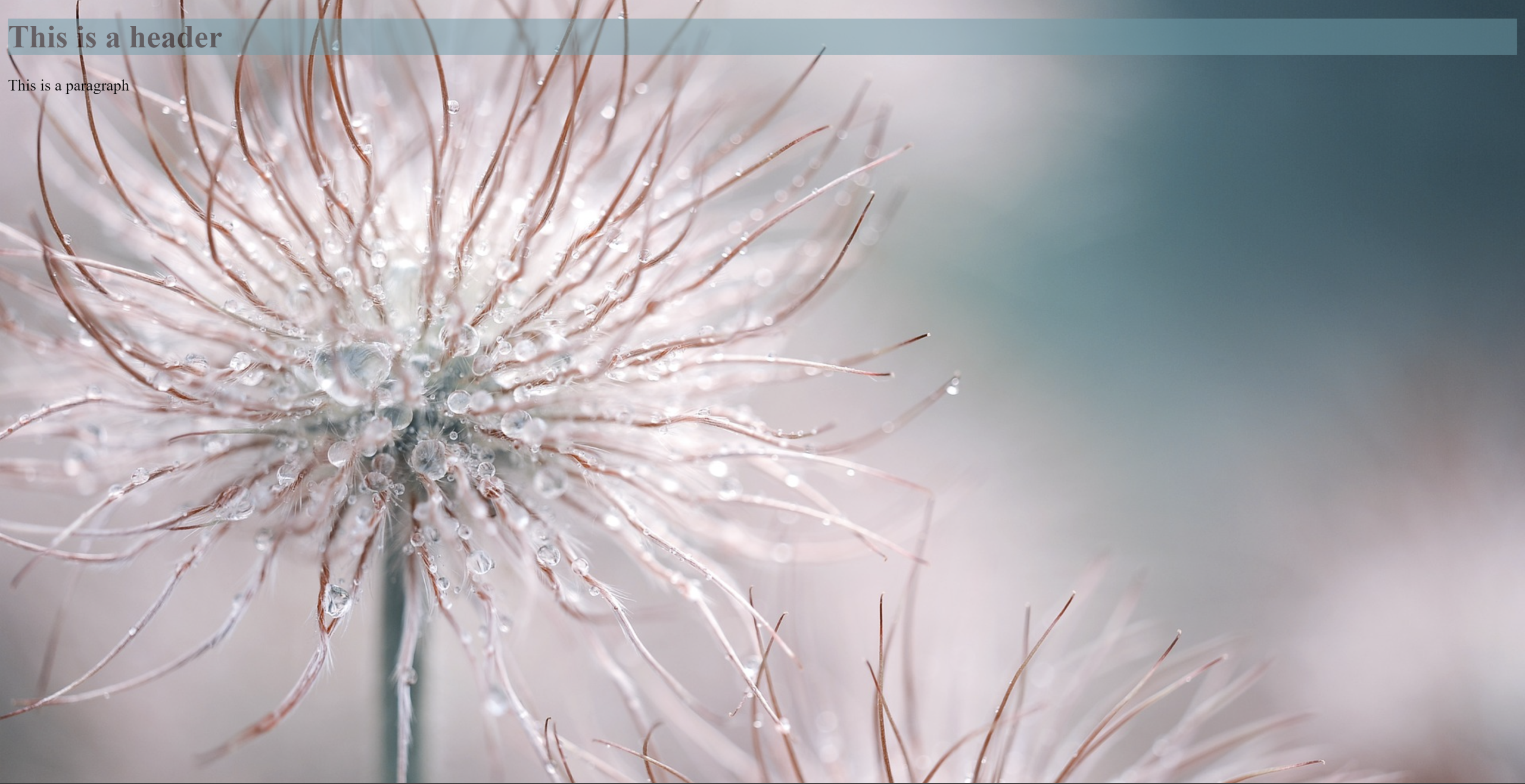
- A solid colour background for the <header> section, but with an opacity rule applied so that the background image is slightly visible behind the <header> container.
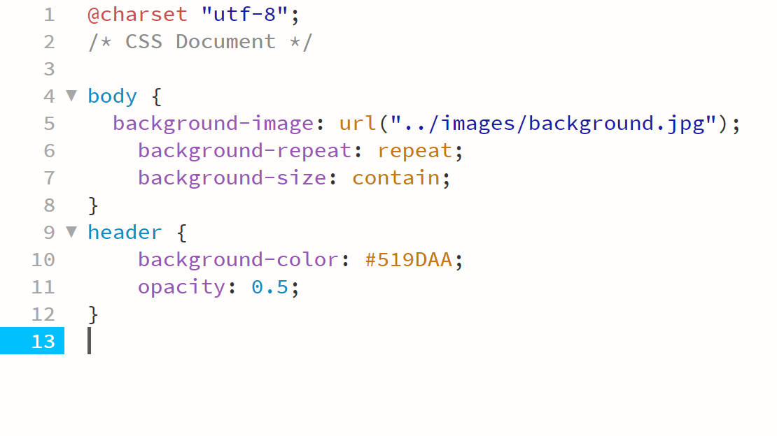
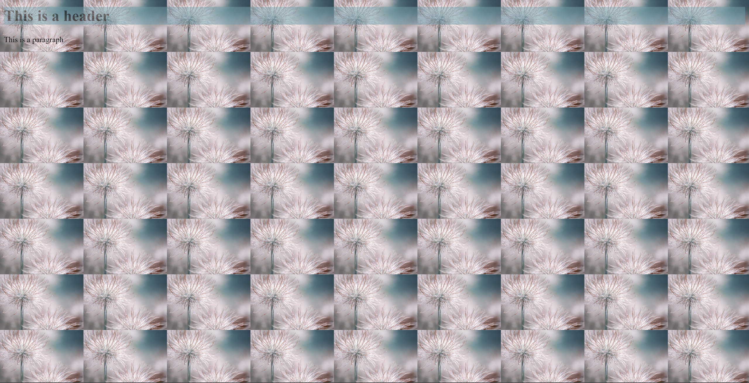
- A repeated pattern of the background image using the properties “background-repeat” and “background-size”.
- Place the background image in the centre of the screen using the properties “background-position”,; “background-size”, and “background-repeat”.
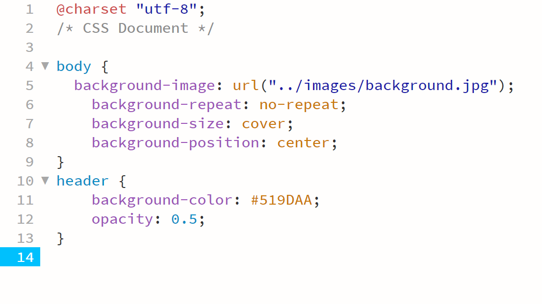
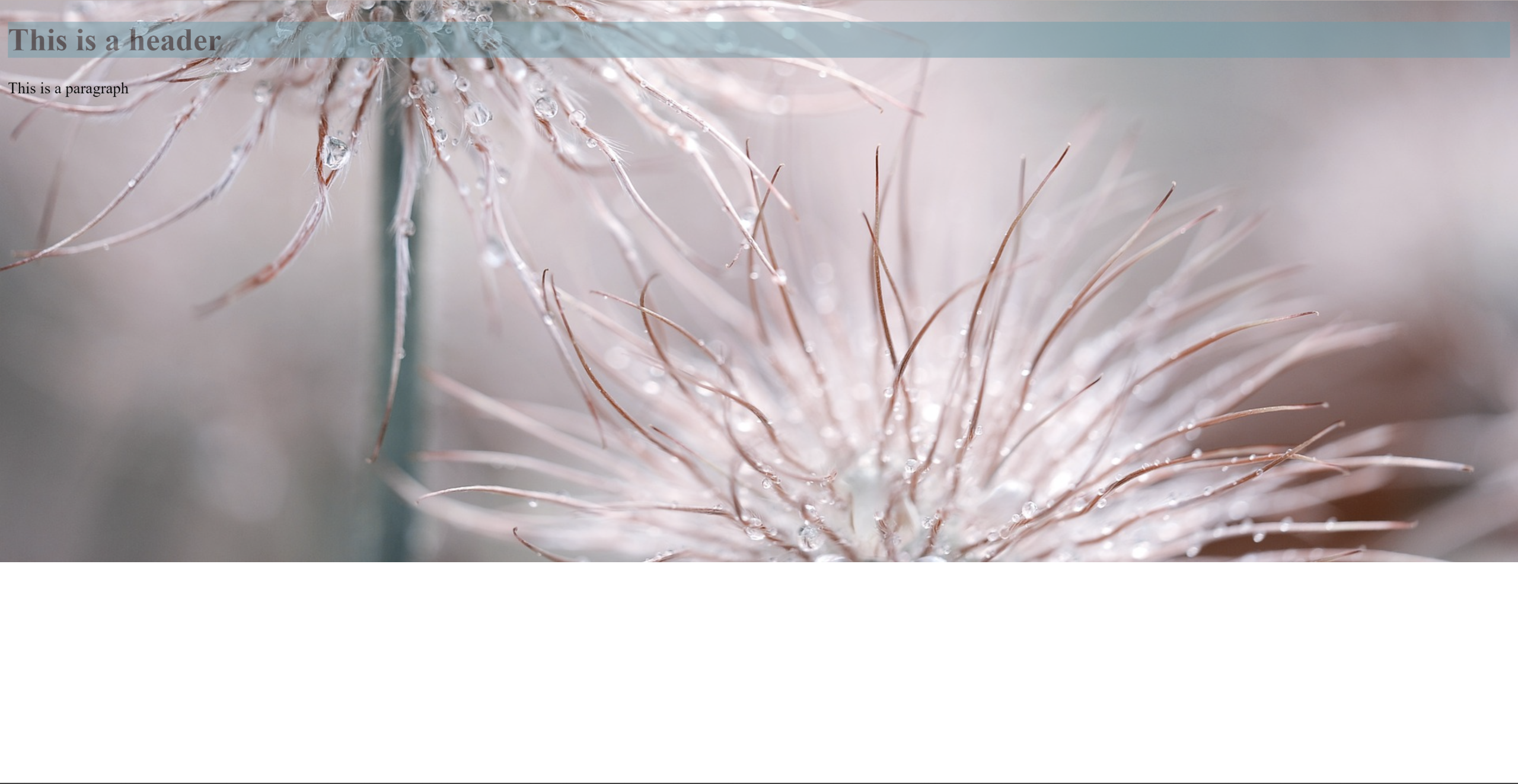
- A full-page background image that fills the screen using “background-repeat” and “background-size” (remember that size can have specific values in % or px, but it can also have relative values like “contain” and “cover”).
Take screenshots of the HTML and CSS code as well as the browser results. Write a short description explaining how the property values changed the behaviour of the background image. This should be loaded onto your blog.
Part 2
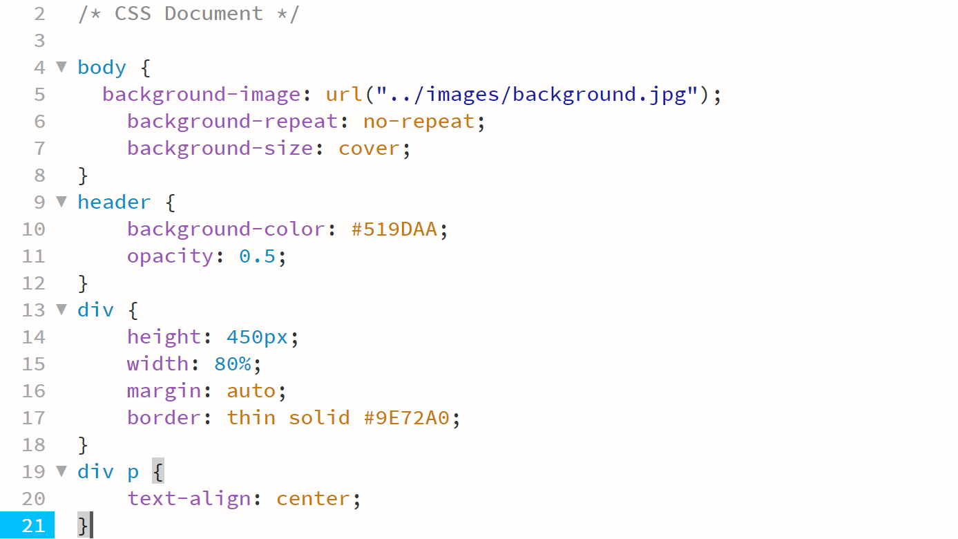
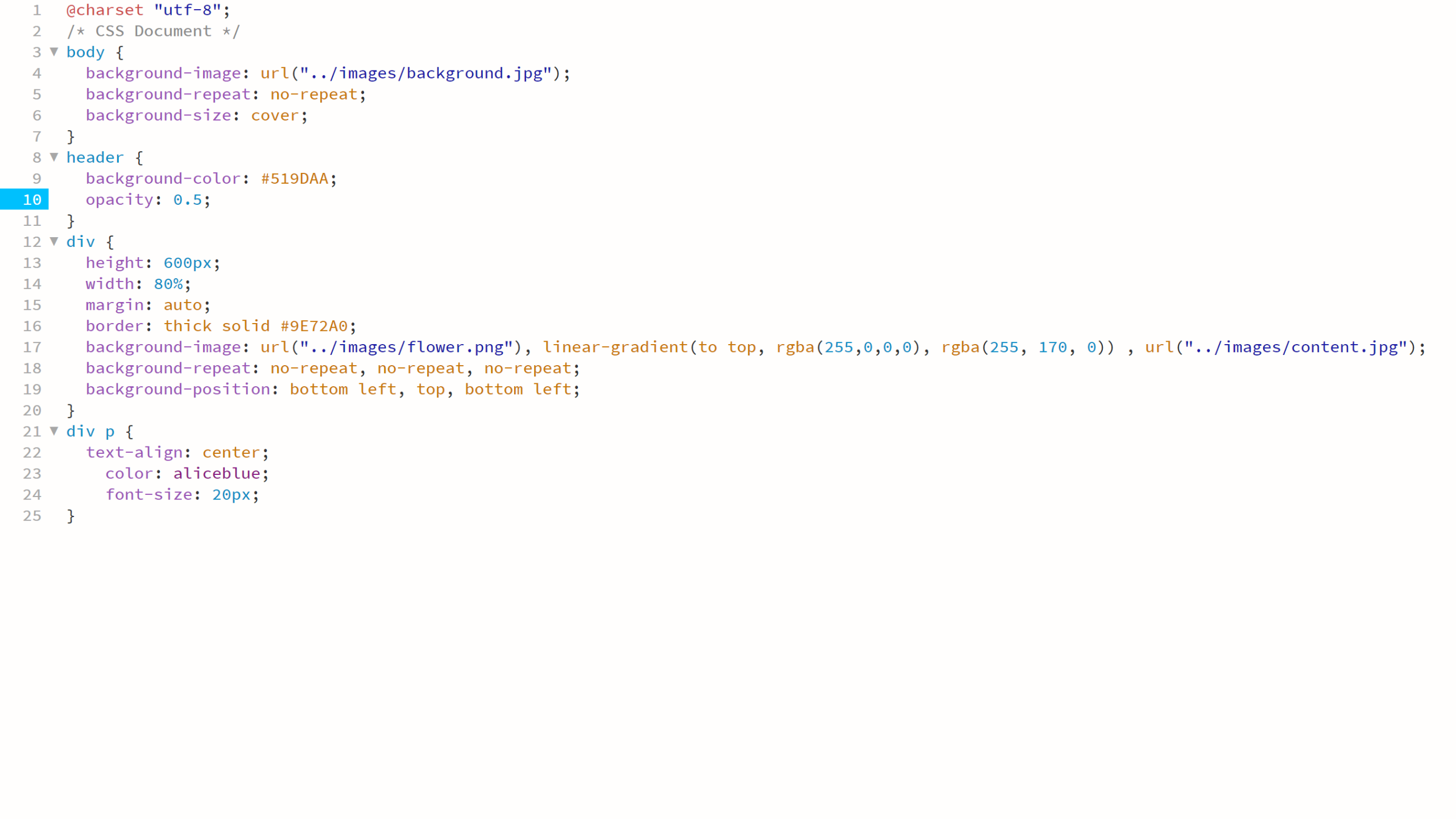
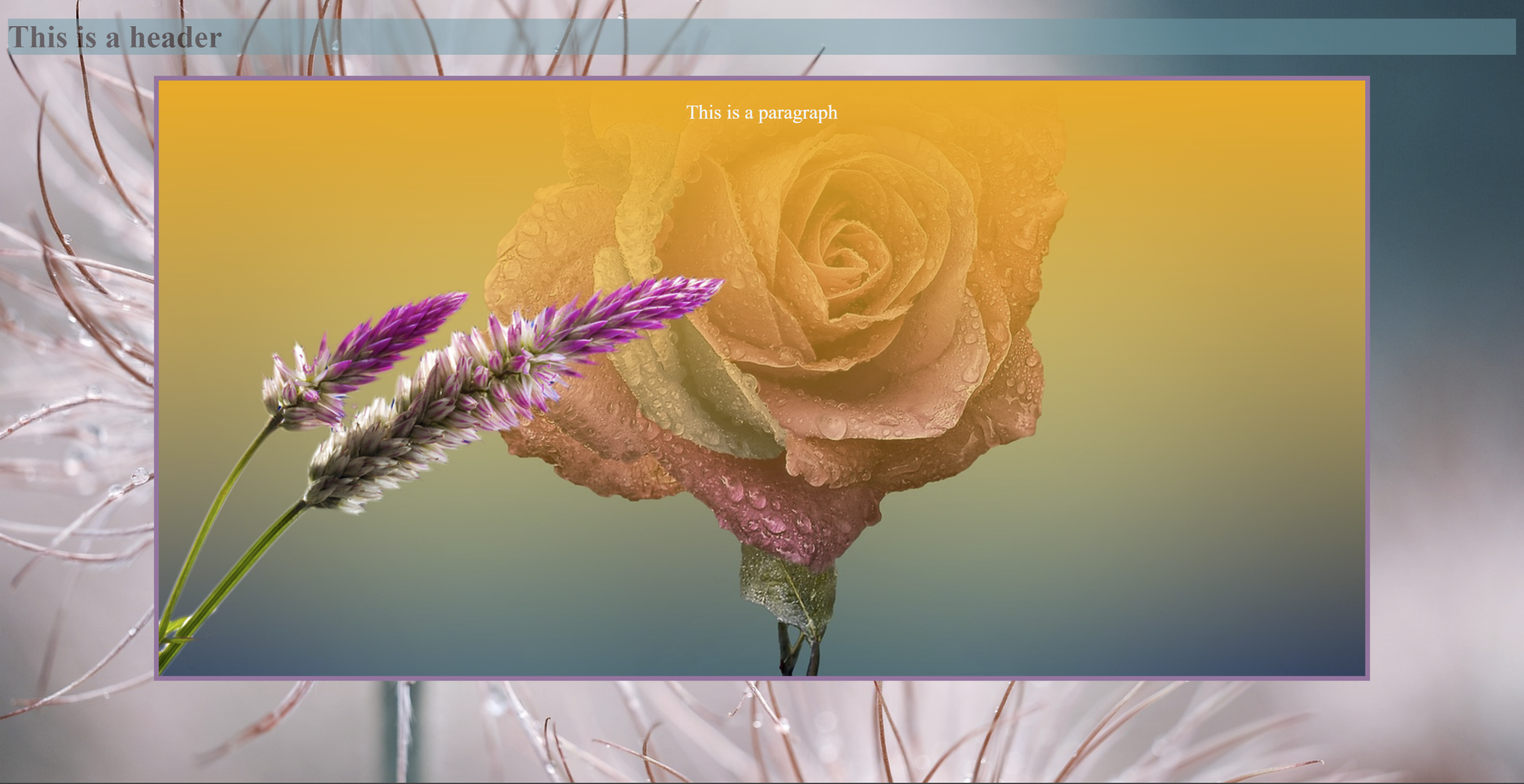
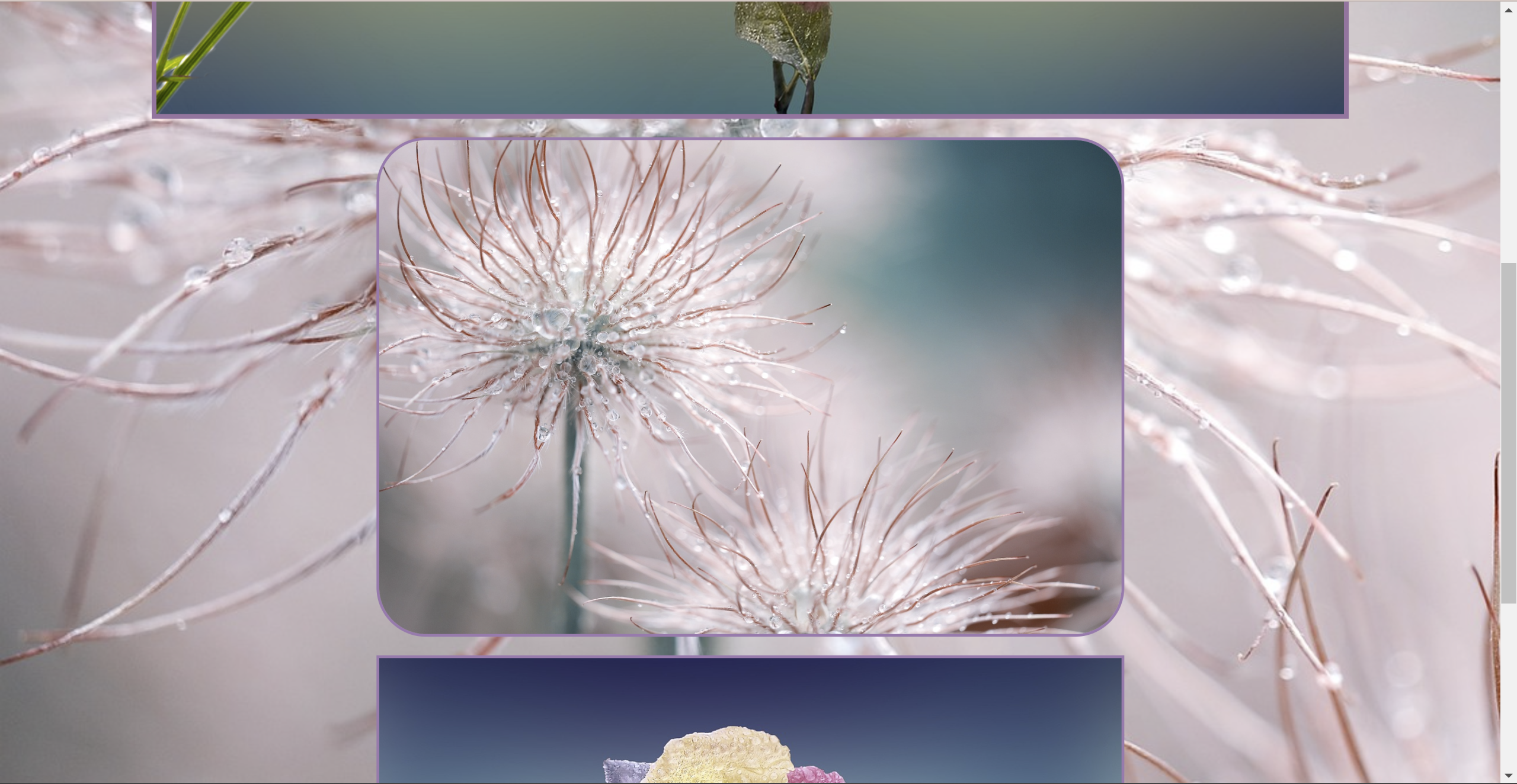
Insert a div with a class into the <main> section of the HTML page. Specify the div’s size using a CSS rule that includes a height and width property. You can also specify a border so you can see the empty container. If you need to refresh your memory on border styles, visit this link.
Once the empty container is showing up in the browser or result view, add a multi-layered background to the container that includes the following:
- A gradient;
- A pattern made up of the png image you collected earlier.
Take screenshots of the CSS code and the result and write a short description explaining how the property values changed the behaviour of the background image.
Part 3
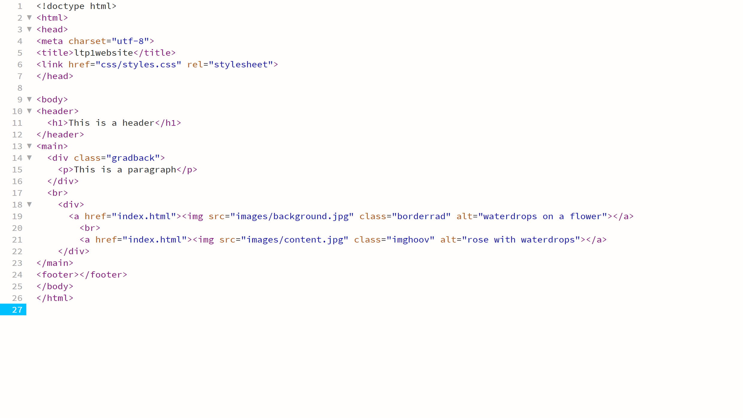
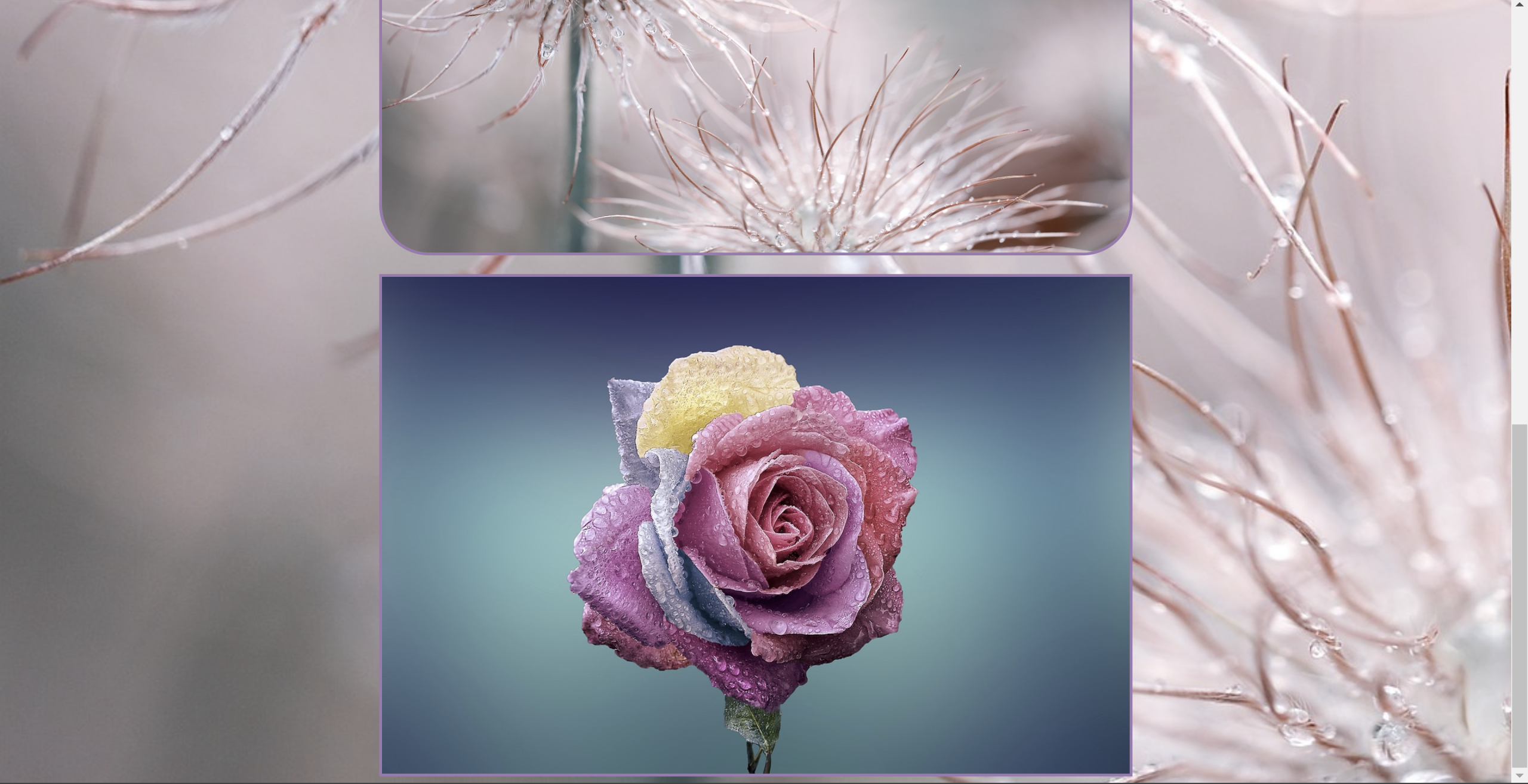
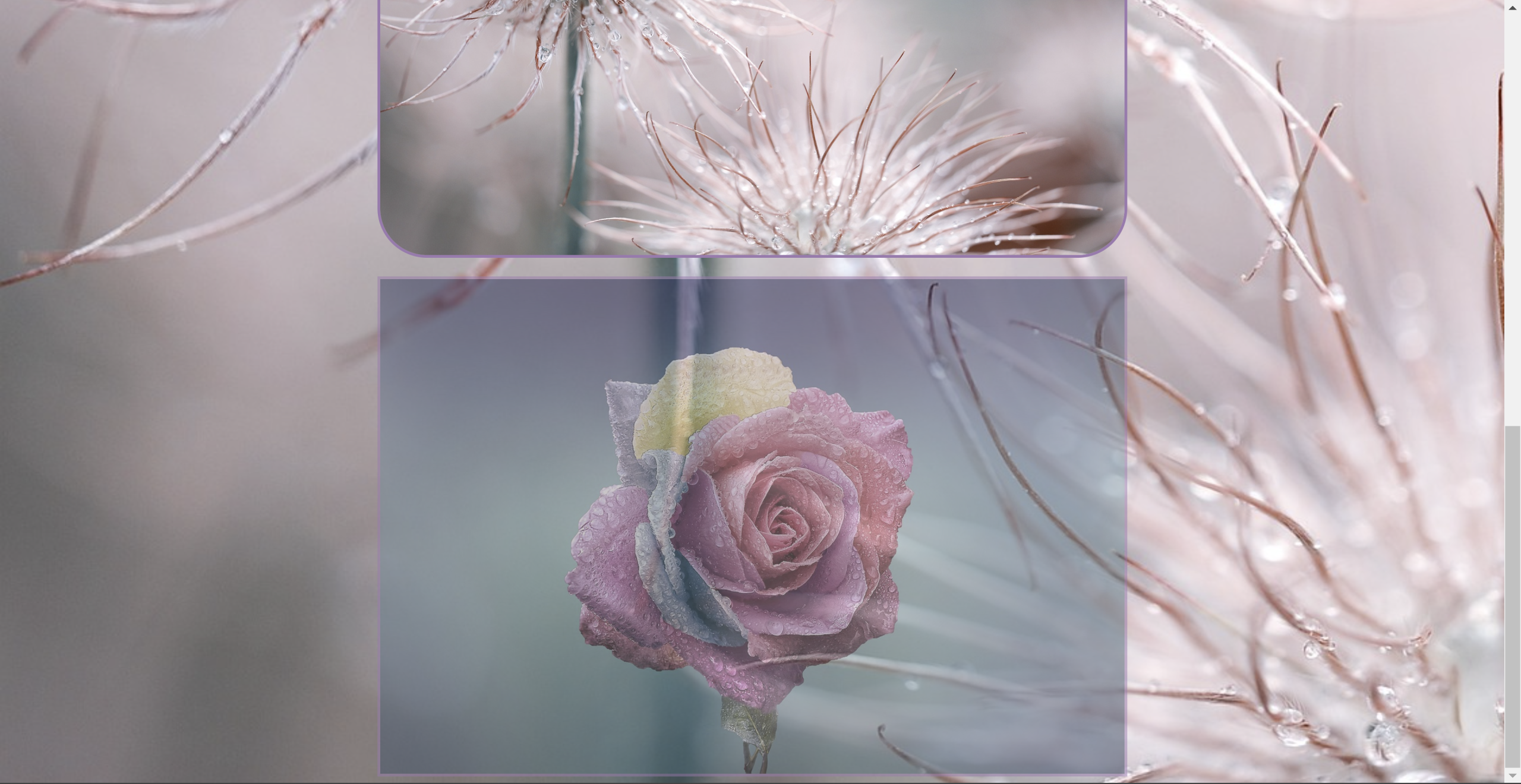
- Apply a border radius property to the first image;
- Apply a pseudo-class property to the second image that reduces the opacity on hover.
Take screenshots of the HTML and CSS code as well as the browser results to load onto your blog.
LT. 3.2 Layout Elements
The task
Part 1
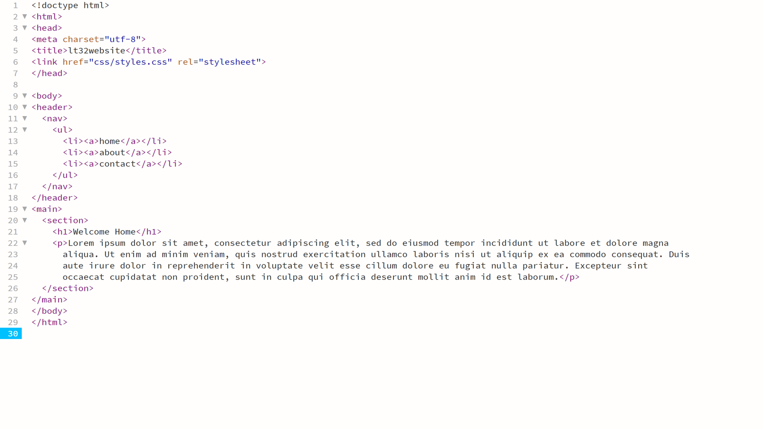
<header>
<nav>
<ul>
<li><a>home</a></li>
<li><a>about</a></li>
<li><a>contact</a></li>
</ul>
</nav>
</header>
<main>
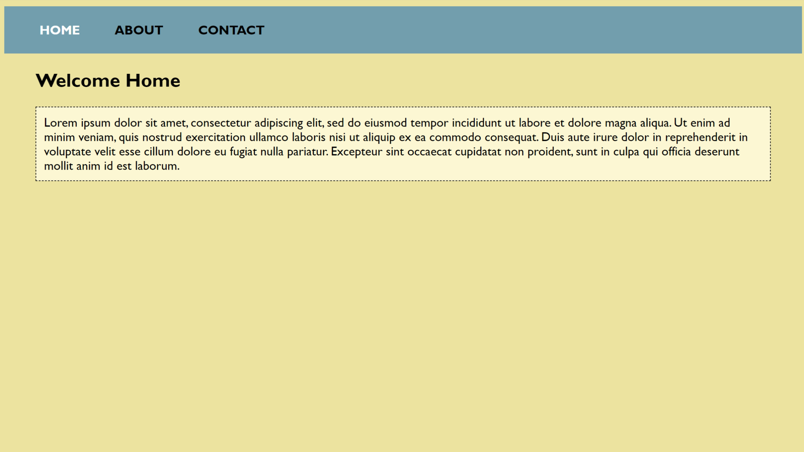
<section>
<h1>Welcome Home</h1>
<p>Lorem ipsum dolor sit amet, consectetur adipiscing elit, sed do eiusmod tempor incididunt ut labore et dolore magna
aliqua. Ut enim ad minim veniam, quis nostrud exercitation ullamco laboris nisi ut aliquip ex ea commodo consequat. Duis
aute irure dolor in reprehenderit in voluptate velit esse cillum dolore eu fugiat nulla pariatur. Excepteur sint
occaecat cupidatat non proident, sunt in culpa qui officia deserunt mollit anim id est laborum.</p>
</section>
</main>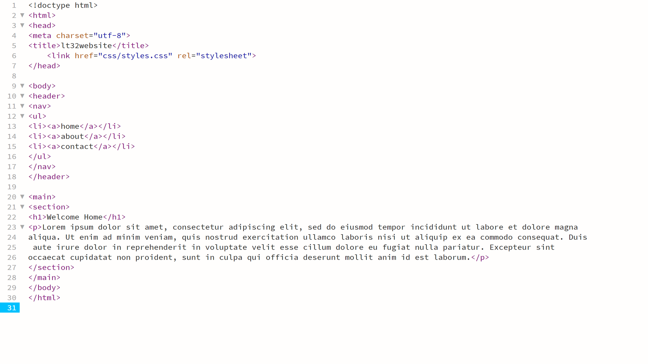
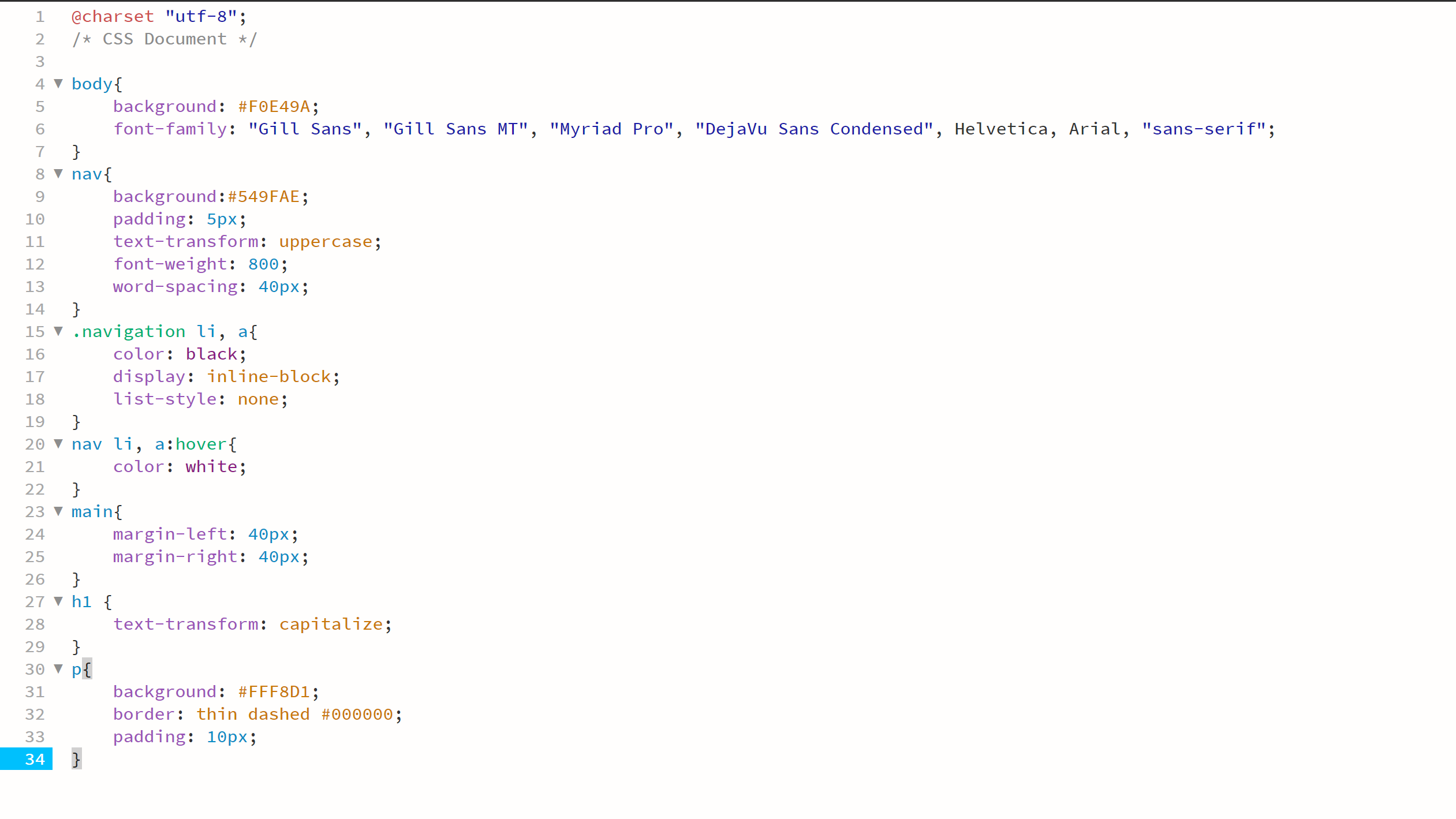
Part 2
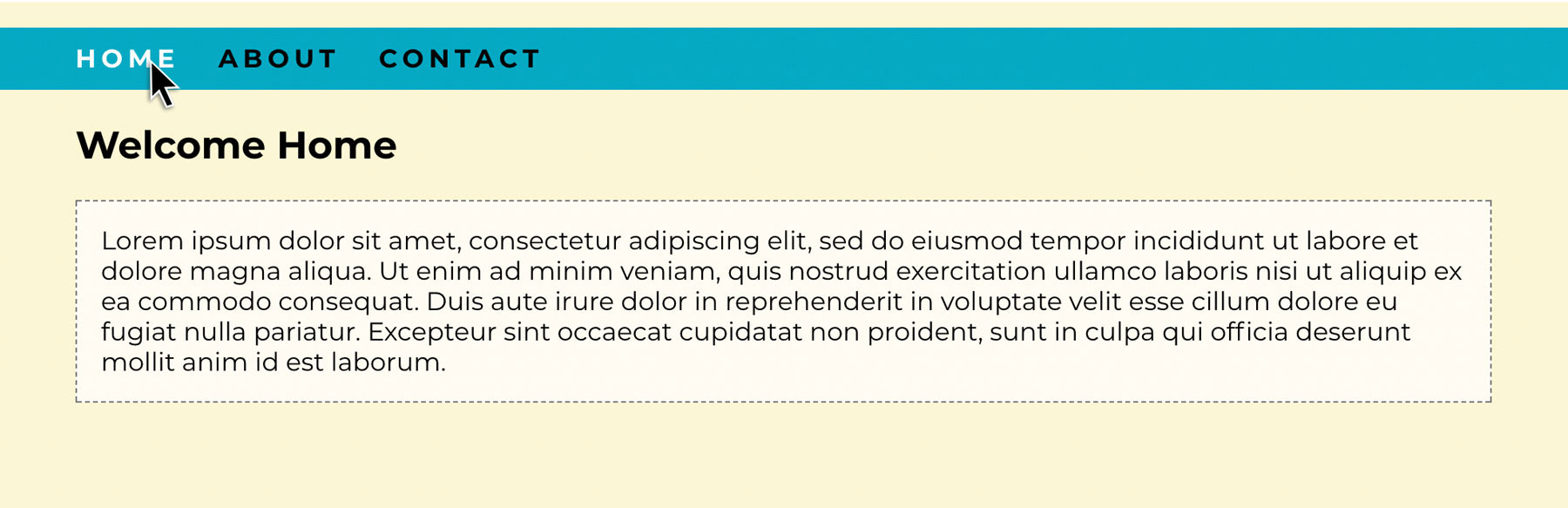
- Classes;
- Inline block display;
- Margin properties;
- Padding properties;
- Font family;
- Background colour properties;
- Border properties;
- Pseudo-class for the hover effect on the navigation menu.
LT. 3.3 – Styling Layout
The task
Goal
Part 1
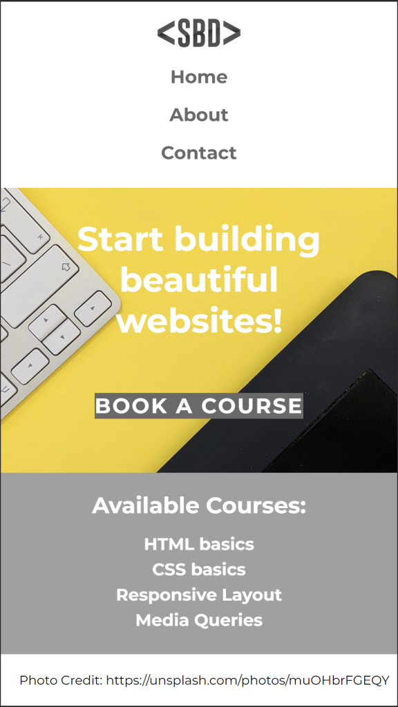
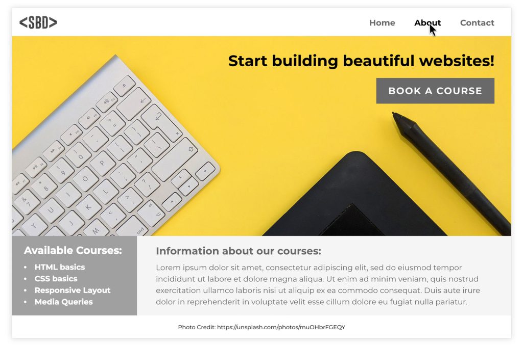
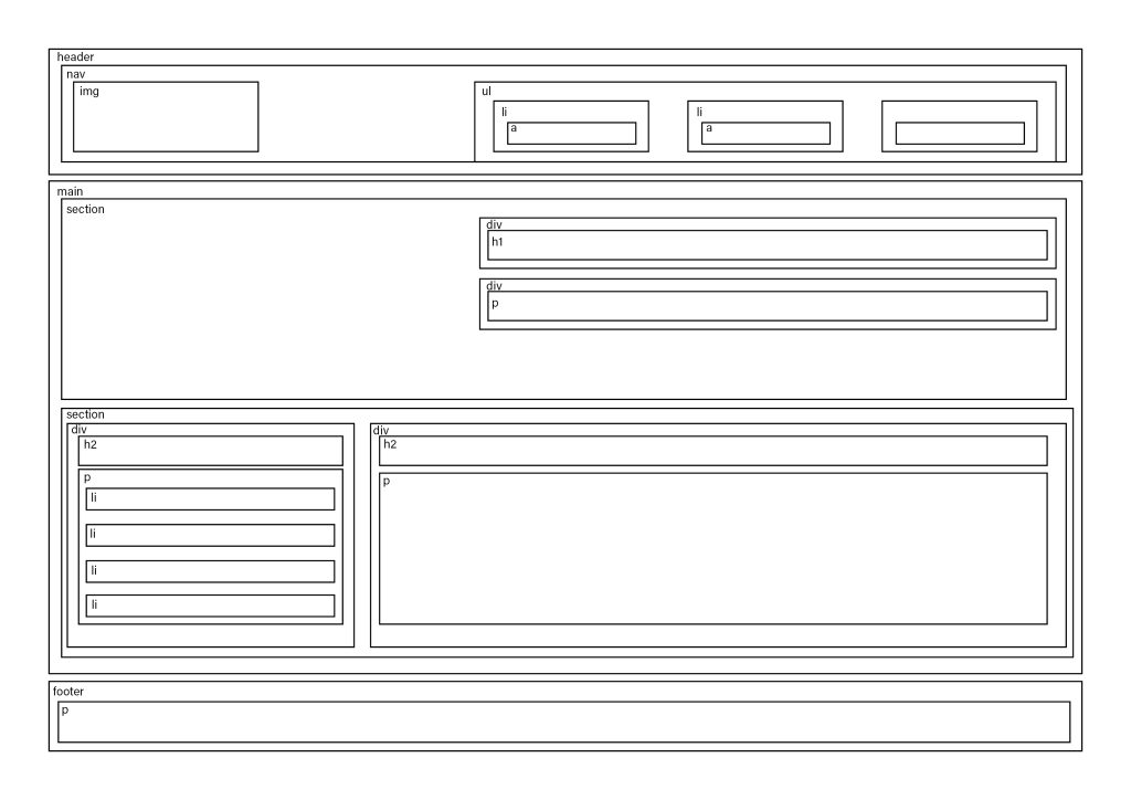
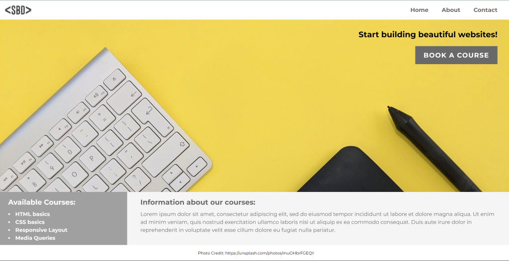
First, examine the layout and draw a wireframe showing the different sections of the page. Then, inspect the HTML code to find the hierarchy of parent and child elements that respond to the sections you identified. Write down the names of the classes of the parent containers that make up the basic structure.
For example: <nav> is the parent container that holds two siblings: the logo image and the <ul> that make up the navigation menu. The <ul> element is the parent container that holds the three list items: Home, About and Contact.
Part 2
- The body element, by default, has some margin around the edges. To remove the margin, set it to 0%.
- Flex was used to style the <nav> element as well as the first hero image section.
- To get the elements within a flex container to align to the left and right sides of the window with space between, use the CSS rule “justify-content: space-between”.
- Remember, padding creates spacing within an element (between the border and the content), while margin creates space between elements (outside the element’s border).
- To align elements within a flex container right, use “justify-content: flex-end”.
- Grid was used to style the information section below the image.
- Position was used to create the footer.
LT. 3.4 – Media queries and code conventions
The task
Goal
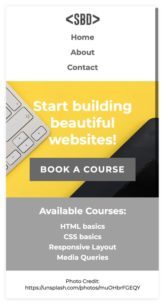
Take a screenshot of your browser display and your HTML and CSS documents. Here is the updated CSS file with media queries to show you how we solved it. Compare this example to your own.