LT – 1.1. Why graphic design history is important
The task
Additional task
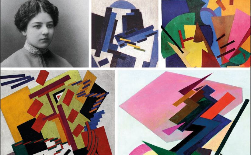
LT – 1.2. Suprematism and constructivism
The task
Describe the similarities and differences between suprematism and constructivism. There is no prescribed word count; you just need to show that you understand the movements in broad terms.
The similarities between Suprematism and Constructivism
- Both were founded in early 1900s in Russia. Suprematism in 1915 and Constructivism in 1920.
- Both movements were founded by artists in reaction to the turmoil of the world we lived in – First World War and the Russian Revolution.
- Artist of both movements was convinced that art could improve society and make the world a better place.
- Constructivism was inspired and influenced by Suprematism.
The difference between Suprematism and Constructivism
- Suprematism is based on the us of geometrical forms, most squares and circles. These geometric shapes would point to the future where everybody could participate, not just elite or culturally acceptable.
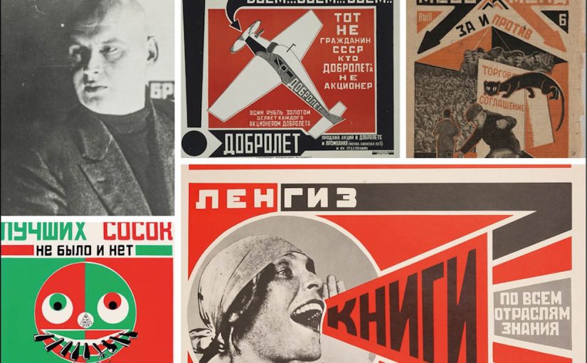
- Constructivism took the abstraction design elements that came from Suprematism and gave it a function and transformed it into political statements.
For each of these movements, find examples from their eras and then two contemporary designs you think are influenced by these styles.
LT – 1.3. De Stijl and Bauhaus
The task
Today we’re taking a break from theory and having some fun with pixel art. Traditionally, pixel art was not seen as art at all; it was merely seen as a way for, particularly video game developers, to use a limited number of pixels to create images.
But it’s really a lot like abstract art: it represents a pictorial element in its simplest, purest form using only squares and flat colours. It forces the creator to focus and isolate only what is most important in an image without providing the finer control you could apply in a more detailed drawing style. Think of it as modern-day Piet Mondrian.
Brief
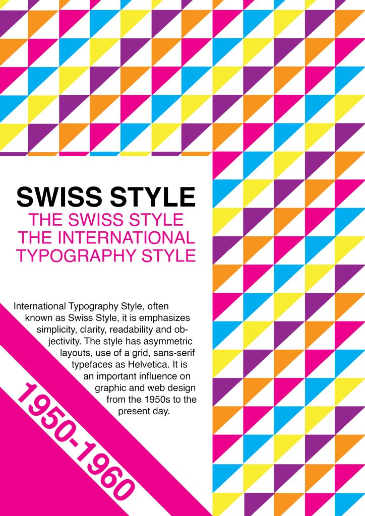
LT – 1.4. The International Typographic Style
The task
Part 2
Design an A2 poster for a Stavanger Symphony Orchestra concert. The concert consists of two parts. The first is a commission from local composer Ståle Kleiberg who’s known as a composer for grand occasions. The Turangalîla-Symphonie by Messiaen follows the intermission, which according to the composer, is a love song.
Use the Swiss style grid to organise the information and the typeface Helvetica. Place the main focus on the image and heading.
The heading of the poster should be SEASON OPENING.
The rest of the information that needs to feature is the following:
PROGRAMME
Ståle Kleiberg (born 1958):
Commissioned work for Stavanger anniversary – World Premiere
Olivier Messiaen (1908-1992):
The Turangalîla-Symphonie
CONTRIBUTORS
Andris Poga, conductor
Pierre-Laurent Aimard, piano
Nathalie Forget, ondes martenot
VENUE
Fartein Valen, Stavanger konserthus
