GD2-AW18 – The Creative Process: Step By Step

LT – 1.1. Lesson task – The creative process: step 1

The task
Write a short, informal paragraph to describe the type of graphic designer you want to be. It can have as many words as you feel fit and can be in any format you wish: draw a picture, add a photo, or make a mind map. Let your personality shape the delivery.

The questions below may kickstart the process:
  • What kind of job do you want to wake up to every day? What do you want to do daily?
  • Which type of clients do you want to work with?
  • After pinning down your interests and vision of yourself as a professional, in which areas do you think you need more growth and experience?
  • What are your next steps to fulfil who you want to be as a graphic designer?
If you are unsure, think of the different courses you’ve done so far in your studies and the projects you enjoyed most – where did you naturally flourish, and which projects did you unexpectedly shine in?

What kind of job do you want to wake up to every day? What do you want to do daily?

I want to wake up to a job that I thrive in, a job that gives me joy in life and not just a paycheck. I want to use my creative mind every day and not waste in retail where I’ve been for the past decade and more. I want to design for people. I’m not sure what way I want to go in graphic design yet, but I do recon it will be design and layout. So this CA we are going to do designing an magazine will be amazing to do. I also like the design part of web design, so maybe a little UI design as well. I know that logo design isn’t a way I probably want to go, but who knows, maybe I start enjoying that part too?

Which type of clients do you want to work with?

Since I think i want to work with layout I want to work with clients that need magazines, infographic, brochures etc. and maybe clients that like some of the styles that I also like so I can evolve and learn more in that genre.

After pinning down your interests and vision of yourself as a professional, in which areas do you think you need more growth and experience?

I need more growth in strategic design and logo design, but also UI, layout, grid, typography and illustrations.

What are your next steps to fulfil who you want to be as a graphic designer? If you are unsure, think of the different courses you’ve done so far in your studies and the projects you enjoyed most – where did you naturally flourish, and which projects did you unexpectedly shine in?

My next step is to finish this last semester, but also watch as many LinkedIn learning courses and learn more about the topics I want to learn more about. And then I need to start searching for companies in the area that I want to work in and start working on my papers.

LT – 1.2. The creative process: steps 2 and 3

The task
In 2008, Paula Scher gave a talk at the Art Centre Design Conference in Pasadena, California, named ‘Serious Play’. Today, it’s widely shared and referenced by graphic design educators because of its simple but also complex truth. In essence, it’s about the importance of play in graphic design (which is quite serious!) and not falling into a pit of design solemness. In this case, solemness means to design safe, predictable, and acceptable things.

Watch the TED video below:
In today’s lesson, we talked about the quiet before the storm in a project – where you have all the information you need, and you now have to think of ideas to communicate them visually. This is a delicate and precious stage in the creative process and will determine the way forward.

Keep Paula Scher’s talk in mind when thinking of ideas:
  • Embrace play and the unexpected.
  • Don’t repeat the same recipe for success.
  • Don’t be afraid of taking on something a little beyond your abilities.
  • Don’t be scared of being a fool.
  • Experiment!
Today you don’t need to do anything for this lesson task. Just think and wonder about it all and try not to be too solemn; instead, embrace play (whatever that means to you specifically).

LT – 1.3. Lesson task – The creative process: step 4
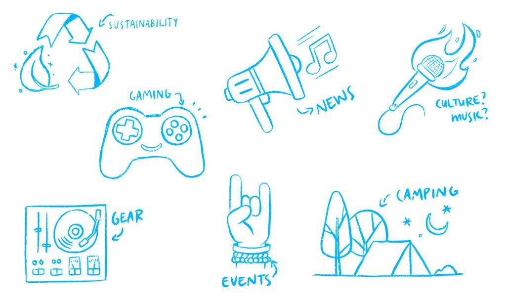
Using any of the vector-building methods mentioned in today’s lesson, convert one of the existing sketches below into a vector graphic. Watch Von Glitschka’s vector-building tutorials again if you need guidance (see the videos in today’s lesson).
Feel free to change the raw sketch to make it your own: add to it or subtract. You can use the final vector graphics in your course assignment if you want to.

Result

LT – 1.4. Lesson task – The creative process: step 5

The task
Thinking back on the course assignments you’ve completed in your studies, how has your journey been regarding feedback on your work from the outside world? When showing your design to someone and they give their opinion and suggestions:
  • Do you feel they are undermining your artistic abilities?
  • Do you try to see reason in the feedback and see how you can interpret it your way?
  • Do you feel overwhelmed and lost and unsure which direction you should go in?
These feelings are valid and experienced by most graphic designers – even seasoned ones working in the industry for years. You have to learn to cope with feedback in a way that will contribute to your growth as a graphic designer but also keep your unique voice as an artist.
Write a short paragraph on your experience with feedback and how you’ve uncovered parts of yourself you did not even know existed. Do you think you have grown? Are you ready for the outside world and its opinions, and do you feel you have enough confidence to stand your ground if needed?
 

My experience with feedback from people around me has been good, but also little confusing. Whit confusing I mean that they love what I’m doing, they like what they see but they can’t directly give me good feedback since they don’t know what to look for when it comes to constructive critics. They usually have a good feedback if I give them different option , like witch one does fit the most.

When it comes to feedback from the forum is always easy to understand and sometimes it’s frustrating, but when it’s frustrating and when I feel I need to do a lot of changes I do my research to find out why would that way work better for the design/task. 

MA01 –  GD 5

Hopefully, by now, you’ll realise that the more your skillset grows in design software, the more creative you can be, and the better your standard of work is. You can have the most fantastic ideas in the world, but if you can’t translate them into a tangible design – it’s not worth much.
For this module assignment, you’ll refresh your knowledge and skillset in Adobe InDesign. Yes, another LinkedIn Learning software course – don’t sigh in weariness! This is where you must exercise self-discipline and be resilient and patient.

Don’t see this assignment as a time-consuming obstacle. See it as an opportunity to learn and re-learn essential skills in a programme you will definitely use in the industry and will be a requirement if you apply for a job as a graphic designer.

Look at these job posts from LinkedIn for junior graphic designers:
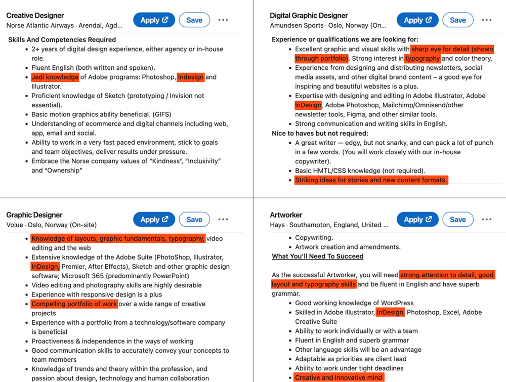
Adobe InDesign is the main programme you’ll use when working with layout design. You may be more comfortable doing layouts in Illustrator, for example. Still, InDesign is the best option when working with multi-page documents, lots of text, and different kinds of image material.
There are three course options to choose from below. Read through each description and decide which option will suit you best. Either way, you’ll benefit immensely from completing any of these three courses.
You only need to choose one of the courses below. After completing one of these, you will:
  • be able to implement all you’ve learnt in your course assignment (which will be a significant addition to your portfolio).
  • receive a LinkedIn Learning® Certificate you can add to your resume.
  • have better knowledge of Adobe InDesign and will be more prepared to enter the work industry.

TIP

When going through these courses, it’s a good idea to open the course on a secondary screen – like an iPad, for example – and then open InDesign on your desktop computer or laptop. Follow along and test things out as the course progresses.

Be actively involved in InDesign throughout the course. It’s better to be alert and engaged with the programme than to sit back and passively listen to what is said in the course.

Hand in the LinkedIn course certificate as part of your course assignment report.

Option 1

If you feel confident in your basic skills in InDesign and just want to refresh yourself with the ins and outs, do this short course below:
 
Video course: InDesign 2021 Quick Start (44m 29s) by Kladi Vergine on LinkedIn Learning.

Option 2

If you want a thorough explanation of the core features of InDesign and want to dive deeply into the foundational functions, do this more extensive course* in InDesign:
 
Video course: InDesign 2022 Essential Training (5h 14m) by David Blatner on LinkedIn Learning.
 
*You’ve already been introduced to this specific course in your first year (GRA1), and maybe you’ve completed it and obtained the certificate. However, if you are still challenged to a large extent by InDesign, it’s a good idea to redo this course to reinforce your knowledge and skill set.

Option 3
The course below is for intermediate users of InDesign. It explores ways to use Photoshop, Illustrator, and InDesign as a powerhouse combination to save time, simplify workflow, and create impressive work. Do this course if you feel you have adequate experience in InDesign, Photoshop and Illustrator:
 
Video course: Photoshop-Illustrator-InDesign Powercombo for Design (2h 30m) by Bart Van de Wiele on LinkedIn Learning.

GD2-AW12 – Low-light and Creative Photography

LT – 2.1. Low-light photography

The task
 

You are required to take and edit a low-light image.

It can be a product photo, a still life or a portrait. Use the unique characteristics of low light to take a photograph with drama and impact. Try different compositions and angles that may enhance the mood.

Do:
  • Use a low ISO setting;
  • Use a small aperture;
  • Use a tripod and your self-timer or a remote/trigger;
  • Watch your focus, and use manual focus if needed.
     
Don’t:
  • Add too much light or expose too much;
  • Leave your VR/IS switched on if you are using a tripod.

LT – 2.2. Painting with light

The task
 
For this task, you are required to take and edit a PWL image.
You are required to use the unique look and feel of PWL photography to make a photograph that shows at least two different PWL techniques, e.g. torch light and a sparkler. You get brownie points if you make your own light source, such as an LED light wand.
You can create a product photo, still life or portrait. However, if you have a unique idea, try that. Experiment with different compositions and angles. Remember to use colours.
Do:
  • Use a low or medium ISO setting;
  • Use a small aperture to give you enough time for the light painting;
  • Use a tripod and your self-timer or a remote/trigger;
  • Shoot in Bulb mode if you need more than 30 seconds;
  • Watch your focus, and use manual focus if needed.
Don’t:
  • Add too much light or expose too much;
  • Leave your VR/IS switched on if you are using a tripod.

LT – 2.3. Intentional camera movement

The task
For this task, you are required to take and edit three ICM images.
Using the unique look and feel of ICM photography, you need to make a series of three artworks for a local art gallery. The idea is to sell the photographs as a set.
Use different ICM techniques, e.g. horizontal movement, camera turning, and vertical movement. Your photos should ‘read’ together, so you need to ensure they work together when placed side-by-side.
Do:
  • Find a subject or scene with enough variation in colour and contrast.
  • Use a low ISO setting.
  • Use a small aperture to give you enough time for the camera movement.
  • Watch your focus, and use manual focus if needed.
Don’t:
  • Use a tripod.
  • Move too little or the effect may just look like a mistake.

LT – 2.4. Double and multiple exposures

The task

You are required to take and edit three images. You can be as abstract as you like. Look for interesting subjects or scenes with enough variation in colour and contrast.

Add a short artist statement of two or more sentences for each.

  • Photo 1: Double exposure
    You need to shoot and edit one double-exposure photograph.
  • Photo 2: Multiple exposure
    Create a multiple exposure consisting of a least three photos combined into one final image.
  • Photo 3: Mirror montage
    Create a mirror montage.

?! GD2-AW11 – Product, Food and Still Life

LT – 1.1. Product photography

The task
You are required to take and edit a product image for IKEA.
Do some research on the IKEA website and create a simple mood board with sample photographs from products on the website, showing the style you are imitating. Your final image must meet their online store’s look, feel, size and resolution.
 
You may shoot any suitable product of your choice, as long as you can envisage it fitting in IKEA. You can choose if you want to photograph the product on a white background or in a lifestyle setting.
Plan your shoot well. Ensure that any label or logo on your product is well lit and sharp.
 
Post your final photograph along with the mood board.

Moodboard

Result

1.2. Food Photography

The task

For this task, your client is a local chef that needs a dark and moody food image for a magazine article in which he will be featured.

Plan your image well. It must be in the editorial style. Ensure that focus and composition lead the viewer’s eye to the main subject. Although rules are meant to be broken, the rule of thirds and, in particular, the use of power points can help with this.

Tight crops and all the other design elements, such as lead-in lines and the use of negative space, will add to a strong composition. Edit your image to the best of your ability.

Remember, your image is all about storytelling. Have fun!

LT – 1.3. Still life photography

The task
For this task, you’ll create a still-life image with a strong artistic style of a small collection of items. The items must have a common theme or symbolic meaning.
The final image will be used in a poster for an art exhibition in your hometown called: 17th century Stilleven.
 
You can use window light, artificial light, or a combination of the two.
 
Add a short description where you elaborate on the theme or symbolic meaning and your intentional placement of objects to create the desired composition.
Be creative and have fun!

1.4. Automotive photography

The task
For this task, you are required to take and edit a lifestyle automotive image.
 
Let’s pretend you are an aspiring influencer and have been spotting nice cars in your neighbourhood. Shoot lifestyle images of a car of your choice and design your first Instagram post.
 
Post your four best images and the final Instagram post.

GD2-AW09 – Graphic Design History: The Age of Information

LT – 2.1. Modern design in America 

The task

Part 1

Explore social media and the Internet to find examples of conceptual illustrations that aptly describe a complex political, social or cultural idea. See if you can find examples of:
  • publications that address global issues and so-called wicked problems; and
  • publications that address national issues (like your local newspaper for example).
Write a sentence or two about these illustrations and publish them on your WordPress blog. Remember to give credit to the publication and (if possible) to the illustrator.
 

Eiko Ojala’s Editorial Illustrations

Eiko Ojala creates digital illustrations that often look like paper-cut artworks. His work for publications like The New York Times and Harvard Business Review addresses topics such as climate change, loneliness, and inequality. His minimalist style uses negative space and layering to evoke strong emotional and intellectual responses to global challenges

https://www.thisiscolossal.com/2021/08/editorial-illustrations-by-eiko-ojala/

Illustration of Climate Change and Migration

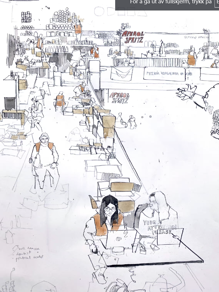
A striking illustration by George Butler in The Guardian juxtaposes the effects of climate change on migration patterns. Using bold, abstract visuals and muted tones, the artwork depicts the interconnectedness of global warming and human displacement, emphasizing urgency and global responsibilitycial Inequality Depictions

https://www.theguardian.com/artanddesign/2022/mar/26/ukraine-war-artist-george-butler-drawings-kyiv-odesa

Part 2

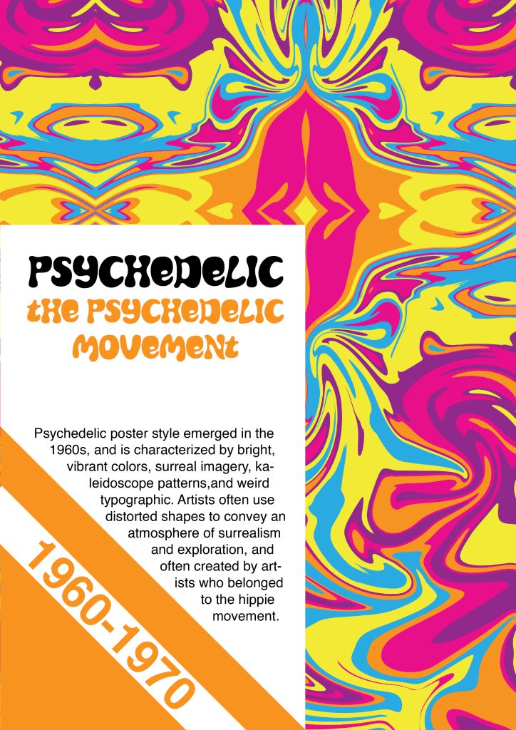
Today you’ll design a psychedelic poster. You can use this poster in your leaflet for the course assignment.

Here is a handy Photoshop tutorial in two parts on how to create a 1960s psychedelic poster (but feel free to do it your own way):

LT – 2.2. Postmodern design

The task

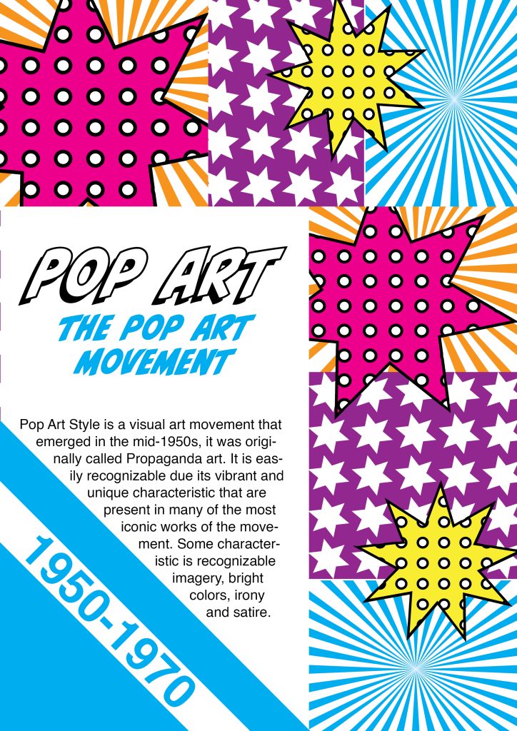
Today you’ll design a Pop Art-style poster. You can use this poster in your leaflet for your course assignment. The subject doesn’t matter – it’s completely up to you.

The article below will show you various examples within the style – don’t be tempted to use an existing Canva template! The idea is for you to understand and appreciate how to use this style in modern-day graphic design.

Instead, look at the examples showcased, take inspiration from them, and apply them to your design. There are many YouTube tutorials as well – explore and have fun.

LT – 2.3. The digital revolution

The task

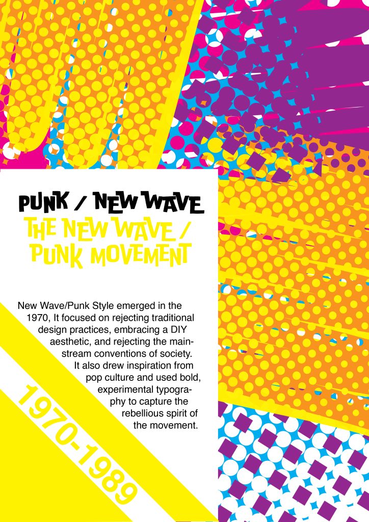
Today you’ll design a poster where the New Wave/Punk style is evident. You can use this poster in your leaflet for the course assignment. Again, the poster’s subject doesn’t matter; it’s your choice.

Read the article below where Emily Gosling talks about how the ‘New Wave Graphics are the most influential designs you’ve probably ignored: the slippery, unashamedly pop-leaning genre changed everything – graphics included’. The article features wonderful examples of the genre you can use as inspiration.

LT – 2.4. Challenges ahead

The task

Find a graphic designer from history you’ve never come across before. Someone less known to the public that you feel needs some acknowledgement. Write a short paragraph (three to five sentences) about them and why you find their work inspiring and important.

Choose one or two of their works to add to your paragraph.

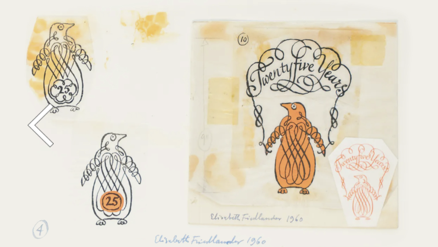
Elizabeth Friedländer.

She was a trailblazer as the first woman to create typefaces for Bauer Types in 1927, including Elizabeth Antiqua and Elizabeth Kursiv. Born in Germany, Friedländer faced persecution during World War II due to her Jewish heritage, which led her to flee first to Italy and later to the UK. During the war, she contributed to British propaganda by producing counterfeit Nazi documents. Post-war, she designed for Penguin Books and created beautiful patterned papers and typographic ornaments.

One of her standout works was her contributions to the post-war Penguin book covers, which helped define the publisher’s visual identity. Her resilience and artistry make her an inspiring figure in graphic design history

https://www.maharam.com/stories/rawsthorn_elizabeth-friedlander#stories-carousel

GD2-AW08 – Graphic Design History: Modernist Era

LT – 1.1. Why graphic design history is important

The task
Before starting with the next lessons in the days to come and deep diving into some of the highlights of the modern history of graphic design, it will be beneficial to get a broad overview of the field. Discover the power of imagery with Sean Adams in the LinkedIn Learning Course below. After completion (with some quizzes in between), you’ll receive a LinkedIn Learning Certificate.
 
Sean Adams managed the AIGA historical archives — the largest collection of graphic design history in the world. In this course, he focuses on the hows and whys of each design movement, detailing the development and evolution of specific styles, techniques, and genres.

Additional task

Before starting the course, get a pencil and a piece of paper ready to draw a horizontal timeline. Make rough notes on the timeline as the course goes on. It does not have to be neat or technically correct in every way! It’s just a way for you to understand how the periods overlapped and influenced each other. Take a picture of your rough timeline just as it is (no need to tidy up) and post it on your blog.

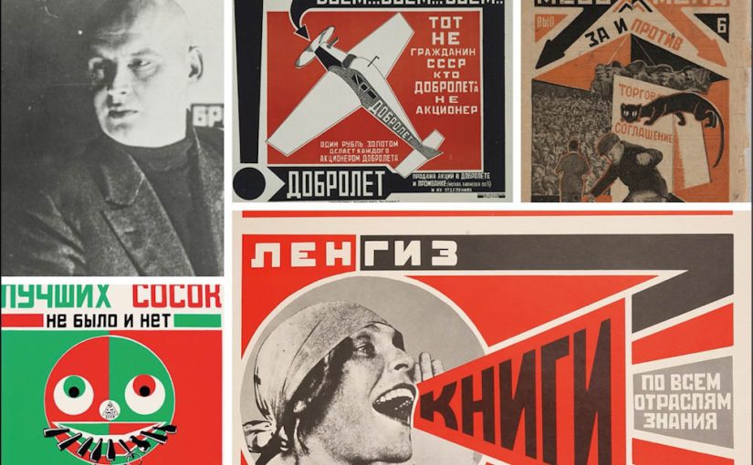
LT – 1.2. Suprematism and constructivism

The task

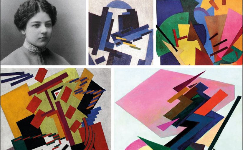
Describe the similarities and differences between suprematism and constructivism. There is no prescribed word count; you just need to show that you understand the movements in broad terms.

The similarities between Suprematism and Constructivism

  •  Both were founded in early 1900s in Russia. Suprematism in 1915 and Constructivism in 1920.

  • Both movements were founded by artists in reaction to the turmoil of the world we lived in – First World War and the Russian Revolution.

  • Artist of both movements was convinced that art could improve society and make the world a better place.

  • Constructivism was inspired and influenced by Suprematism.

The difference between Suprematism and Constructivism

  • Suprematism is based on the us of geometrical forms, most squares and circles. These geometric shapes would point to the future where everybody could participate, not just elite or culturally acceptable.

  • Constructivism took the abstraction design elements that came from Suprematism and gave it a function and transformed it into political statements.

For each of these movements, find examples from their eras and then two contemporary designs you think are influenced by these styles.

LT – 1.3. De Stijl and Bauhaus

The task

Today we’re taking a break from theory and having some fun with pixel art. Traditionally, pixel art was not seen as art at all; it was merely seen as a way for, particularly video game developers, to use a limited number of pixels to create images.

But it’s really a lot like abstract art: it represents a pictorial element in its simplest, purest form using only squares and flat colours. It forces the creator to focus and isolate only what is most important in an image without providing the finer control you could apply in a more detailed drawing style. Think of it as modern-day Piet Mondrian.


Brief

Build a pixel art version of one of the options below as a vector image in Illustrator. The idea is to make something that’s as simple as possible, using a limited number of squares (“pixels”) and flat colours. Focus only on the most necessary details.
 
Option 1
Use any face (your own, a family member’s or even a pet’s), and create a square pixel art avatar. See with what number of limited colours and blocks you can make a recognisable face.
 
Option 2
Move away from any representational depiction of an image and go completely abstract.
 
I chose option 2

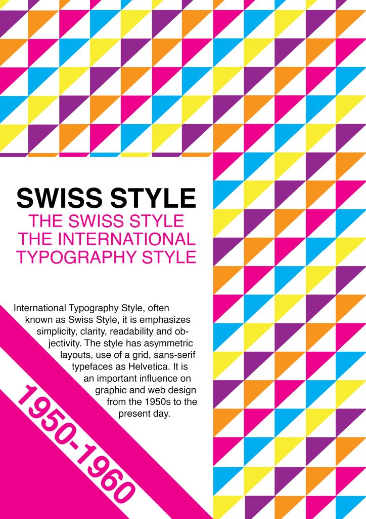
LT – 1.4. The International Typographic Style

The task
Today you’ll design a simple but striking poster using the Swiss style grid – based on the work of Josef Müller-Brockmann. You can either use InDesign or Illustrator, and the task shouldn’t take longer than an hour – in fact, it should take far less than an hour. You may spend most of your time searching for a perfect photo.
 
Use John McWade’s tutorial below as a guideline. (Part 1)
 

Part 2

Design an A2 poster for a Stavanger Symphony Orchestra concert. The concert consists of two parts. The first is a commission from local composer Ståle Kleiberg who’s known as a composer for grand occasions. The Turangalîla-Symphonie by Messiaen follows the intermission, which according to the composer, is a love song.

Use the Swiss style grid to organise the information and the typeface Helvetica. Place the main focus on the image and heading.

The heading of the poster should be SEASON OPENING.

The rest of the information that needs to feature is the following:

PROGRAMME
Ståle Kleiberg (born 1958):
Commissioned work for Stavanger anniversary – World Premiere

Olivier Messiaen (1908-1992):
The Turangalîla-Symphonie

CONTRIBUTORS
Andris Poga, conductor
Pierre-Laurent Aimard, piano
Nathalie Forget, ondes martenot

VENUE
Fartein Valen, Stavanger konserthus

 
Image: choose a main image to complement the information. You may use a photograph or typography as an image.
 
Feel free to make more than one poster by simply replacing the image and changing the mood of the design completely.

GD2-AW03 – Images and Layout with CSS

LT. 3.1 Styling Images

The Task

You need to create an HTML and CSS document for this lesson task. Use one root folder containing separate CSS and image folders. Find three images you can use; one will be used as a background and one as part of the content, while the third should be a simple png with a transparent background.

Link the styles.css file with the HTML document using the property inside the section of the HTML document.

Part 1

Create a basic structure for the HTML document with a <body> containing a <header>, <main> and <footer> section. Insert a <h1> element into the <header> section and a <p> element with text inside the <main> section.

Using CSS, apply the following to the HTML page:

  • A background image for the <body> section;

  • A solid colour background for the <header> section, but with an opacity rule applied so that the background image is slightly visible behind the <header> container.
 
Once you have the background image showing, apply different values to the background properties that will produce the following results:

  • A repeated pattern of the background image using the properties “background-repeat” and “background-size”.
  • Place the background image in the centre of the screen using the properties “background-position”,; “background-size”, and “background-repeat”.
  • A full-page background image that fills the screen using “background-repeat” and “background-size” (remember that size can have specific values in % or px, but it can also have relative values like “contain” and “cover”).

Take screenshots of the HTML and CSS code as well as the browser results. Write a short description explaining how the property values changed the behaviour of the background image. This should be loaded onto your blog.

Part 2

Insert a div with a class into the <main> section of the HTML page. Specify the div’s size using a CSS rule that includes a height and width property. You can also specify a border so you can see the empty container. If you need to refresh your memory on border styles, visit this link.

Once the empty container is showing up in the browser or result view, add a multi-layered background to the container that includes the following:

  • A gradient;

  • A pattern made up of the png image you collected earlier.

Take screenshots of the CSS code and the result and write a short description explaining how the property values changed the behaviour of the background image.

Part 3

Insert two images in the <main> section using the <a> property in the HTML code. Using CSS, do the following:
 
  • Apply a border radius property to the first image;

  • Apply a pseudo-class property to the second image that reduces the opacity on hover.

Take screenshots of the HTML and CSS code as well as the browser results to load onto your blog.

LT. 3.2 Layout Elements

The task
You need to create an HTML and CSS document for this lesson task. Link the CSS file with the HTML document using the property inside the section of the HTML document.

Part 1

Copy this basic structure into the body of the HTML document and indent the code so that it shows the nested relationship of the content:
 
<header>
<nav>
<ul>
<li><a>home</a></li>
<li><a>about</a></li>
<li><a>contact</a></li>
</ul>
</nav>
</header>

<main>
<section>
<h1>Welcome Home</h1>
<p>Lorem ipsum dolor sit amet, consectetur adipiscing elit, sed do eiusmod tempor incididunt ut labore et dolore magna 
aliqua. Ut enim ad minim veniam, quis nostrud exercitation ullamco laboris nisi ut aliquip ex ea commodo consequat. Duis
 aute irure dolor in reprehenderit in voluptate velit esse cillum dolore eu fugiat nulla pariatur. Excepteur sint 
occaecat cupidatat non proident, sunt in culpa qui officia deserunt mollit anim id est laborum.</p>
</section>
</main>

Part 2

Using what you’ve learned so far, try to recreate the following browser display using CSS to style the above HTML:
Here’s a list of things that should be included in the HTML/CSS:
  • Classes;
  • Inline block display;
  • Margin properties;
  • Padding properties;
  • Font family;
  • Background colour properties;
  • Border properties;
  • Pseudo-class for the hover effect on the navigation menu.

LT. 3.3 – Styling Layout

The task
Download the exercise files containing the basic HTML document, logo and photograph. You will have to create a CSS document for this lesson task. Use one root folder to save the HTML file, and use separate CSS and image folders. Link the stylesheet to the HTML document using the link attribute in the <head> of the HTML document.
 

Goal

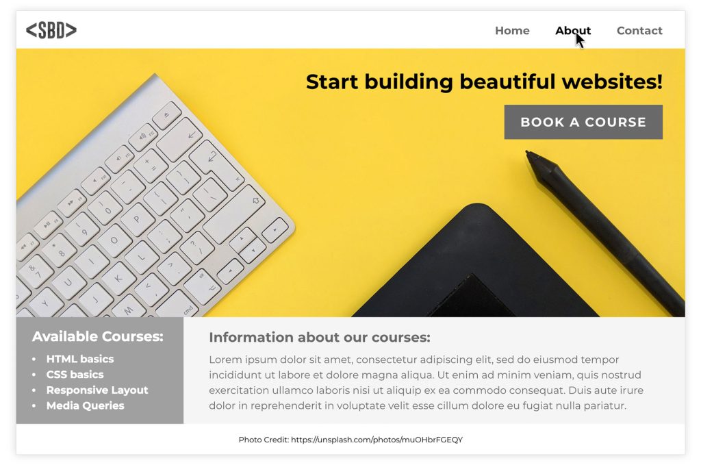
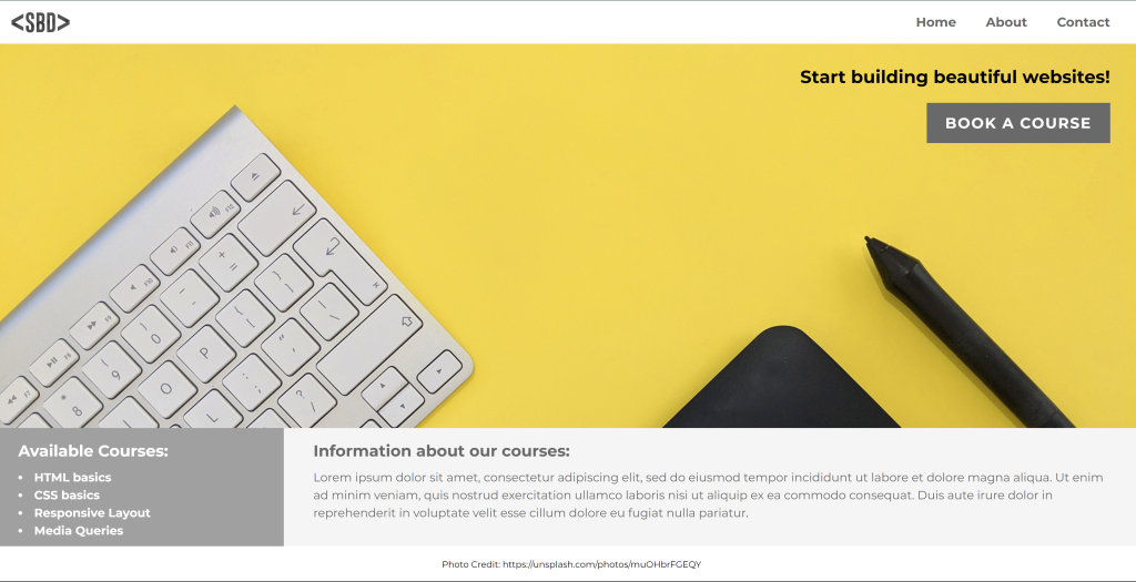
Look at this layout for a fictitious website advertising web development courses. Use what you have learnt to create the same layout (or as close to this as possible):

Part 1

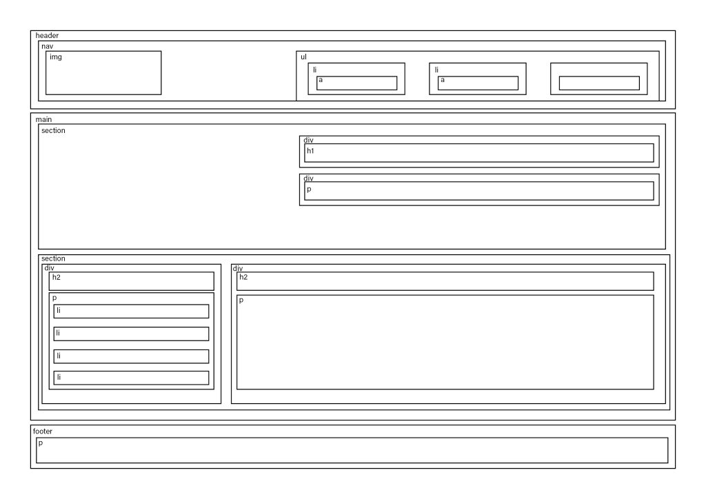
First, examine the layout and draw a wireframe showing the different sections of the page. Then, inspect the HTML code to find the hierarchy of parent and child elements that respond to the sections you identified. Write down the names of the classes of the parent containers that make up the basic structure.

For example: <nav> is the parent container that holds two siblings: the logo image and the <ul> that make up the navigation menu. The <ul> element is the parent container that holds the three list items: Home, About and Contact.


Part 2

Start styling the different sections by assigning rulesets to the existing classes. Here are some tips you might find helpful:
  • The body element, by default, has some margin around the edges. To remove the margin, set it to 0%.
  • Flex was used to style the <nav> element as well as the first hero image section.
  • To get the elements within a flex container to align to the left and right sides of the window with space between, use the CSS rule “justify-content: space-between”.
  • Remember, padding creates spacing within an element (between the border and the content), while margin creates space between elements (outside the element’s border).
  • To align elements within a flex container right, use “justify-content: flex-end”.
  • Grid was used to style the information section below the image.
  • Position was used to create the footer.
Here is the CSS file to show you how we solved the above layout.
Take screenshots of your result. Write a short summary about how well you think you could redo the example website. Comment on what you’ve learnt.

LT. 3.4 – Media queries and code conventions

The task
For this lesson task, you’ll continue to work on the website you styled for SBD (fictitious website for web development courses) from the previous lesson task.
 

Goal

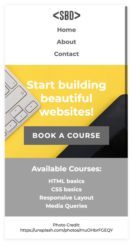
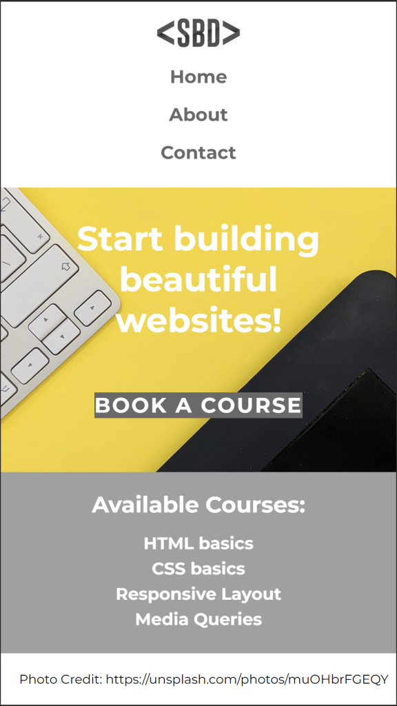
Using what you’ve learnt, add media queries to the stylesheet that will adjust the layout of the website to look like this on a mobile device:

Take a screenshot of your browser display and your HTML and CSS documents. Here is the updated CSS file with media queries to show you how we solved it. Compare this example to your own.

GD2-AW02 – CSS Basic

LT. 2.1 CSS Basic

A Nordic non-profit organisation commissions you to create a website to promote mental health awareness. This is a fictitious client.

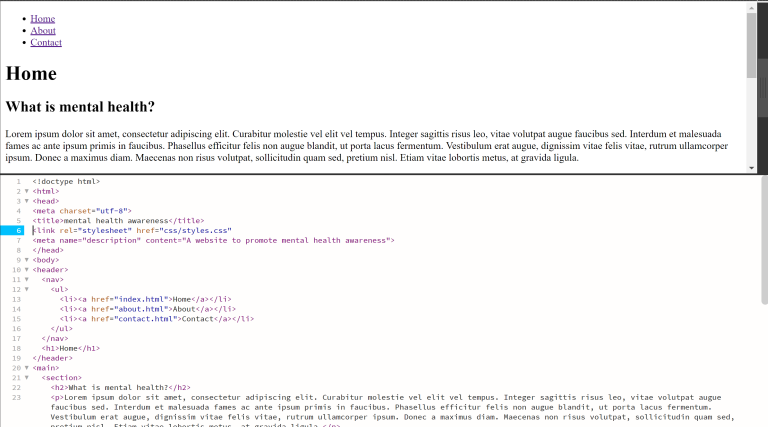
Part 1

Create a basic file structure to organise your different types of documents and images.
Create at least three HTML pages for the project and name the home page index.html. Each HTML file should have the following:
 
  • A <head> section with an appropriate title and meta description.
  • A <body> section divided into a <header>, <main> and <footer> section.
  • Every page <header> must have a <ul> that contains links to all the HTML pages and a <h1> element that names the page.
     
The home page (or index.html) should also have a <main> element that contains the following sections:
 
  • What is mental health?
    This section should have at least one <p> element with text (you can use placeholder text).
  • What are the warning signs?
    This section should include a list (you can decide to use a <ul> or <ol>).
  • What to do?
    This section should include a <p> element with at least one link to an outside source using the <a> element.
Remember to make use of semantic <H1>, <H2> and <p> elements to organise the body text, headings and subheadings on the page.

Part 2

Create a new document in Adobe Dreamweaver. This time, choose “CSS” as your document type. A window with source code will open. Save the file as “styles.css” in the same root folder as the index.html file and close it.

Go back to the source code of the index.html file and link the styles.css file to the index.html file. You should add all the information inside the <link> tag using attributes. Remember, a link element is one of the elements that does not require an opening and closing tag.

Part 3

Using your existing index.html document, give a unique ID to one of the sections in your document and give a class to one of the <p>, <ul> or <ol> elements.

Now open the CSS file and create a ruleset that targets each the following elements inside the HTML document:

 
  • The <h1> element;
  • The section with the unique ID;
  • The <p>, <ul> or <ol> element with a class assigned to it.

LT. 2.2 CSS Implementation And Inheritance

Part 1

Using what you’ve learned about general and more specific styling, apply a style to all text inside the <body> of the html document. You can use any property, but some suggestions are different web-safe fonts like in the lesson example, a text-decoration, font style or a colour property.

Using a descendant selector, specify a different style for the links inside the list items of the navigation. Test to see if the link items render differently than the general body text in the browser or result view.

Take screenshots of the HTML, CSS and browser or result view and describe what you’ve learned.

Since we actually have been through this basic HTML and CSS the first year I feel that until now it’s just a refresh on what I learned the first time we were going through this. But again I feel like this modul is a bit deeper in to the basic. So to be honest I haven’t learnt that much more out of this but I feel it was a really nice refreshing.

Part 2

Open the website CSS Zen Garden in Chrome. This website was developed to display how powerful CSS can change the appearance of a simple HTML document.

Using the Chrome inspect function, find the following elements:

  • <h1>
  • <p>
  • A link <a> with the class=”designer-name” inside a <li> element.

For each element, write down the CSS ruleset applied to it (you will see this in the styles pane). After doing this, load a different CSS style to the webpage and repeat the exercise.

Write about how the appearance of each of the three elements changed from one CSS ruleset to the other and mention what properties and values were applied. You can include screenshots to support your writing.

h1 {
padding-top: 0;
padding-bottom: 5px;
border-bottom: none;
font-family: ‘Julius Sans One’, sans-serif;
font-size: 3.2em;
text-transform: uppercase;
}

p {
display: block;
margin-block-start: 1em;
margin-block-end: 1em;
margin-inline-start: 0px;
margin-inline-end: 0px;
}

a.designer-name {
color: #616857;
font-size: 0.9em;
font-style: normal;
}

h1 {
position: fixed;
left: -.3em;
top: 0;
width: 1em;
font-size: 48px;
line-height: .8;
text-align: center;
text-transform: uppercase;
word-wrap: break-word;
text-shadow: 0 0 48px rgba(0,0,0,0.3);
webkit-transition: all 0.2s ease-out;
moz-transition: all 0.2s ease-out;
ms-transition: all 0.2s ease-out;
o-transition: all 0.2s ease-out;
transition: all 0.2s ease-out;
}

p {
display: block;
margin-block-start: 1em;
margin-block-end: 1em;
margin-inline-start: 0px;
margin-inline-end: 0px;
}

a.designer-name {
font-family: ‘Montserrat’, Verdana, Helvetica, Arial, sans-serif;
font-weight: bold;
font-style: normal;
font-size: .875em;
text-decoration: none;
text-transform: uppercase;
}

LT. 2.3 Styling Text

Question 1

Use an online font library and select a font pair for your project. You need to choose one font to use as a heading font and a different font to use for all paragraph or body text. We recommend Google fonts, but you can use a different library if you want to. 

Using the <link> tag method described in the lesson, link the chosen fonts into your project. Create rules in CSS to apply the fonts from the library to create a different font style for headings, paragraph text and list items. The same text styles should apply to all the pages of your website. 

Take screenshots of the HTML, CSS and browser or result view. If you encounter any problems, try to go over the lessons on inheritance and styling text. Write a short paragraph to explain what you have learned about styling text using fonts from an online font library. 

As I mention in one of the last tasks I feel that I already knew this from earlier. But it’s still nice to go through it again.

LT. 2.4 Pseudo-Classes

Part 1

For this lesson task, you need to focus on applying pseudo-classes to the navigation list. Apply a “hover” and “active” state to all the menu items. The styling can be as simple as a background colour, font style or text-decoration.

The hover style must show when you hover over the link with your mouse, and the active state must show on the link when you are on that particular page. For example, the “contact” link in the navigation list must look different to the rest of the links when you are on the contact page.

Part 2

It’s time to put the links to the test from outside your local folder. Upload the root folder containing all your web page files to your host using an FTP client. Once uploaded, check if the fonts load correctly on all pages, check the images and pseudo-classes and check if your page links work properly.

Take screenshots to show your web page loads correctly in the Google Chrome browser. Upload the screenshots with a short description of the process to your blog. If you had to fix any links, remember to also write about your problem-solving.

The website is working.

GD2-AW01 – HTML Basics

LT. 1.1 Hosting And File Management

Part 1

Since you will create your own website using HTML and CSS in this course, you will need to acquire your own hosting service. This part of the lesson task is mandatory.

You are free to choose any hosting service, but we recommend one.com. The monthly fee is low, and the beginner plan is sufficient.

Consider your domain name very carefully. This cannot be altered. You will be able to use this domain for future website projects. (You can, of course, sign up for other domain names and delete the one you have, but “getting it right the first time” saves you a great deal of trouble.)

I already have hosting at one.com, for my portfolio and my reflective journal. I’m going to move my reflective journal from www.tinahetland.com to www.myreflectivejournal.hetiart.no as soon as I have some time to do it. The reason for this is because I want to use www.tinahetland.com for my photography portfolio again.

Part 2

The Norwegian Seafood Council wants to promote the health benefits of Norwegian salmon to the local and international market. You need to create an informative website for this purpose. (This is a fictitious client and project).

Create very basic wireframes for the website, showing at least three pages. These can be low tech wireframes that show planning for the page structure and navigation.

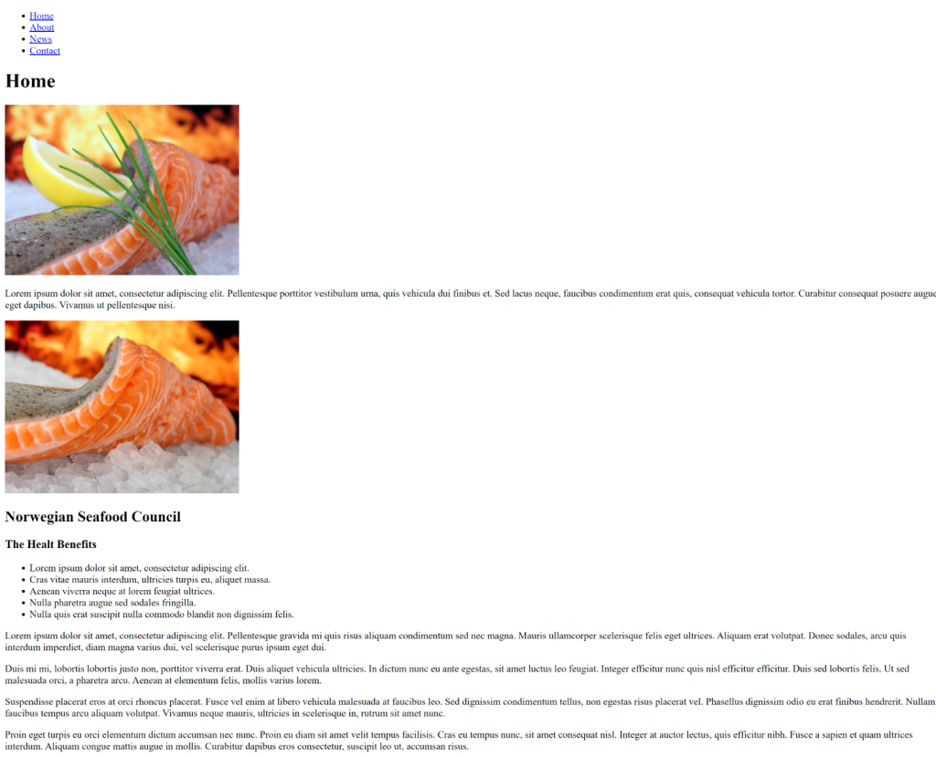
The Norwegian Seafood Council Wireframe

Part 3

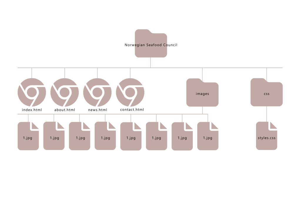
Create the structure for the HTML files and folders of the web page. Think about the root folder and name the folders correctly. Firstly, sketch out what the structure will look like. Then, set these up, so you are ready to code your website.

Open Adobe Dreamweaver. Click on the ‘Create New’ button, and under ‘Document type’, choose HTML. Keep the ‘Framework’ as none since we will not use a Bootstrap framework. You can give the file a name, call it ‘home’ and the ‘Doc Type’ should be HTML5.

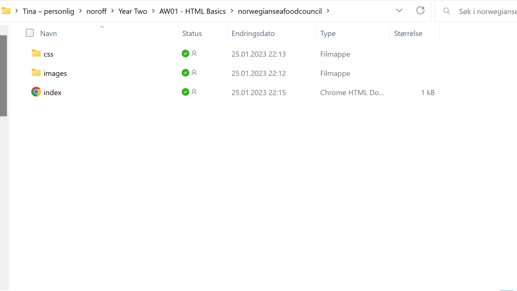
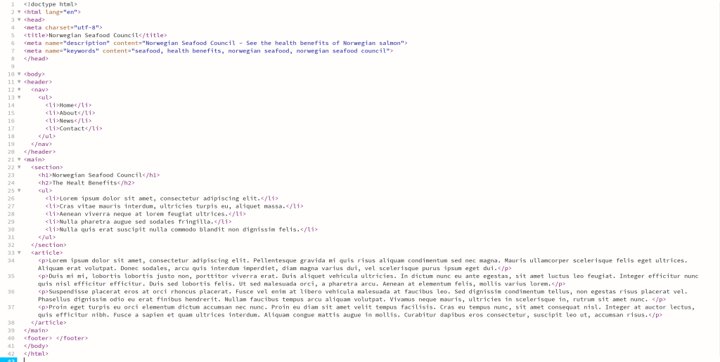
This will open a blank document in Dreamweaver. You will see a tab called ‘Untitled-1’ in the top left bar. This is because the file is not yet saved. Hit ‘save’ and save the file as Index.html in the correct folder of the folder structure you created. One HTML document called ‘index.html’ is enough for this LT.

Remember, this structure should be set up so that it can be uploaded to a hosting server without disrupting the file paths. When you are done, take a screenshot of the folder and, together with the sketch of your structure, upload it to your WordPress blog.

The Norwegian Seafood Council Structure

LT. 1.2 HTML Basic

For this lesson task, you need to create a basic HTML structure.

Part 1

  • In Adobe Dreamweaver, open up the index.html file you created in the previous lesson task. If you do not have one, then create a new document now.
  • Make sure the HTML file is saved as index.html in the folder structure you created for the lesson task on planning the structure. Note that the tile of the page can be different from the file’s name. You always need to name at least one file index.html, as a browser will look for such a file to load first. It does not have to be your home page, but this is standard practice.
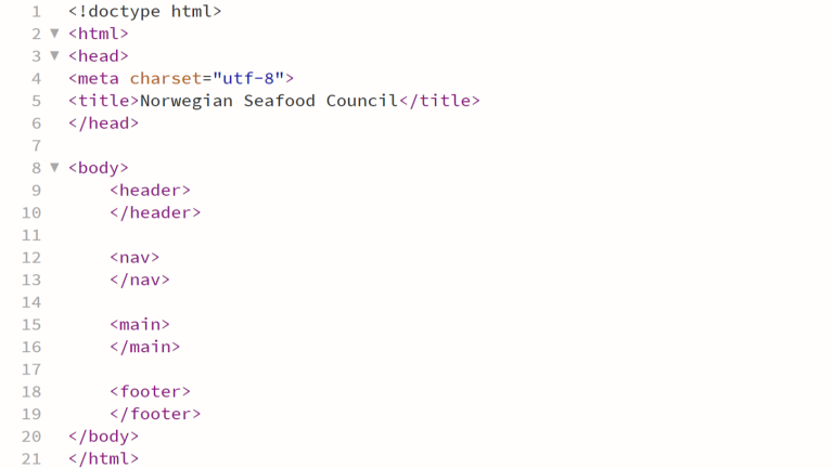
  • Now, start adding some tags. It is perfectly fine if you don’t add any information between the opening and closing tags for now, just focus on the different tags that will make up the structure of the webpage. Your HTML file should have the following content:
    • <!DOCTYPE html> – this should be the first line in the document.
    • <html><head> and <body> elements.
    • Page title – note: the <title> element must sit within the <head> element.
    • <header><main> and <footer> elements, these must sit within the <body> element.

Almost all of the elements you will use have opening and closing tags. Typical “newbie” mistakes include forgetting to close your tags. Check your work!

Take a screenshot of the HTML coded document to post to your blog.

Basic HTML Structure

Part 2

You have created an HTML document with the following content:
  • <!DOCTYPE html>
  • <html>
  • <head>
  • <body>
  • <title>
  • <header>
  • <main>
  • <footer>
In one or two sentences, describe the function and meaning of each element and, where applicable, state in which parent folder you are expected to find the element.

Description And Meaning

<!DOCTYPE html> : The first line of the document that indicate what document it is.

<html> : The <html> tag is the main “nest container” where all of the elements are put in to.

<head> : The <head> tag contains metadata and information about the page, this will not be visible on the website.

<meta> : The <meta> tag always go inside the <head> element and are typically used to specify the data of the page, like page description, keywords, author and viewport settings.

<title> :  The <title> tag is required in a HTML document, it defines the title of the document. This title is shown in the browsers title bar or in the pages tab. This tag needs to be inside the <head> tag.

<body> : The <body> tag defines the document’s body, it contains all the elements of an HTML document as headings, paragraphs, images, nav, tables, lists, footer, etc. And there can only be one <body> element in the document.

<header> : The <header> tag represents the container for introductory content or a set of navigational linkes. This tag needs to be inside the <body> tag.

<nav> : The <nav> tag defines a set of navigation links, the <nav> element is intended only for  major blocks of navigation links. This tag needs to be inside the <body> tag.

<main> : The <main> tag specifies the main content of the document. This tag needs to be inside the <body> tag.

<footer> : The <footer> tag is the last element inside the <body> tag, and are placed at the bottom of the page. This can contain many elements but typically contains authorship, copyright, contact information, related documents, back to top links, etc.

LT. 1.3 Semantic HTML

For this lesson task, you’ll be working on the same HTML document you created in the previous lesson task, “Creating an HTML structure”.

Part 1

The following elements should now be added to the HTML document:
  • <meta> element with some metadata – charset, description, keywords, author, viewport – note: must sit within the <head> element.
  • Create a <ul> (unordered list) with <li> elements that will later form the navigation menu. (You are not required to style or link anything at this point, just list the menu items that will represent the links to the different pages of the website later). Think carefully about where you should place this list.
  • Create at least two sections in the content using either <section><article> or <aside> elements that will hold the main content.
  • Create at least one <h1> element, and one <h2> element. Note how the <h1> and <h2> elements render as different sizes, and as bold text.
  • Create at least four <p> elements.

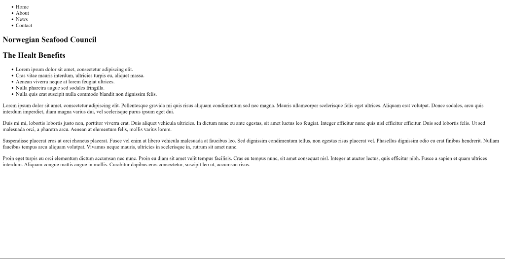
Check your page in a web browser to make sure it works properly. Don’t be discouraged if the results are not overly impressive or if the page does not work as you expected. We will be quickly moving along to more complex and visually rich pages.

Post screenshots of the code and browser result to your WordPress blog.

LT. 1.4 HTML Links And Images

For this lesson task, you will continue to work on the web project to promote Norwegian salmon. You can use the same HTML document you’ve been working on in the previous two lesson tasks as a starting point. 

Part 1

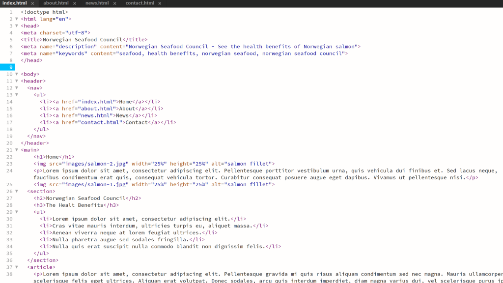
Create the other HTML pages that you have planned for the webpage. (This should include all the pages that are on your <ul>). Take note of where you are saving these files in your file structure. 

Using the href=”” attribute and relative file paths, create links to each of the pages from the <ul> in the index.html document. 

Populate each of the new HTML files with the same <ul> for navigation and at least a <h1> header to state the title of the page.

Part 2

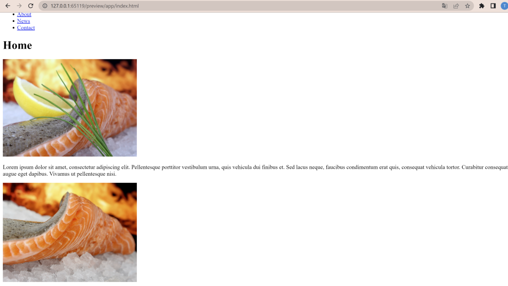
In your index.html document, add one image to one of the sections in the page using a relative file path. Note that you need to take special care of where you put the image in the folder structure and how you link the href. Add text for the alt attribute. This should describe the image in some way if it’s not displayed.

You can experiment by adding a width or height attribute to make the image fit inside the browser display.

Add another image. Observe how the images are placed on the HTML page. Add a <br> element between the images to see how the layout changes. Add an <hr> element to insert a line break between the images. Finally, add a <p> element between the images. 

Part 3

Select the root folder containing your HTML and the ‘Images’ folder and upload it to your host using an FTP client. Once uploaded, check if the remote files work in your browser. 

Check your page links in the live browser to see if it works properly. Check if the images display. If not, check your links and file locations.

Post screenshots of the code and browser result to your WordPress blog and write about what you have learned. 

I’ve uploaded the root folder in to file management at one.com and the page loads and look as it should. The linked also works.

We have been through all this coding earlier but I feel that now when we actually have to write the code ourself I understands it even better then I did earlier. When we made the CA05 and CA07 I used a lot of finished codes, bootstraps and snippets. So by actually write them myself is going to be a hard thing but so much better when it comes to actually learning it.

GD1-AW33 – Point Of Sale

LT. Point Of Sale

Practical Assignment

Part A

 
Consider the touchpoints of your brand in general (to ensure that all the elements work together) and then focus on your packaging. Design a set of Point of Sale elements that will promote your product in-store. The set can consist of however many elements you choose. It can be in any format that you would like it to be. Please consider the following:
 
  1. Can customers clearly see your product in your Point of Sale elements?
    Do you use your Point of Sale to also showcase your actual product?
  2. Brand Integration
    Does it integrate with the brand’s look and feel?
  3. Designed to sell!
    Does it persuade customers to buy your product?

Part B

 
Brand manual.
Take pictures of your elements and include them in a presentation of your brand called a brand manual or a design manual. Your brand manual should have a minimum of 7 pages and include logo, color scheme and chosen typography as well as the different elements produced during this 4 week project period (brochure, infographic, packaging, point of sale). 
Hand in your brand manual as a PDF.

GD1-AW32 – Packaging Design

LT. Packaging

Practical assignment (creative problem solving)

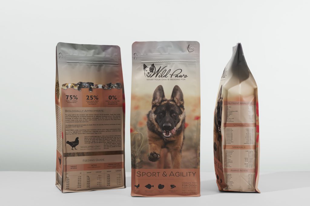
Using the logo you created in Week 1 and the brochure you designed in Week 2, think about your brand and design packaging for your product. Remember that you can decide about the detail of your product. Is it dog biscuits, meat products in a tin, dry pellets or a new and exciting product?

Do your design according to the following steps:

  1. Exploration

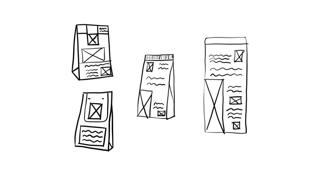
    Use sketching techniques to draw thumbnails and hand in your thumbnails as scanned PDFs.

I have some real troubles with my printer when it comes to scanning sketches. And since I have a laptop that I can sketch on I’ve started to make the sketches straight on the laptop.

I have owned dogs in almost 15 years, I’ve worked in several petstores so I have been around dogfood half of my life. So for me it was an easy choice when it comes to what type of packaging.

The four sketches is the same principle but different design. Two of them have an extra piece of paper that is over the top that you can lift up. The other two has a normal packaging.

  1. Brand integration

    Choose one of your thumbnails and refine your design. Place it next to your brochure and logo and see how you can merge your design with the brand identity. Also, what fundamentals of the brand can you draw from and use in your design? Hand in a picture of your thumbnails, mock-ups, logo and brochure together.

I want to use recycled paper for the bags, and something I really miss on dog foods today is that you actually can see the food inside. So on one of the sides I want to have a window that makes it possible to actually see the size and shapes on the pebbles. The reason that I want this is that I have dog that is medium big size, his main food is raw food. But as treats I use a dry food, so I want to use the smallest size I can find on the pebbles.

  1. Design

    Now design your packaging properly, using any design application of your choice (or a combination of e.g. Photoshop, InDesign and Illustrator). Export the flat design as a PDF.

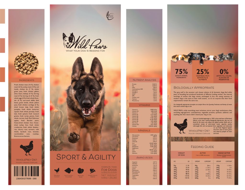
For the design I wanted it to work well together with the logo and the brochure. I also wanted to use the infographic that I made on the last LT with the brochure. I needed to change the size and needed to break the whole infographic apart to place it where I wanted it to be in the design.

  1. Testing

    Make a life-size mock-up of your final design and take photographs of it. Remember that you can take more than one photo to show the different angles and sides of the packaging. Here your presentation skills are vital. How do you present the final mock-up in a photo to reflect the true essence of your design?

I’ve made a digital mockup of the design.

  1. Presentation

    Take pictures of your printed-mockup to show off the various aspects and angles of your packaging. You can also make a digital mock-up*.


When I was finished with the design I wanted to do more, to have a series of products, not just the one that was the main task. The only thing that I changed on the design was the background image the color scheme and the name on the product. I only made these to show a bigger spectrum of products so I didn’t change the text. I also changed the brochure, so the infographic page that I had is gone. But I’ve added new pages that contains every product with infographic on each product. The new brochure is here.