AW20 – Design for screen 1: part 1 – LT – Design Different Looks

Copy the exact content from a homepage of a website of your choice. Now redesign this homepage in three different ways. Each design should evoke a different emotional response from viewers. You can choose what you would like these emotional responses to be.

Please upload this activity to your WordPress blog along with a short paragraph where you explain the look and intent of each of the three designs.

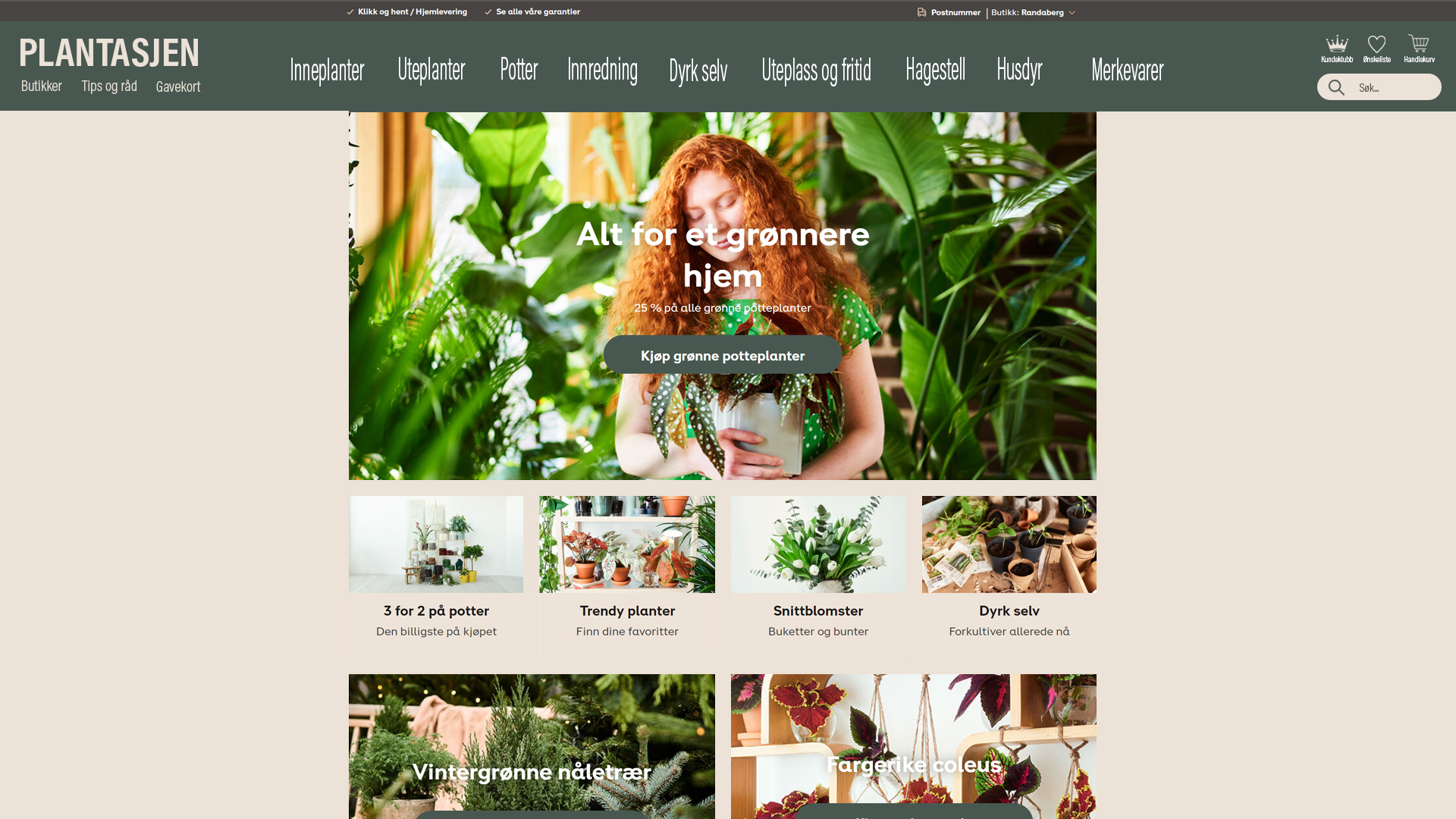
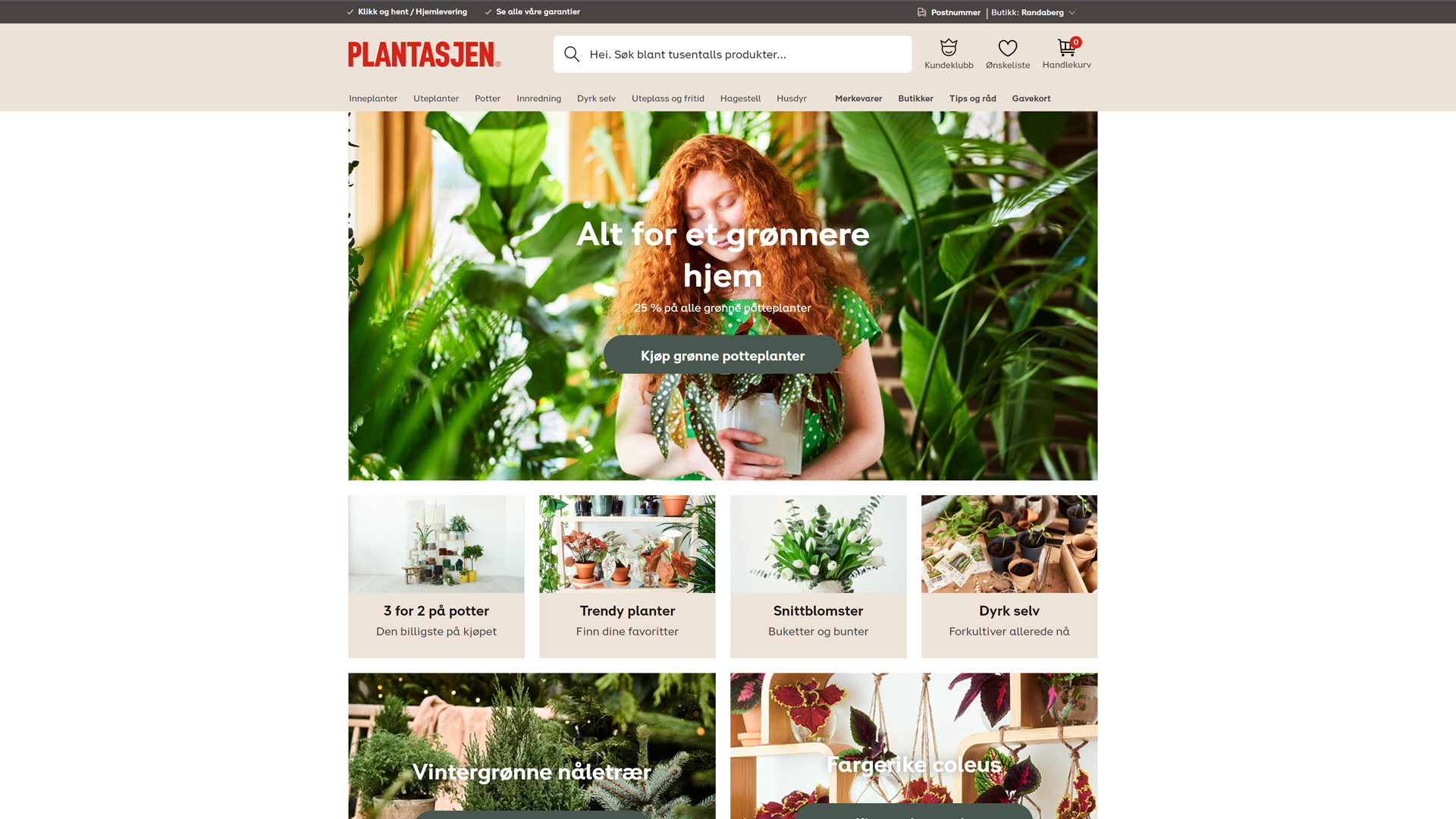
I chose to copy plantasjen.no and redesign this site. To be honest I didn’t used as much time as I should have done because I’ve been sick the last week and haven’t had energy to use a lot of time on it.

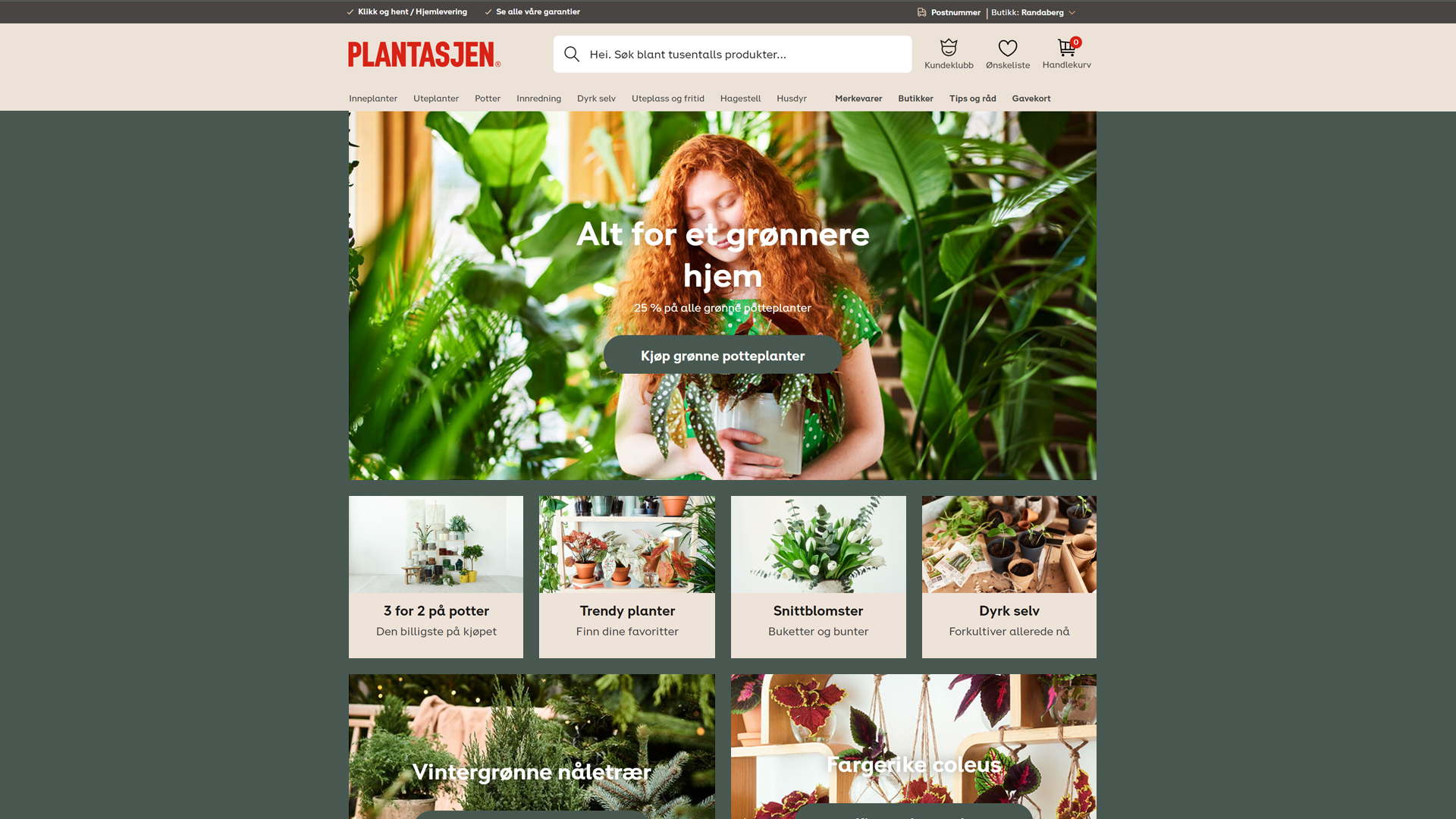
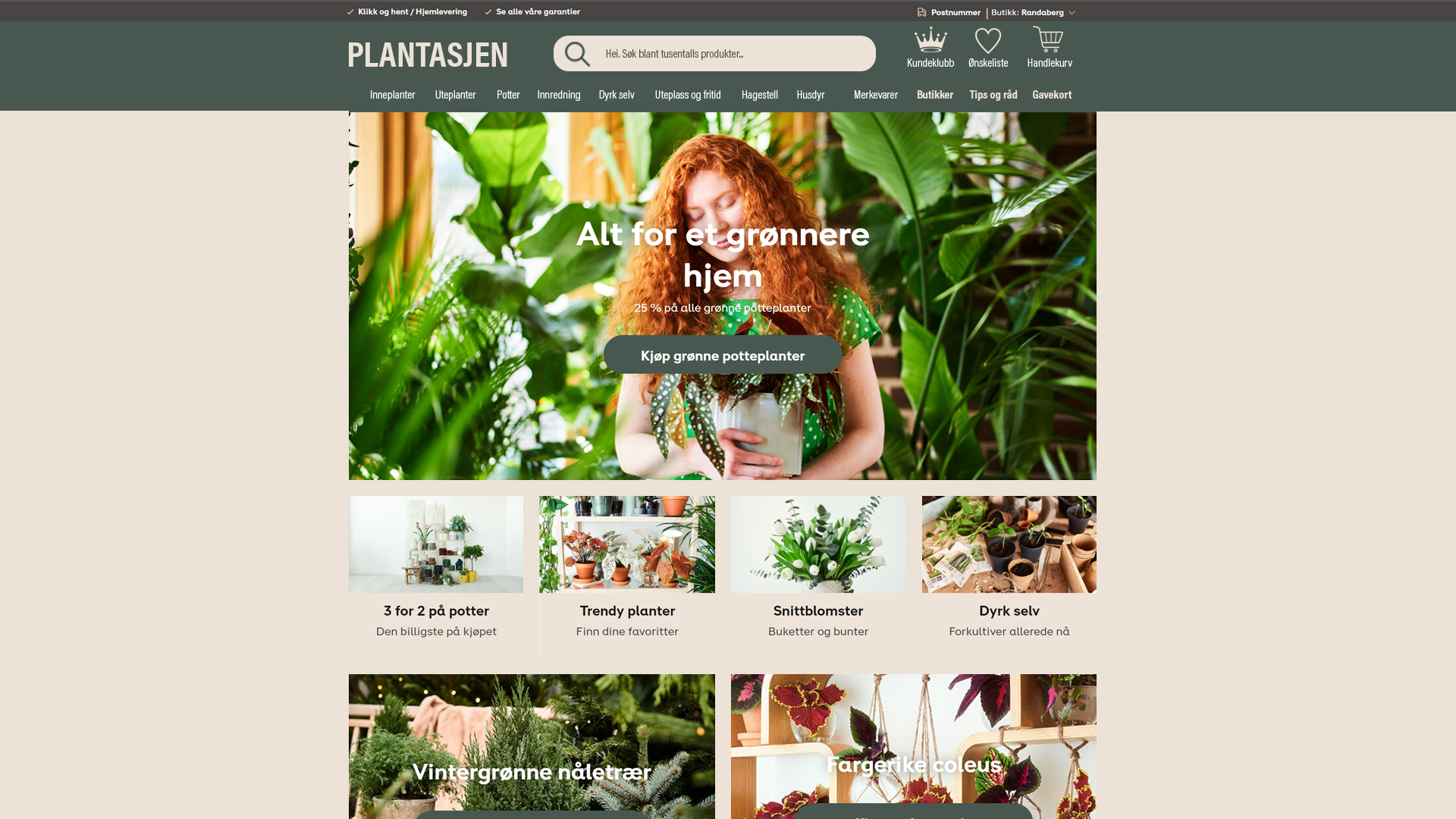
So here is the original design and the three redesign I made. I kept the colors that was already on the page. But I styled it three different ways with the colors.

The orginal
Nr1. Here I just changed the background colour to the same colour as the button “kjøp grønne potteplanter”.
Nr2. Here I chose the beige colour for the background and nav type colour and used the green colour as the nav background colour.
Nr3. This has the same colours as nr 2, but I changed the style on the navbar. I wanted the navigation to be larger since i think that on the original the type size is a bit small.

AW19 – DESIGN FOR SCREEN 1 : PLANNING – LT – Providing Your Own Hosting Service

This lesson Task is to acquire your own hosting service. This hosting service will be needed throughout the rest of your studies, and this Learning Activity is therefore mandatory.You are free to choose any hosting service in the world. If you find it difficult to find one, we recommend one.com.If you choose one.com, the monthly fee is low. The beginner plan is sufficient, and there are step-by-step guidances to setting up the account, creating e-mail addresses, connecting via ftp etc.By acquiring the web hosting yourselves, you get (depending the hosting service):

  • Valuable training in providing hosting services
  • Domain name of your choosing
  • Personalised e-mail account with your own domain name
  • Cloud drive
  • A lot more space
  • 24/7 support
  • The service and domain name remains yours after your studies are done (if you wish to keep it)

Consider your domain name very carefully. This cannot be altered. (You can of course sign up for other domain names and delete the one you have, but “getting it right the first time” saves you a great deal of trouble.)

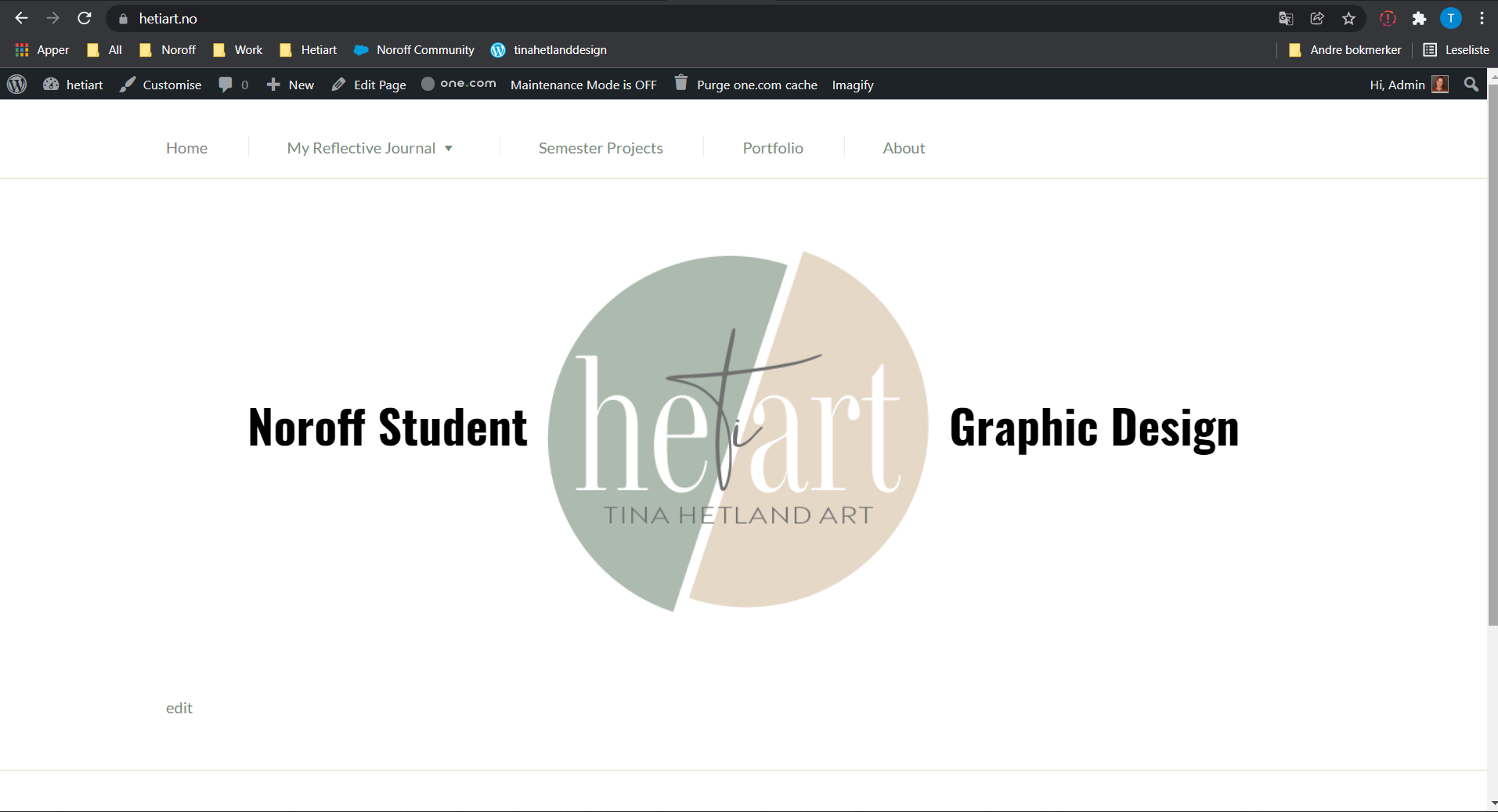
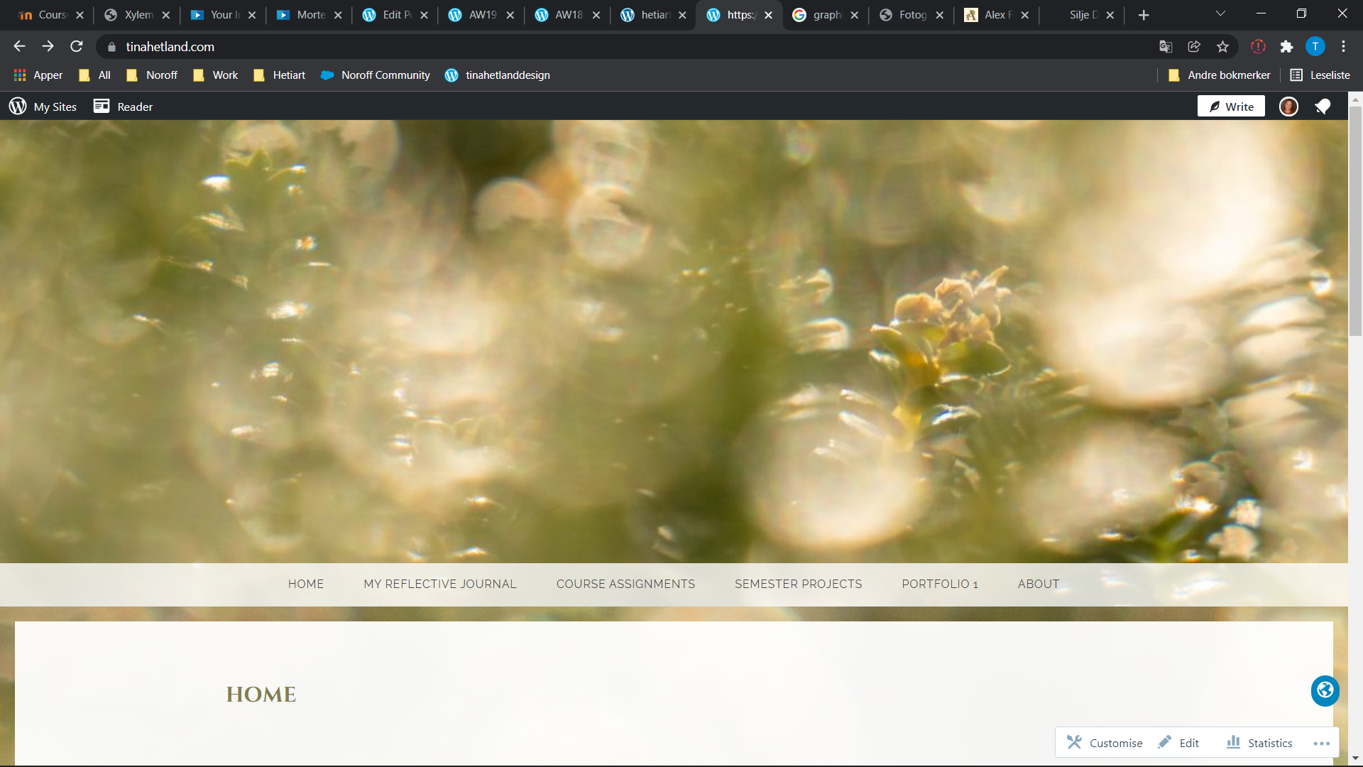
I already have my tinahetland.com domene, but I have some problems with one.com with that domene. So I made one more just to do this task right. That new one is hetiart.no

AW19 – DESIGN FOR SCREEN 1 : PLANNING – LT – CREATE A WIREFRAME

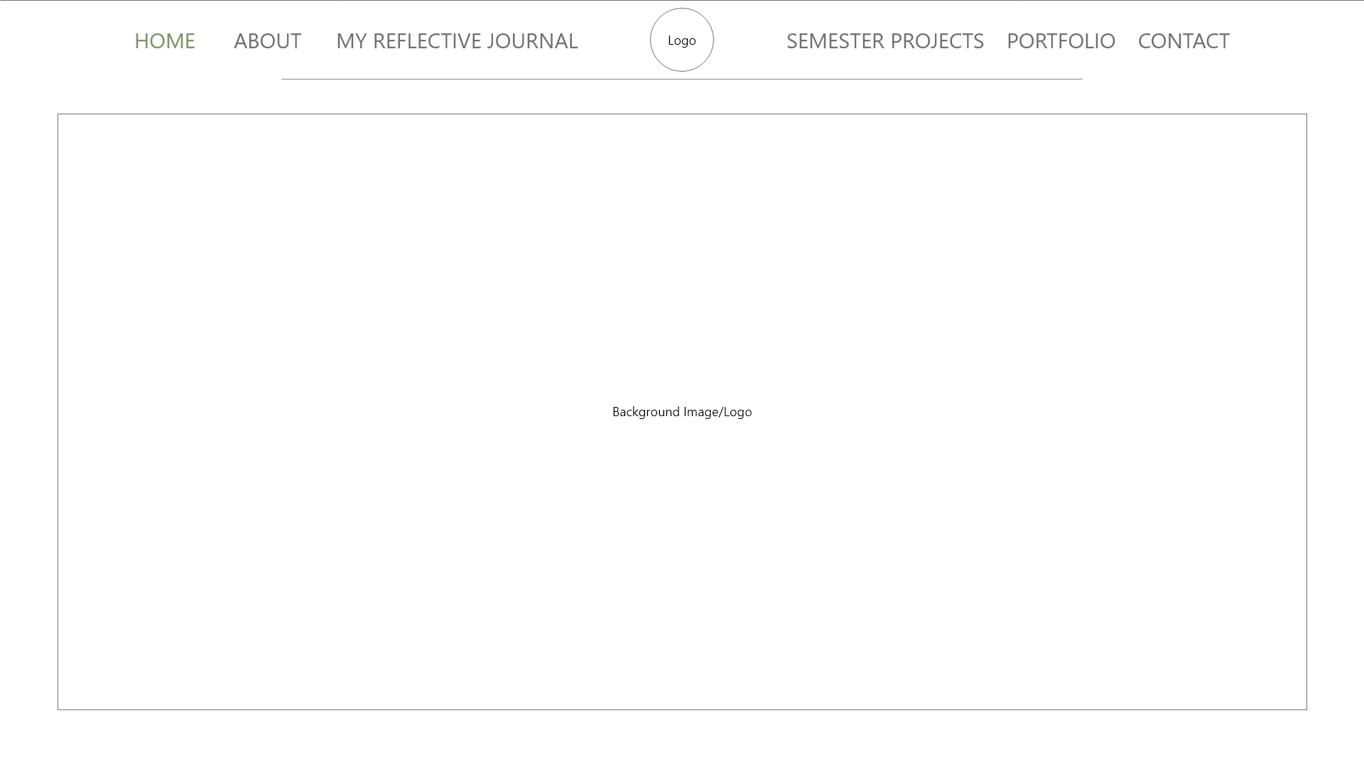
Now it’s your turn to create your very own website wireframe.In the last task, you had to come up with a list of 10 questions for a briefing form. I would like you to now fill in this briefing form, take the answers and create a wireframe for the site.This wireframe do not have to be a wireframe for your current Course Assignment (Product Website) it’s purely for you to practice your skills.You can choose if you want it to be a lo-tech or hi-tech architecture.  Regardless of which method you choose, I would like to see as much detail as possible. Also, please write a short paragraph to explain why you chose the lo-tech or hi-tech option.

  1. Do you want to build a new website or redesign an existing one? If it’s an existing one, do you have a domain name and a host?
    • I want a new website
  2. Describe your business in a few sentences.
    • I’m a graphic design student, so I want a website for my portfolio and other school work.
  3. Please list the names of three sites that you like and explain what you like about them.
  4. Do you have any existing style guides and guidelines?
    • Not directly a style guide, but I have a logo that have two specific colours.
  5. What kind of visitors are you expecting on your website? (Consider their income, interests, gender and age.)
    • For now I want a site that draw other students to the site, students and other people that is interested in graphic design. So every age, gender and so on.
  6.  What is your deadline for completing the site? How big is the budget?
    • I don’t have a deadline on the site itself, but I have to host the domene before end of this academical week.
  7. Are you active on social media?
    • Yes and no, I have a few different accounts on Instagram, I have one for hetiart as well but haven’t been that active on it.
  8. How do you want to promote your website?
    • I want to promote it through social media.
  9. Would you like us to provide ongoing support and maintenance?
    • I’m going to do that myself.
  10. Who will be the contact person for this project?
    • That will be me.

I choose to make a lo-tech wireframe since I’m so new to this, because it’s a quicker way to do it and because it’s good to make a lo-tech wireframe for every project.

AW18 – INTRODUCTION TO DESIGN FOR SCREEN – LT – GET THE BASIC RIGHT – PART 2

Part Two

Surf the web and find 10 sites you would consider to be great websites. Simultaneously, make a list of 10 sites you consider bad web sites. Remember to describe why you would define them as such. Upload your lists on your blog.

10 good websites.

  1. https://sunnivaengen.no/
  2. https://www.etsy.com/
  3. https://www.ikea.com/no/no/
  4. https://www.ellos.no/
  5. https://www.plantasjen.no/
  6. https://guidetoiceland.is/
  7. https://www.anabrandt.net/
  8. https://www.adobe.com/
  9. https://www.instagram.com/
  10. https://www.komplett.no/

Most of these websites have a nice clean design. The colour theme, graphics and the type looks good. And it’s easy to get around on the page.

10 bad websites.

  1. https://solheimgartneri.no/
  2. https://penstore.no/
  3. https://www.japanphoto.no/
  4. https://www.ebay.com/
  5. https://no.pinterest.com/
  6. https://www.hcpet.no/
  7. https://tropehagen.no/
  8. https://www.1001fonts.com/
  9. https://sportoutlet.no/
  10. https://sportnorge.no/

Most of these websites has a mor simple design. And a lot of them is hard to navigate around on. I personally work at sport outlet, their website looks good when you just look at it. But it lacks a lot of navigation, it’s hard to navigate around and they are not on top of it when it comes to categorizing and searching.

AW18 – Introduction to Design for Screen – LT – Get The Basic Right – Part 1

1: Explain the following terms in your own words:

  • The internet
  • HTML
  • Browser
  • Search engine

The Internet.
The internet is a large wire network with computers, cell phones and many other devices that communicate with each other. It’s the fundamental of the Web that makes the Web possible. The internet is that the main function of it is to share information.

HTML.
Html (HyperText Markup Language) is the universal language that is used to retrieve, present and send  information via the internet. The html is the web page’s appearance/presentation, it defines the meaning and the structure of web content.

Browser.
The browser is an application that has been created to view html documents. A browser is an application for accessing the world wide web and to display pages and files on the web

Search Engine.
The search engine work by crawling billions of pages using web crawlers. This mean that it is first crawling to find pages to their database, then the next step is the indexing. This is when the results are organised and added to their database.

2: Please research and add another 10 questions to the briefing process.(See the lesson.)

  1. What kind of visitors are you expecting on your website? (Consider their income, interests, gender and age.)
  2. Who are your competitors and how do you differ from them?
  3. What actions do you want visitors to take on the site?
  4. What is your deadline for completing the site? How big is the budget?
  5. What features should be used on the website? ( This includes things like contact forms, pictures, videos, etc. )
  6. Please list the names of three sites that you like and explain what you like about them.
  7. Do you have any colour preference? What should the look and fell for the website be?
  8. Who will be the contact person for this project?
  9. What do you NOT want on your site in terms of text, content, colour and graphic elements?
  10. Who will be responsible for maintaining the website? Will the person have the time and skills to do so?

My 10 questions.

  1. Do you want to build a new website or redesign an existing one?
  2. Describe your business in a few sentences.
  3. What makes your services unique?
  4. Would you like us to provide ongoing support and maintenance?
  5. Do you have any existing style guides and guidelines?
  6.  Do you have any domain name and host?
  7. Are you active on social media?
  8. Do you require a blog? If so please specific if you know how you want the blog to look like
  9. How do you want to promote your website?
  10. Where do you see your company in five years?

3: From this list of 20 questions (your 10 added to my 10), please create the ultimate list of 10 questions that you would use for clients.

  1. Do you want to build a new website or redesign an existing one? If it’s an exicting one, do you have a domain name and a host?
  2. Describe your business in a few sentences.
  3. Please list the names of three sites that you like and explain what you like about them.
  4. Do you have any existing style guides and guidelines?
  5. What kind of visitors are you expecting on your website? (Consider their income, interests, gender and age.)
  6.  What is your deadline for completing the site? How big is the budget?
  7. Are you active on social media?
  8. How do you want to promote your website?
  9. Would you like us to provide ongoing support and maintenance?
  10. Who will be the contact person for this project?
Semester Project 1

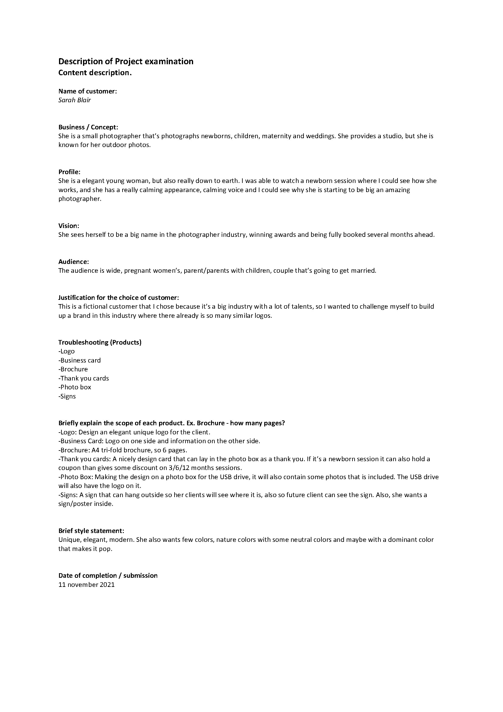
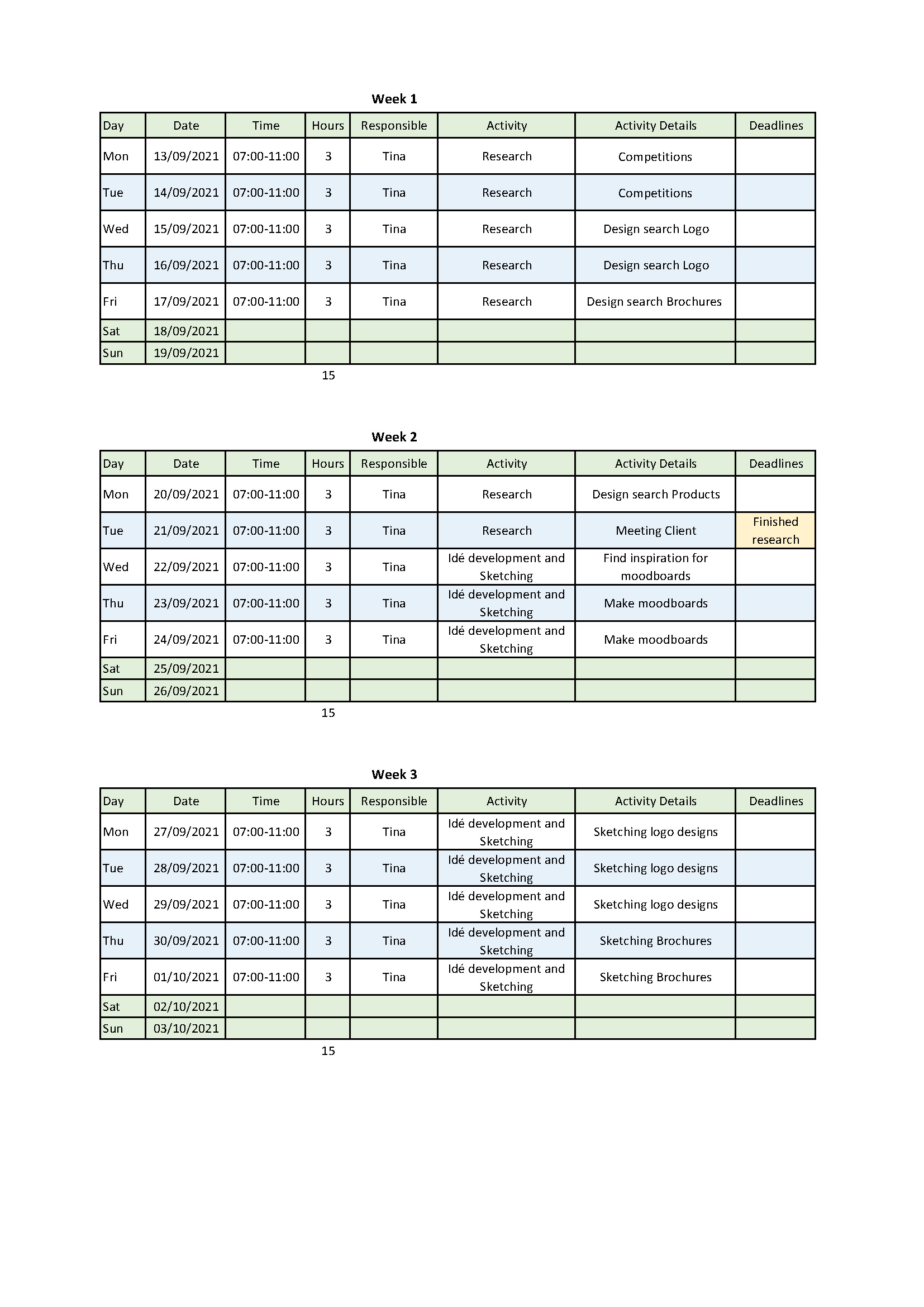
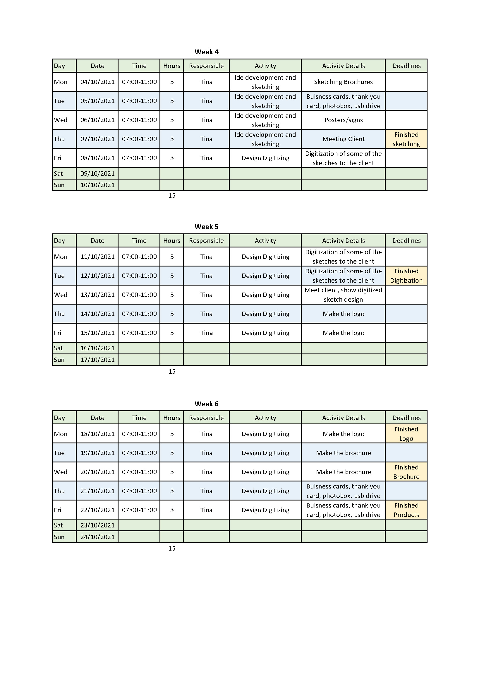
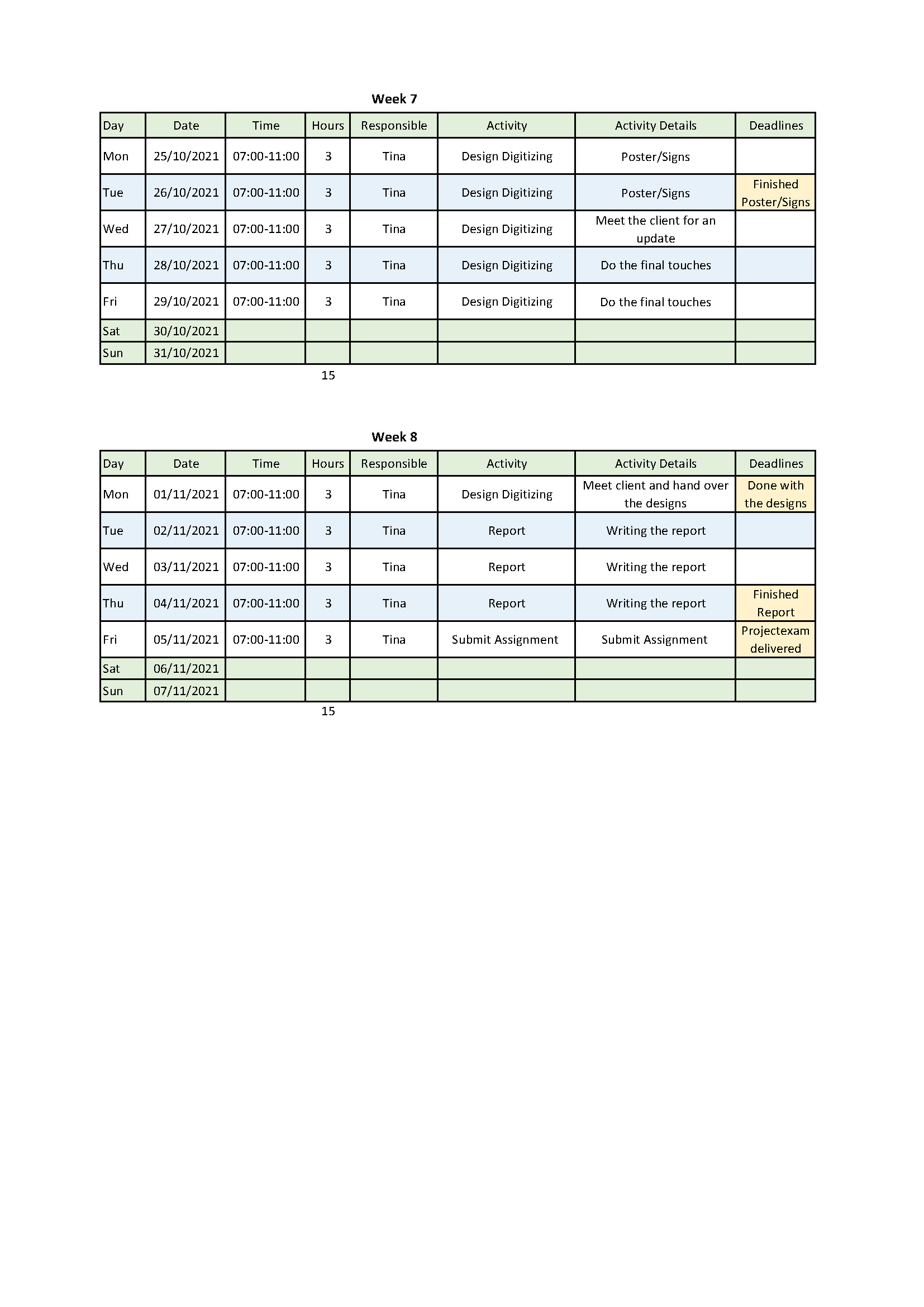
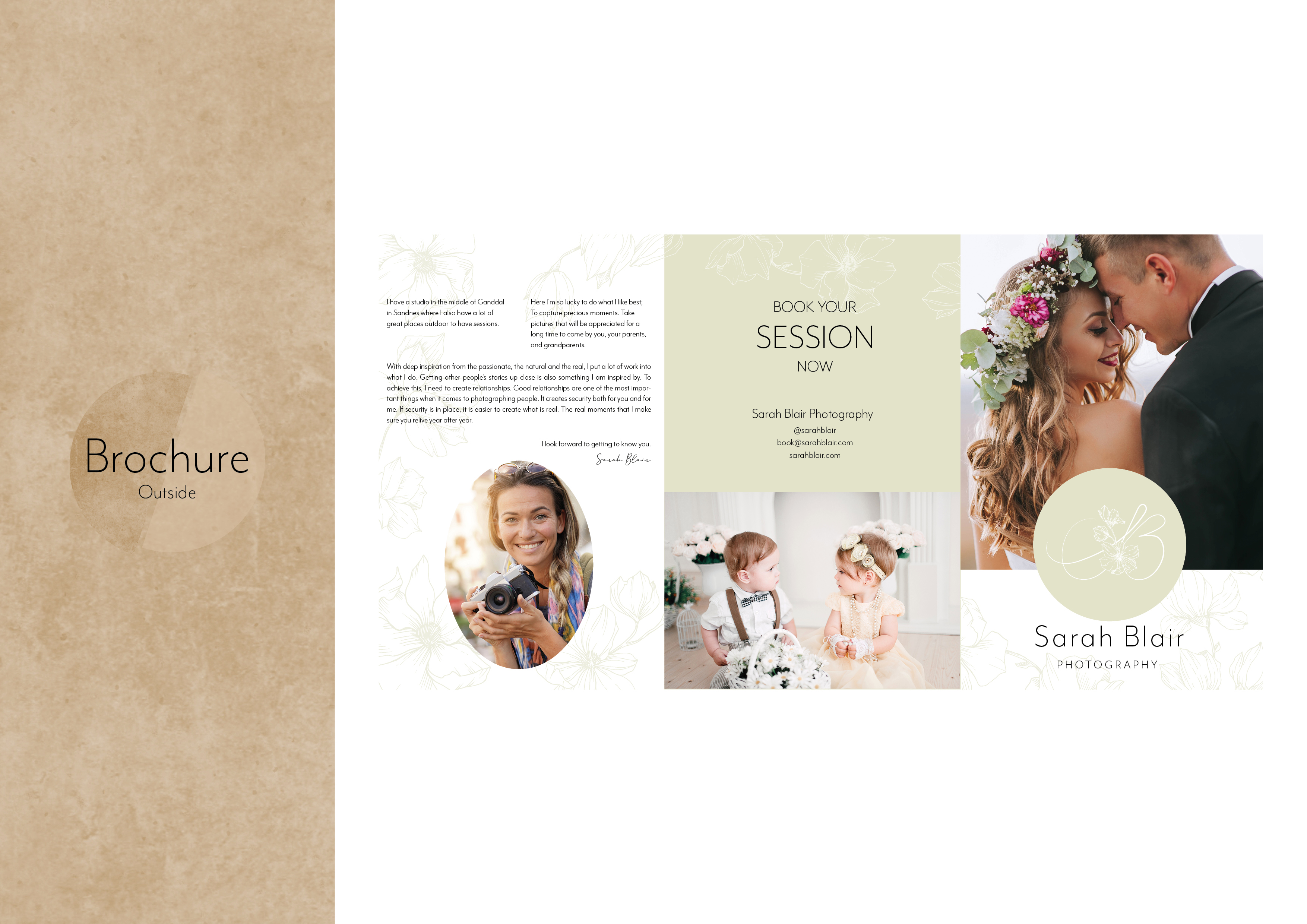
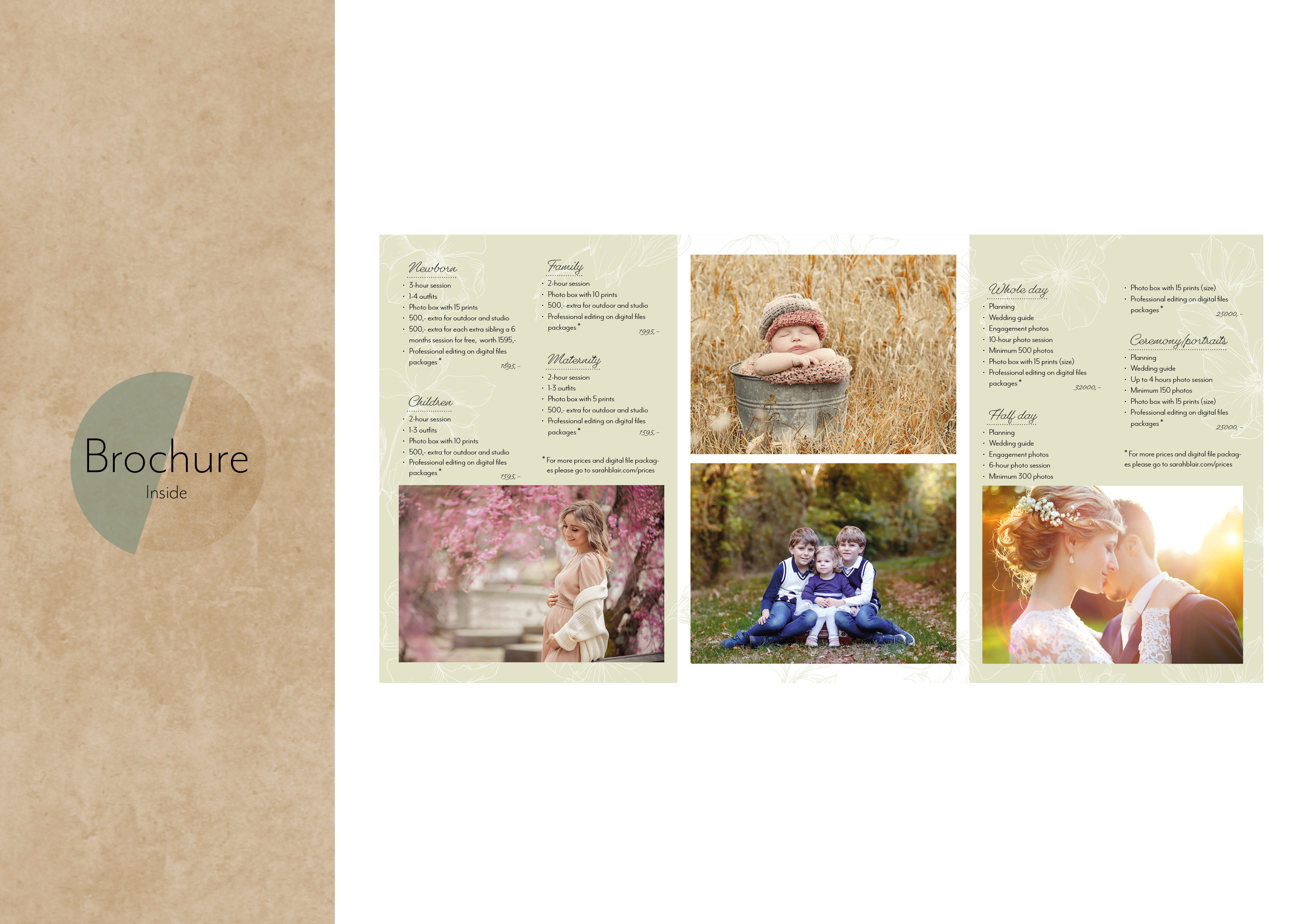
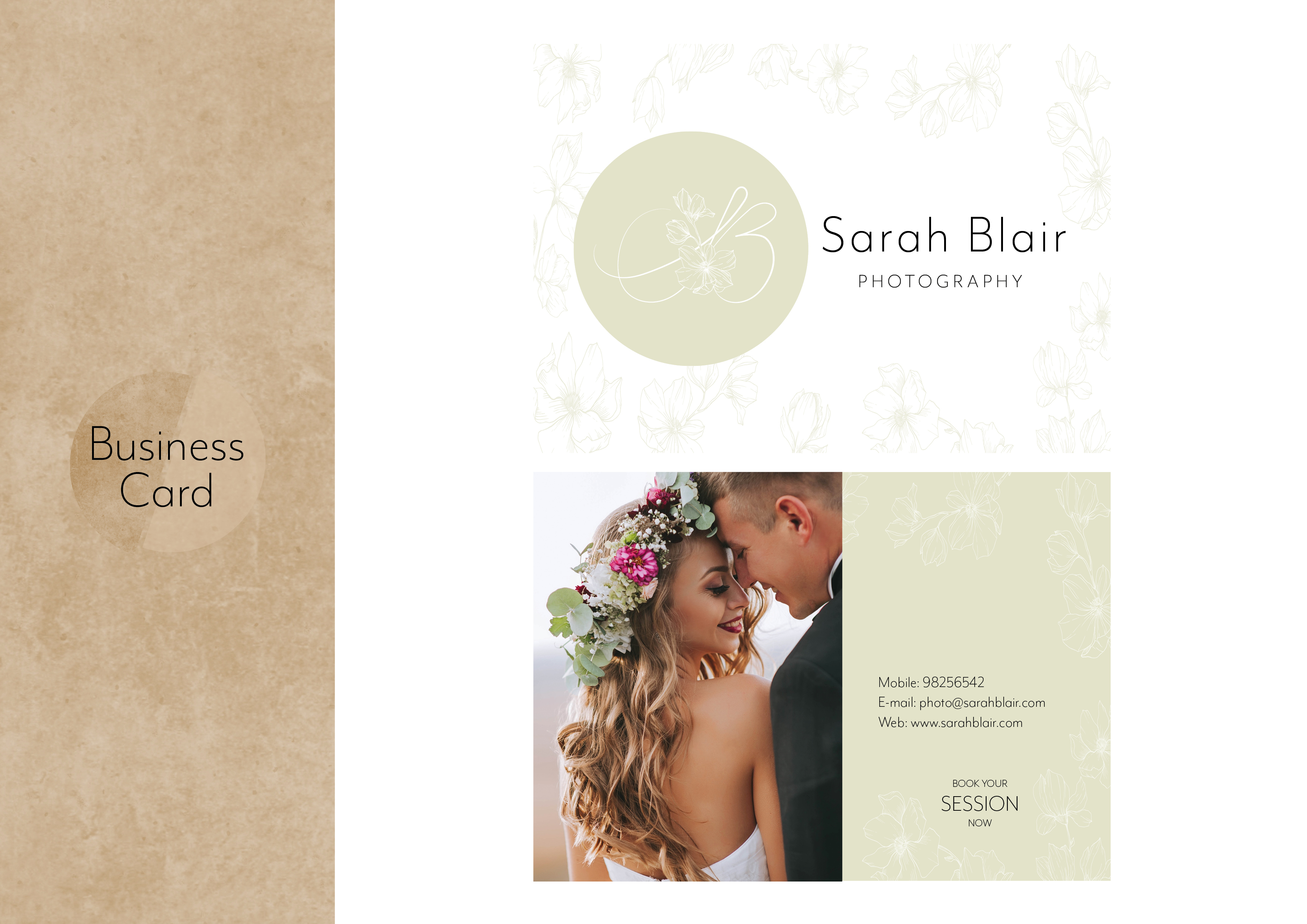
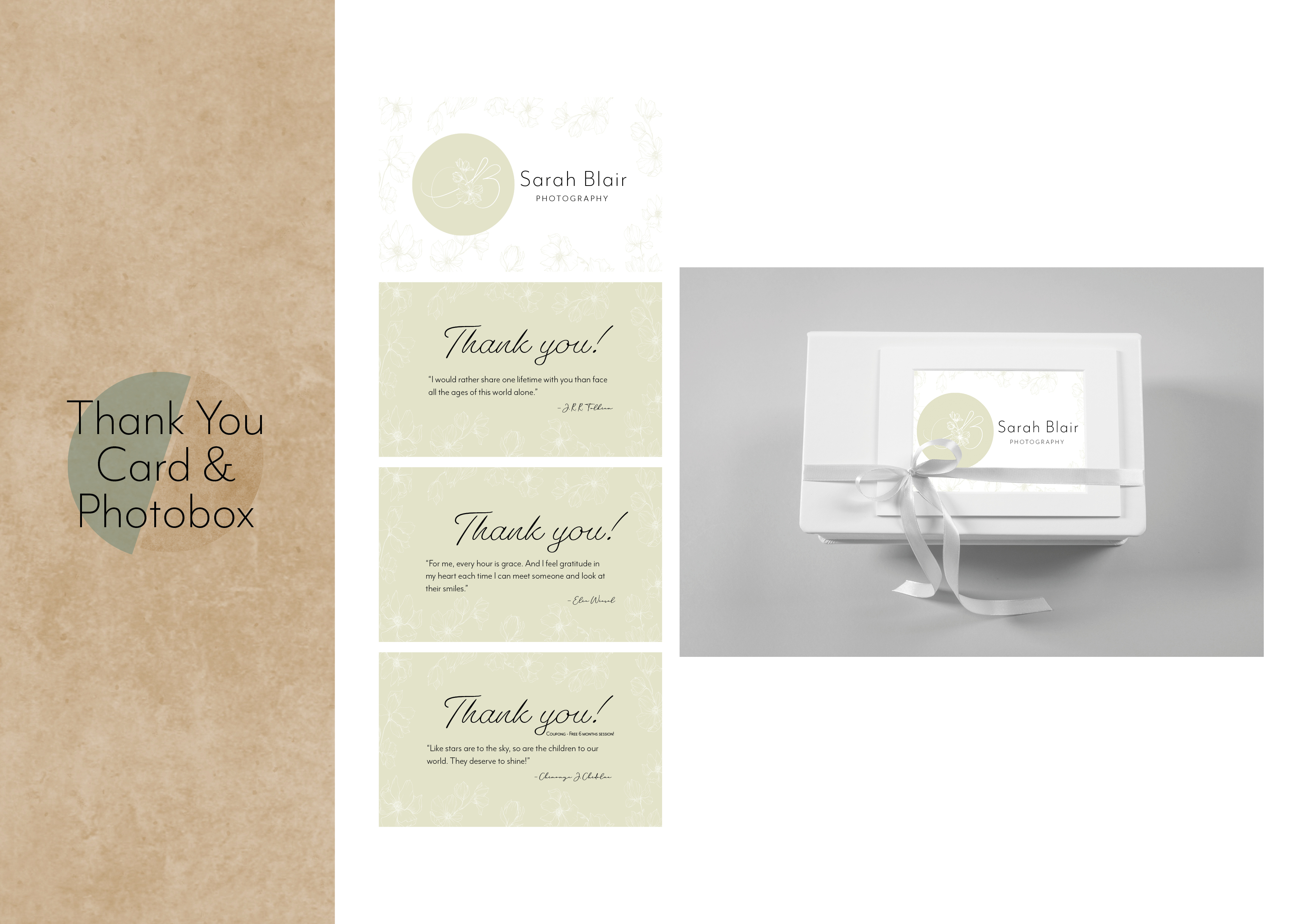
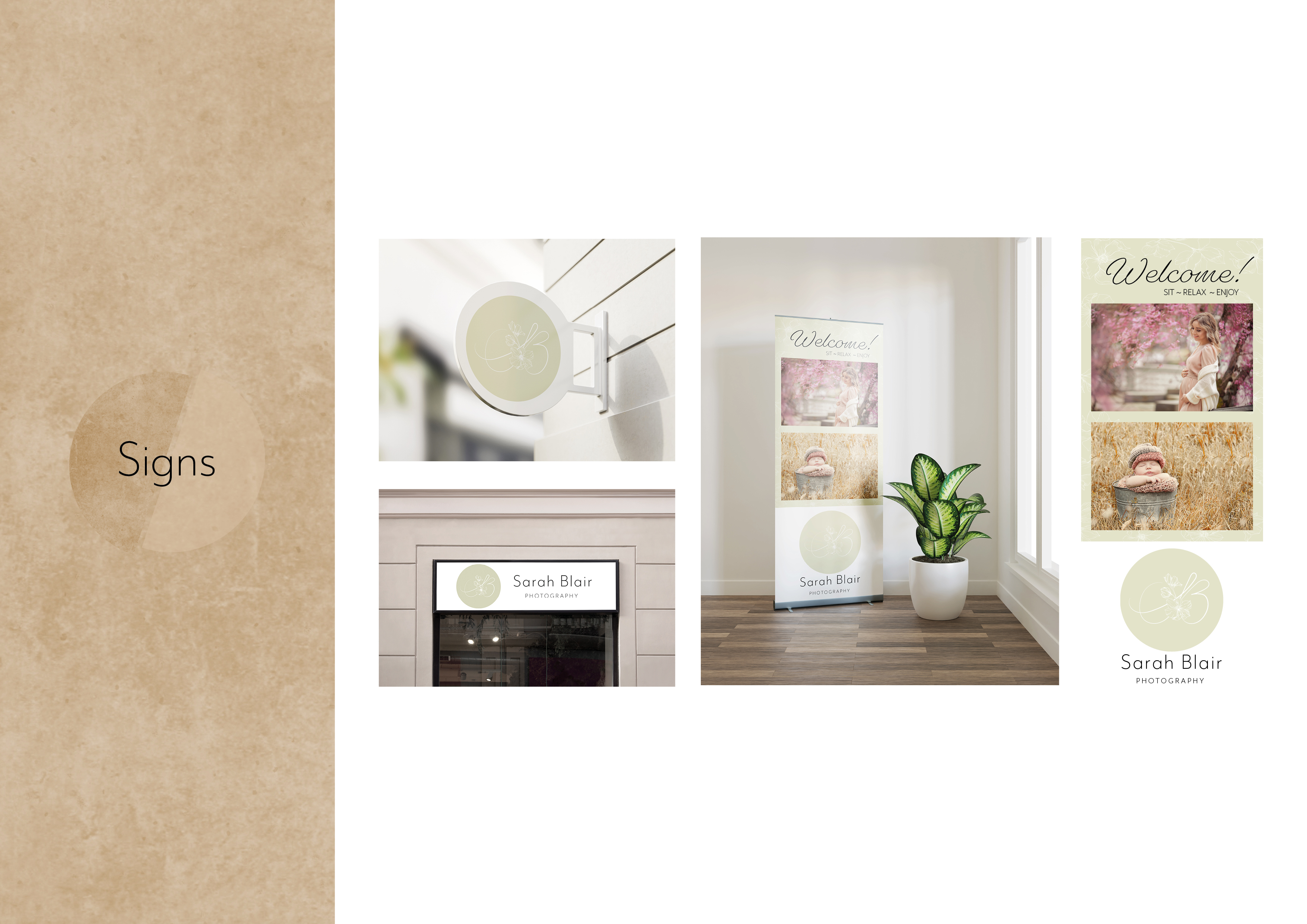
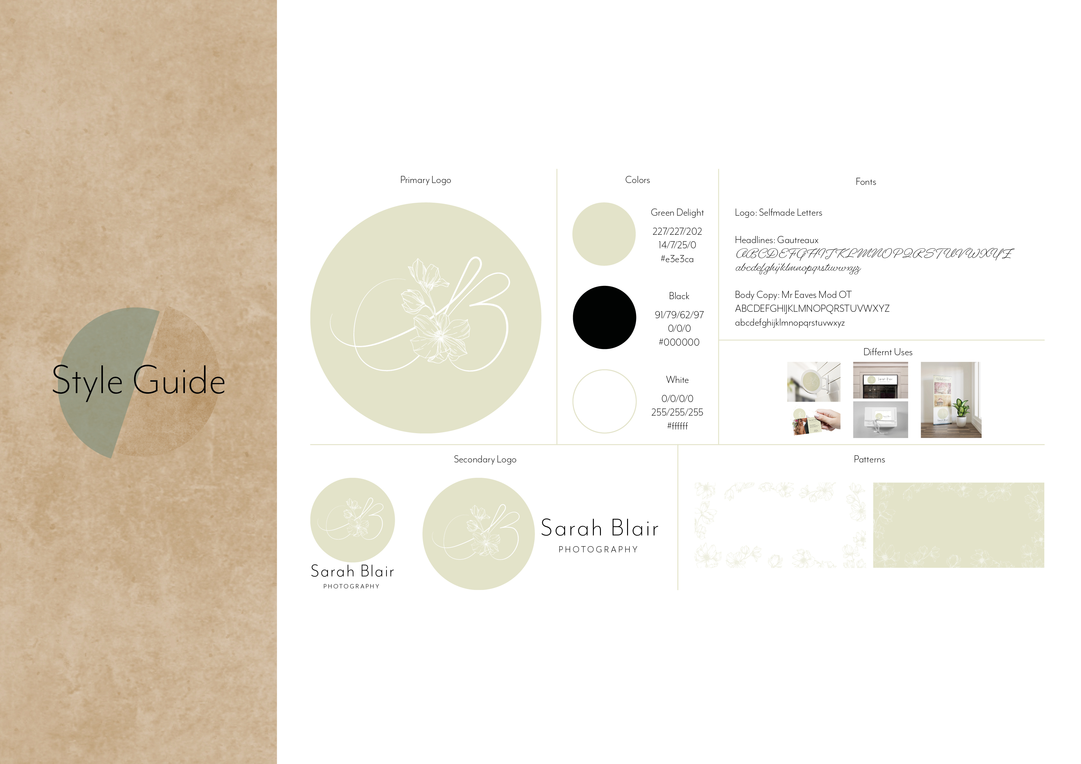
For this semester project we were asked to complete an authentic graphic design project for a real or fictitious client. The main task for this project is making printable products and show what we have leaned so far in the semester. Before I could start with the project, I had to write a project description and make a work schedule and get this approved by the teachers.
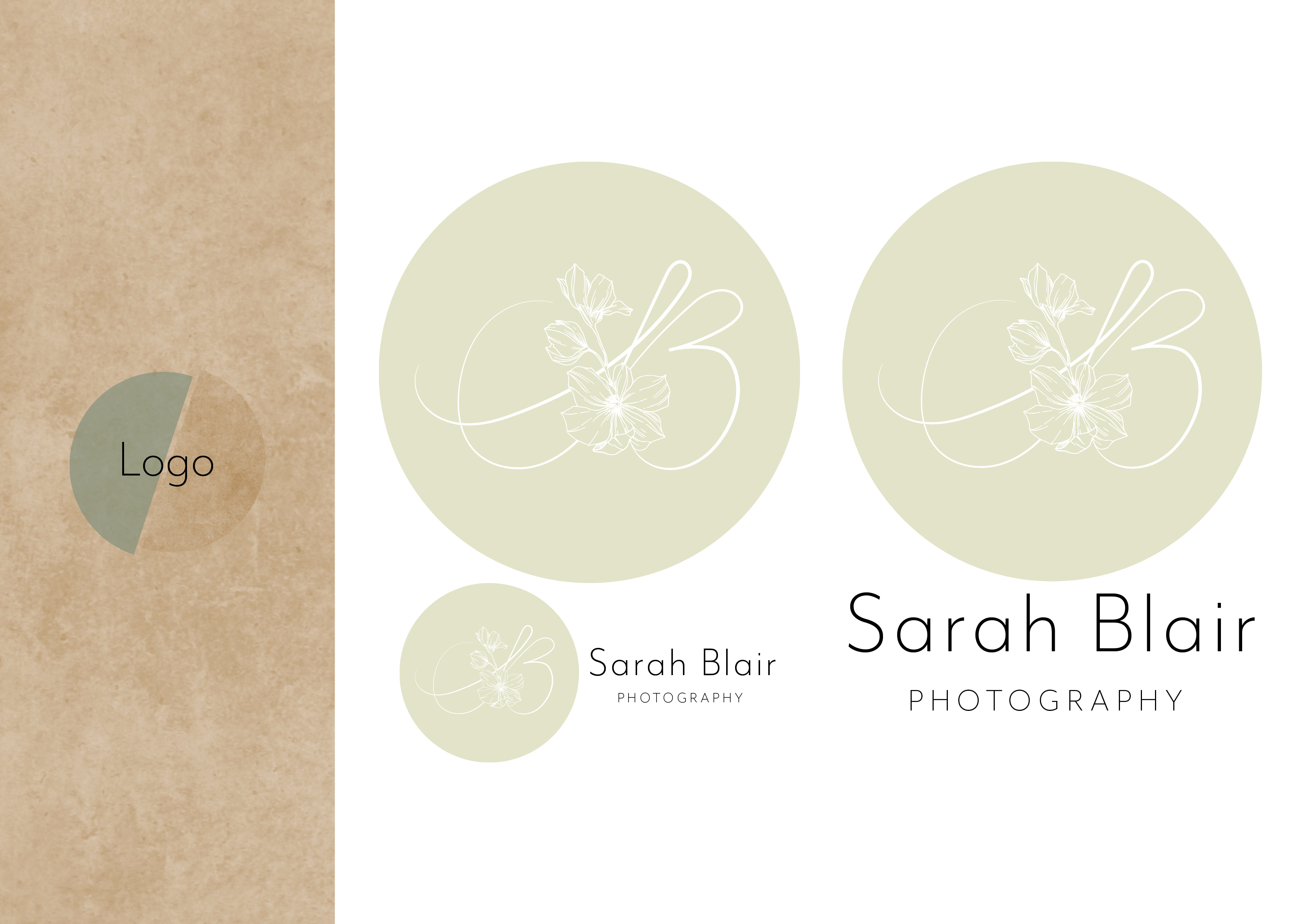
I chose to use a fictitious client since it’s so early in the study. I wanted to make a brand from scratch so my client is a young photographer that needed logo, brochures, business card, photobox design, thank you cards and different signs.

Here is the project description that I sent in, and the schedule.

CA04 – Photography

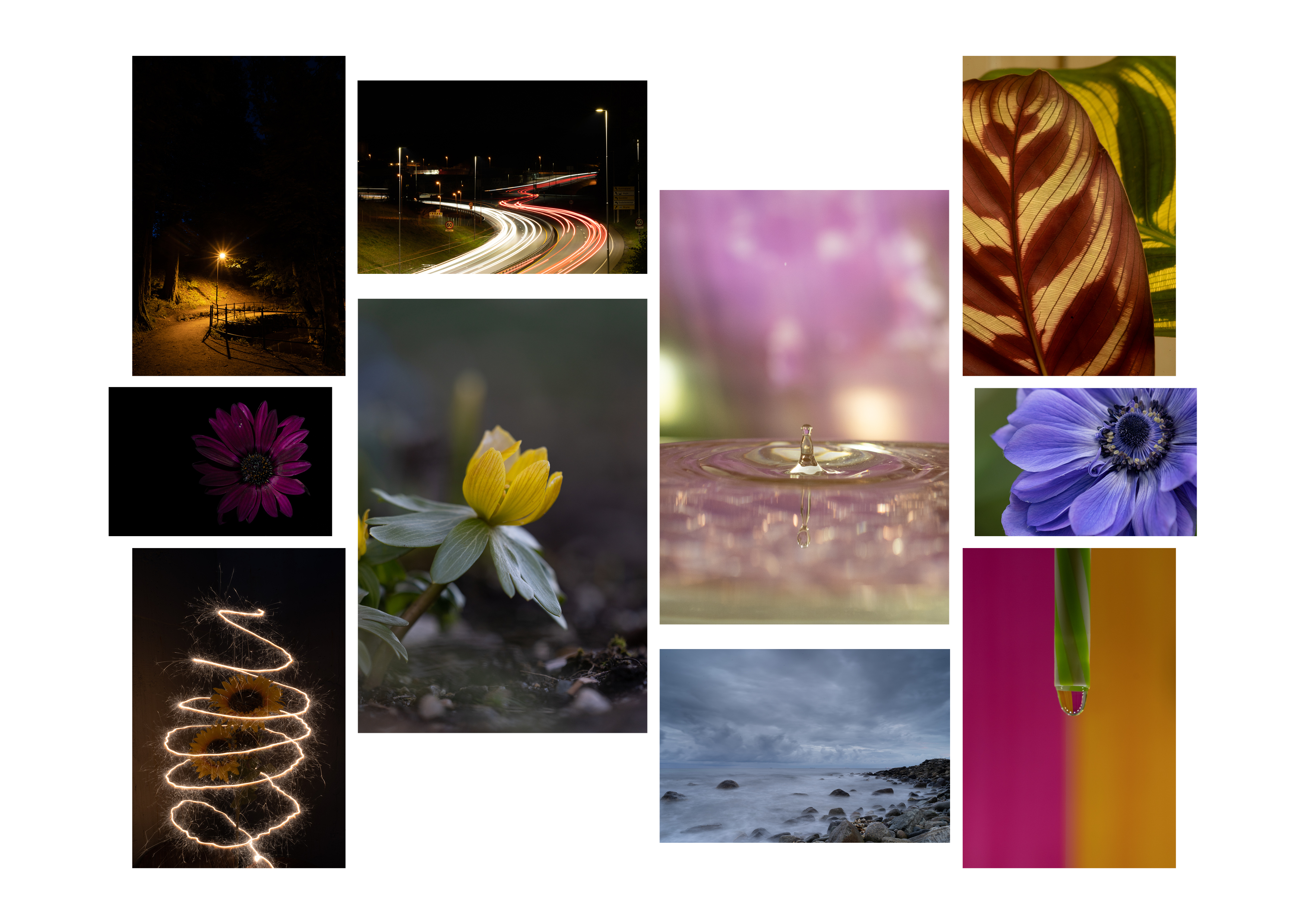
This task was about taking 10 different photos, at least one photo for each topic listed below.

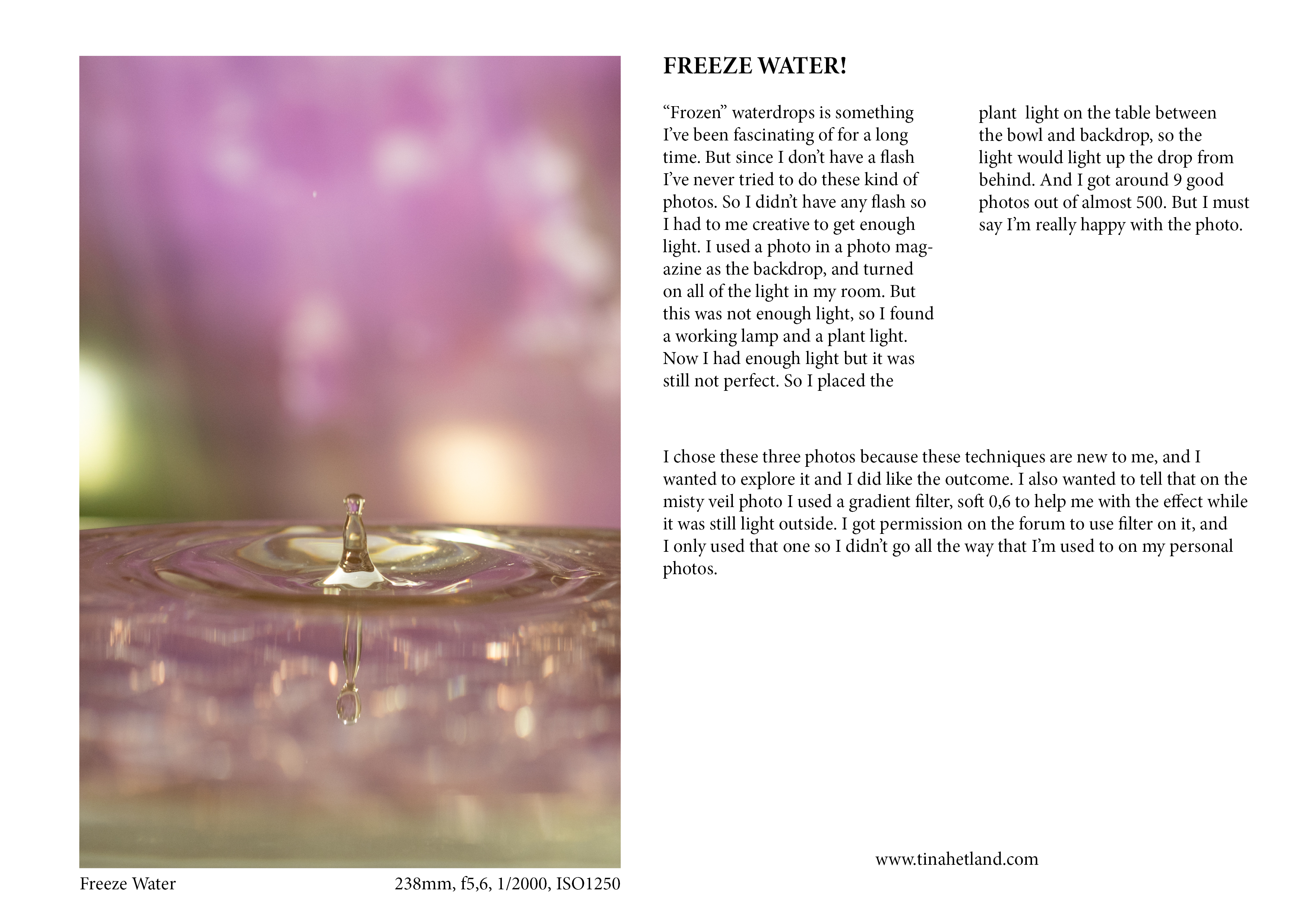
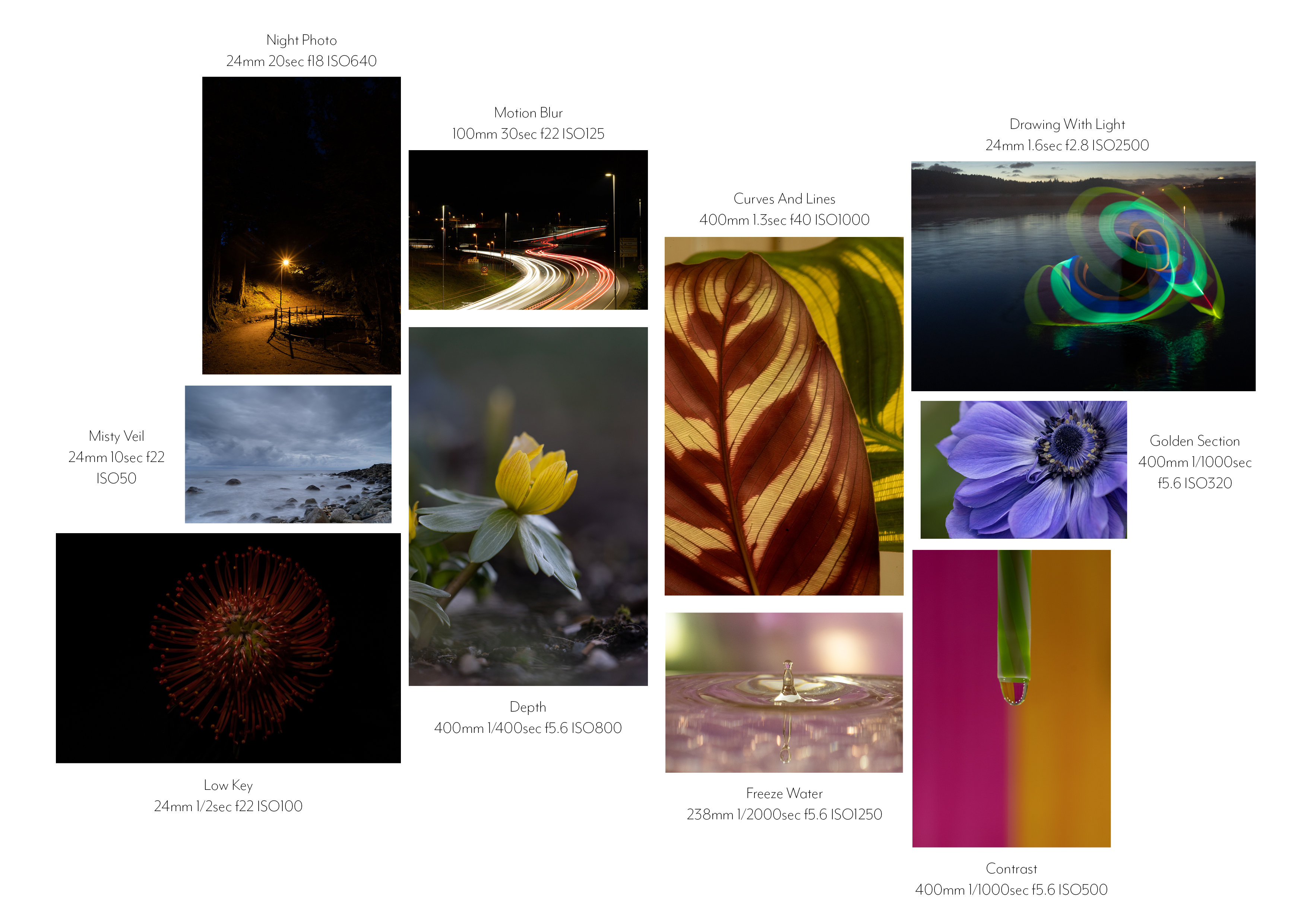
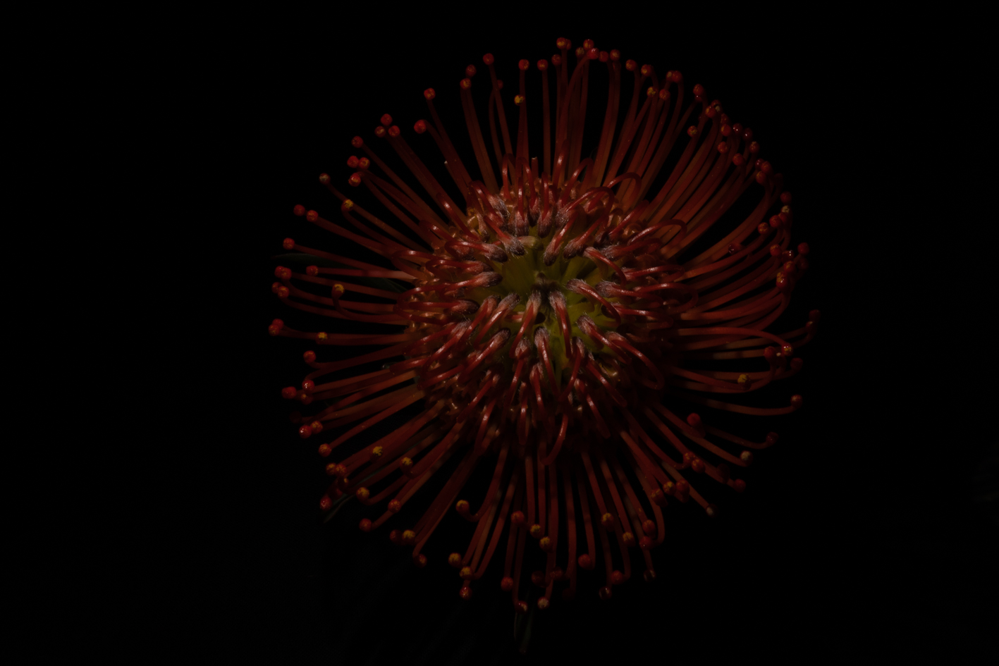
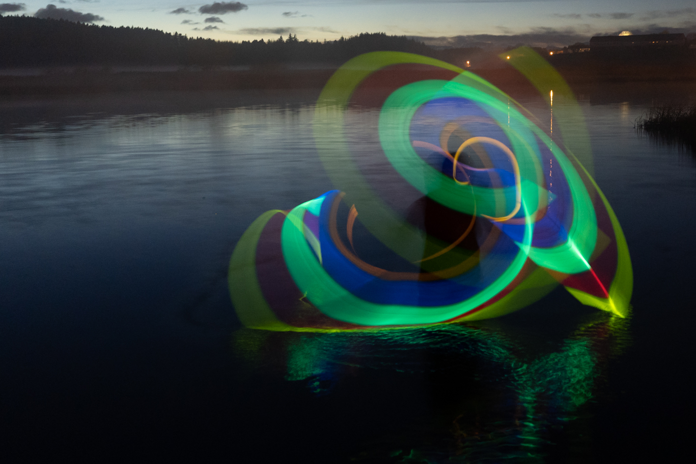
Night photo, Freeze water, Misty/silky water, The golden section, Motion blur, Contrast, Low key or high key, Leading lines or curves, Drawing with light, Shallow Depth of Field

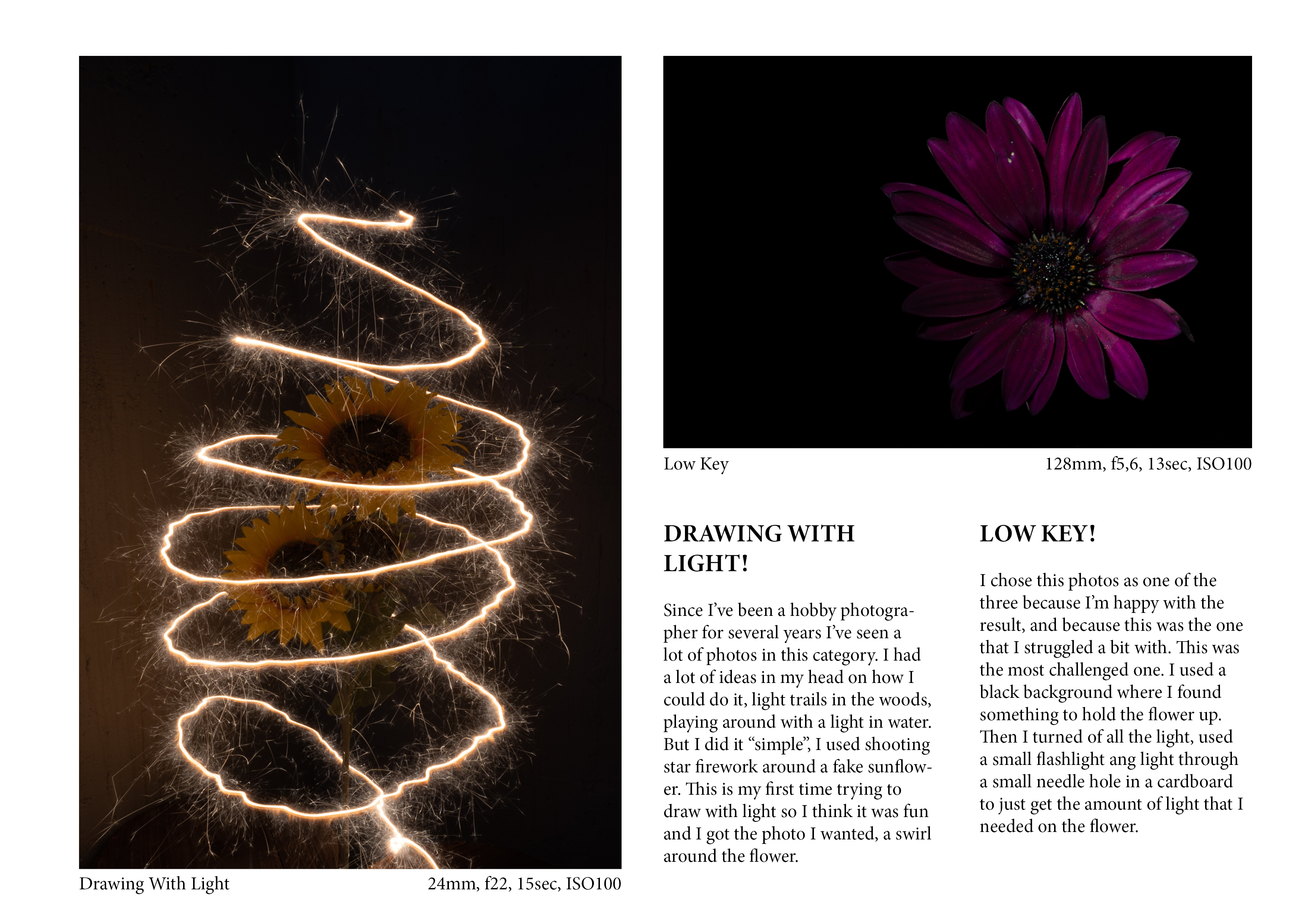
Then we had to create a composition of the 10 photos, and choose the three best and write the description with technical settings and the reflections on the three photos.

After the feedback I got I decided to change two of the images just because I was totally agree with the feedback. I took a new photo of “low key” and drawing with light. The drawing with light was a bit shaky so I decided to use some lights in the water instead. The low key is sort of the same but I wanted to light up the whole flower.

I also forgot to write down the setting for all of the photos.

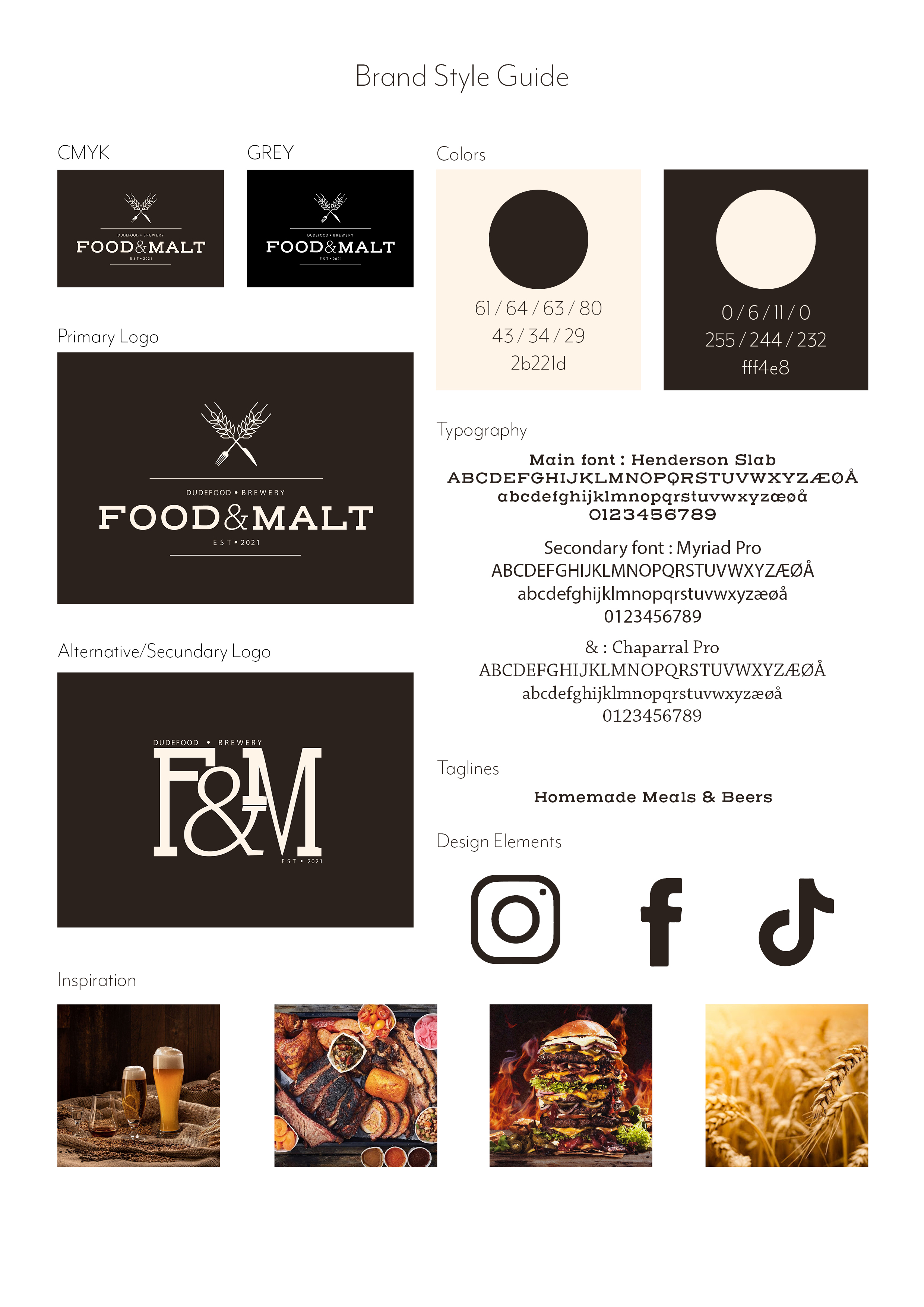
CA02 – Logo Design – Food & Malt

Food & Malt is a new restaurant that two friends, Anders Braathen and Even Vehla is opening. Anders has a long experience in brewing and working in a restaurant. They want to introduce this trend in the Norwegian marked combined with brewing. They want to serve quality homemade lunches, snacks and with a great selection with beers. For this they want a Logo and a brandstyle guide.