Author: Admin


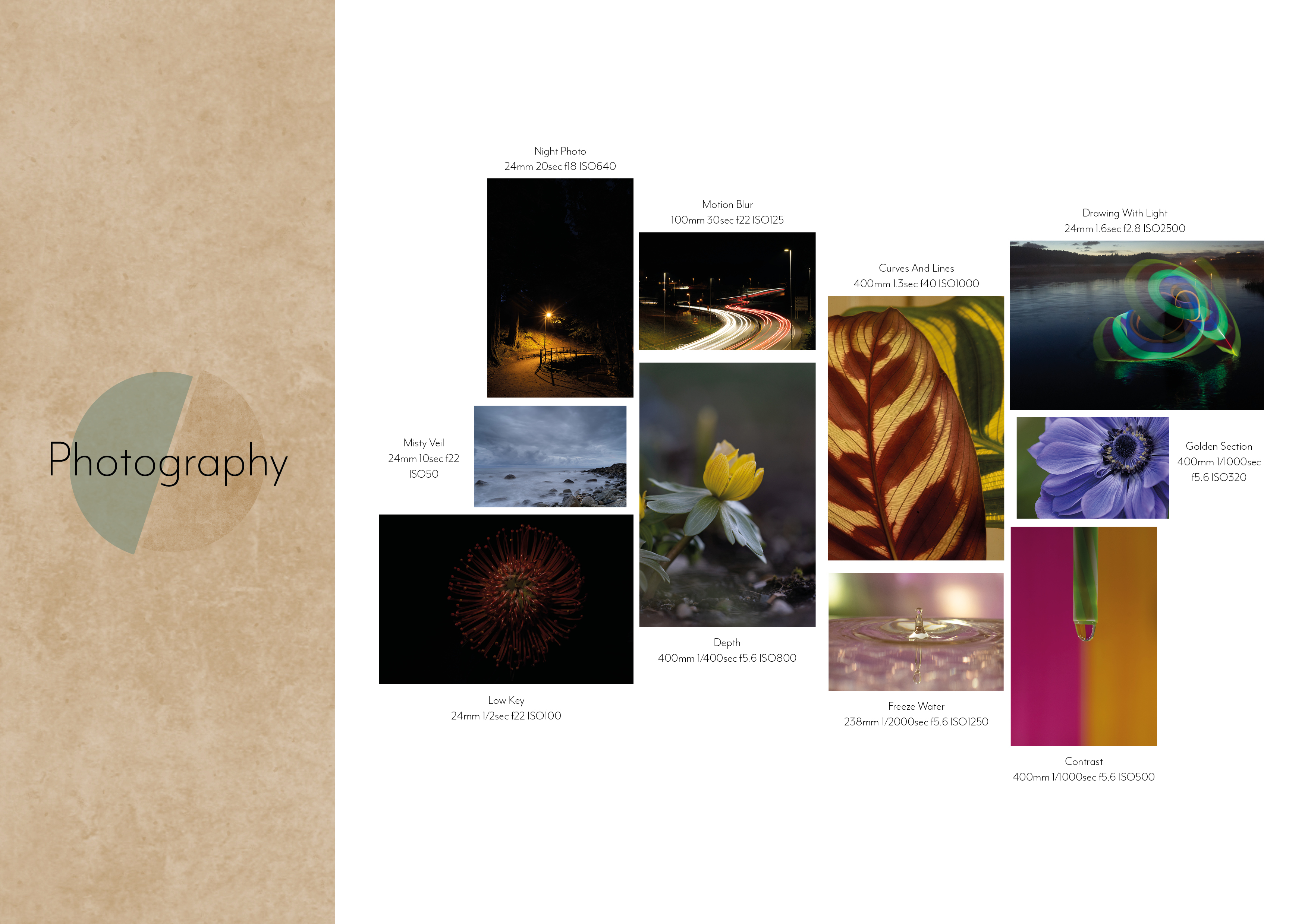
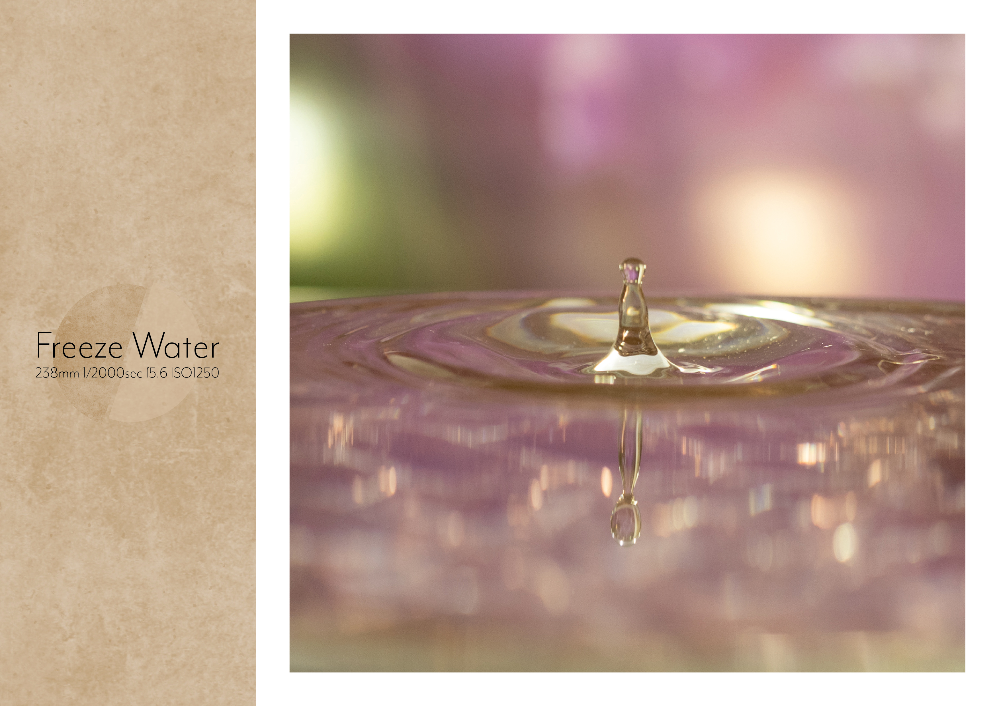
P1 – CA04 – Photography
P1 – CA03 – Egg Booklet
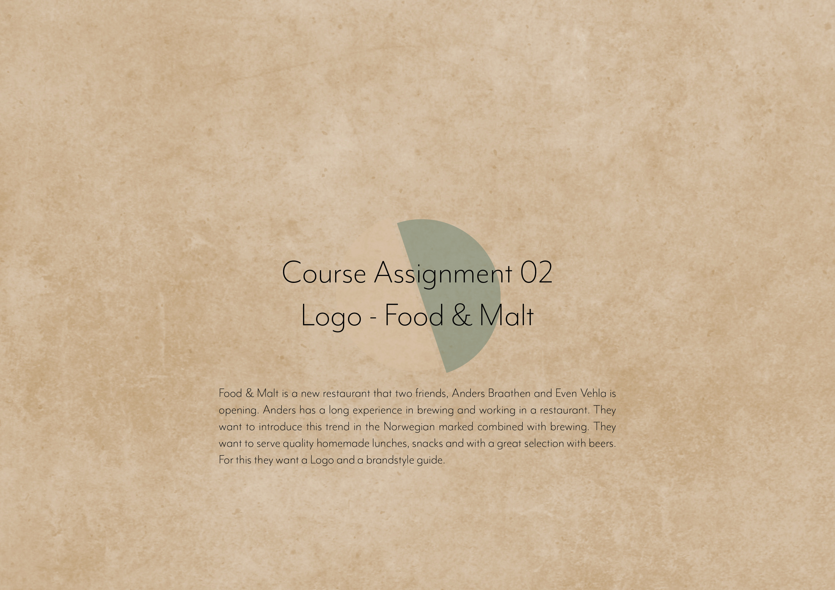
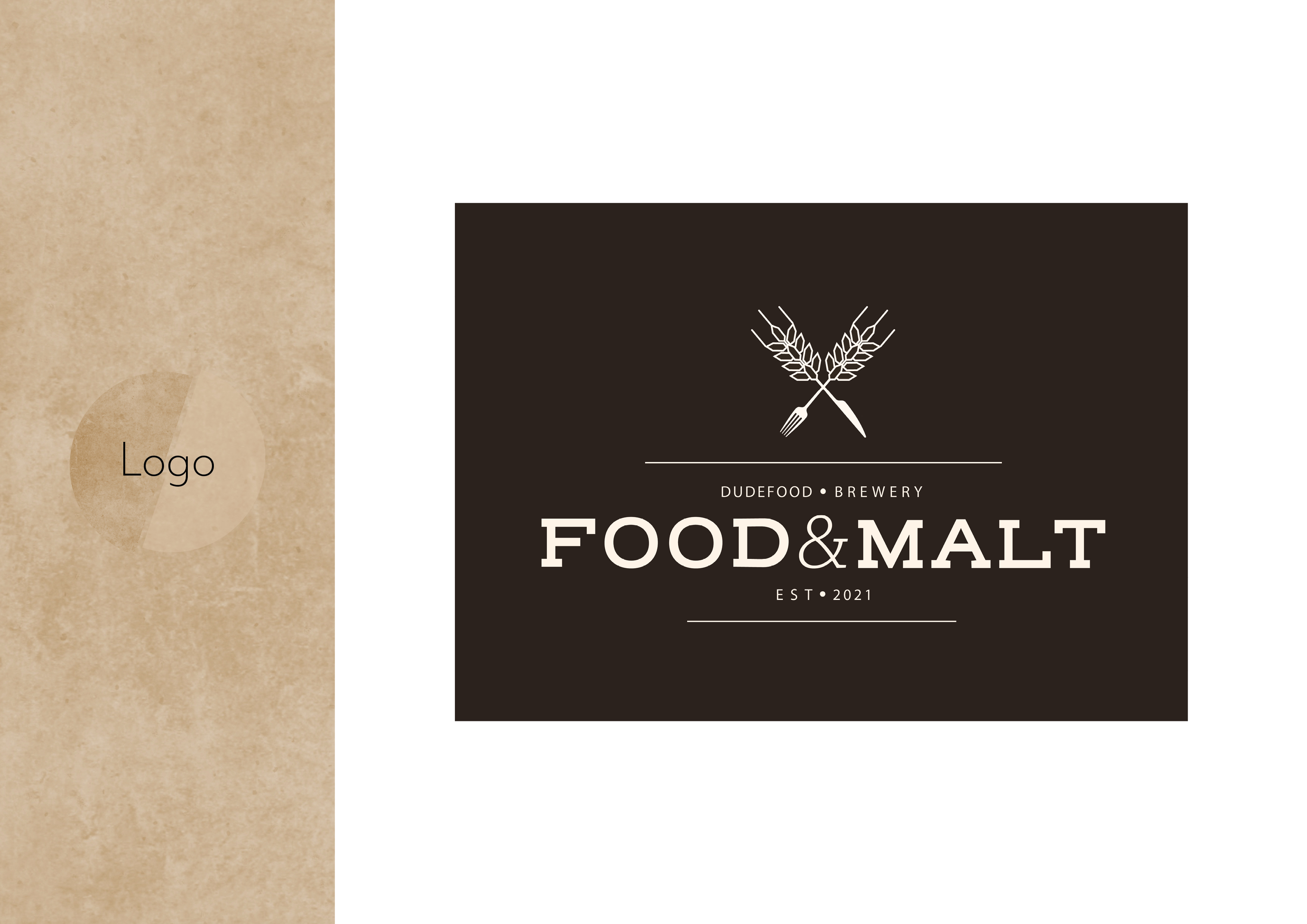
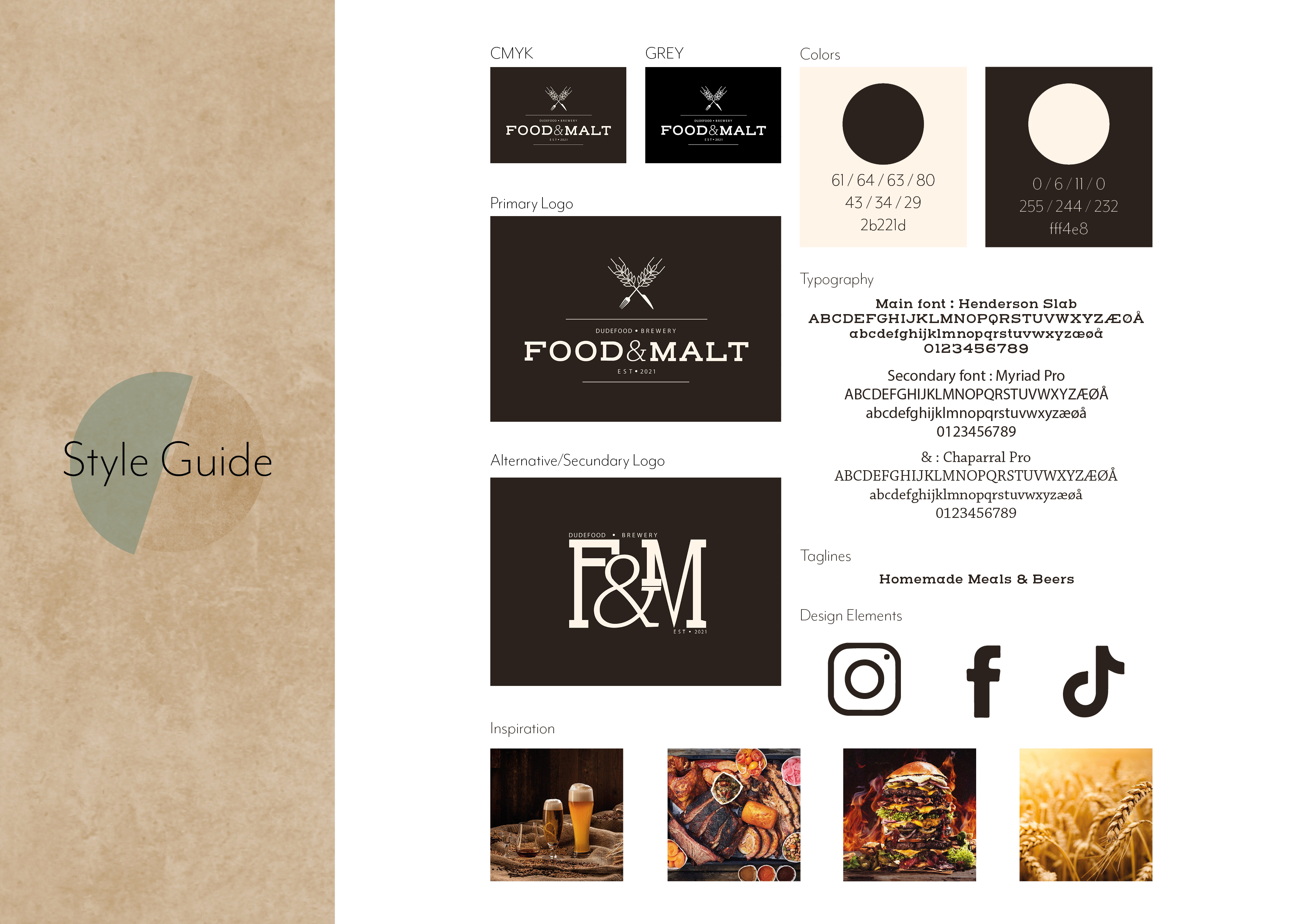
P1 – CA02 – Logo Design – Food & Malt
P1 – CA01 – Idea Development – Design Principles
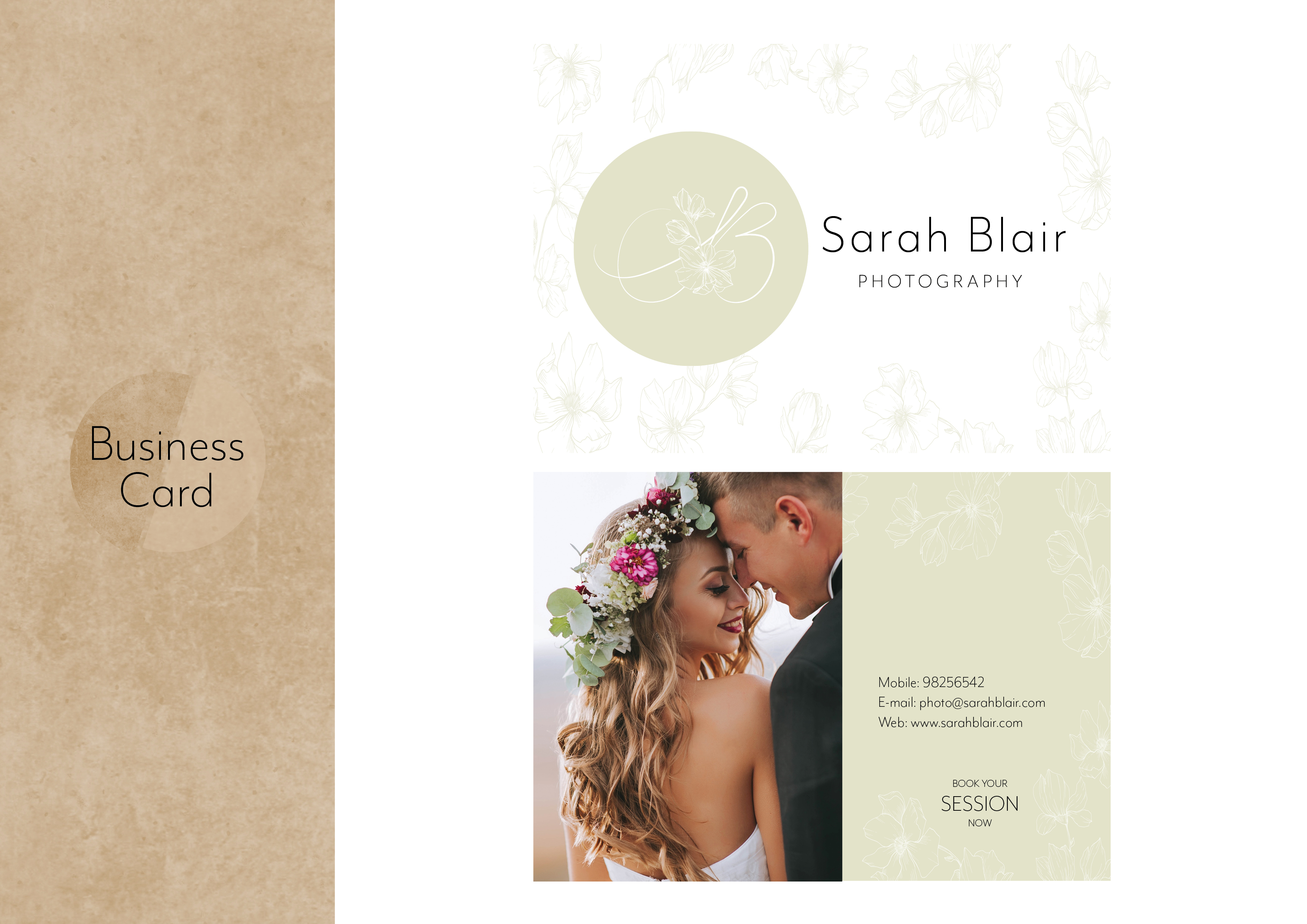
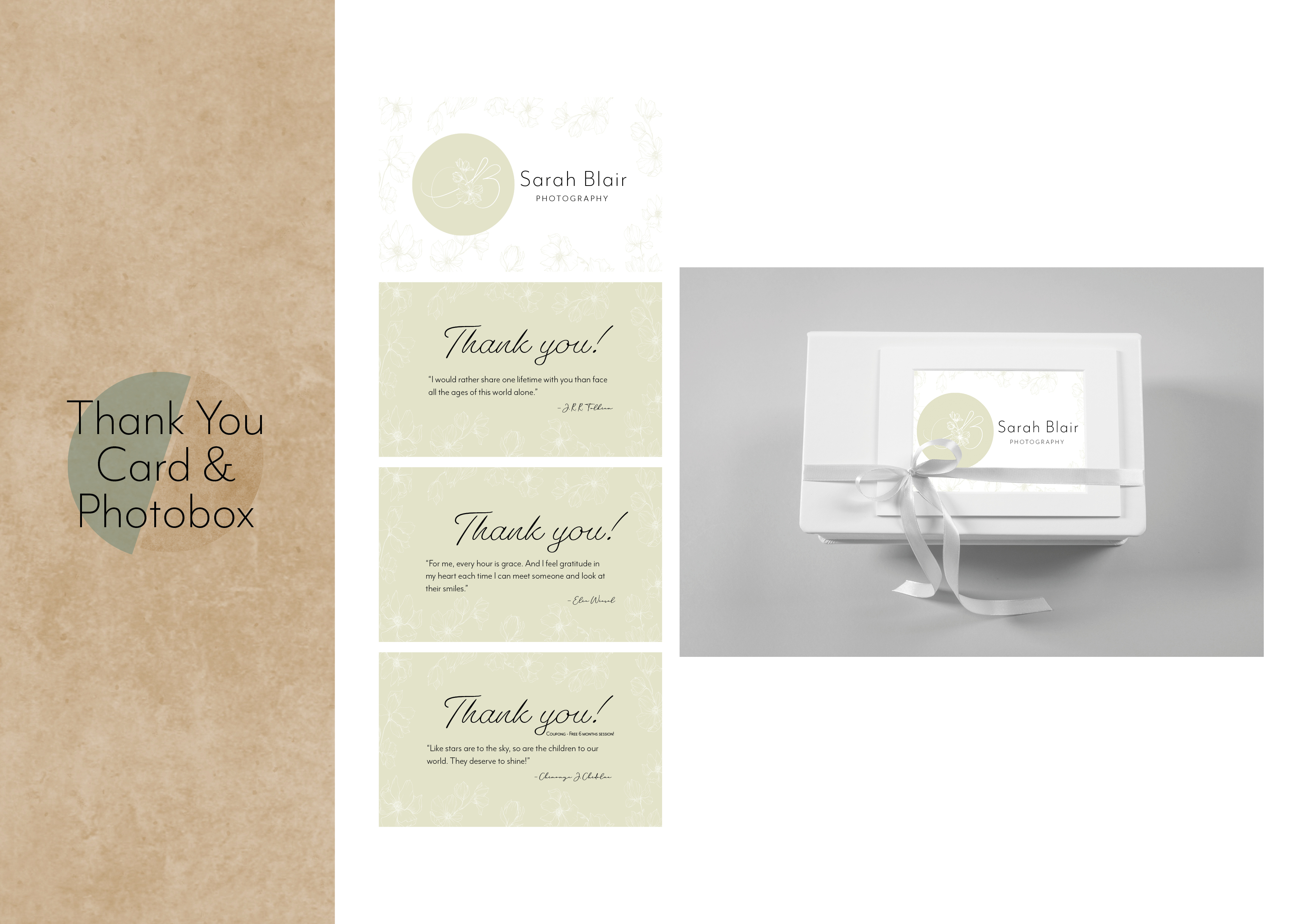
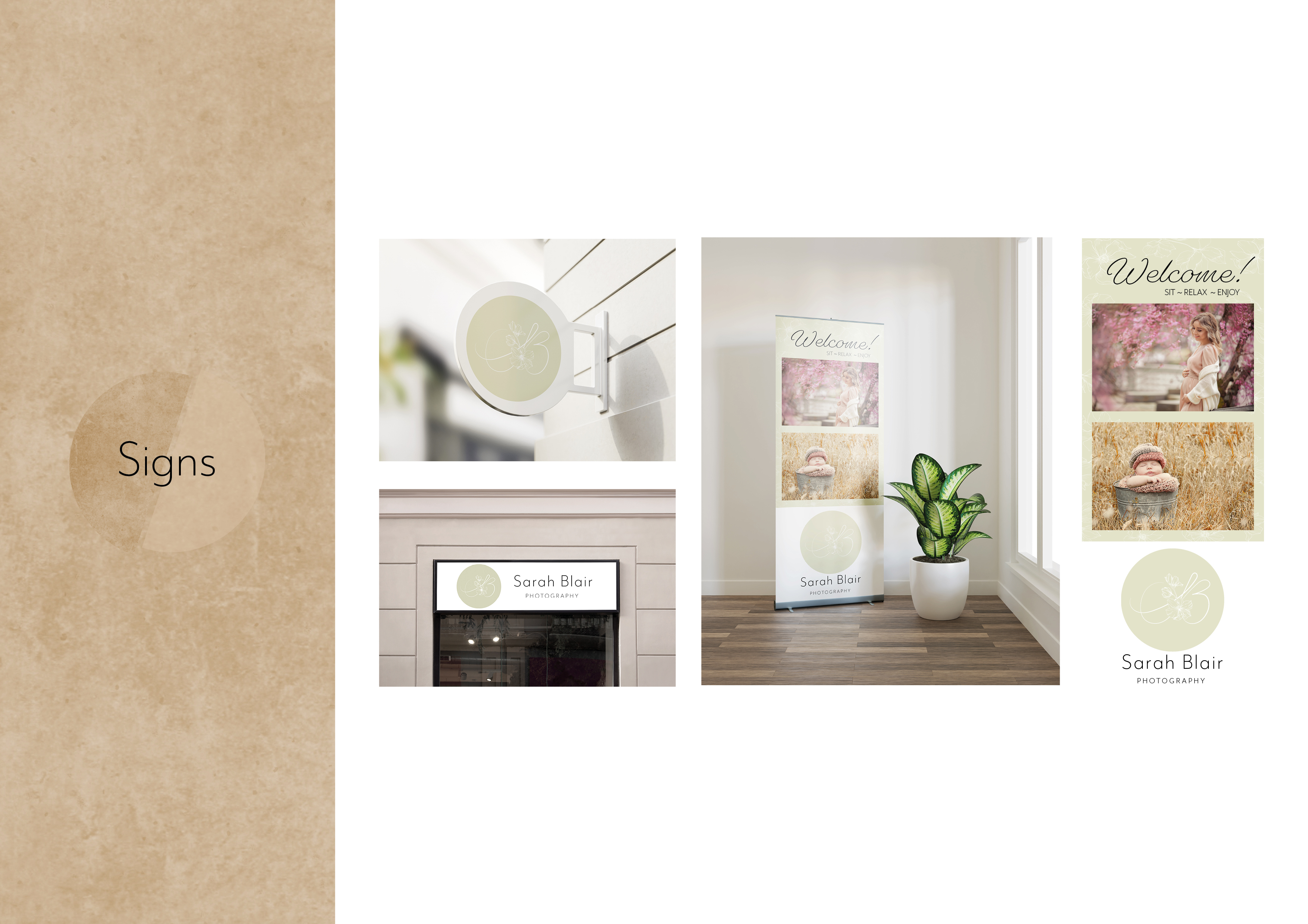
CA01 – Idea Development – Design Principles
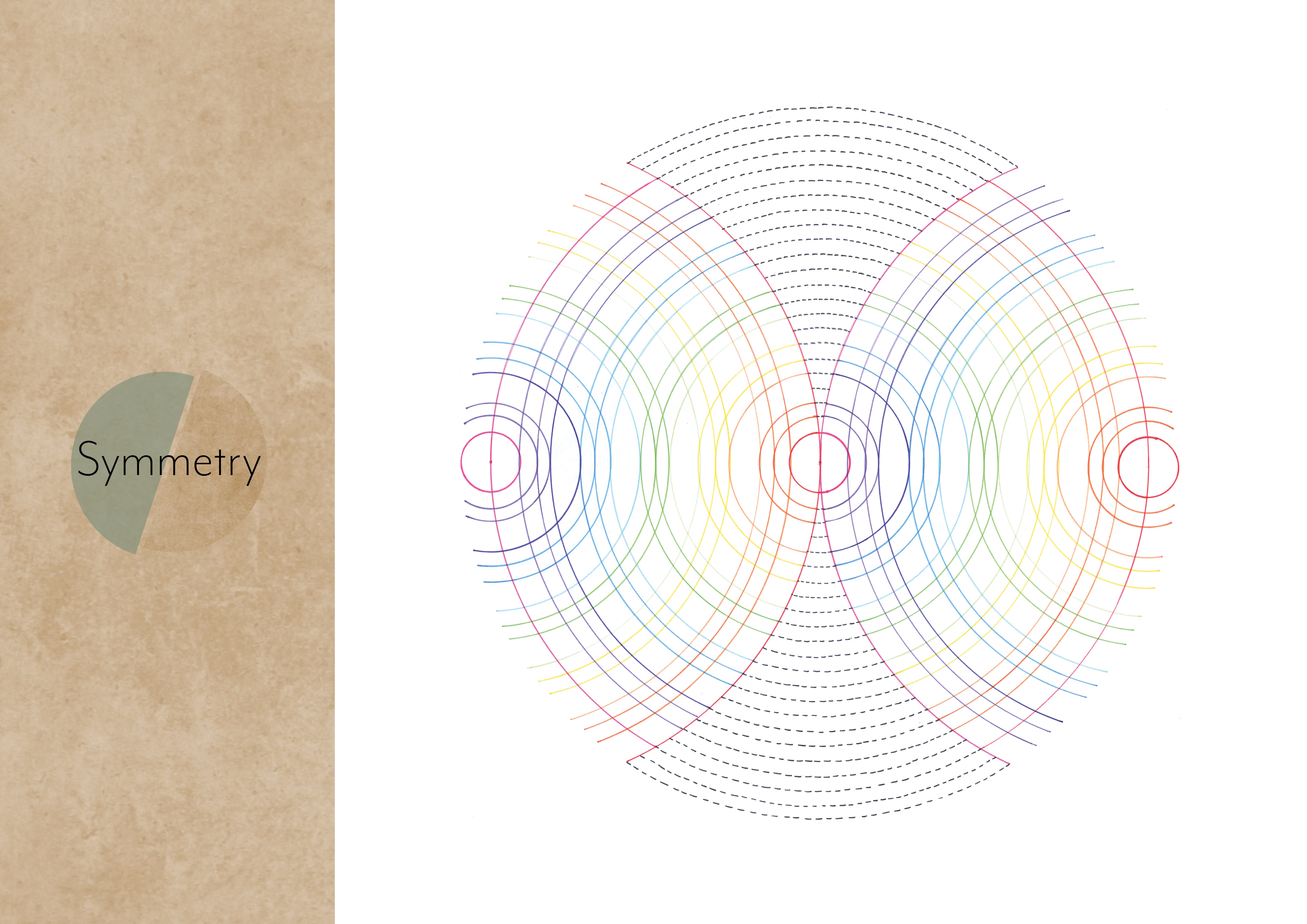
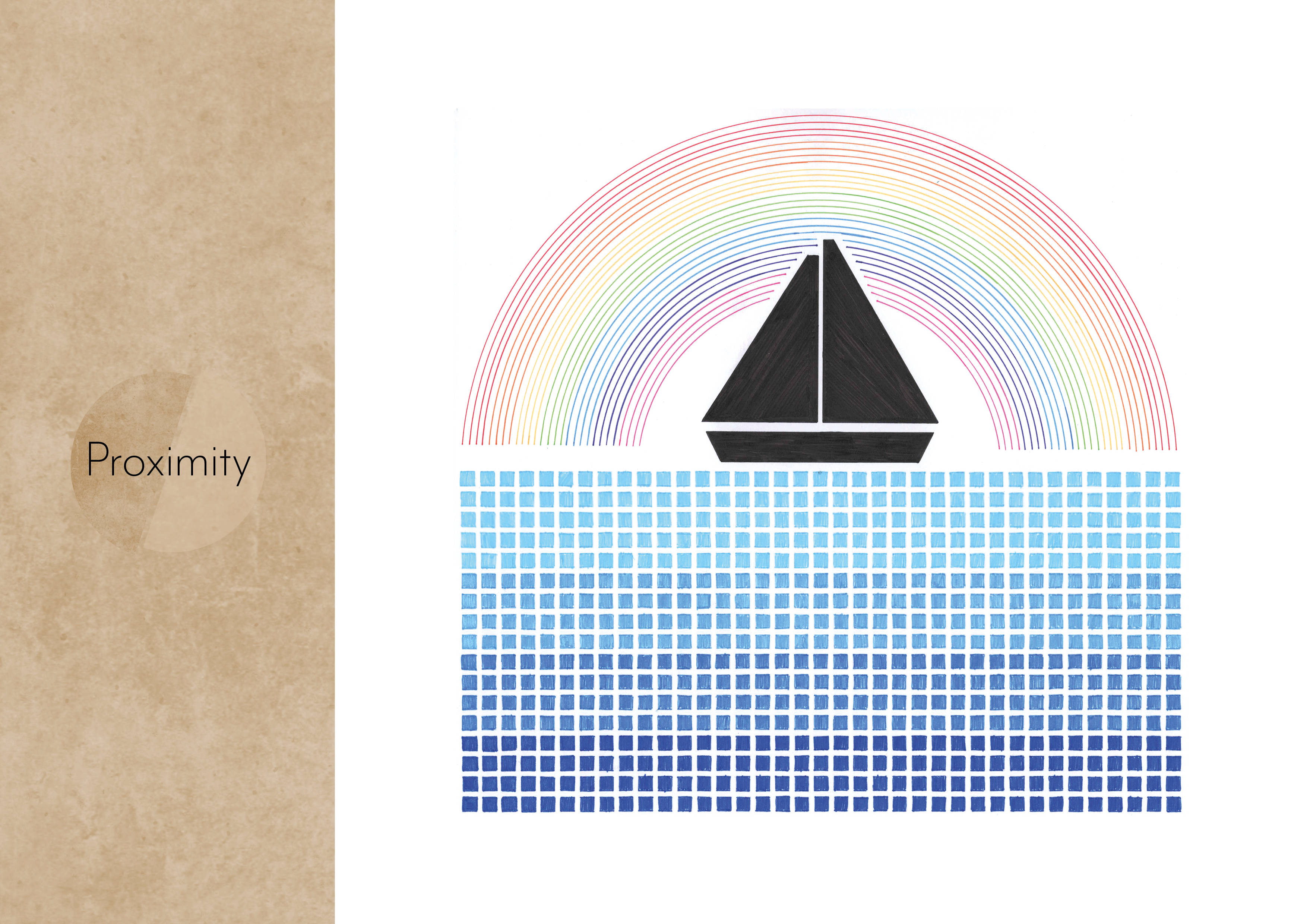
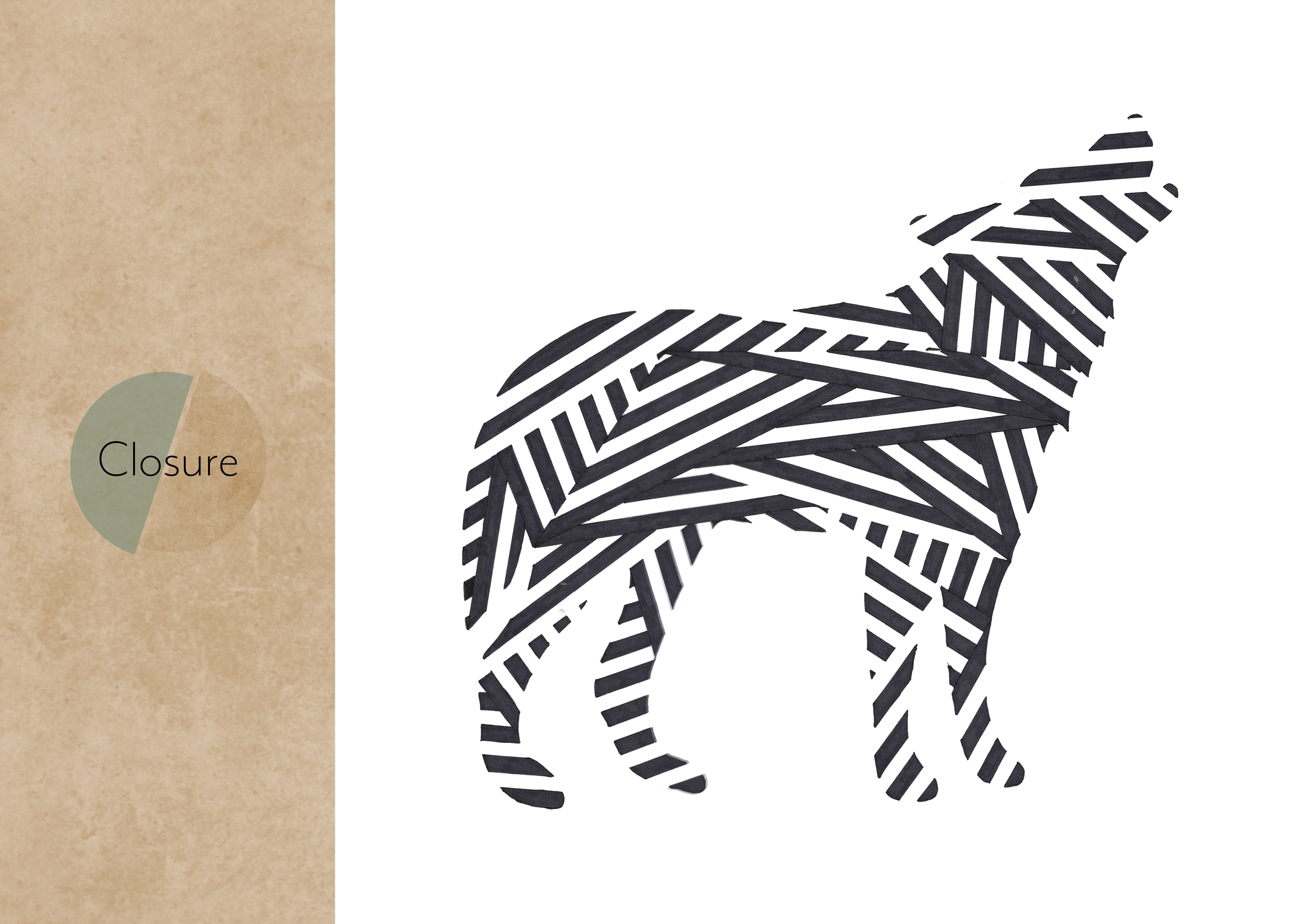
For this assignment we had to research the 8 different design principles: Figure/ground, Continuation, Closure, Proximity, Similarity, Symmetry, Common fate and Prägnanz. Then we had to choose three of these principles and make an illustration of each of them. Each item had to be 25x25cm.
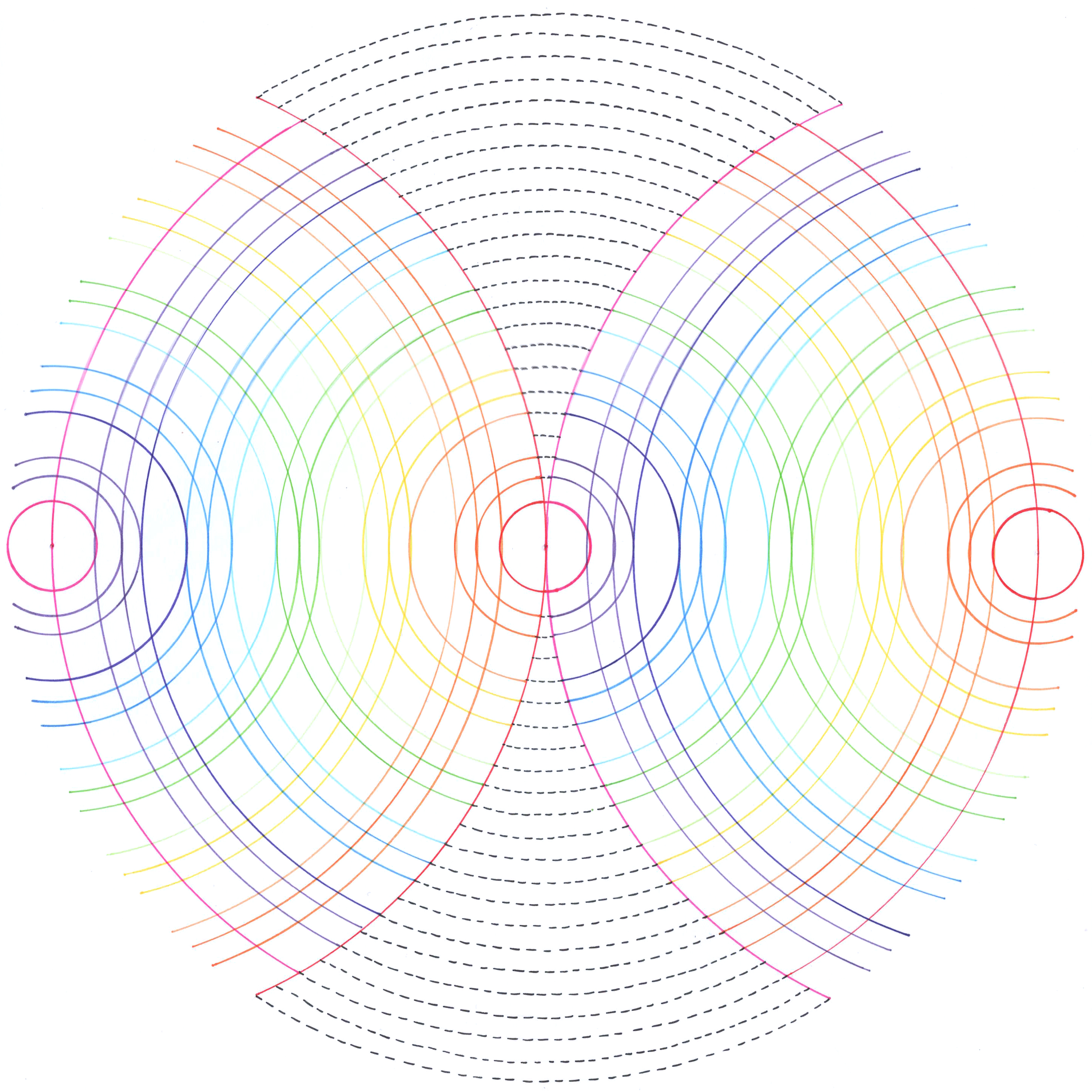
Symmetry 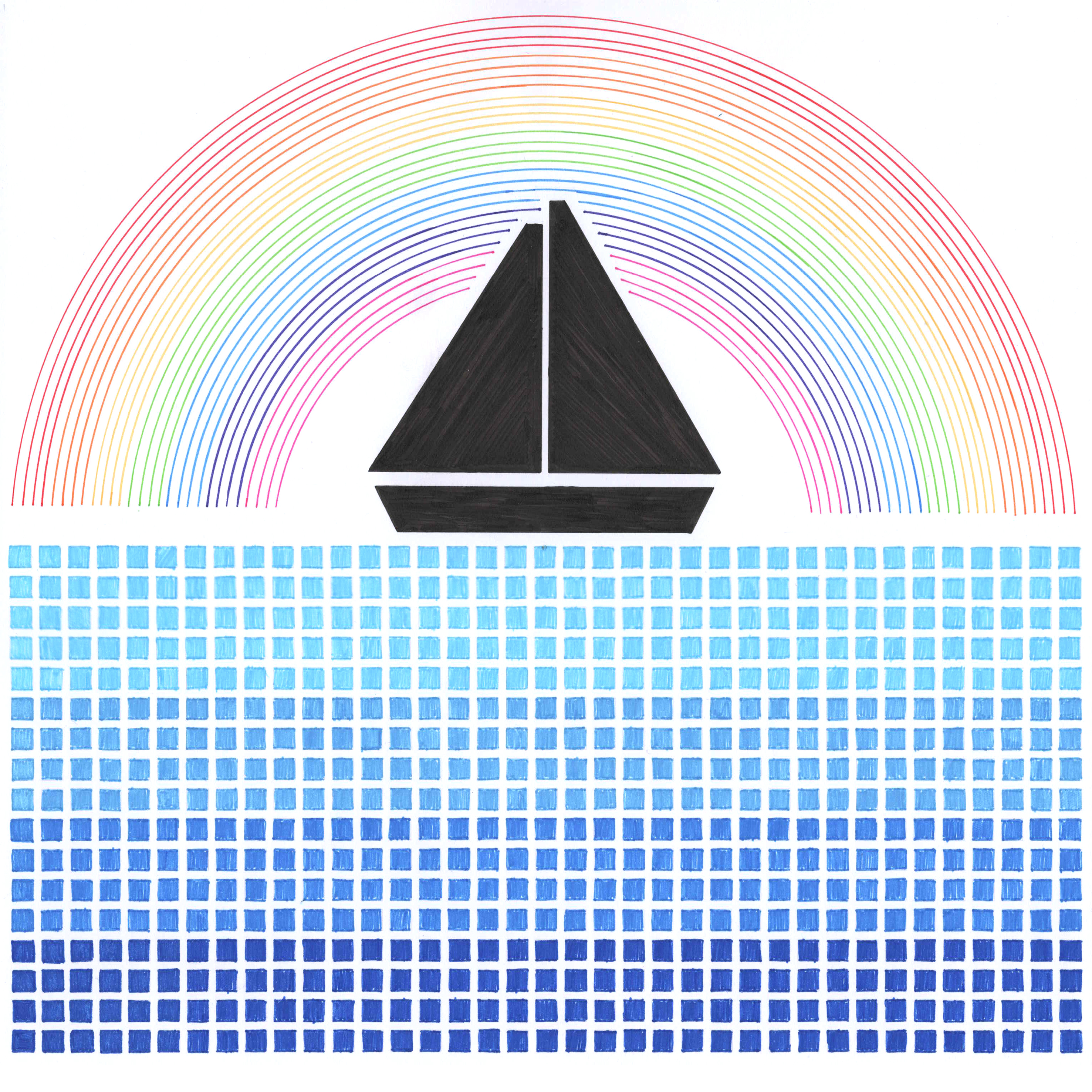
Proximity 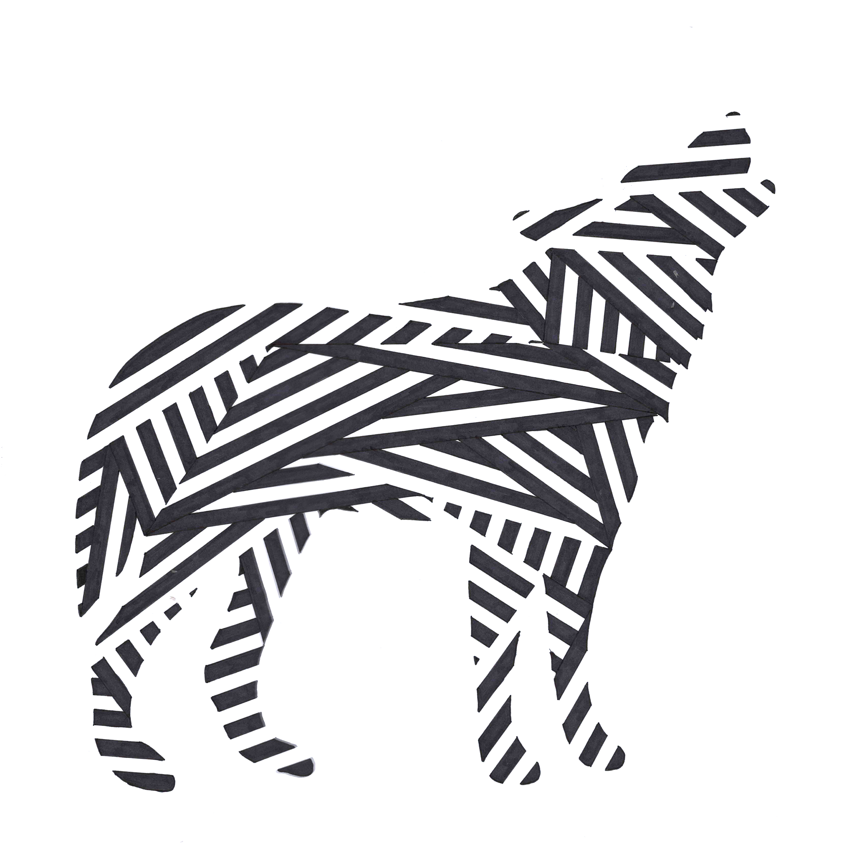
Closure
AW12 – Print Preparation – LT. Question 3
Homework (2 days)
- Watch the videos provided below
- Complete the LinkedIn Learning exercise files and submit it with your assignment
Designing a Magazine Layout With Nigel French


Learning Print Production With Claudia McCue


AW12 – Print Preparation – LT. Question 2
Research, written and practical assignment (problem solving)
- Use the magazine style brochure that you designed in Module 5. Add a spot varnish to the cover and change the design to use spot colours. (You are welcome also make layout changes if you want to.) For your magazine, use a spot varnish for the cover and design it using two spot colours.
- Make use of your checklist that you designed and prepare the file for print.
- Decide what paper weight and type you will use.
- Decide what type of binding you will use, for example, saddle stich, perfect bind, etc. (See the printing terms link.)
- Upload the print-ready PDF to your blog and post screenshots of your packaged files, and instructions.
Make sure to include the instructions (like spot varnish, paper choice and binding) in the file.


AW12 – Print Preparation – LT. Question 1
Design your own printing checklist form.


AW10 – Layout – LT. Design of layout in InDesign
Using InDesign, design a 8-page brochure for a fictitious travel agent.
- The size of the brochure should be A5 (when it is folded).
- Design the brochure in full colour.
- Use fake body copy but create sensible headings.
- Use titles, headings and images of your choice.
- Be sure to pay attention to:
- Choice of type
- Choice of imagery
- Use of layout and grid to communicate the content.
This is the best task to now, I really enjoyed doing this task!
For this I wanted to make a travel brochure for Dovre National Park, the wildlife edition. I wanted to make a seasonal edition where you can read about the different seasons, and what you are able to see throughout the four seasons.
I’ve used the same photo for the frontside and the backside, so if you fold it out you can see the whole photo.
Page two is the overall info about exploring the wildlife at Dovre, while the third is more about how important it is to care about the welfare for both the nature and the wildlife. The photo on these two pages is my own photo from my trip there in February.
Page 4-7 is the four seasons with animals. I’ve only used one photo for each season so it wouldn’t get to much photo, what you can see of wildlife will be written under/over the photo. I used a colored rectangle under the type that I dragged into the middle to give it a more interested look.
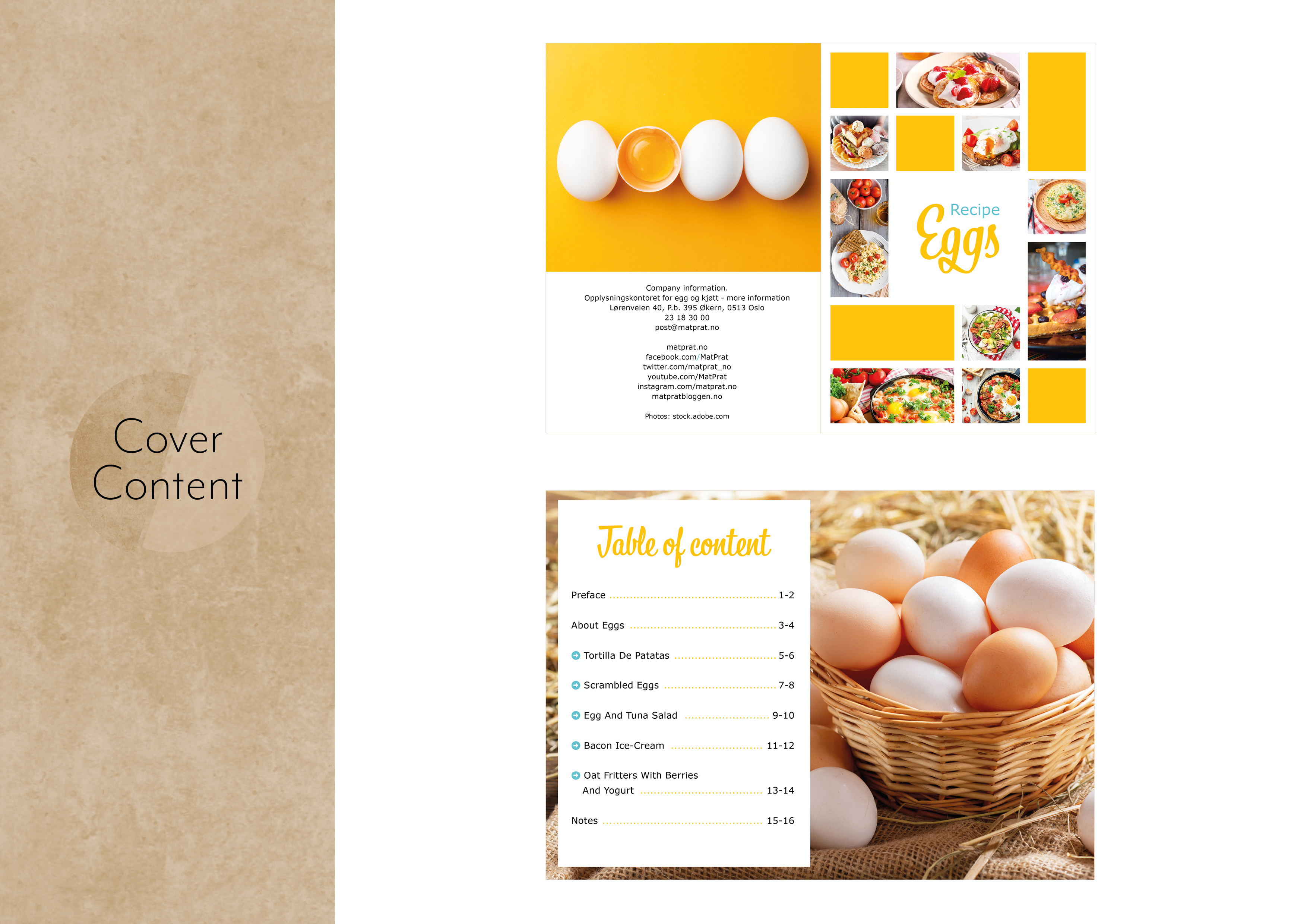
Now I’m really looking forward to starting on my egg booklet, I really like doing task like this!


All of the photos except the one that I’ve taken is from stock.adobe.