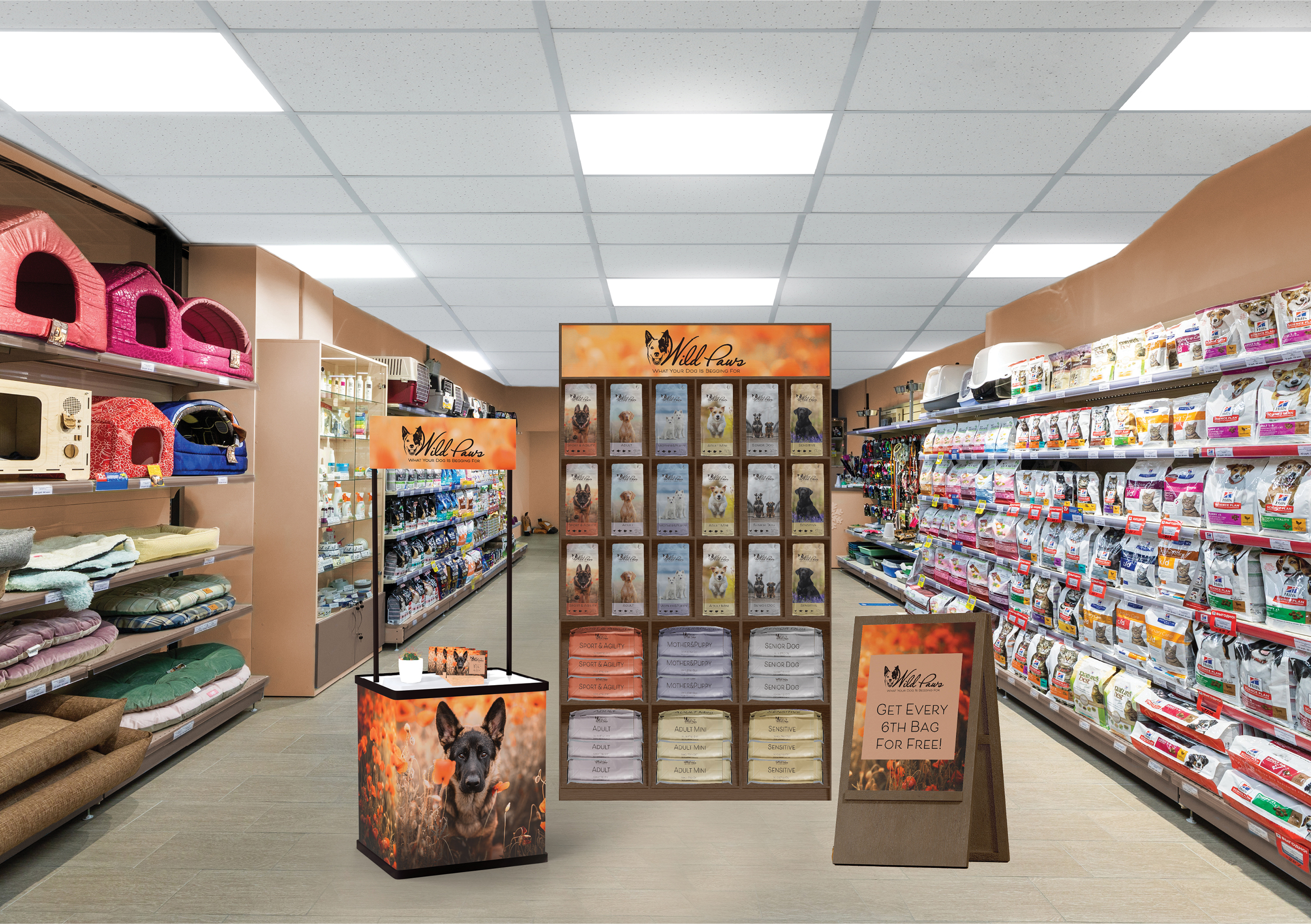
LT. Point Of Sale
Practical Assignment
Part A
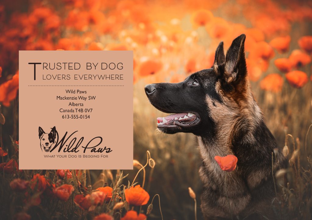
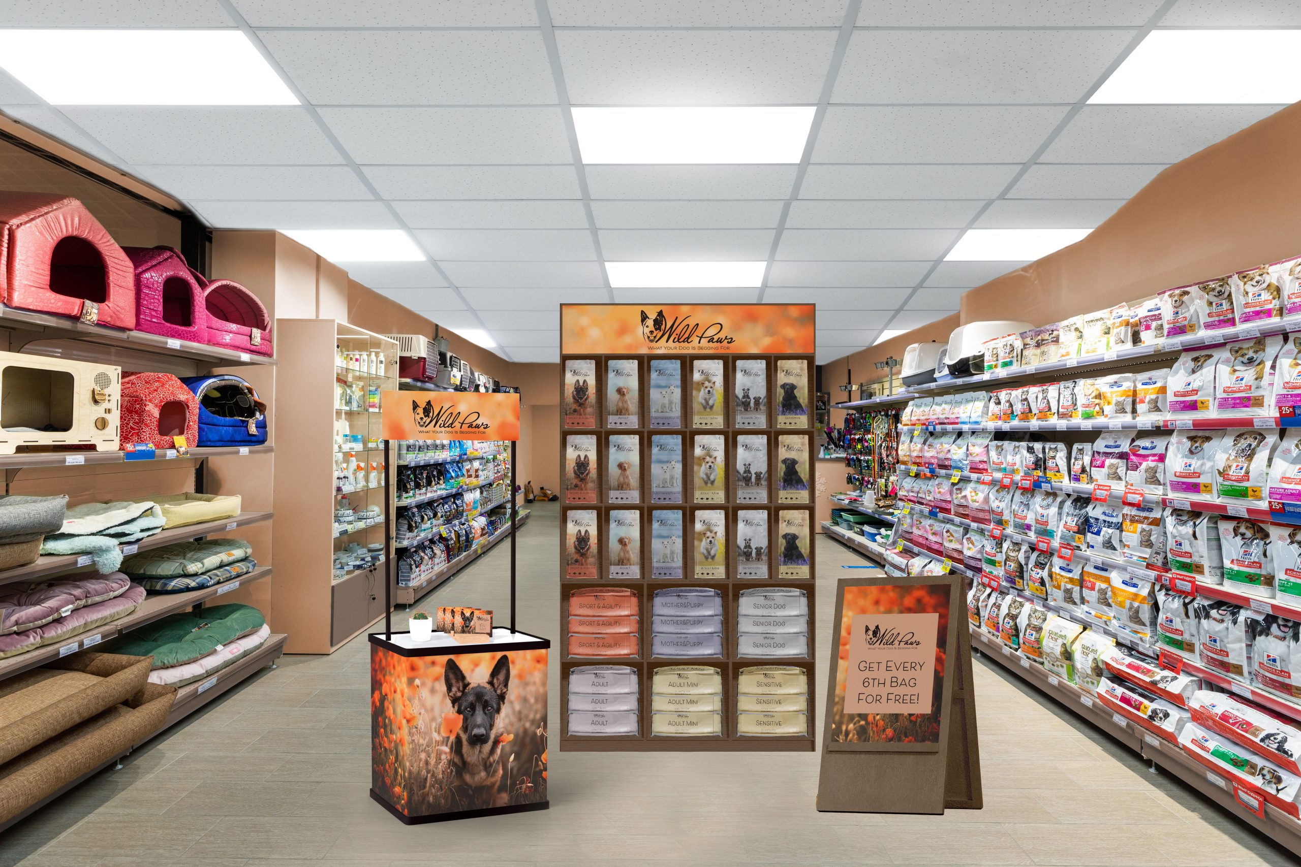
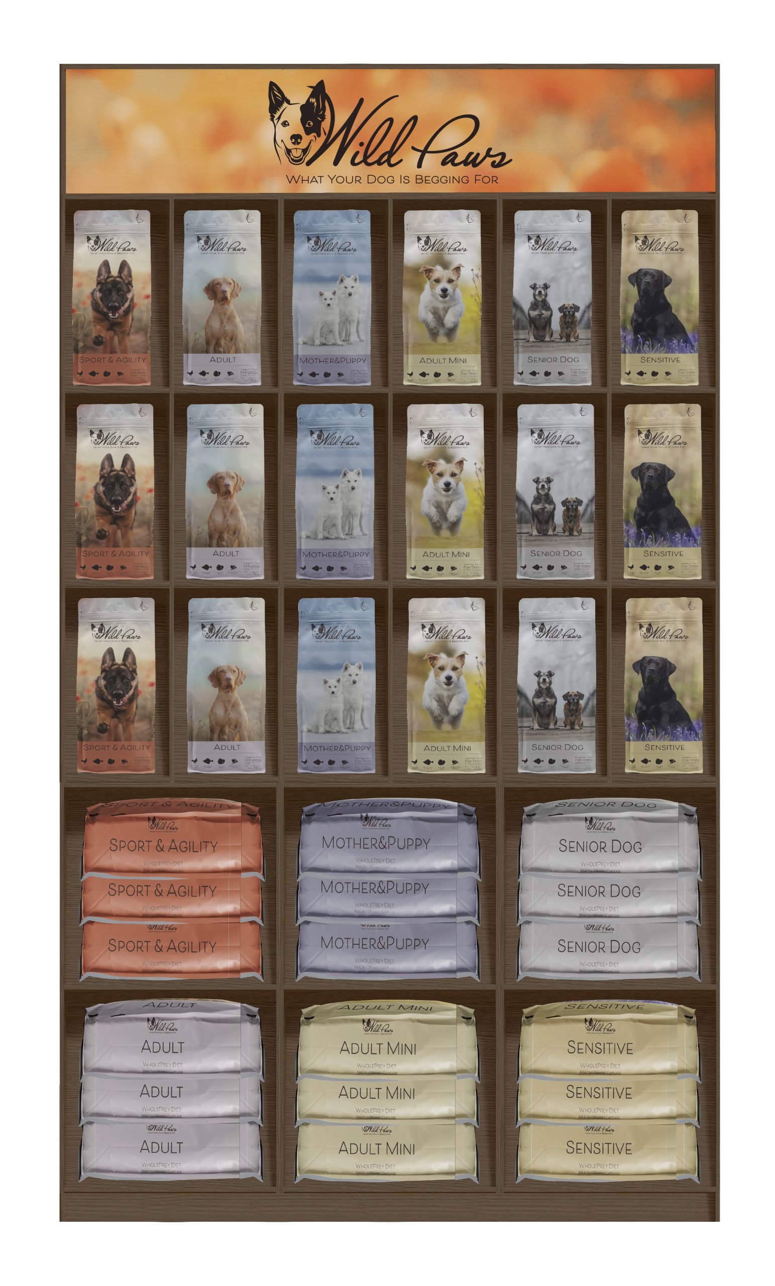
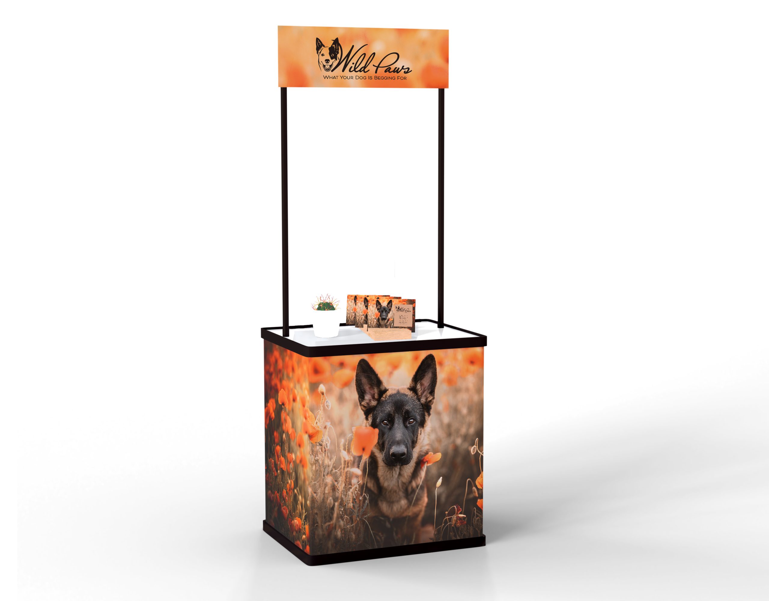
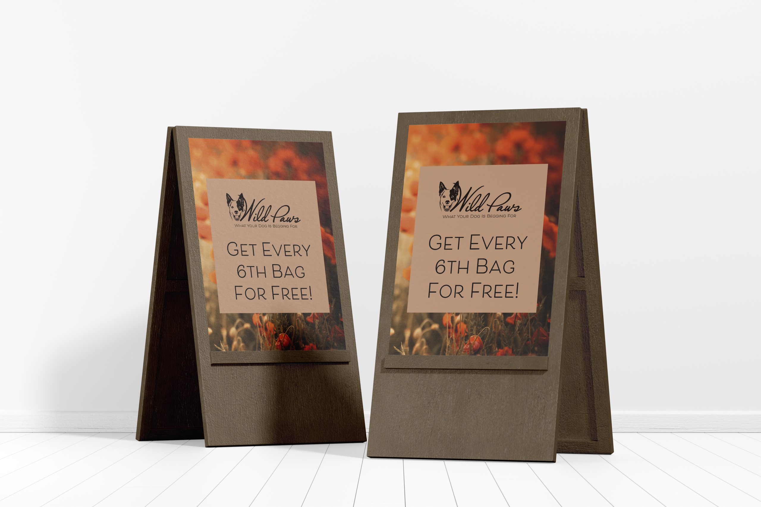
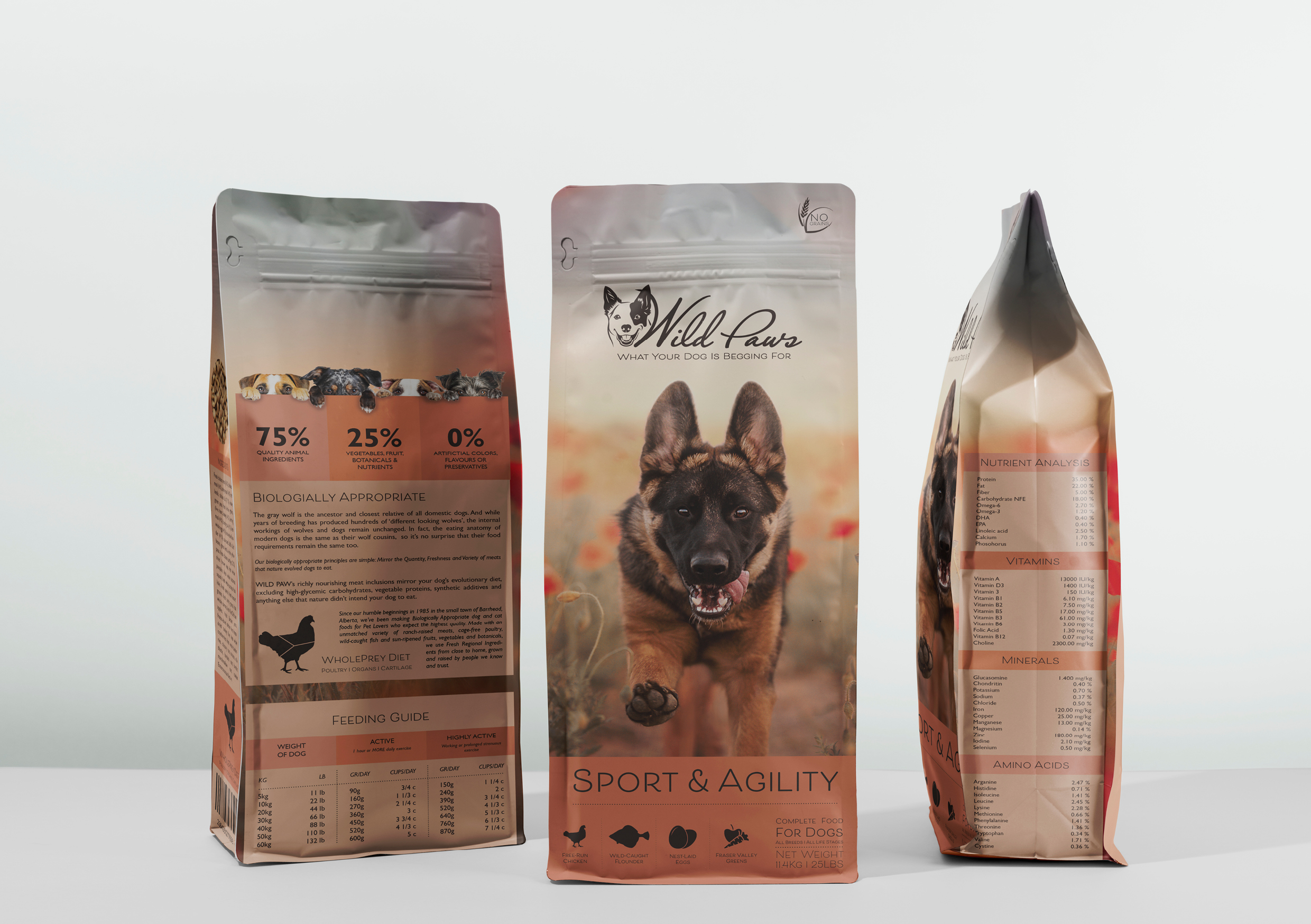
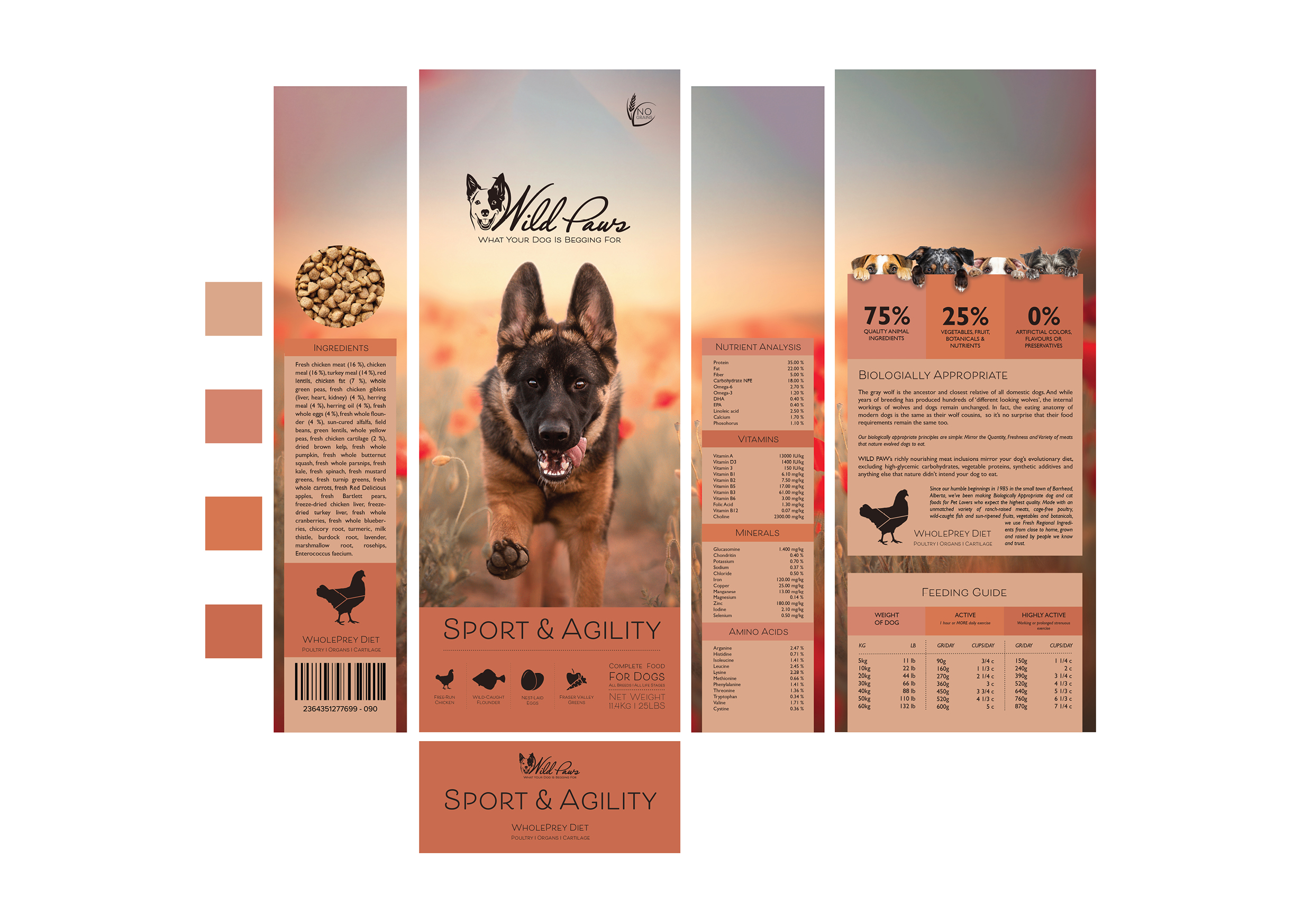
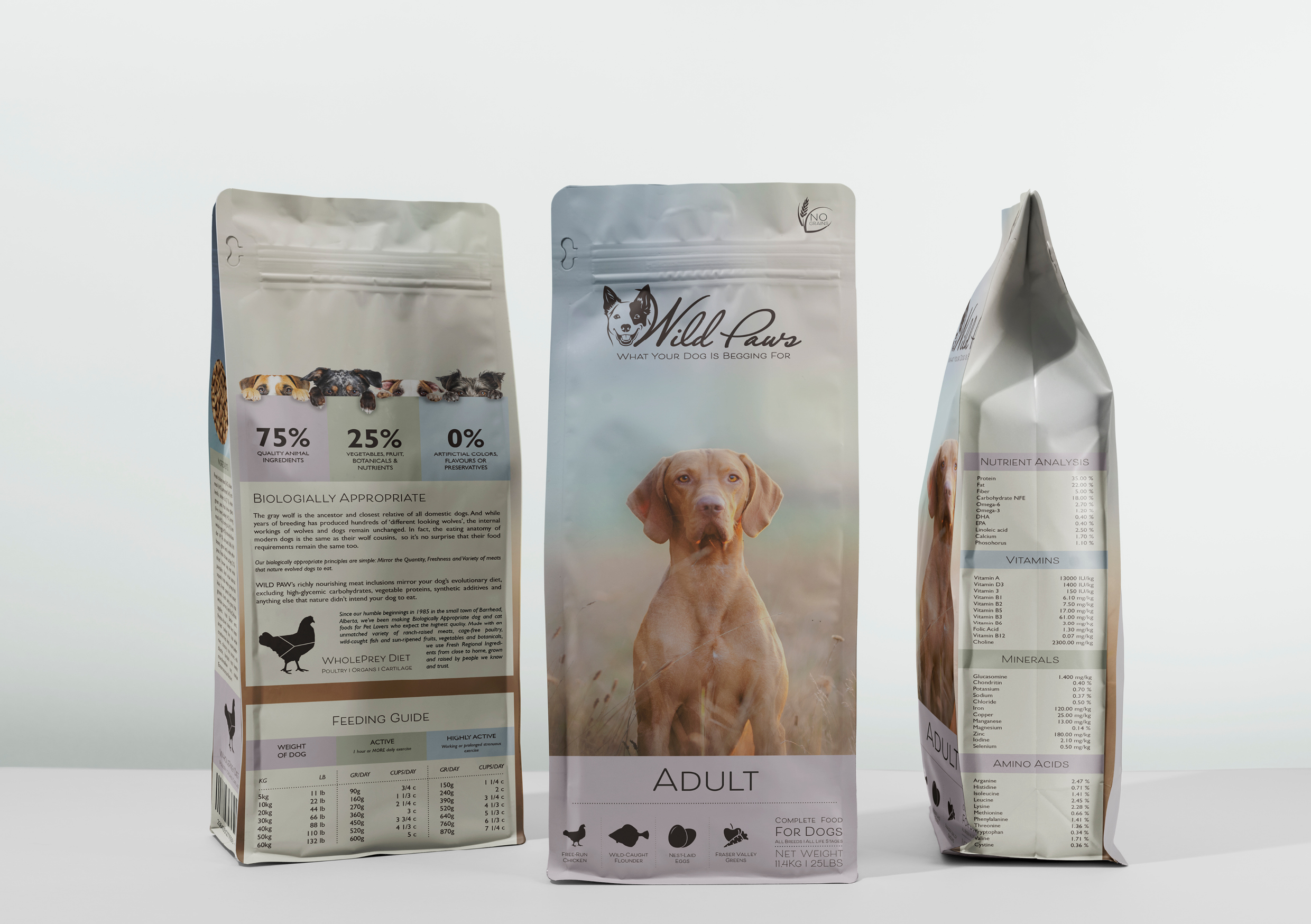
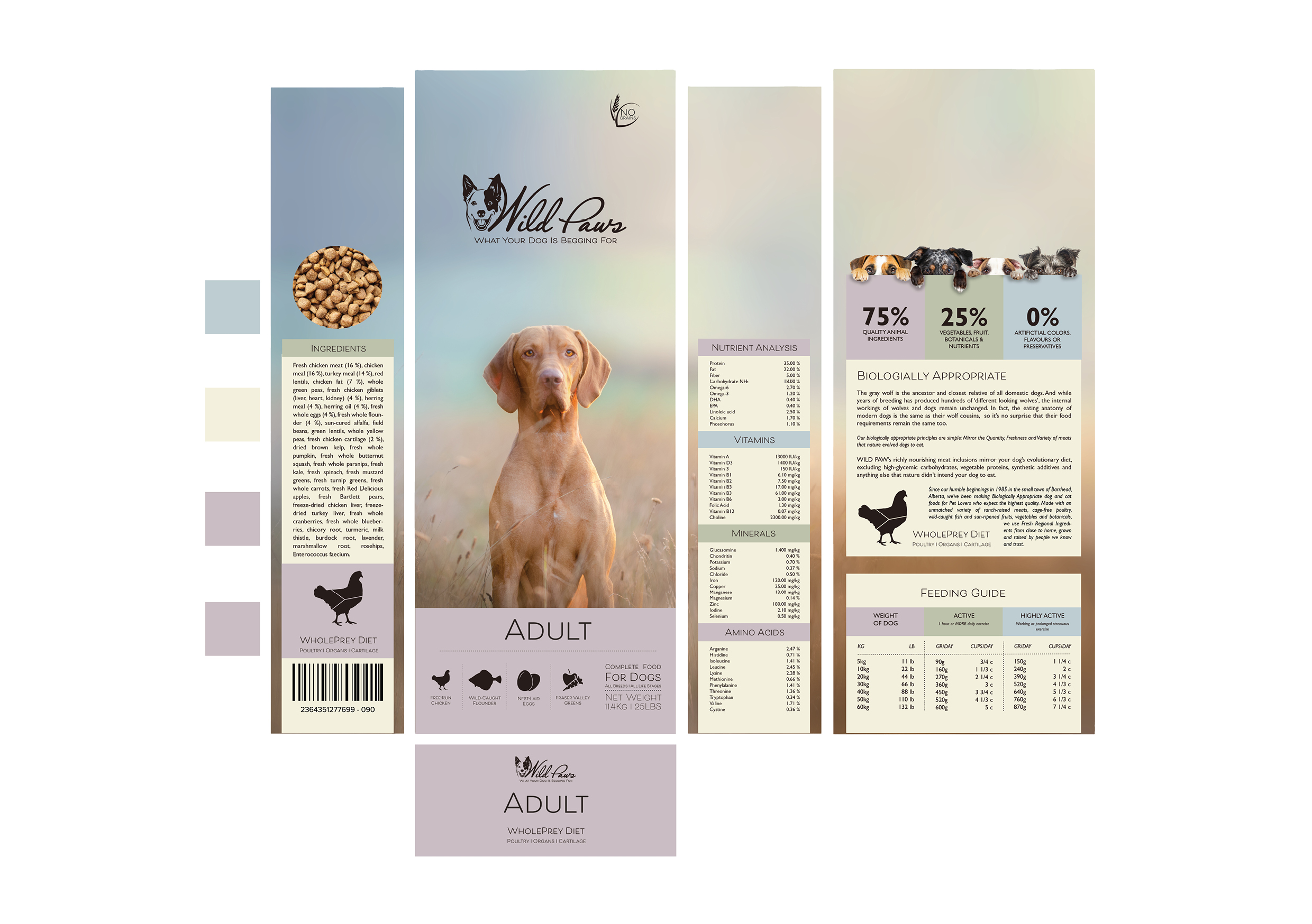
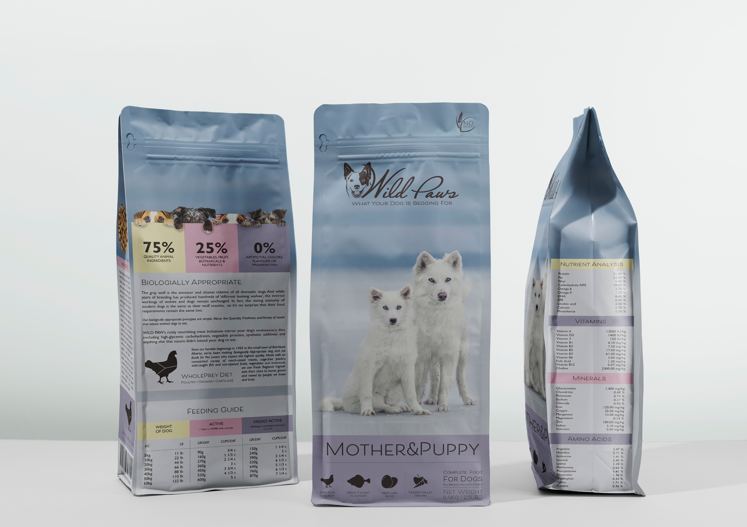
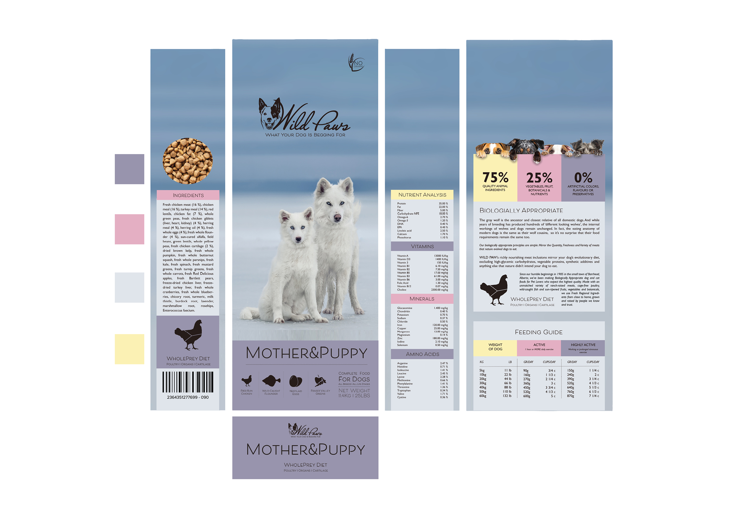
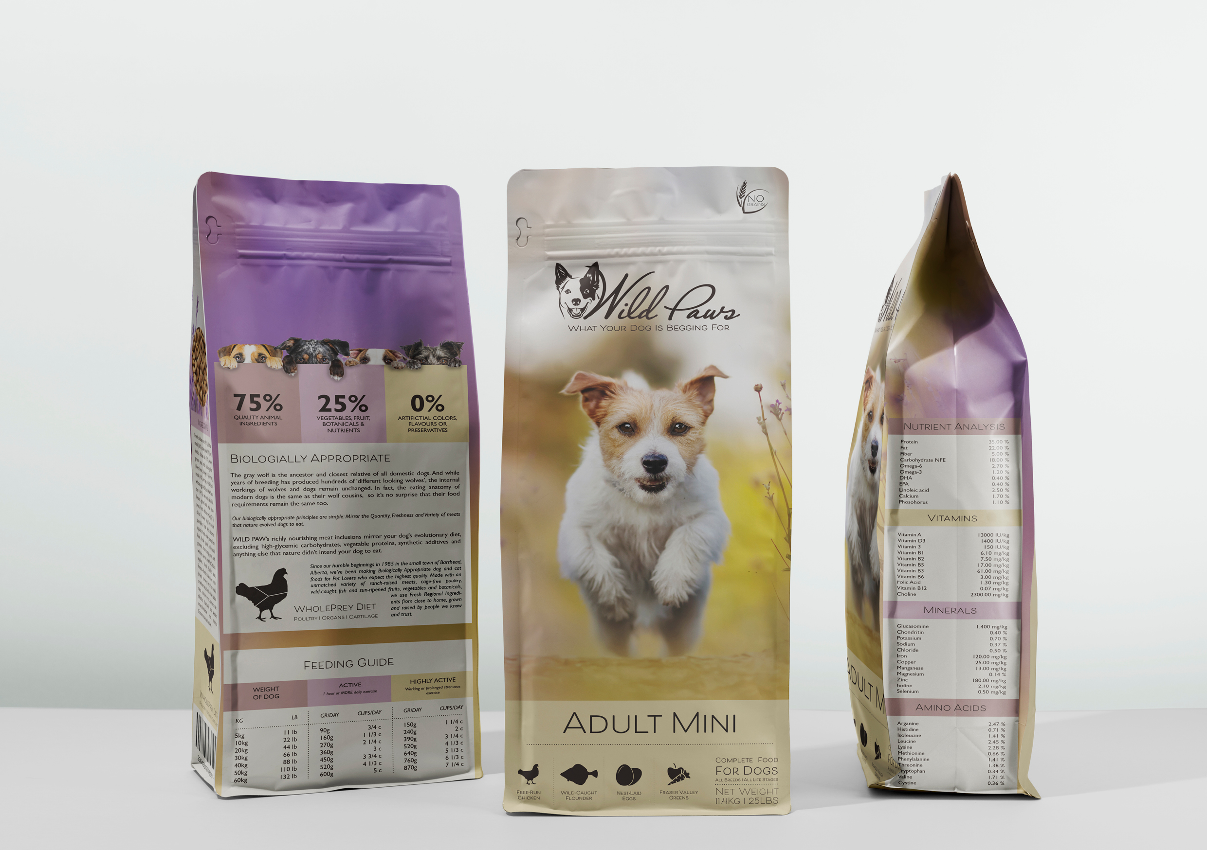
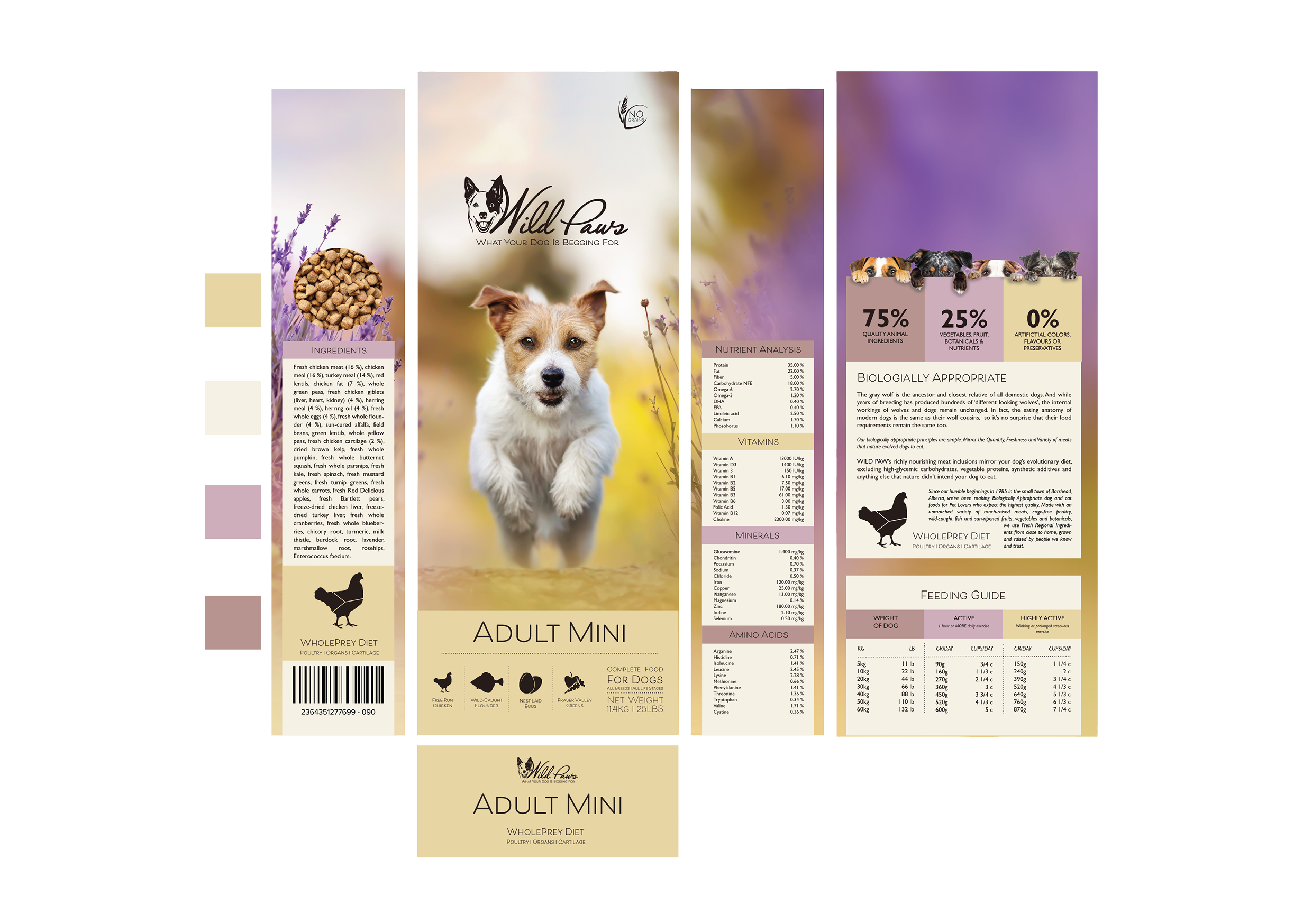
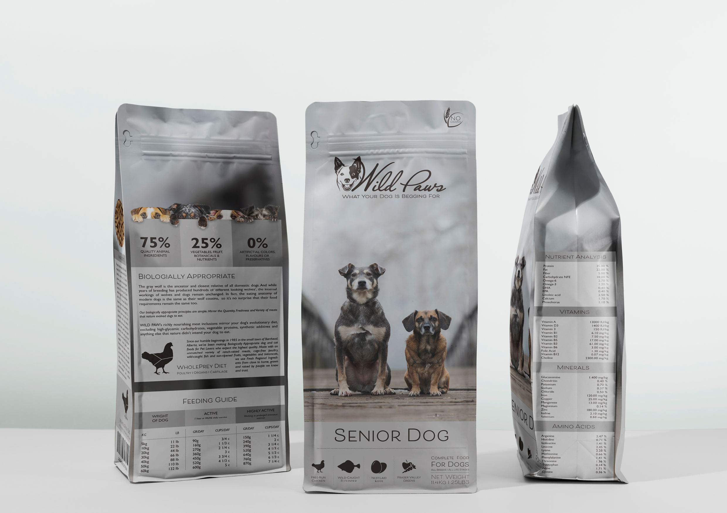
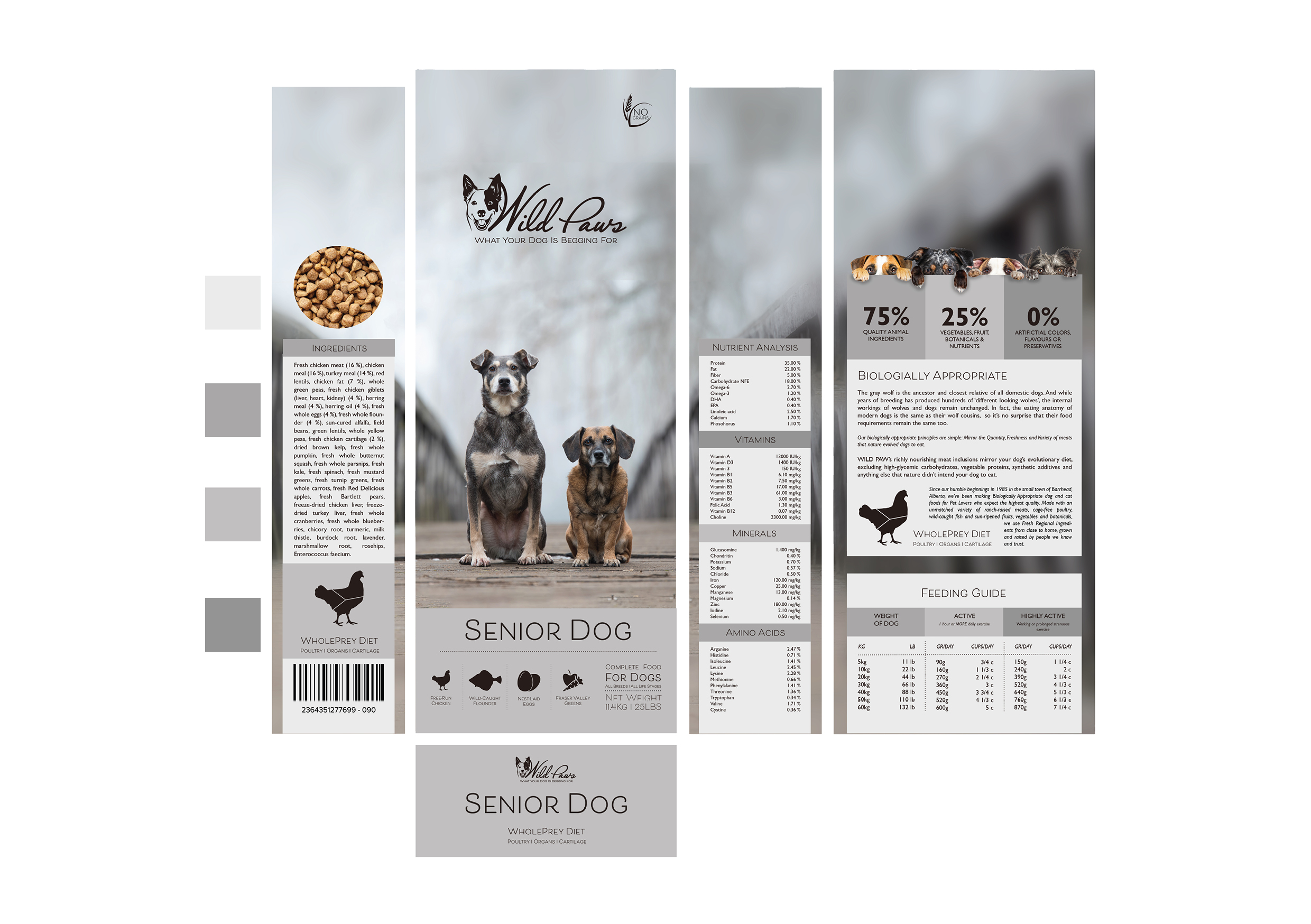
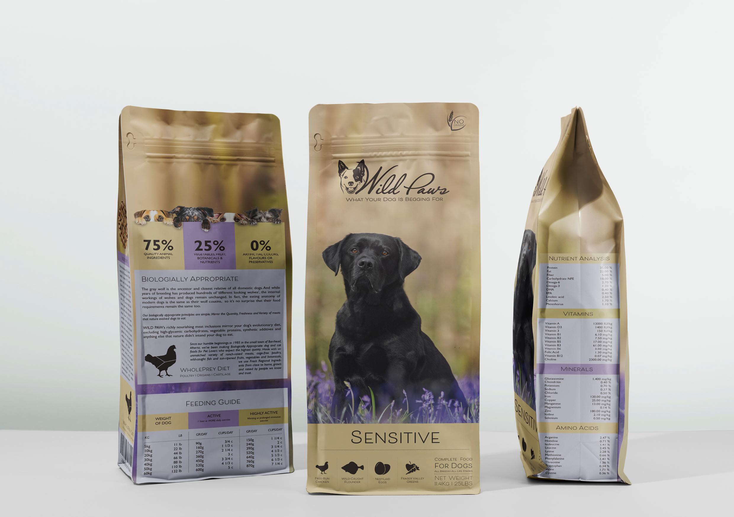
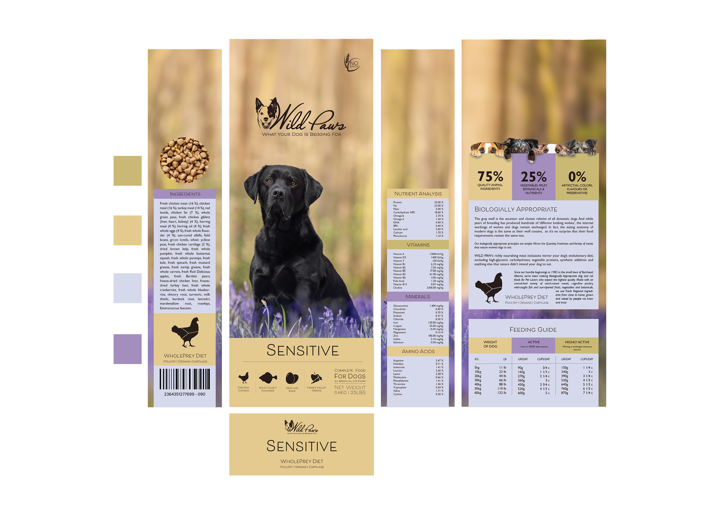
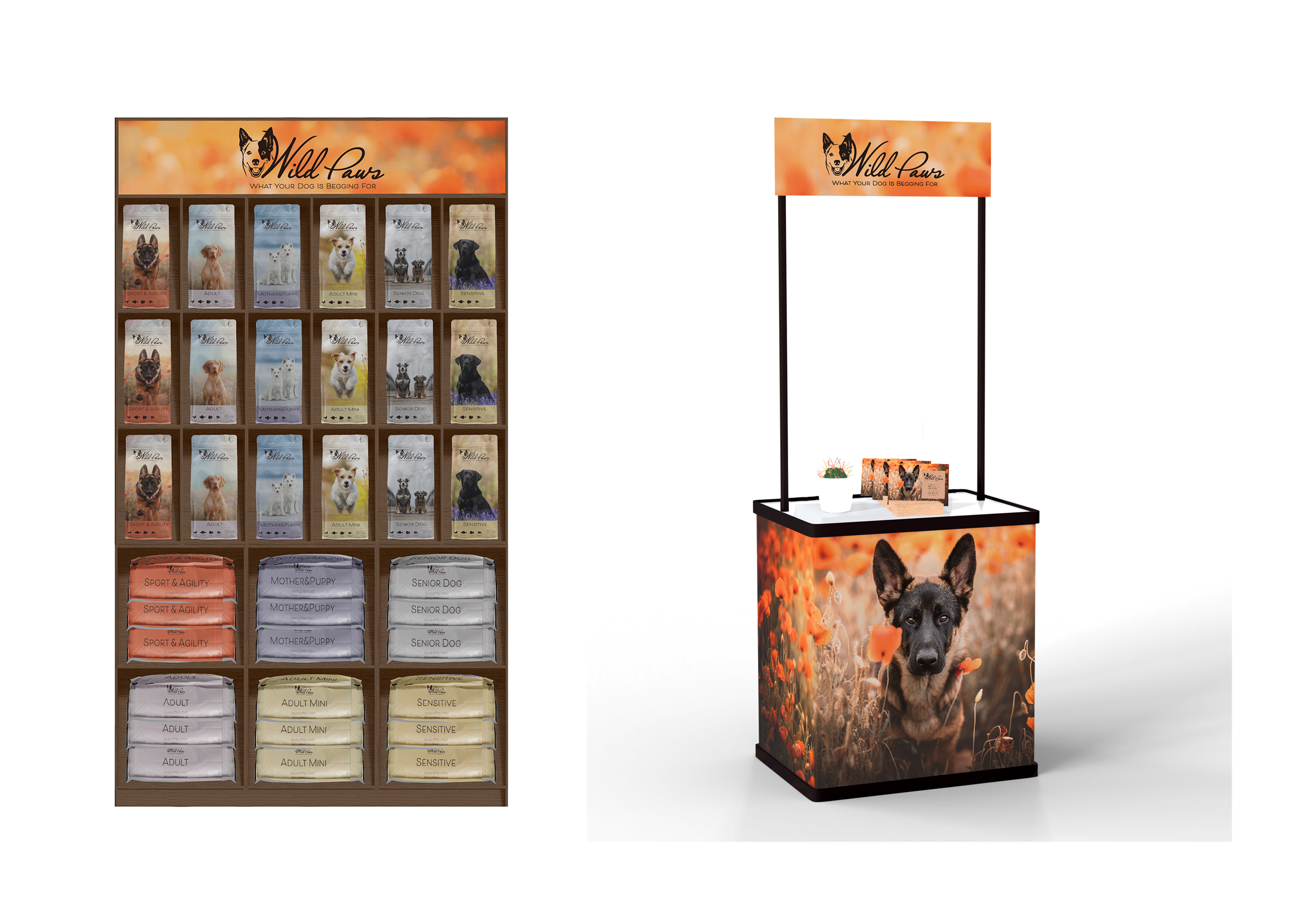
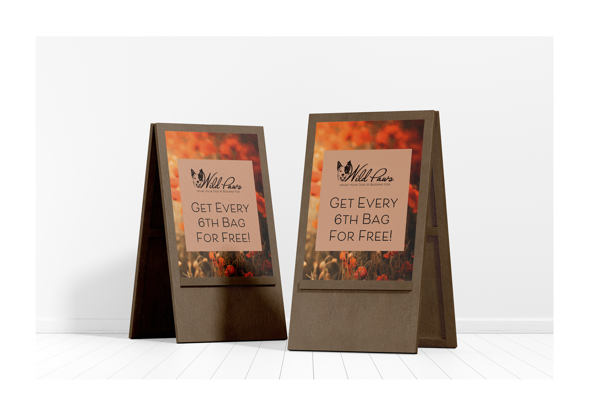
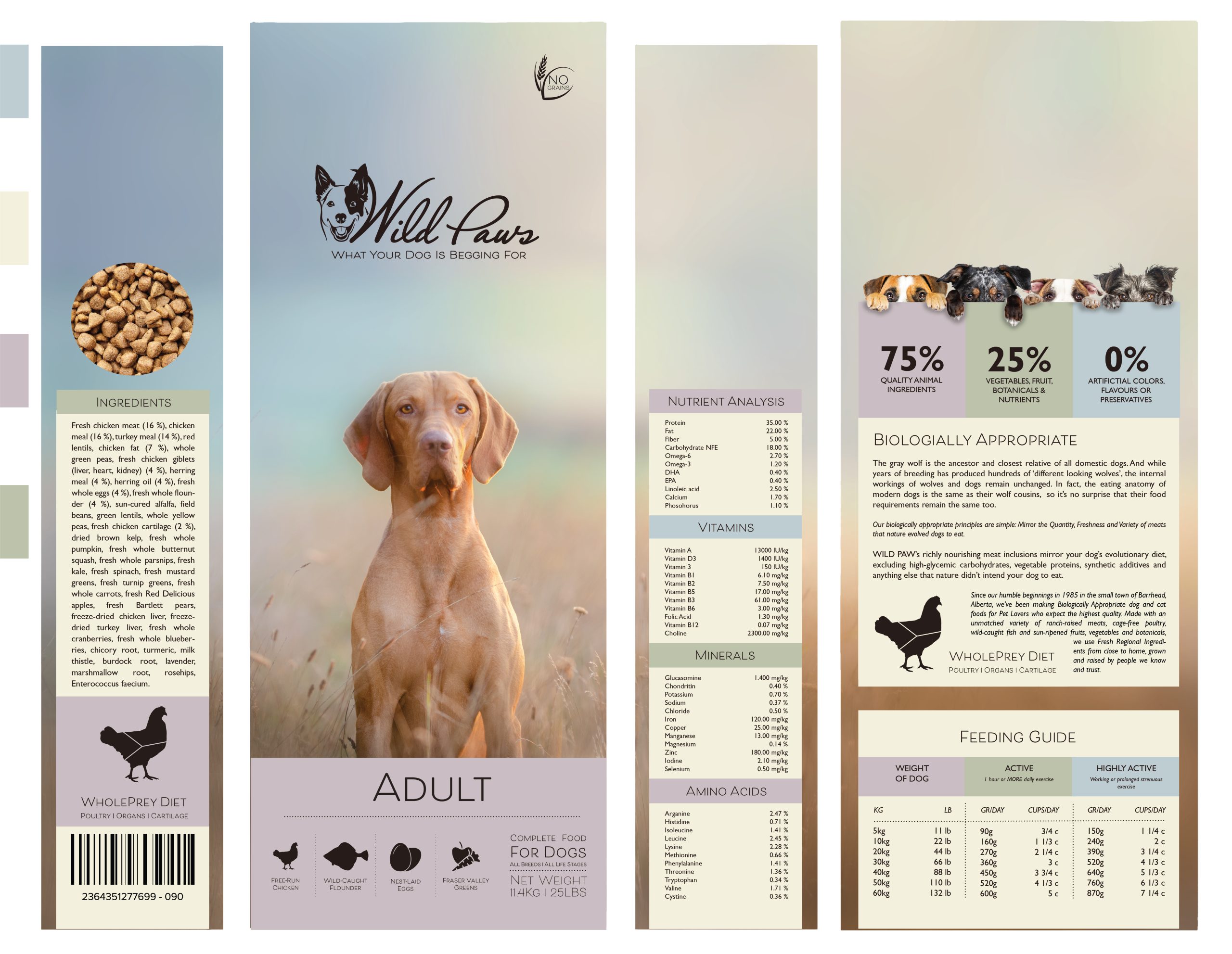
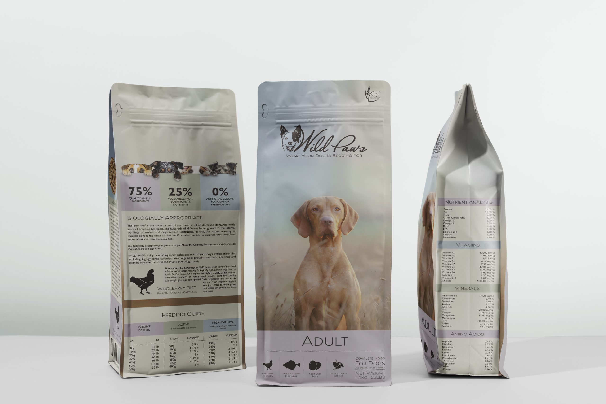
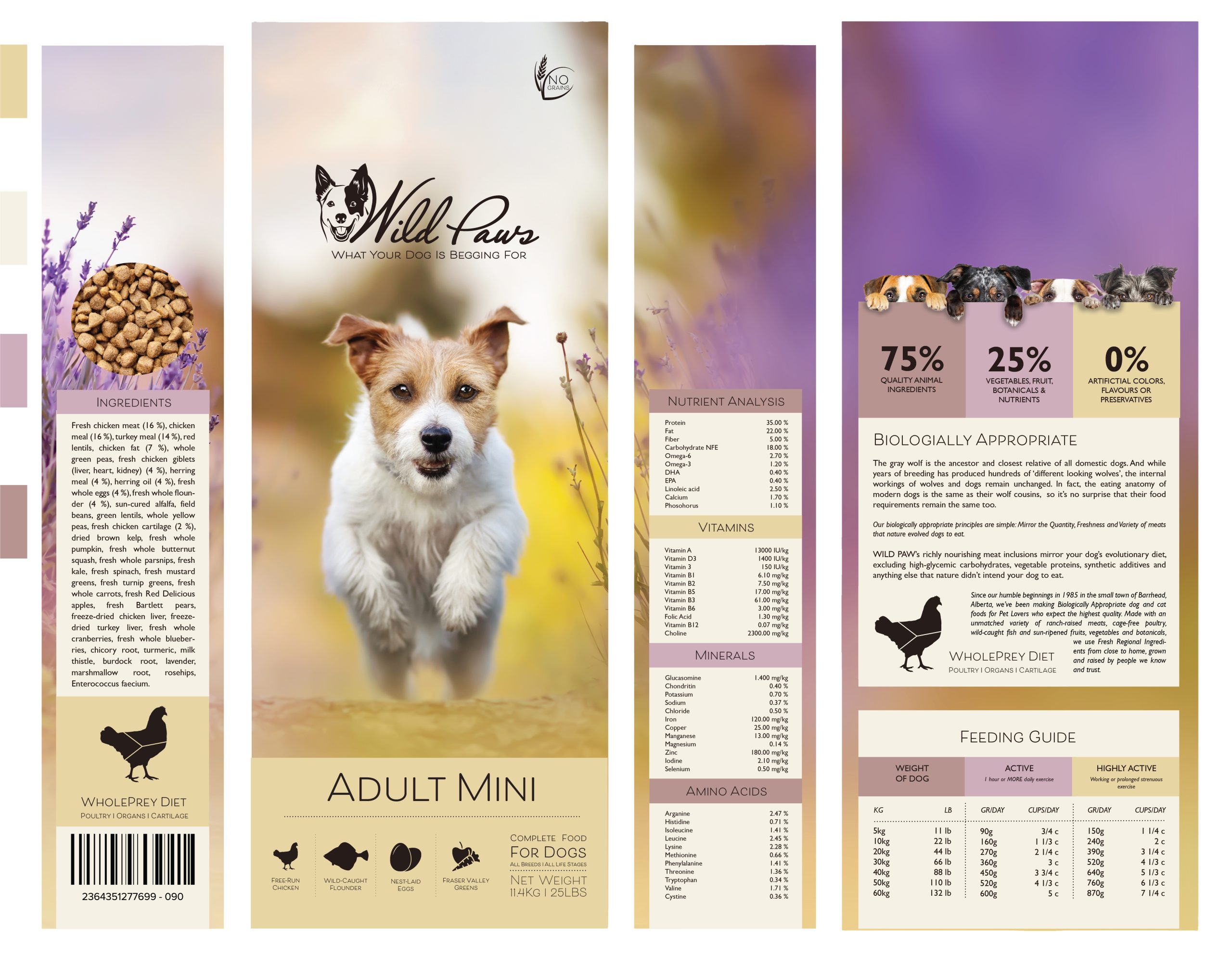
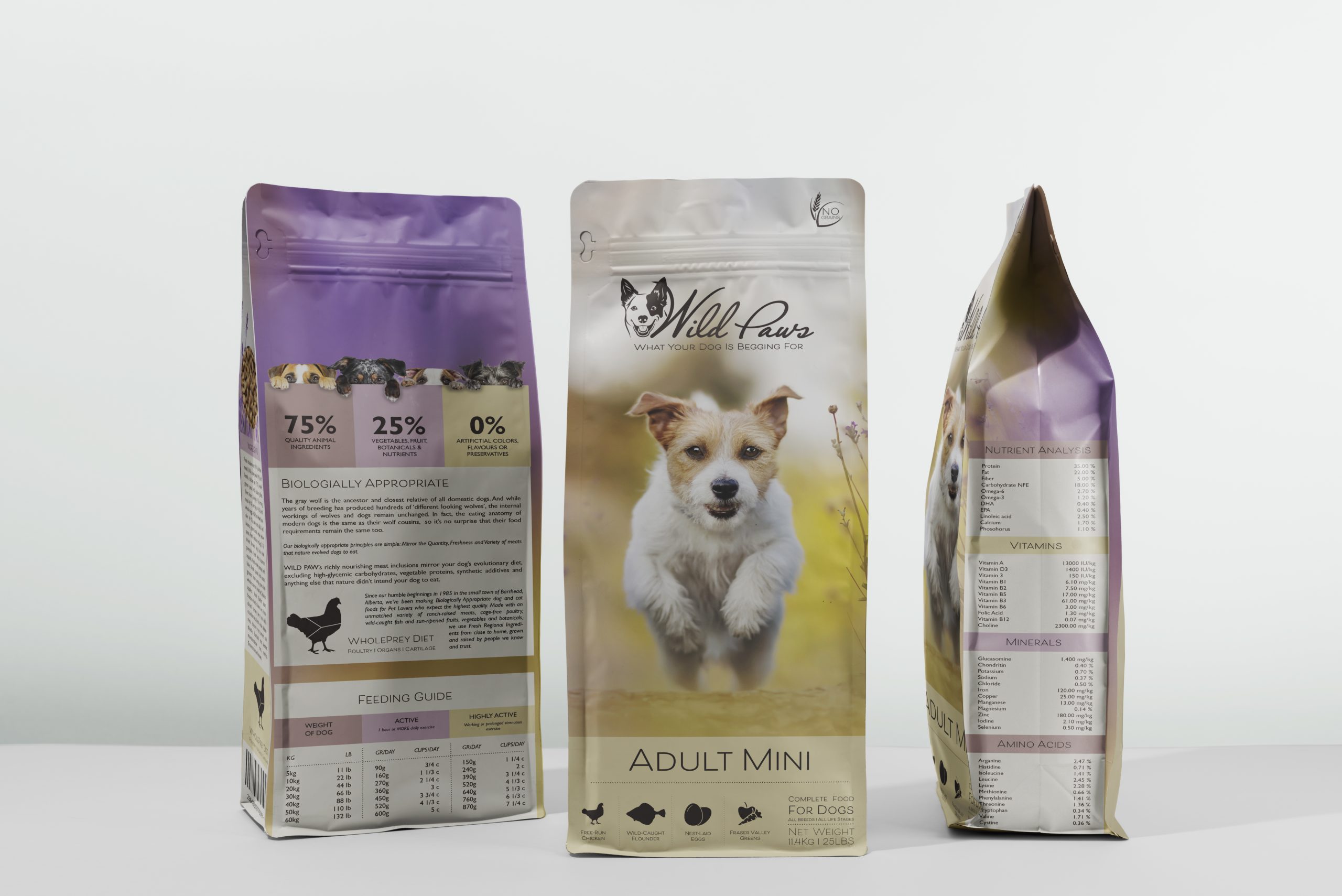
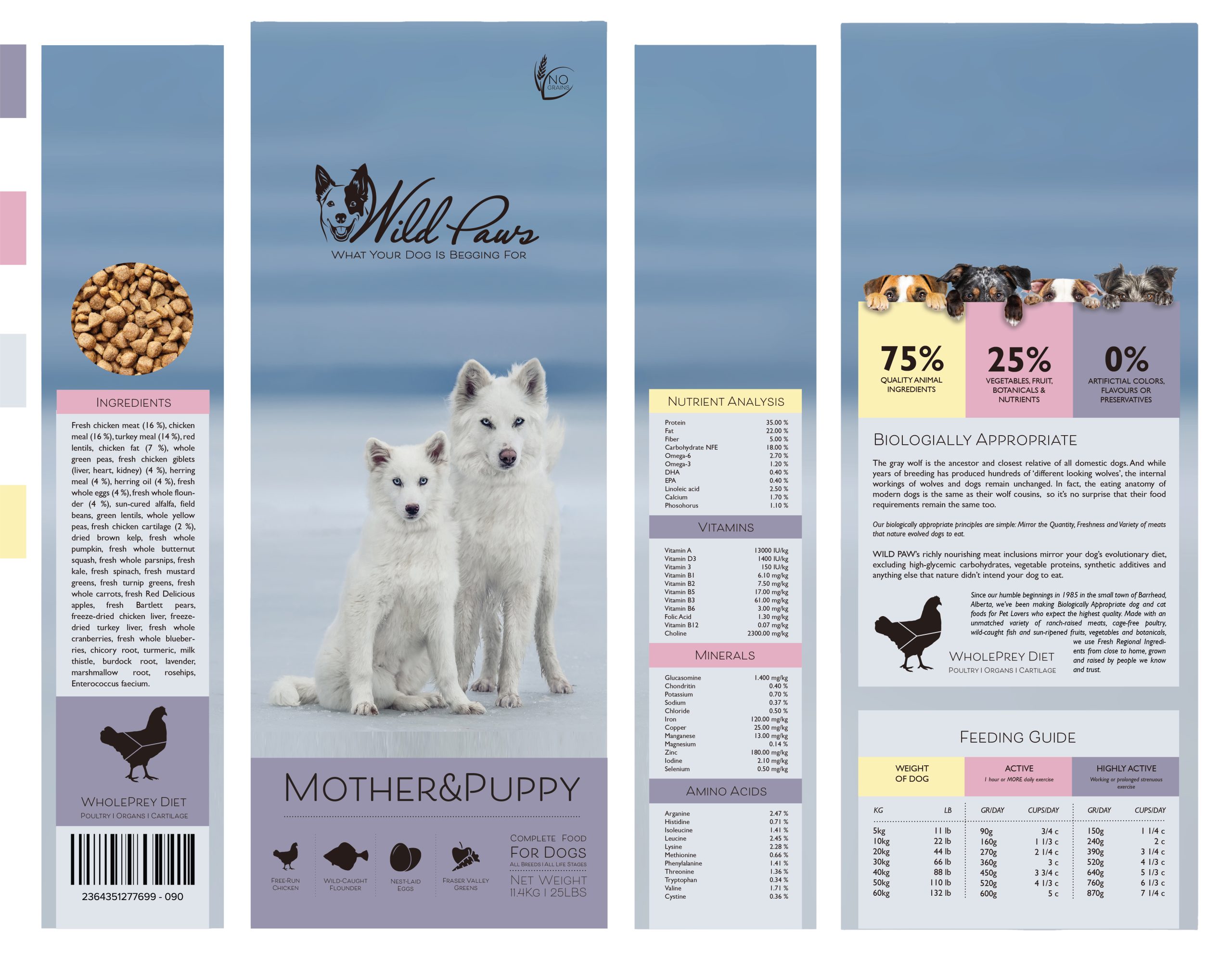
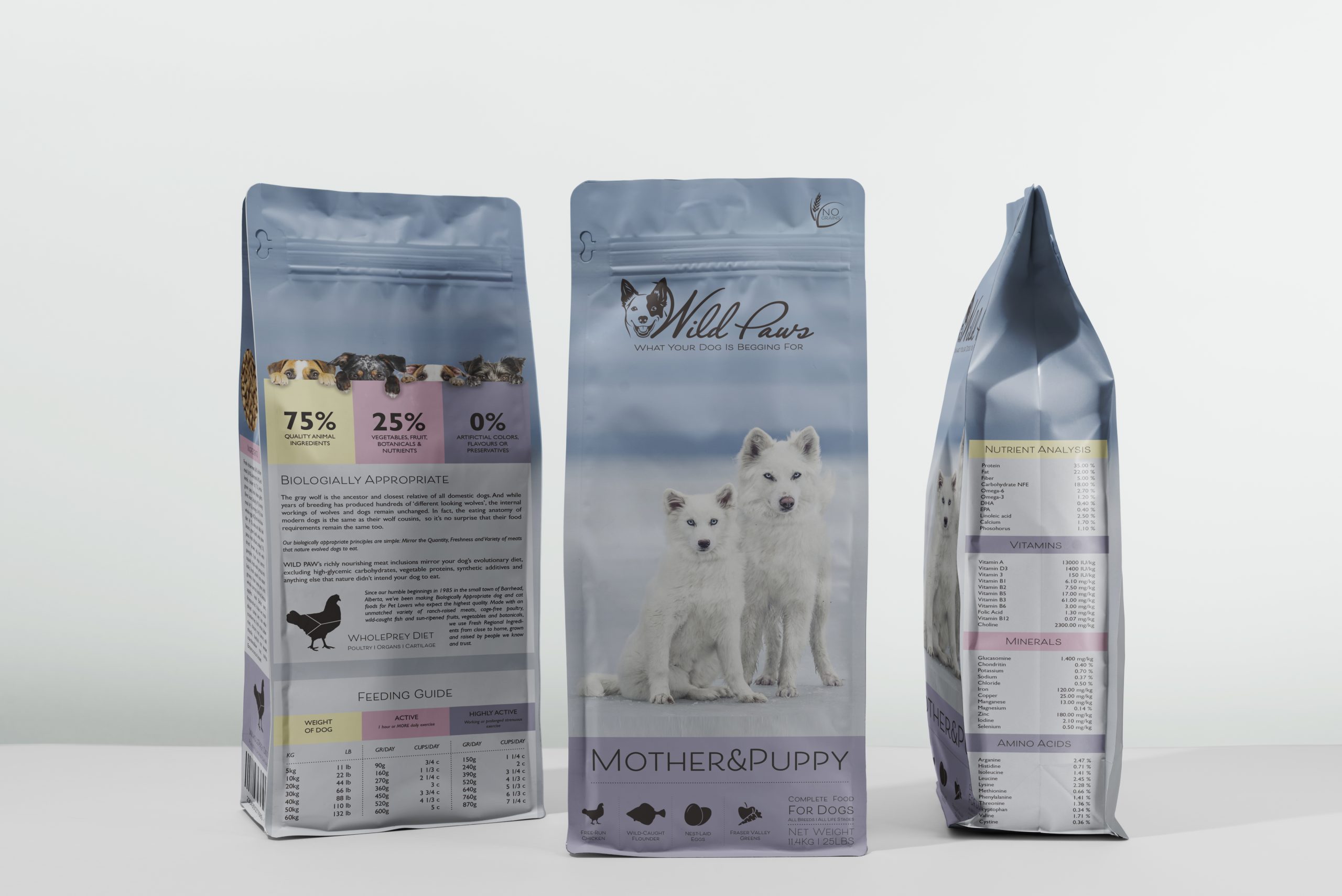
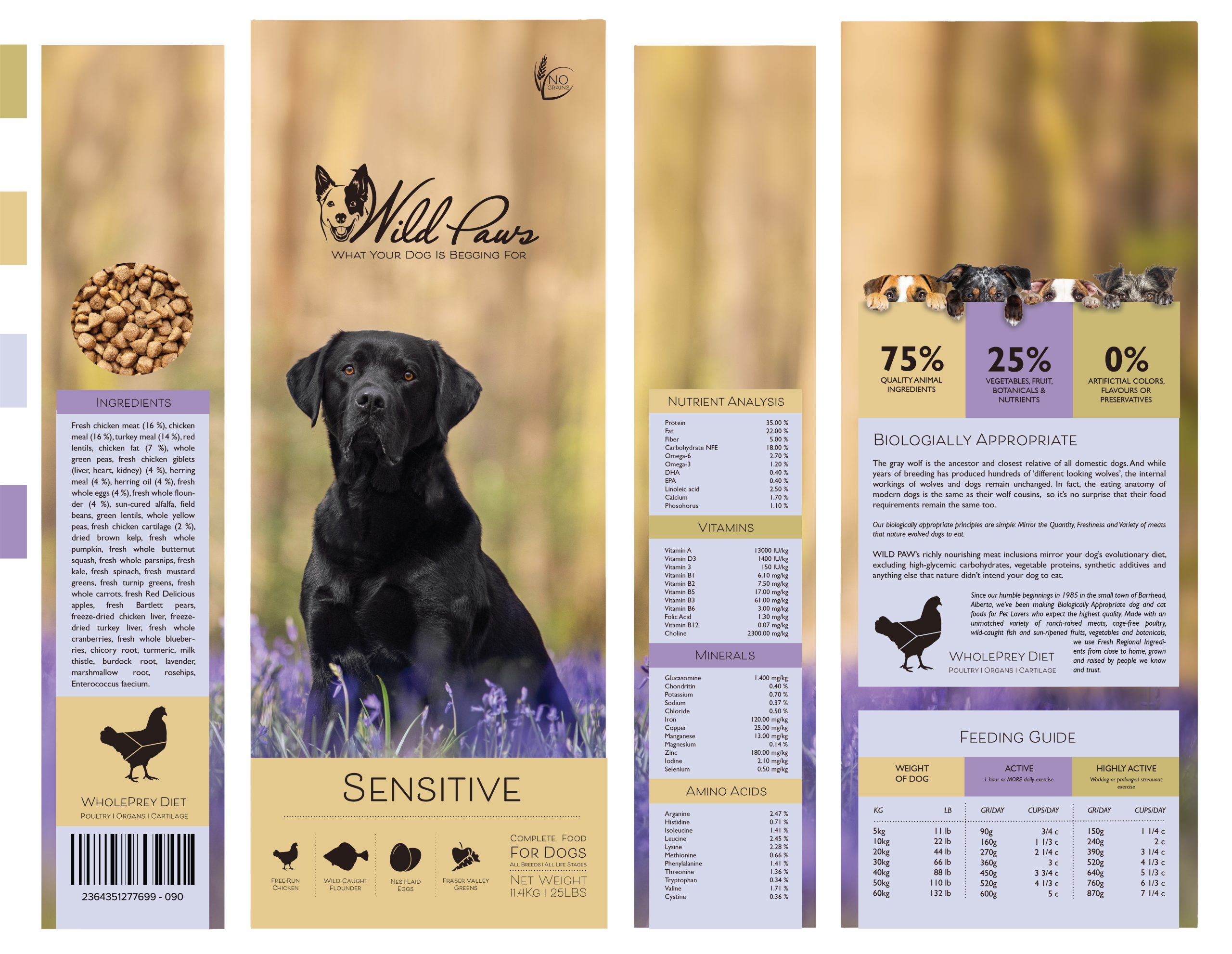
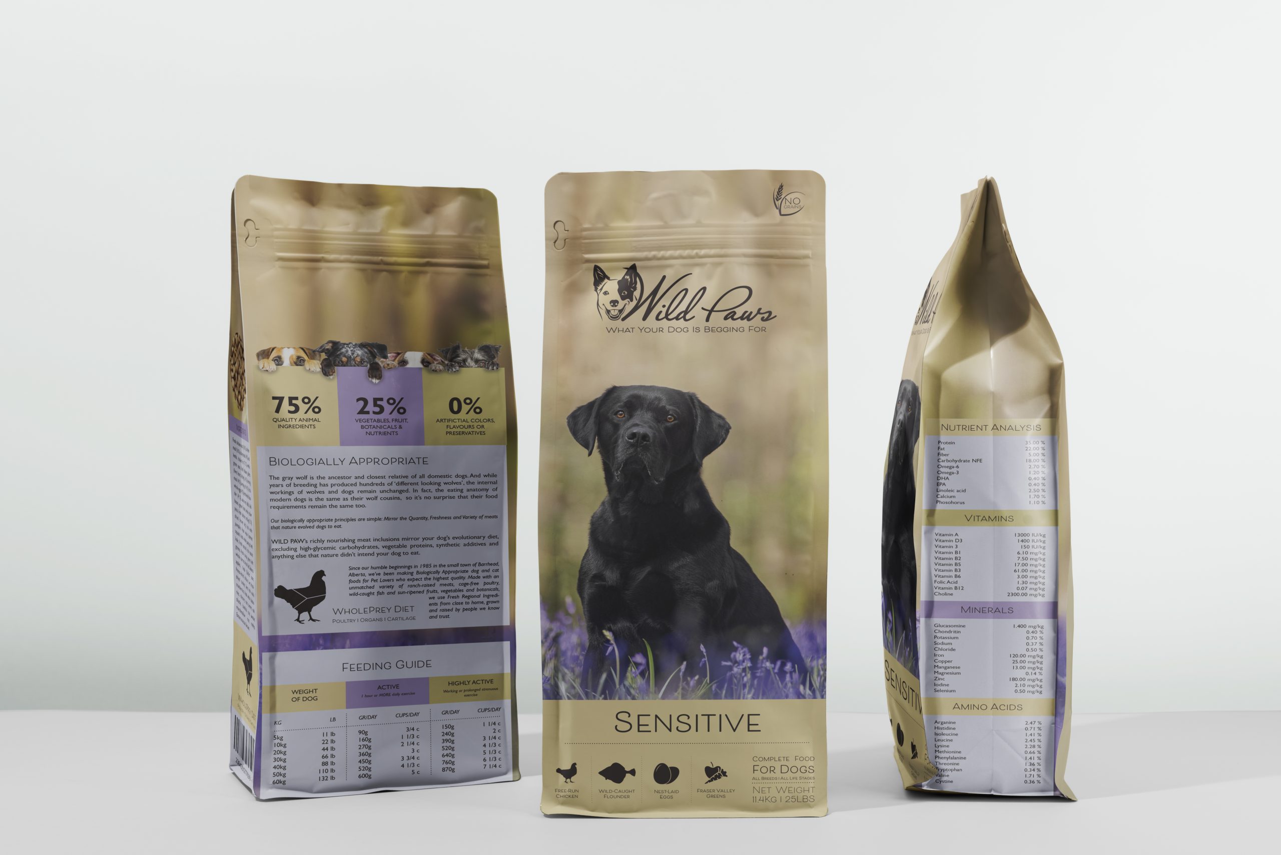
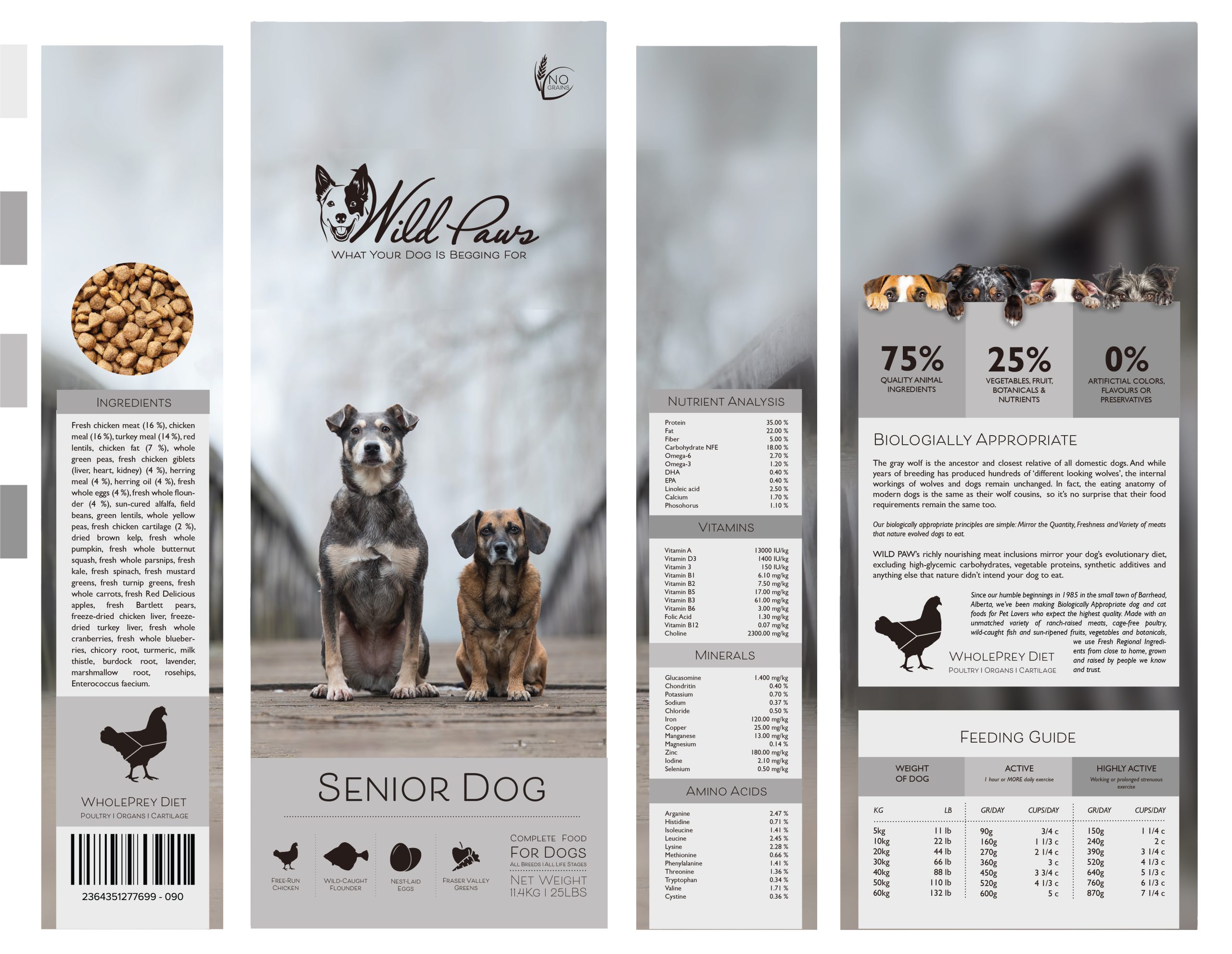
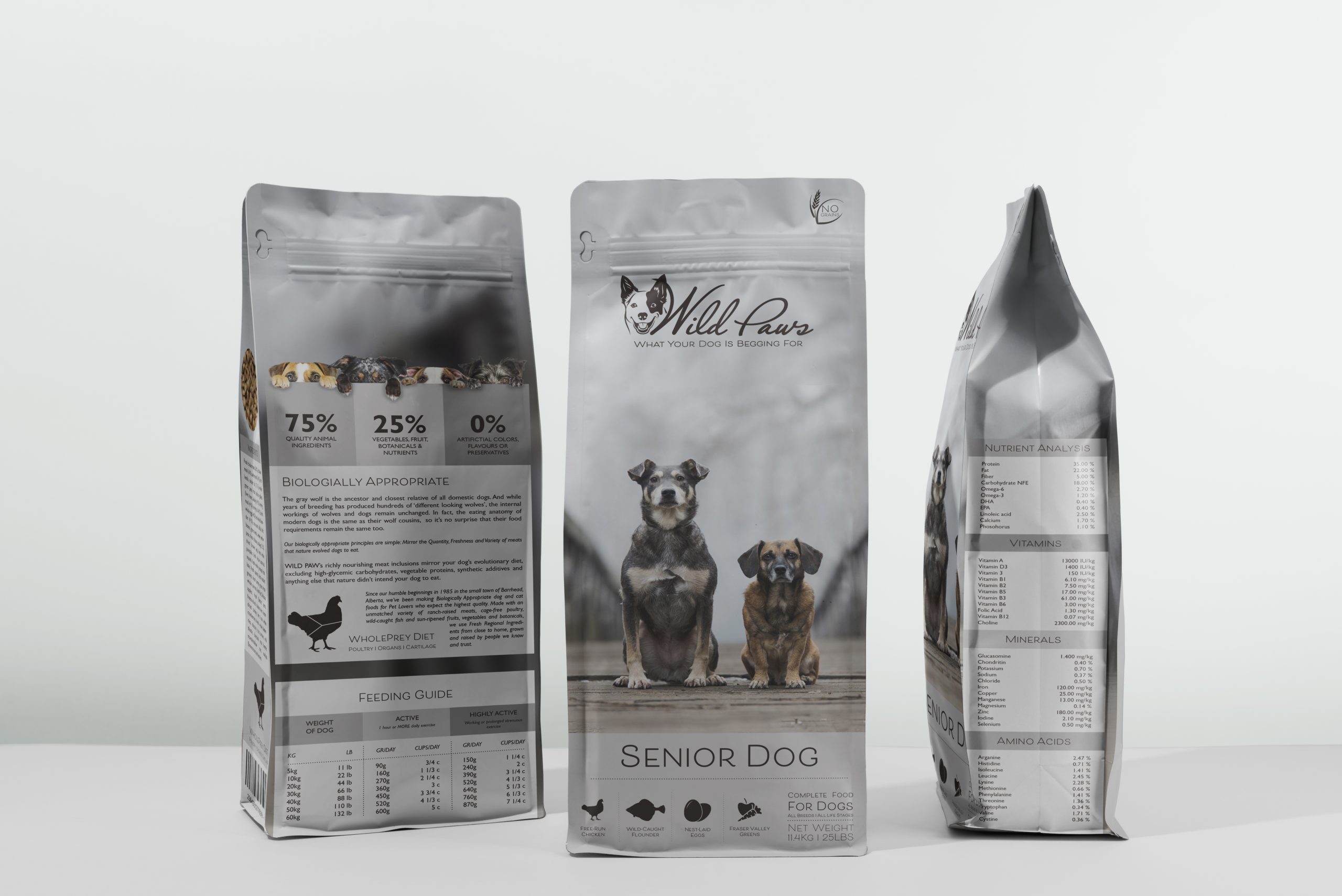
Consider the touchpoints of your brand in general (to ensure that all the elements work together) and then focus on your packaging. Design a set of Point of Sale elements that will promote your product in-store. The set can consist of however many elements you choose. It can be in any format that you would like it to be. Please consider the following:
- Can customers clearly see your product in your Point of Sale elements?
Do you use your Point of Sale to also showcase your actual product? - Brand Integration
Does it integrate with the brand’s look and feel? - Designed to sell!
Does it persuade customers to buy your product?
Part B
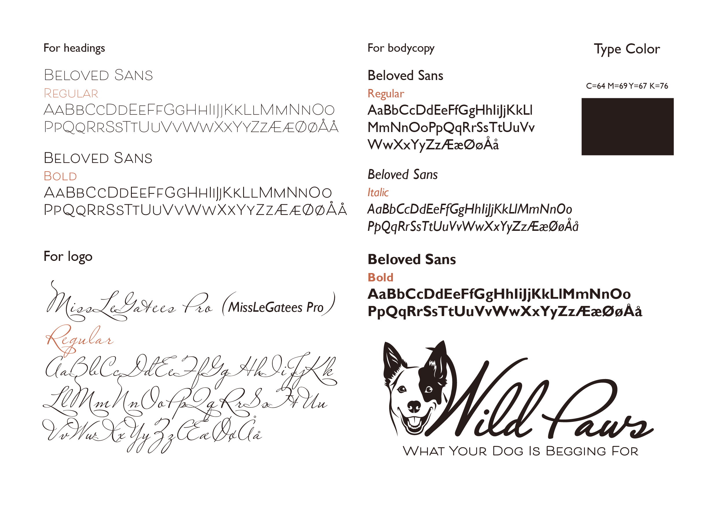
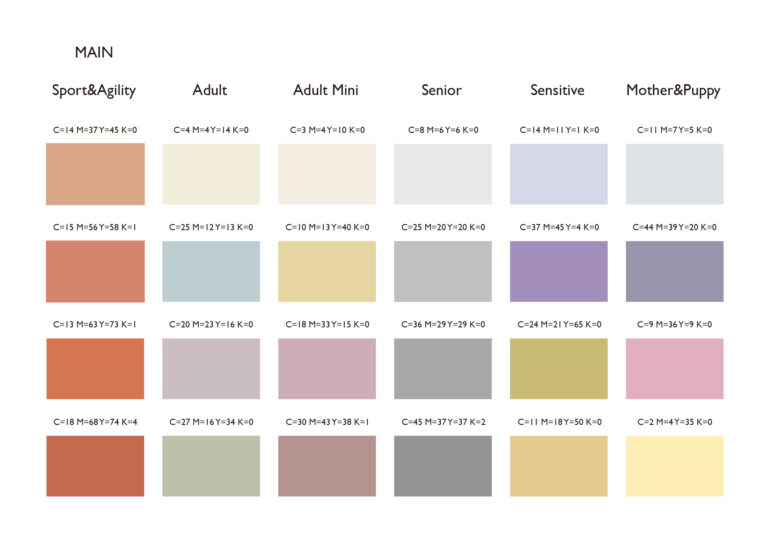
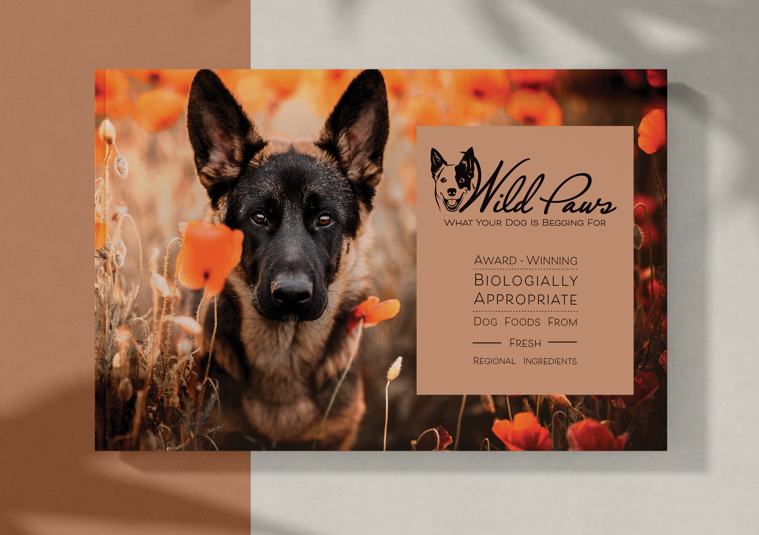
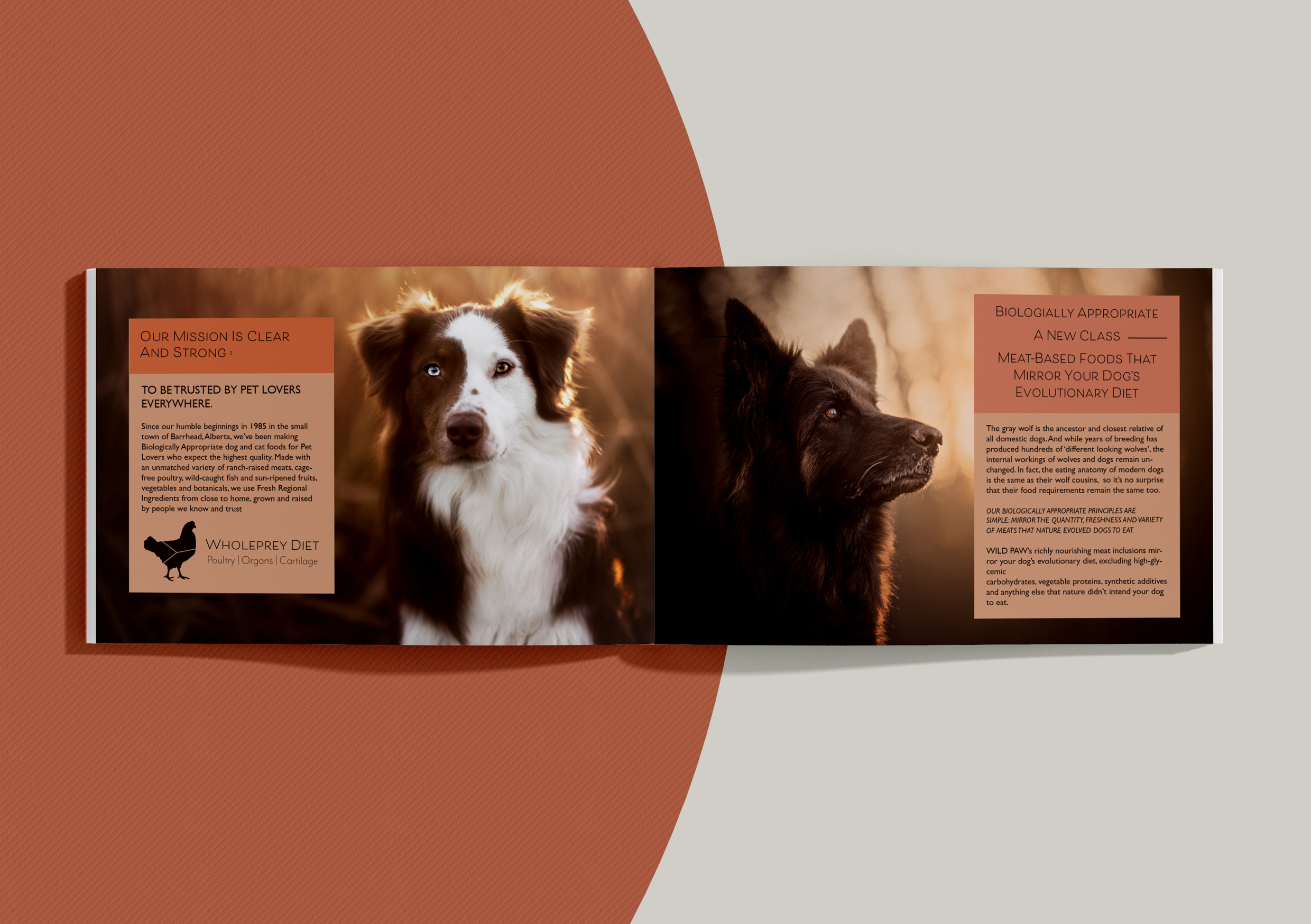
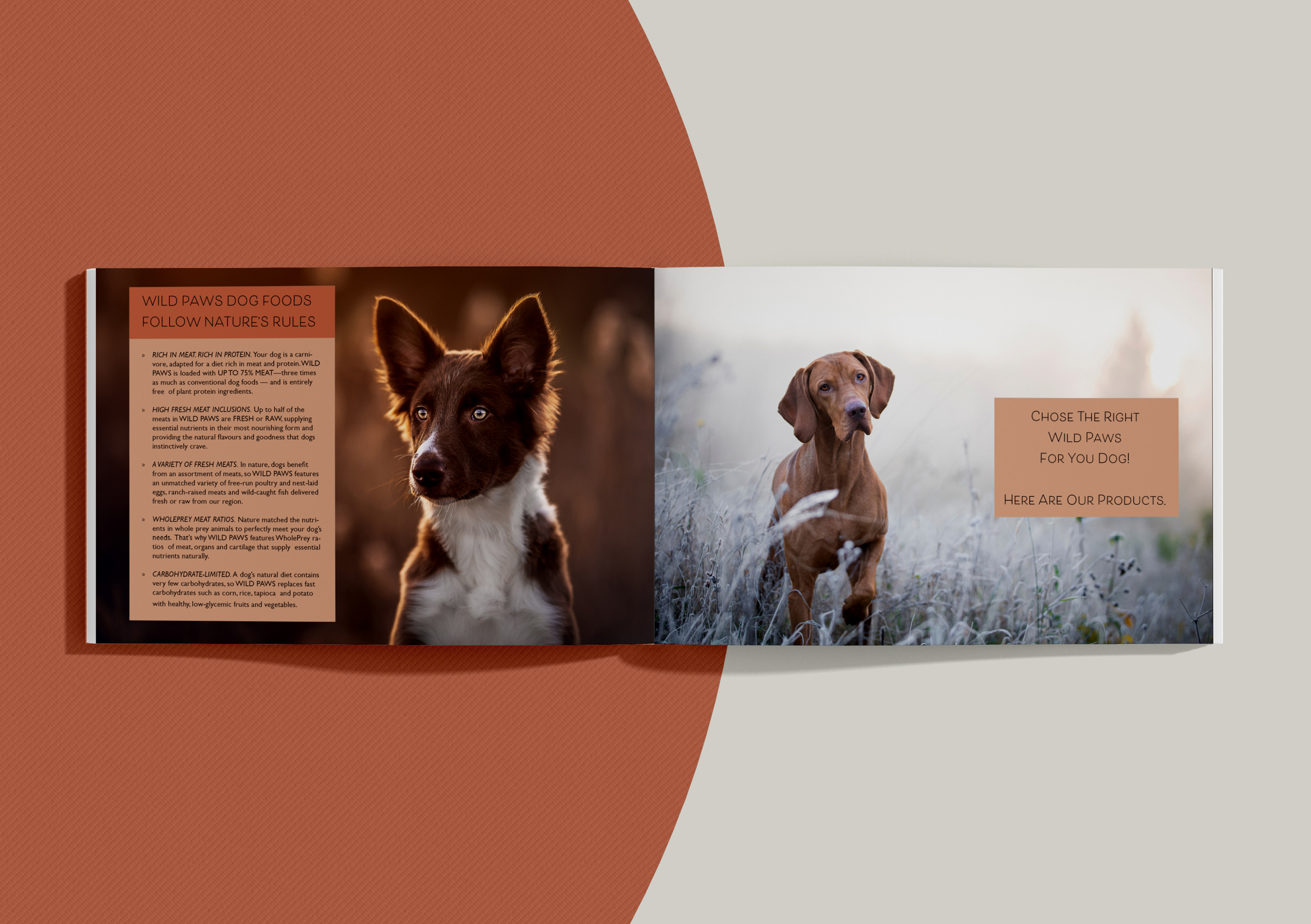
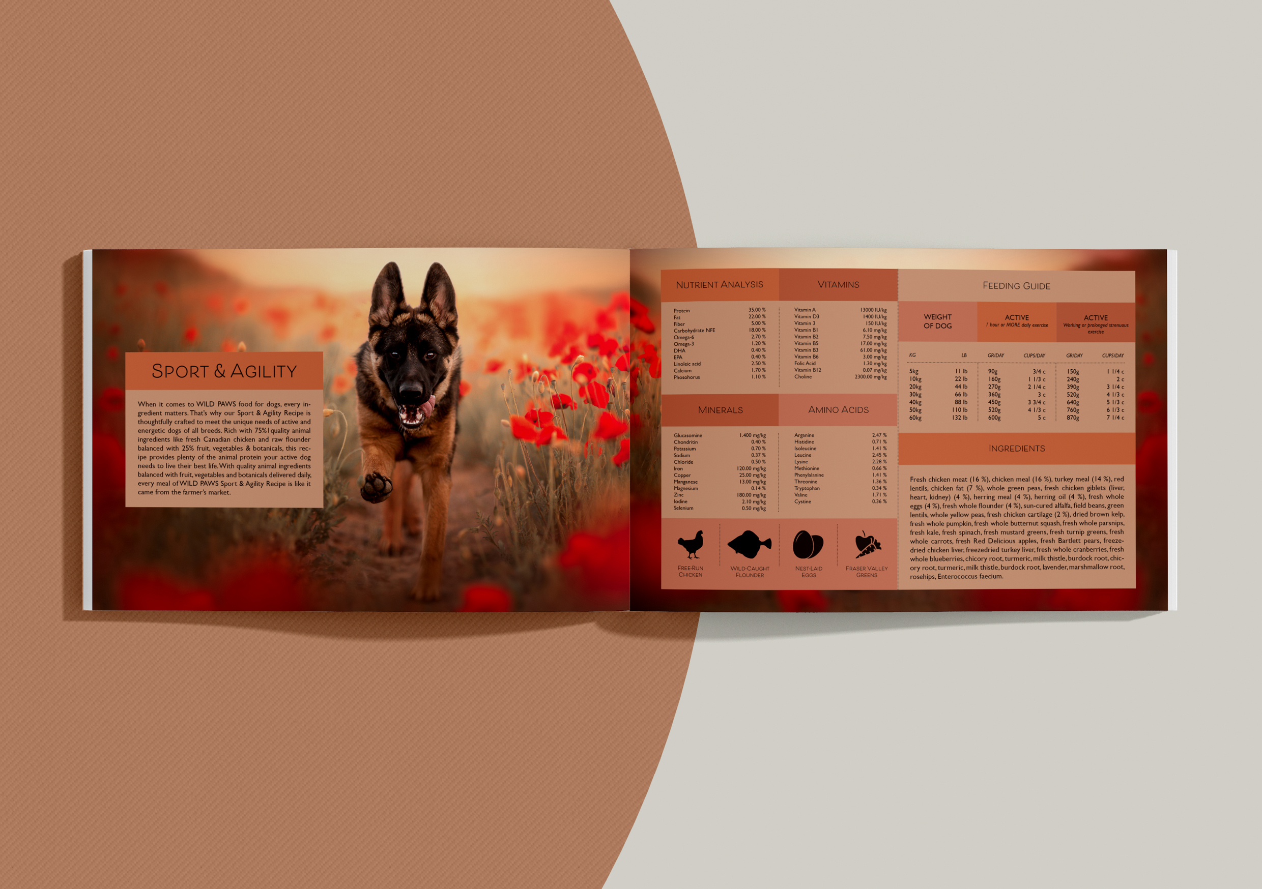
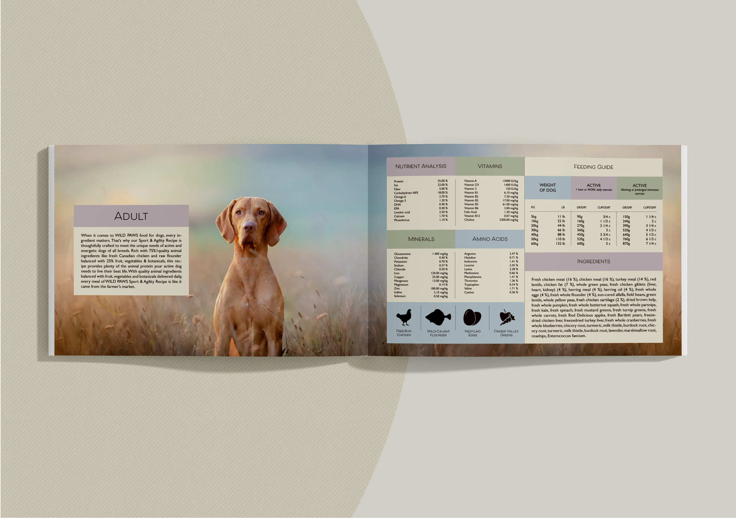
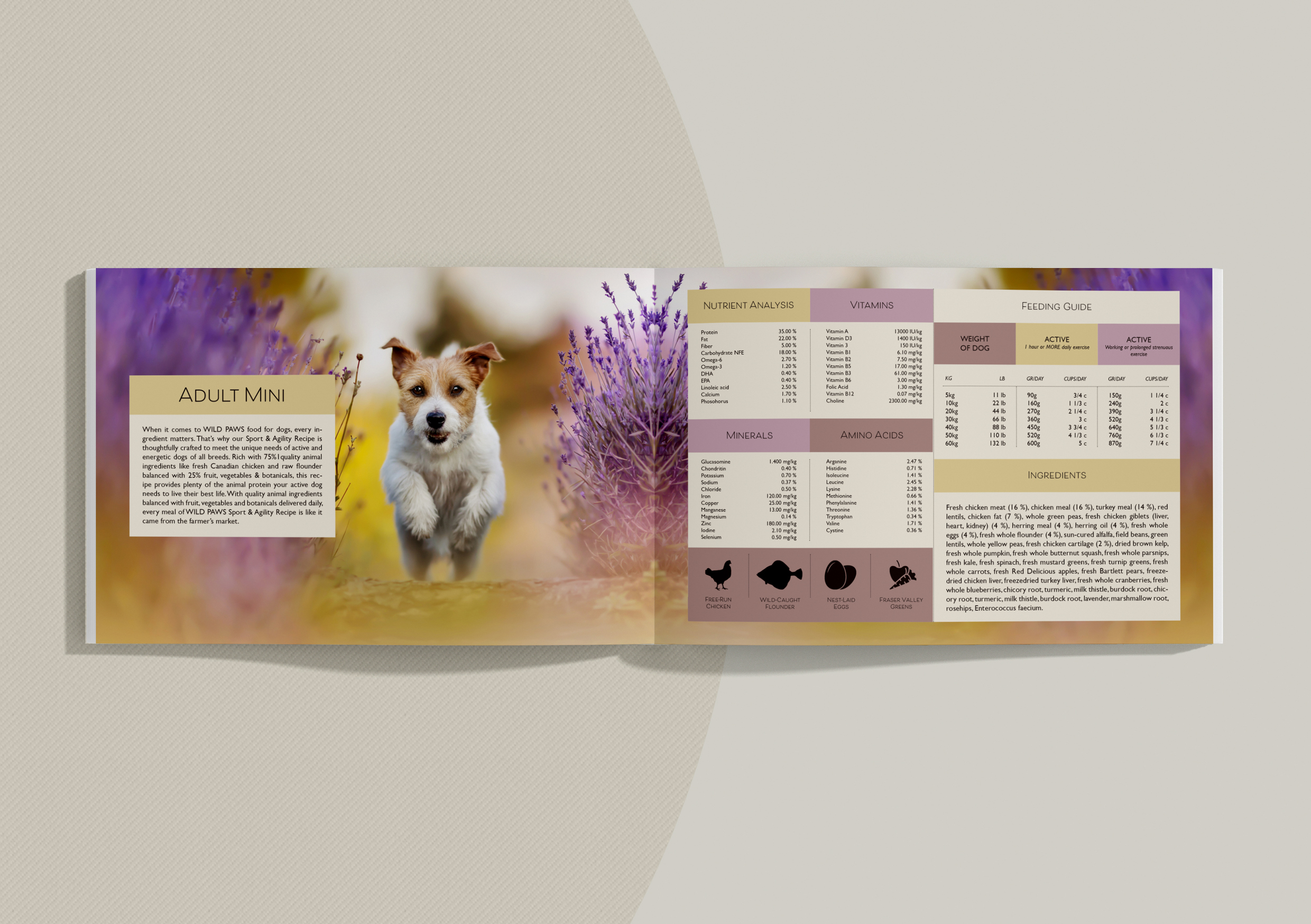
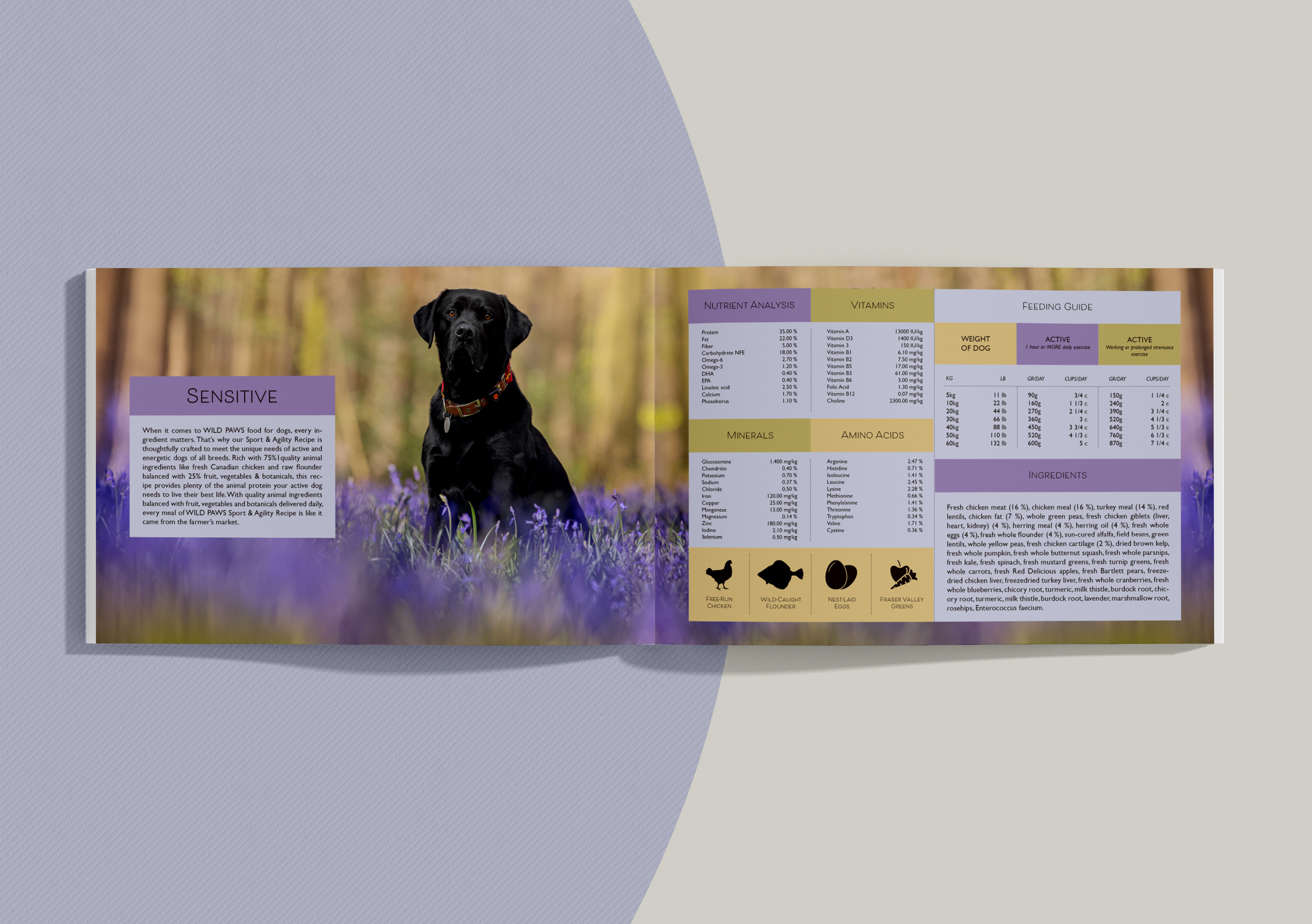
Brand manual.
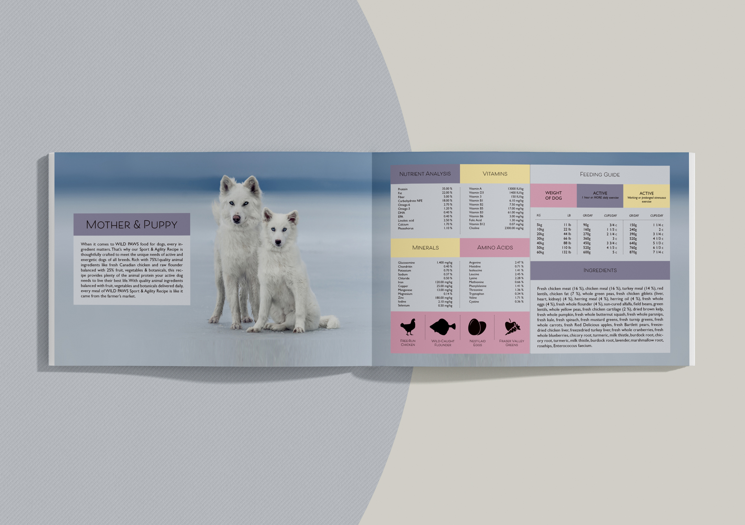
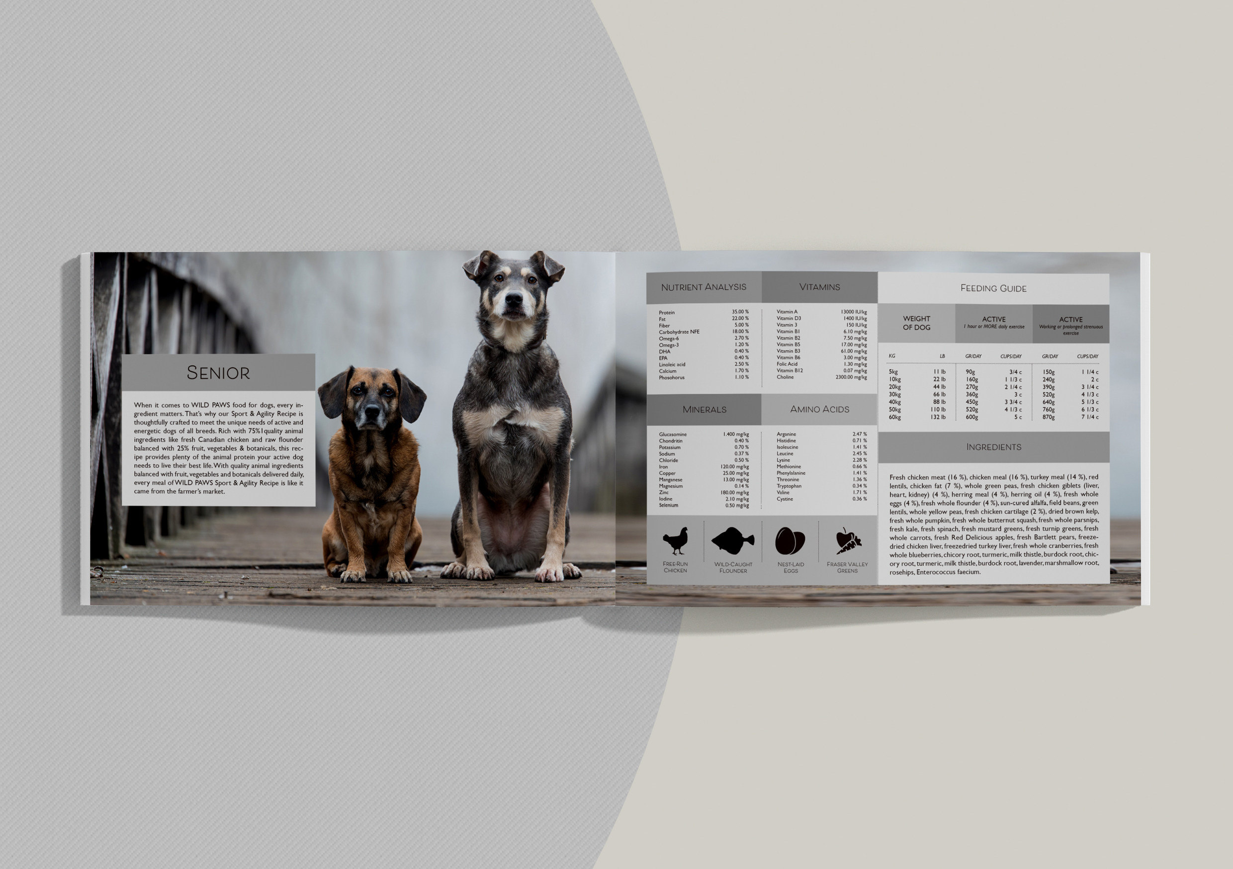
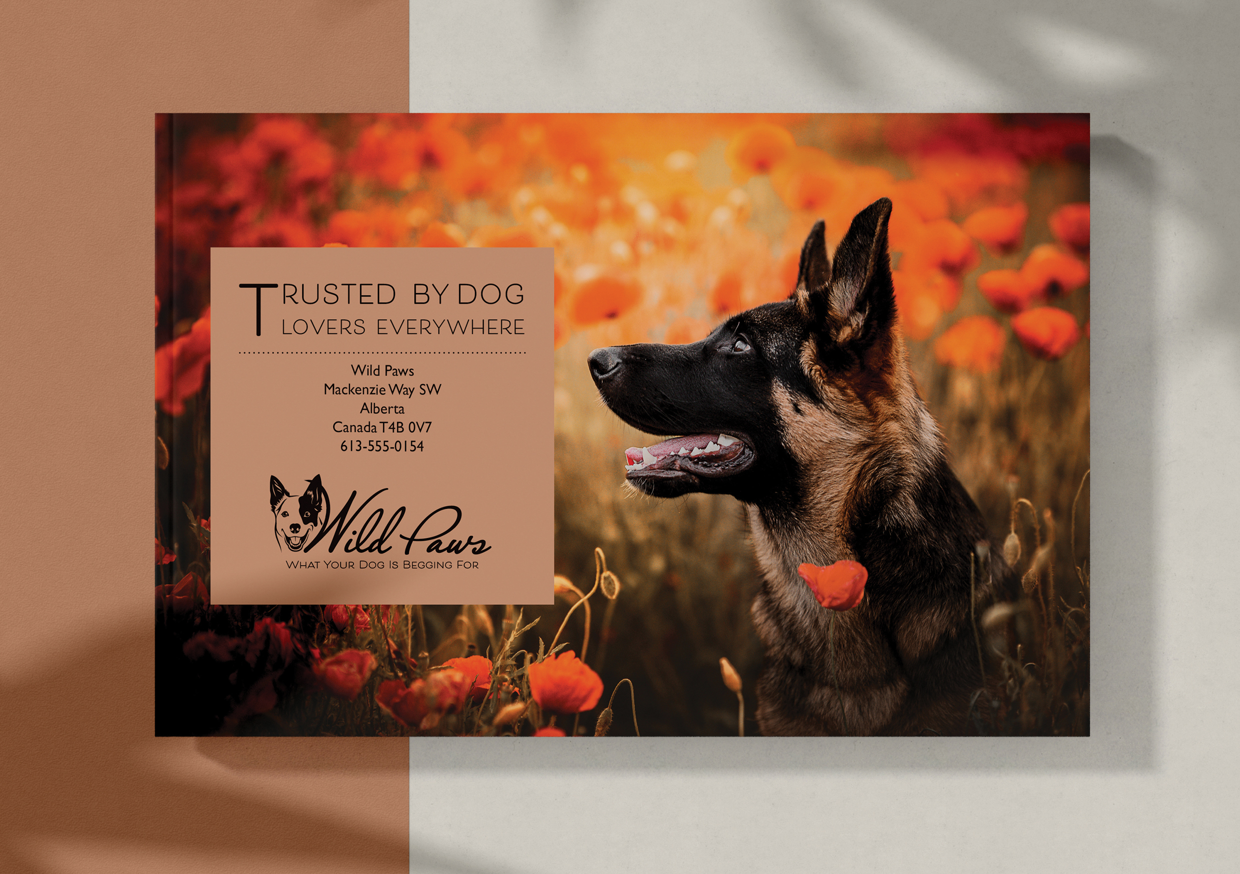
Take pictures of your elements and include them in a presentation of your brand called a brand manual or a design manual. Your brand manual should have a minimum of 7 pages and include logo, color scheme and chosen typography as well as the different elements produced during this 4 week project period (brochure, infographic, packaging, point of sale).
Hand in your brand manual as a PDF.


