LT 2.1 Introduction to Illustrator and Photoshop
The task
- Step 1 – Open up Illustrator and Photoshop.
- Step 2 – Configure your workspace to something you’re comfortable with, and give the ‘layers’ panel extra space.
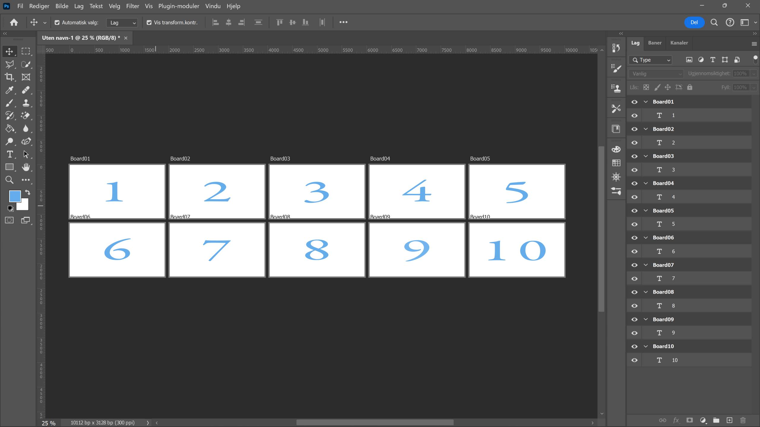
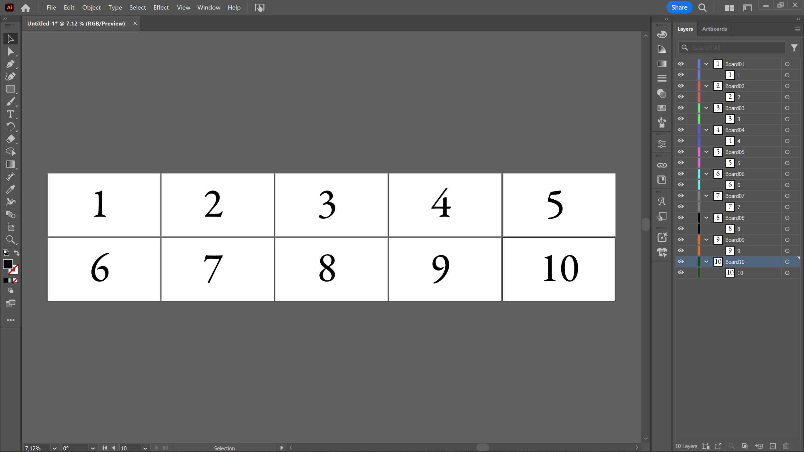
- Step 3 – Create 10 artboards. Fill in each artboard with the numbers one to 10 in order.
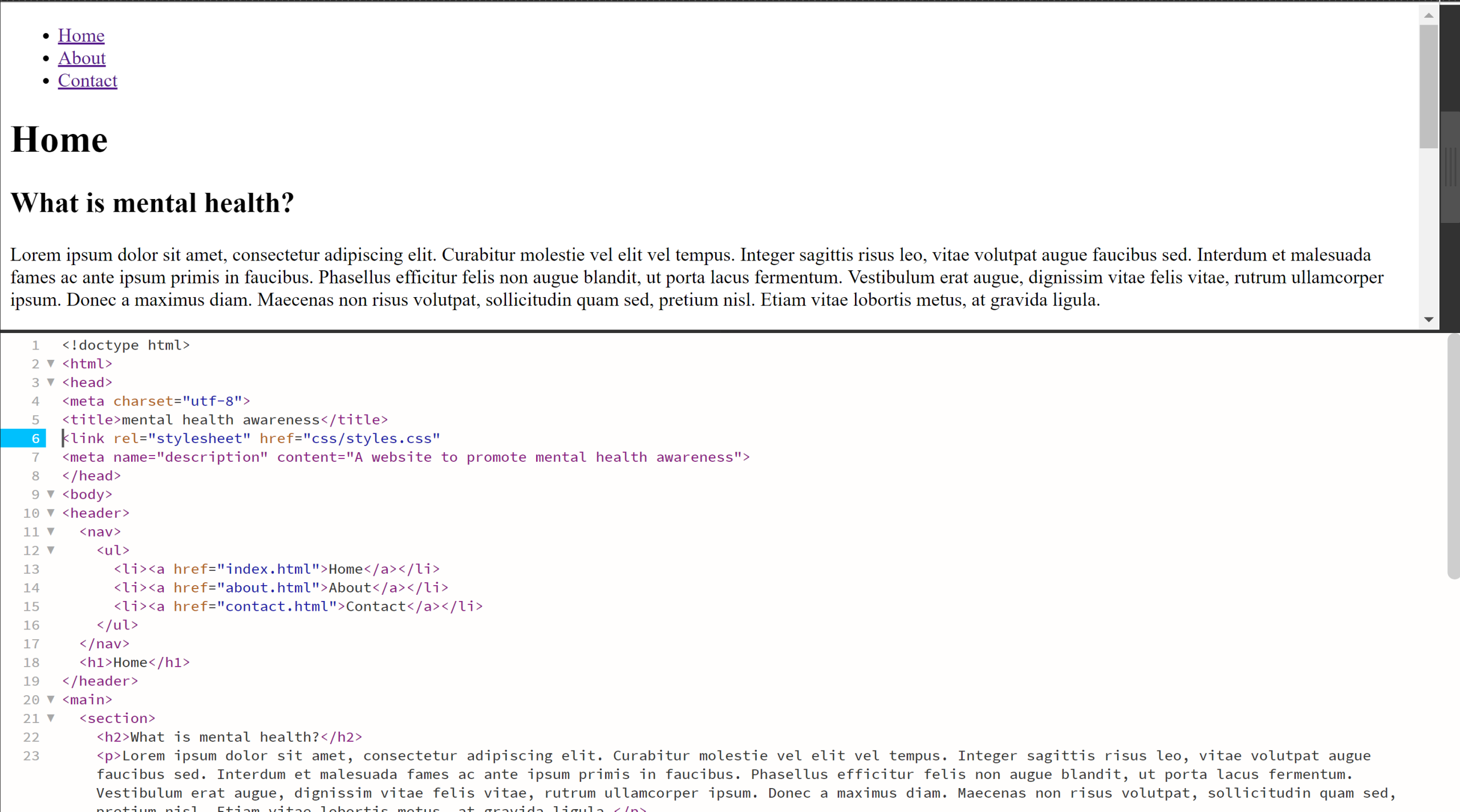
LT 2.2 Design Principle part 1
The task
Here’s a fantastic piece of motion design by Elastic. They carefully consider the design principles we’ve learnt about today – but can you spot them?
- Step 1 – Watch the video carefully and analyse each shot.
- Step 2 – Take screenshots and write a motivation on where your spot contrast, emphasis and balance.
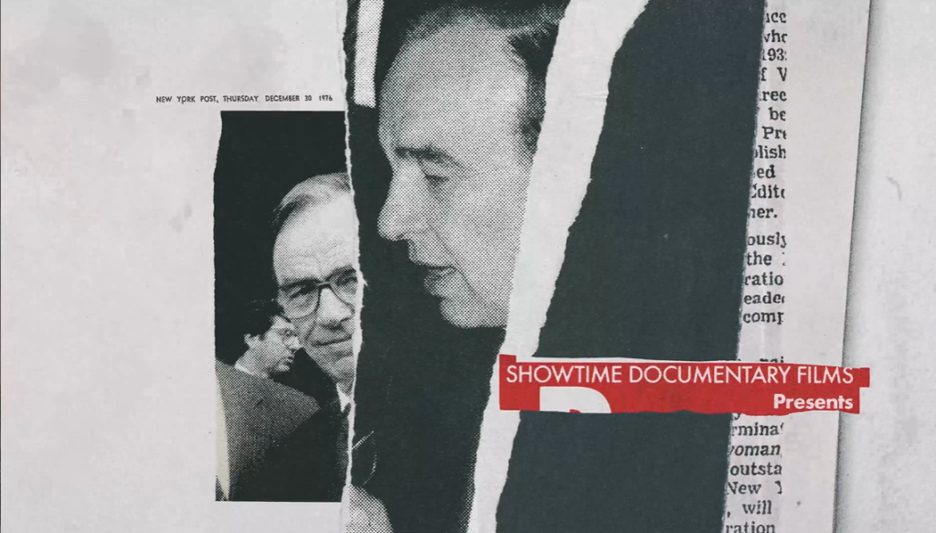
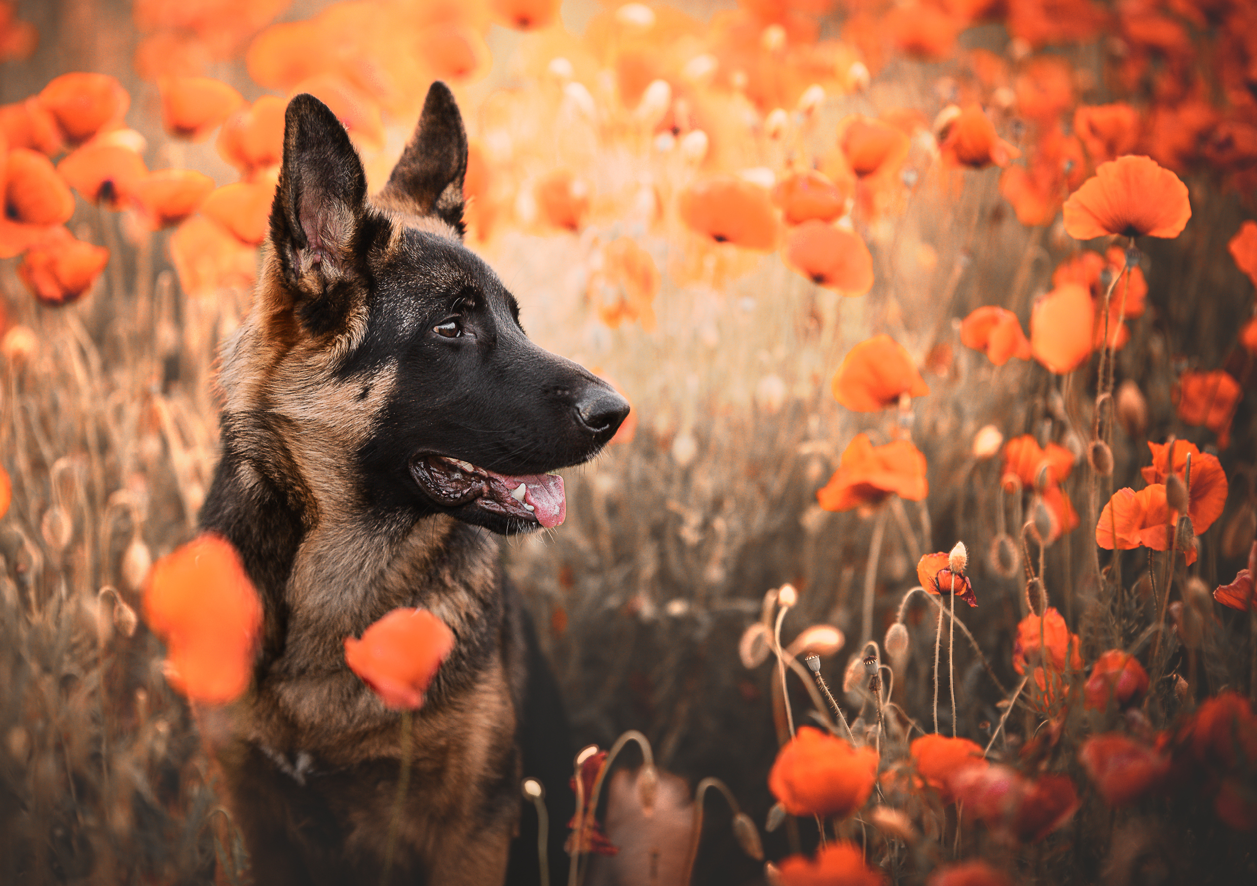
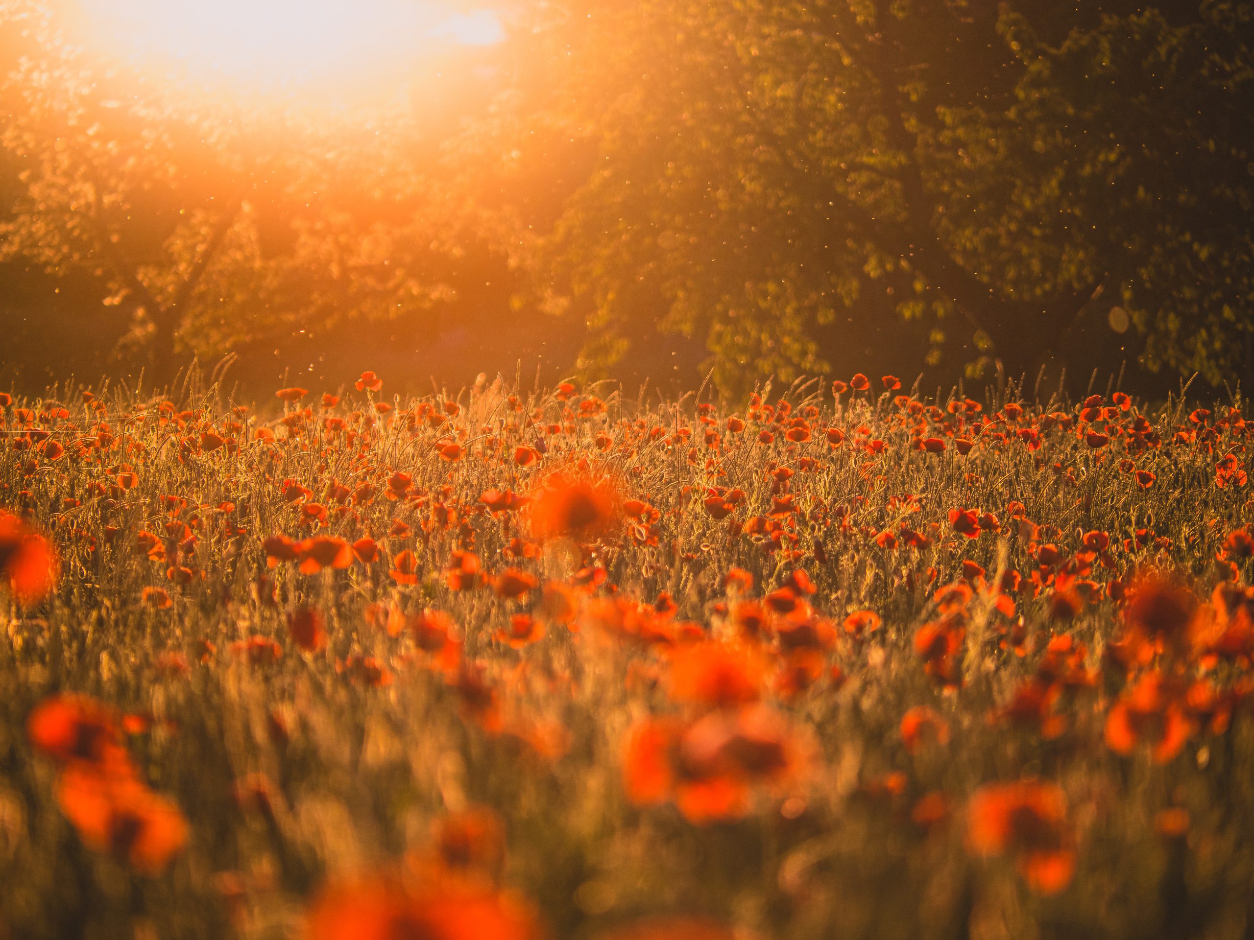
Contrast: In the opening sequence, bright, saturated colors pop against a dark, neutral background. The interplay of light and shadow also creates depth, highlighting specific elements. For instance, the use of glowing edges focuses the viewer’s attention effectively
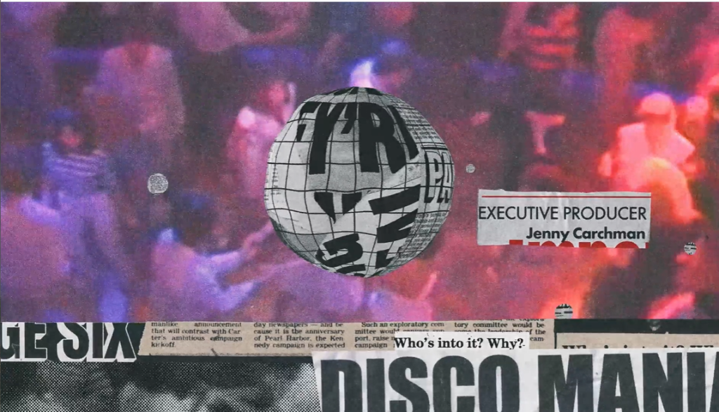
Emphasis: Motion is used to direct focus. For example, A glowing circular element grows in size and moves toward the center of the frame while the surrounding elements fade out. This guides the viewer’s focus to the center and highlights the main point of the scene.
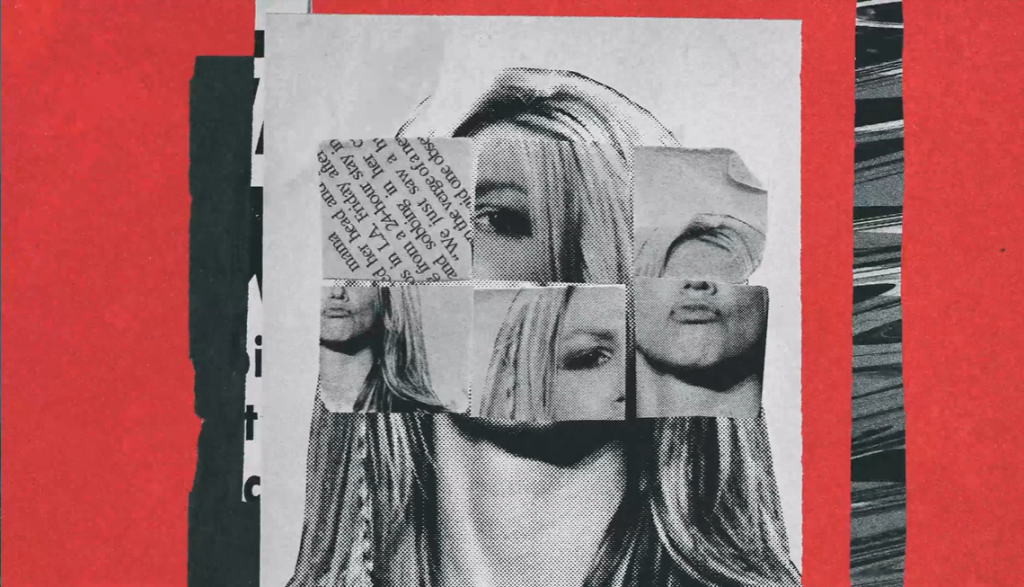
Balance: Throughout the video, balanced compositions alternate between symmetry and controlled asymmetry. This dynamic approach keeps the design engaging while maintaining harmony across the scenes.
Symmetry is achieved with a split-screen layout, where elements on either side are mirrored in shape and motion, creating visual harmony while maintaining dynamism.
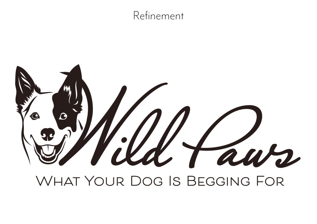
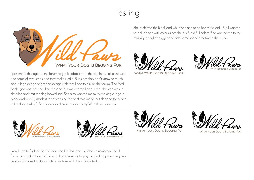
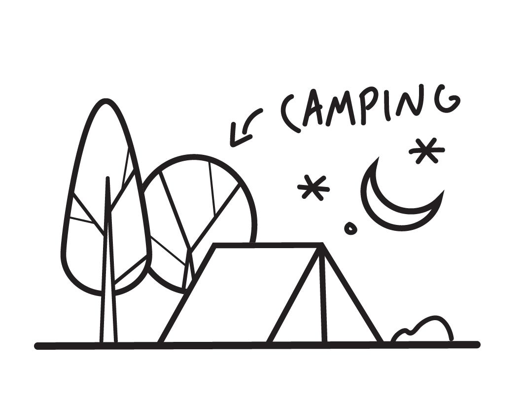
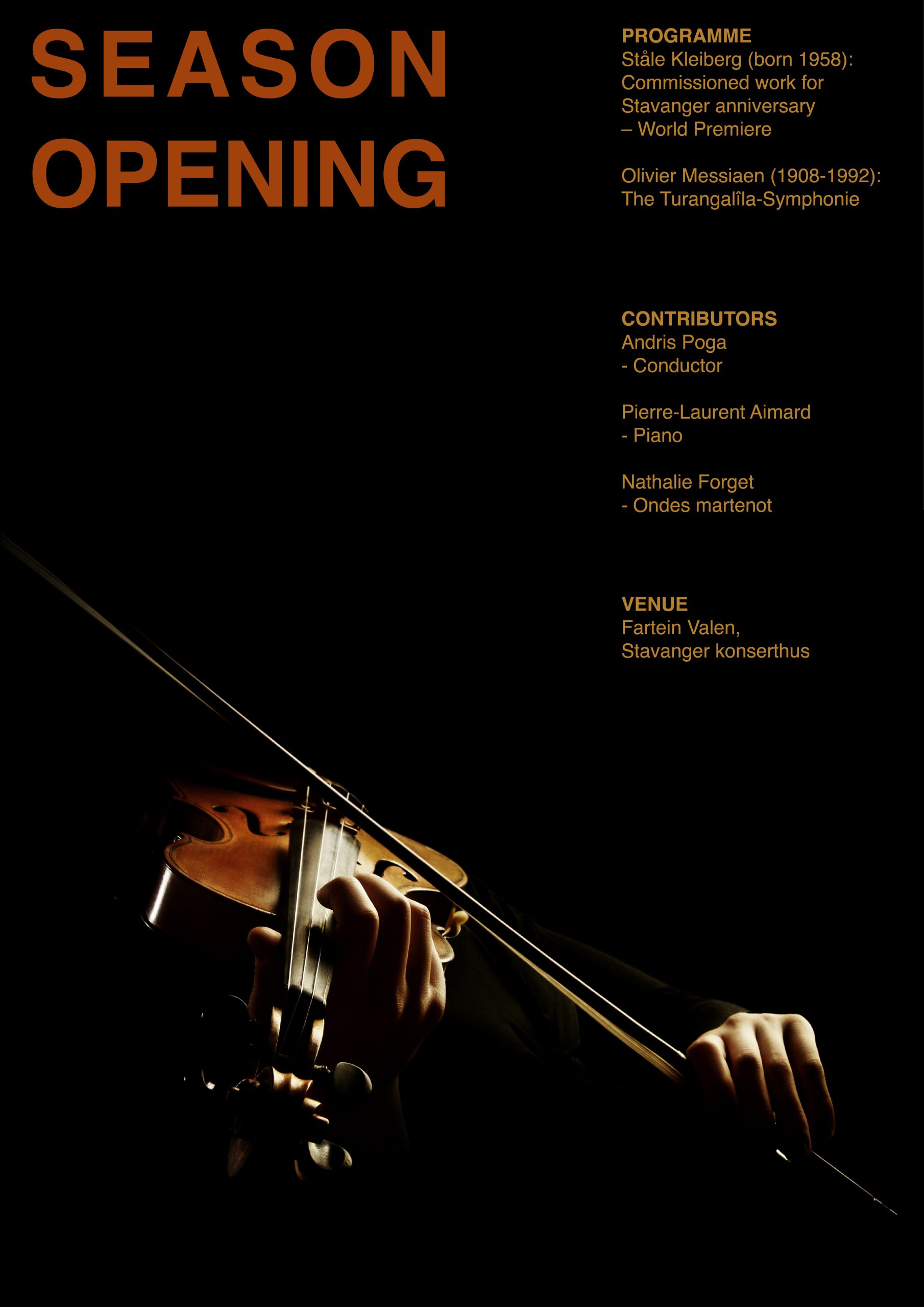
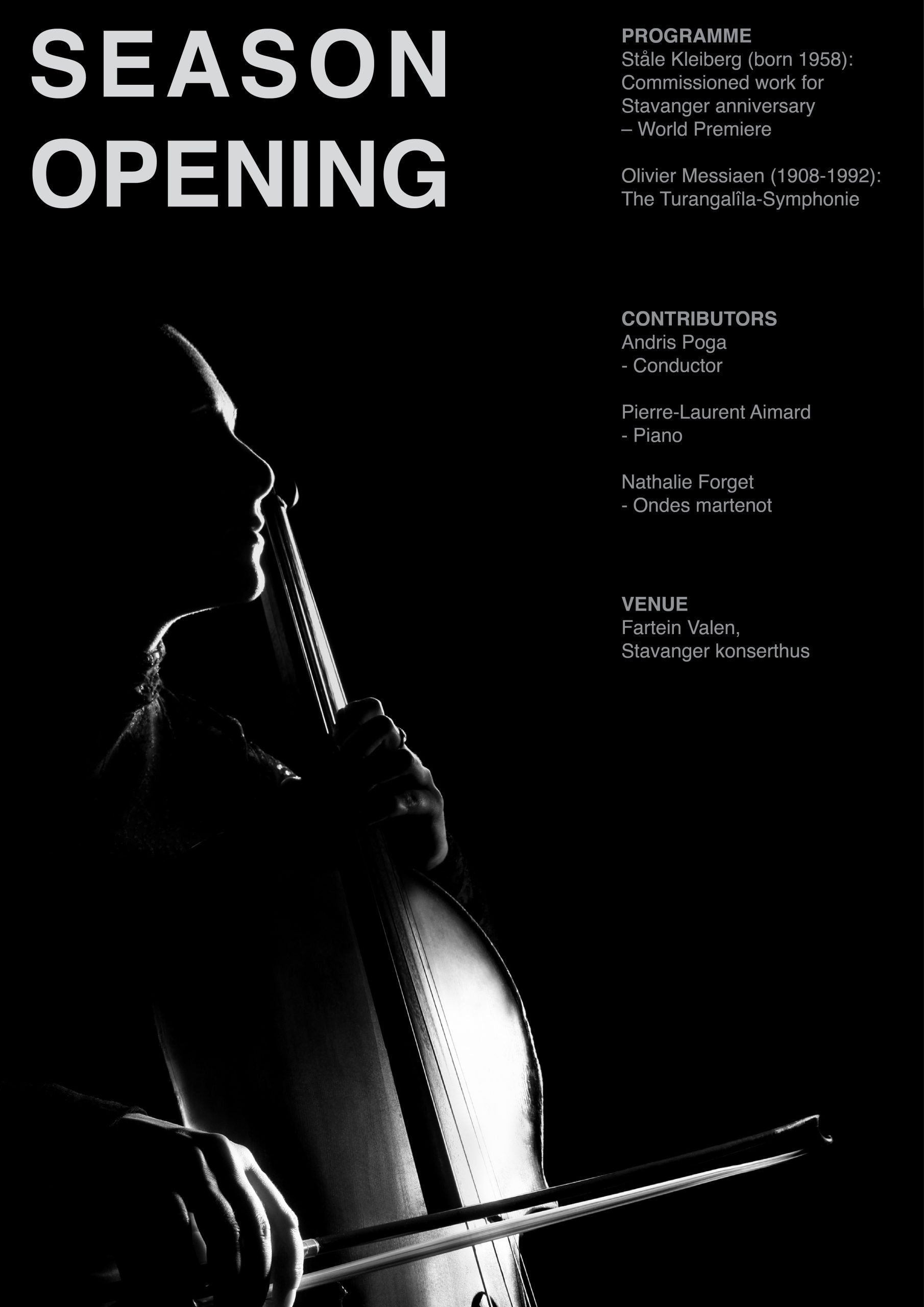
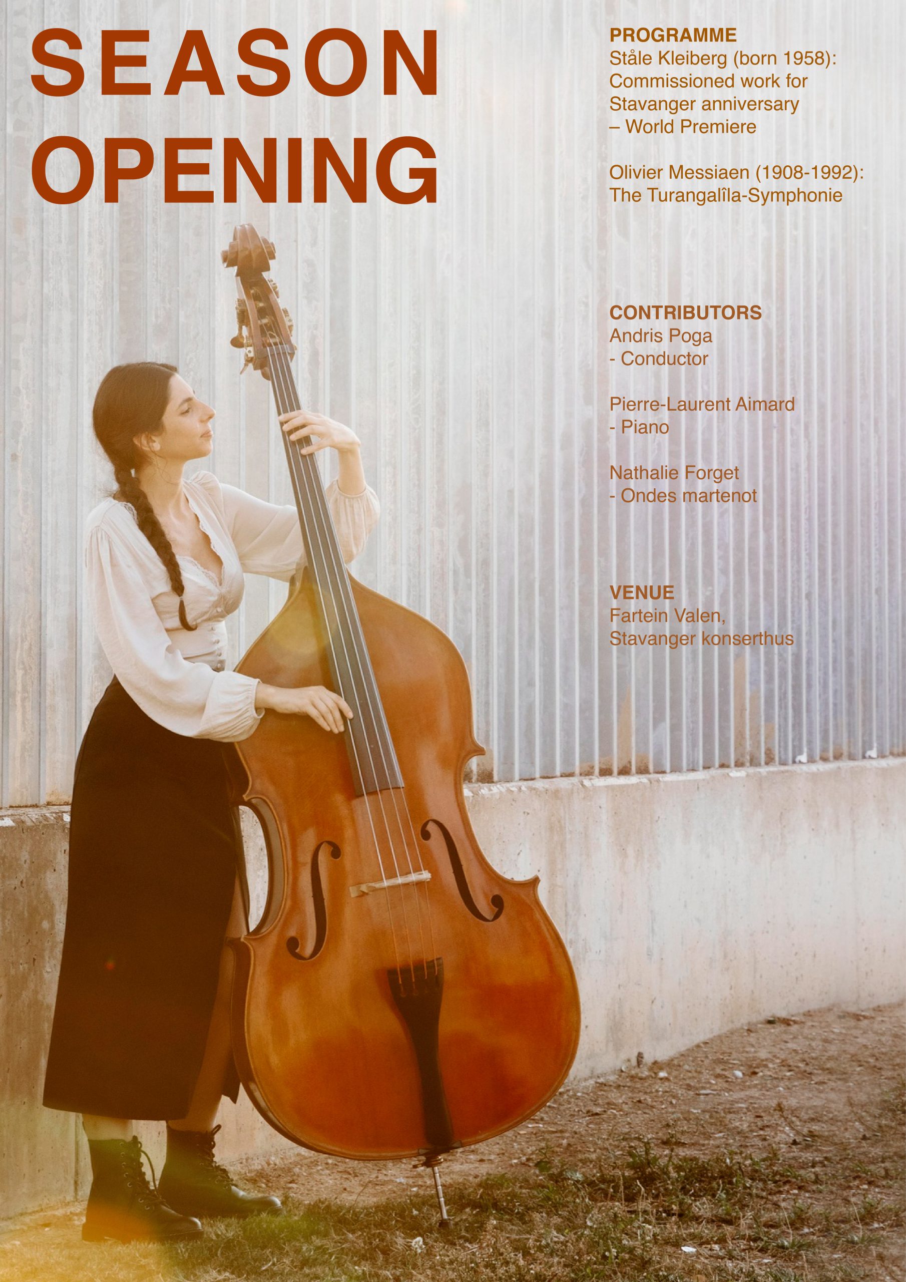
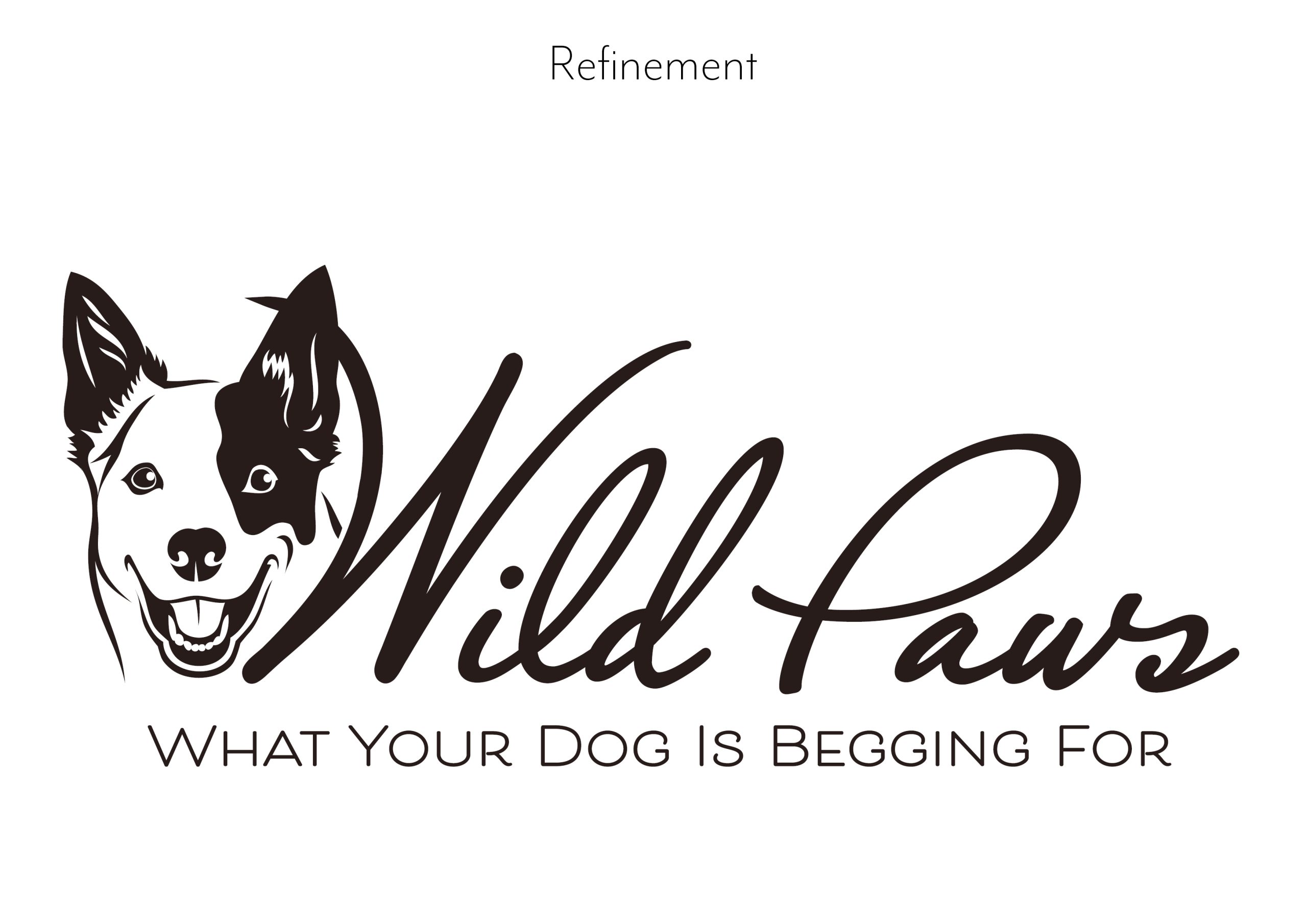
A sports brand is launching three new products: ‘Noon’, ‘Kayak’ and ‘Radar’. They also happen to be three palindromes to make our design choices a bit easier.
- Step 1 – Pick one of the words above.
- Step 2 – Create a quick logo that has contrast, emphasis and balance.
- Step 3 – Write down how you added the above principles.Ask your classmates on the student discussion Forum if they can spot these elements in your design (optional).
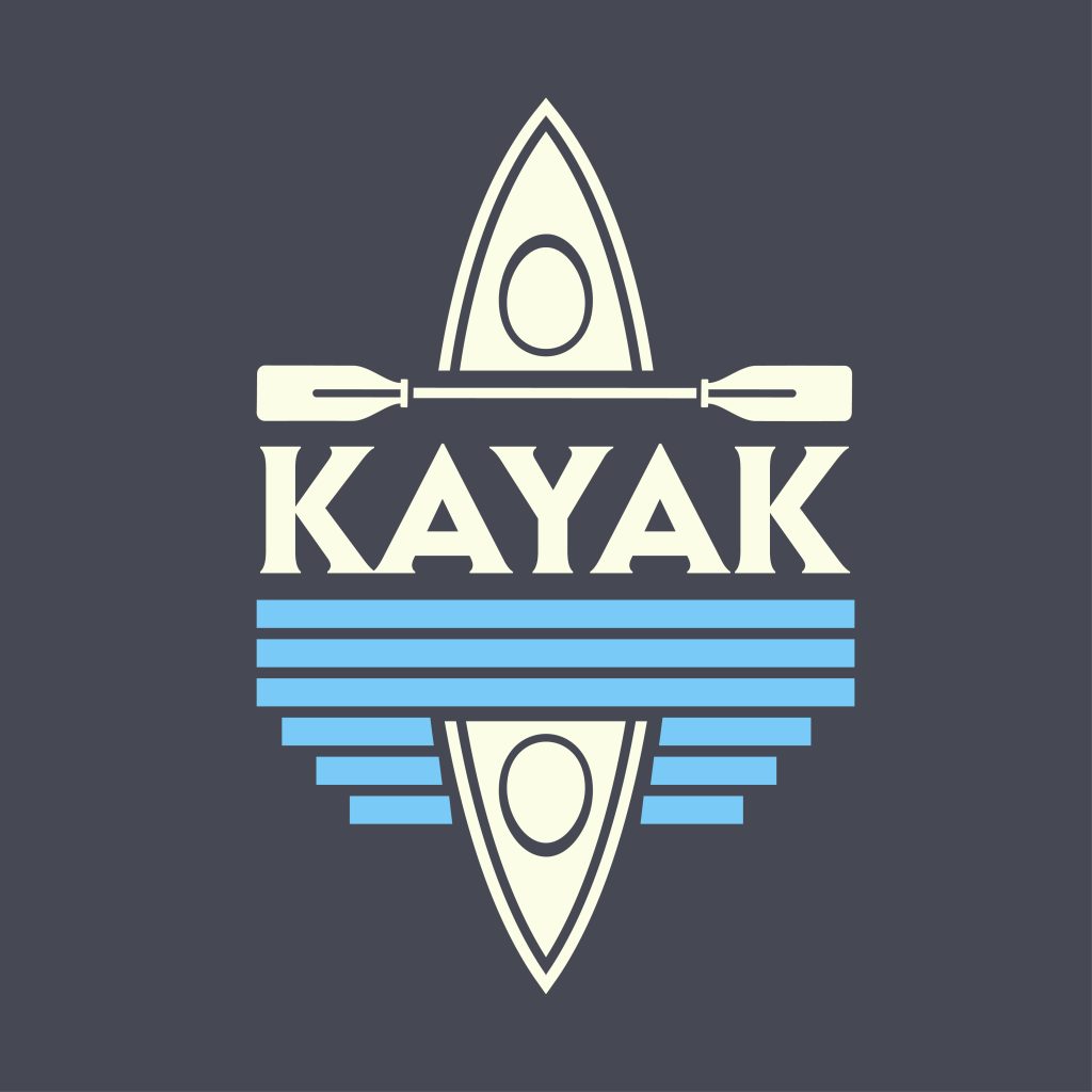
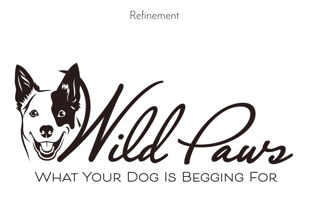
Here is the logo design for “Kayak.” It reflects the brand’s adventurous spirit with a mirrored text effect that simulates water reflection. The navy blue background, clean white typography, and light blue waves emphasize contrast, symmetry, and balance.
LT 2.3 Design Principles part 2
The task
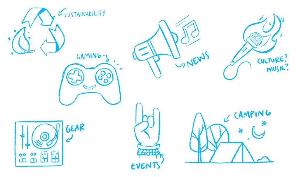
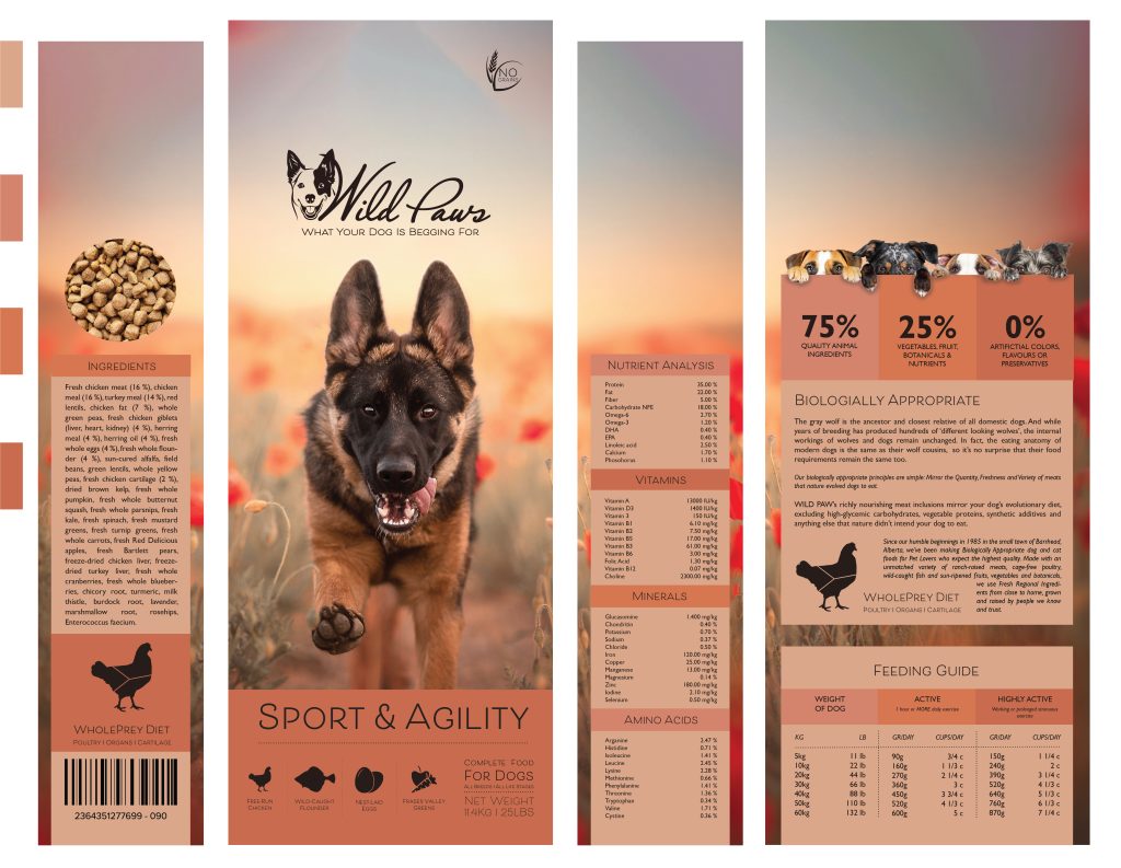
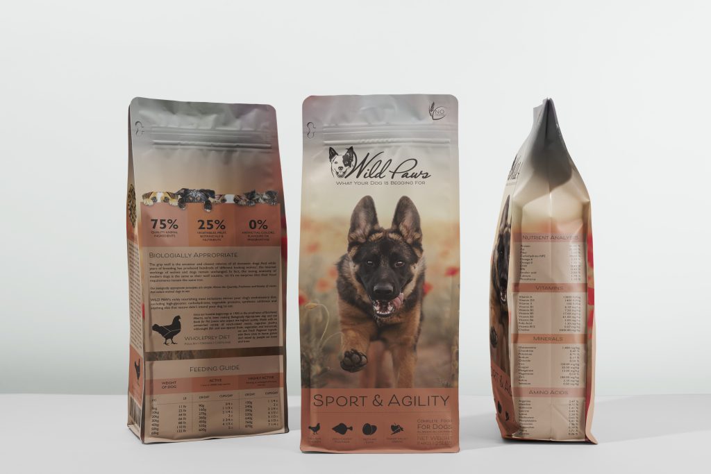
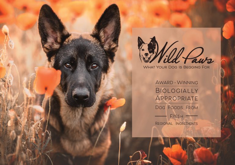
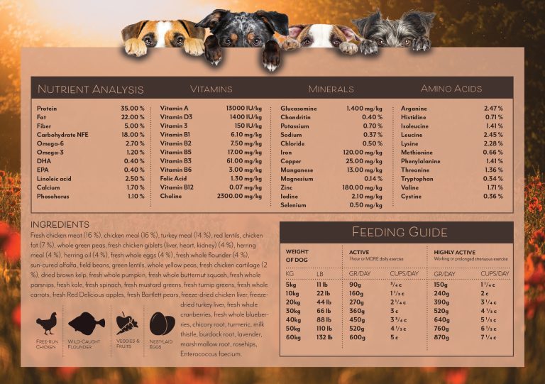
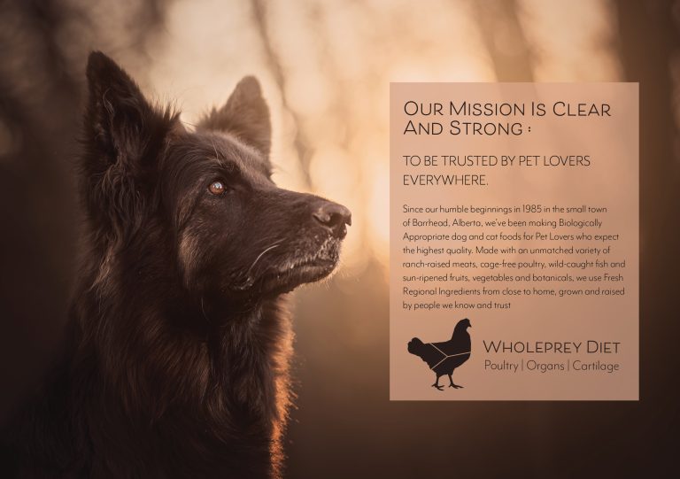
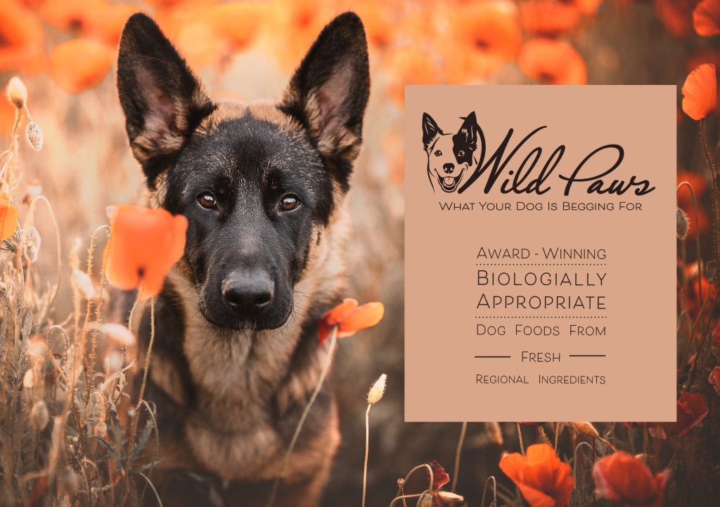
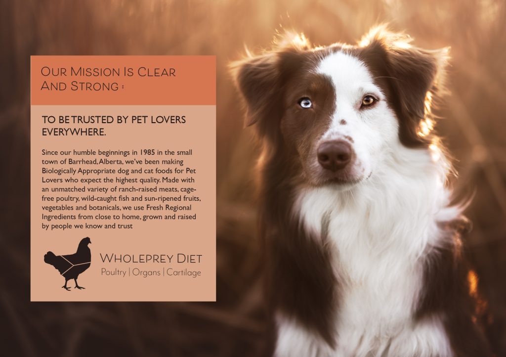
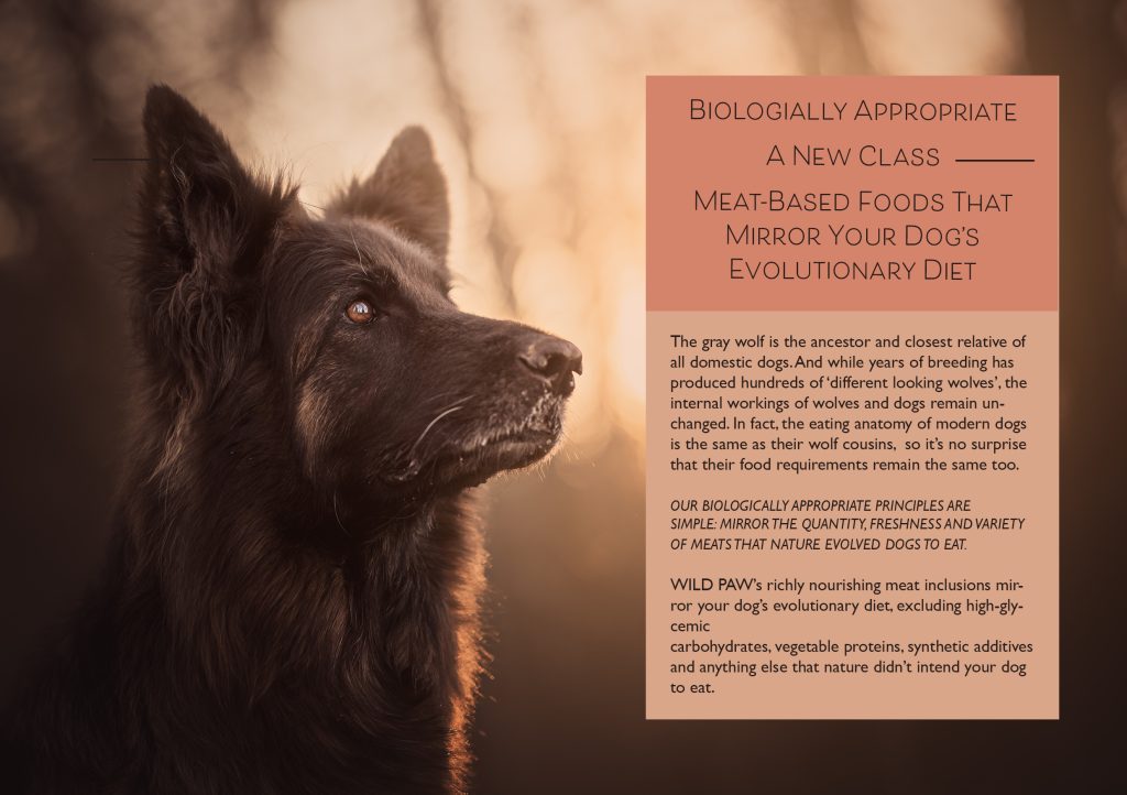
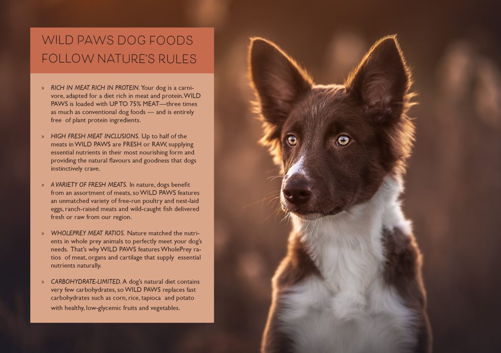
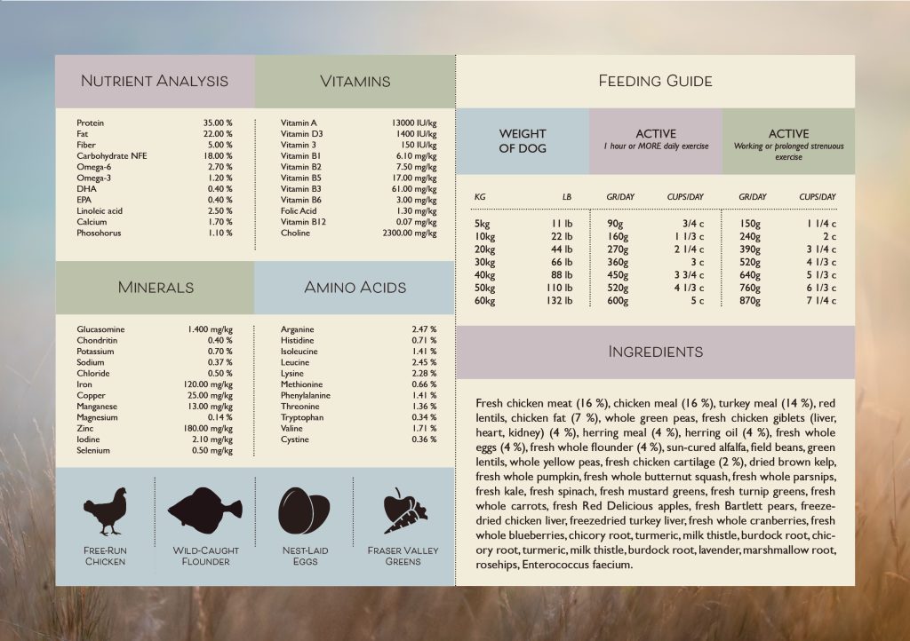
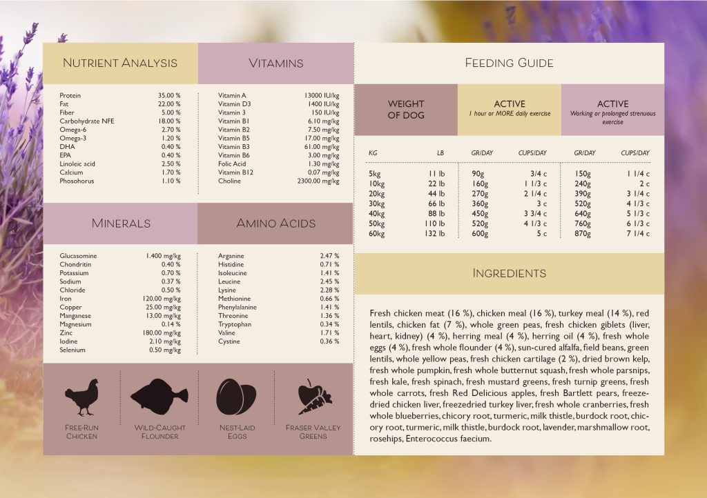
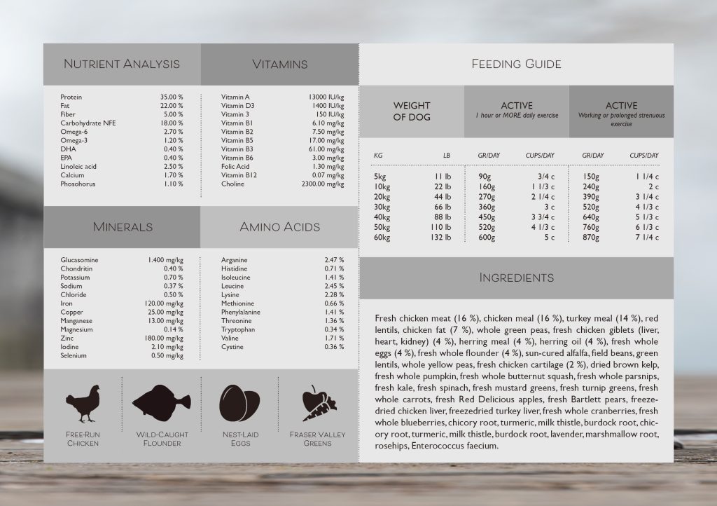
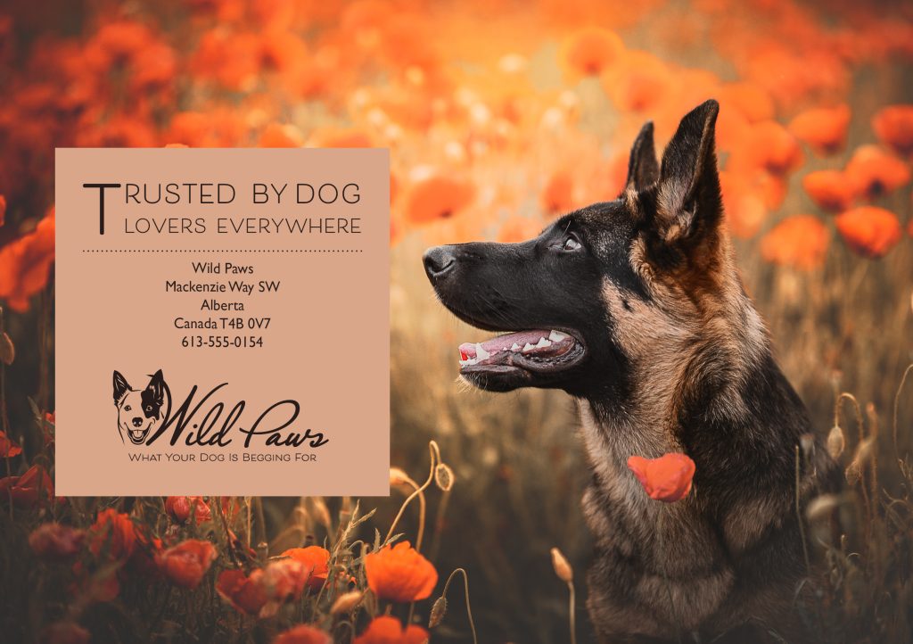
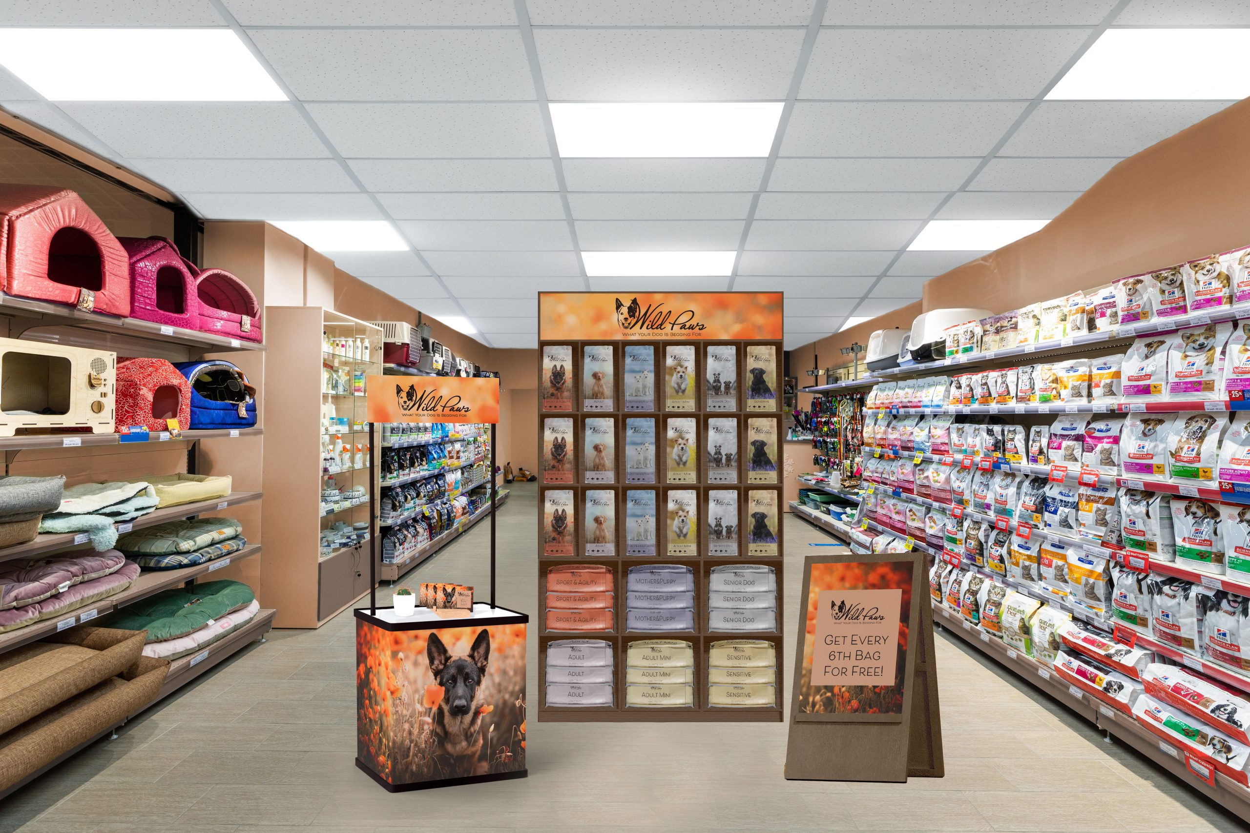
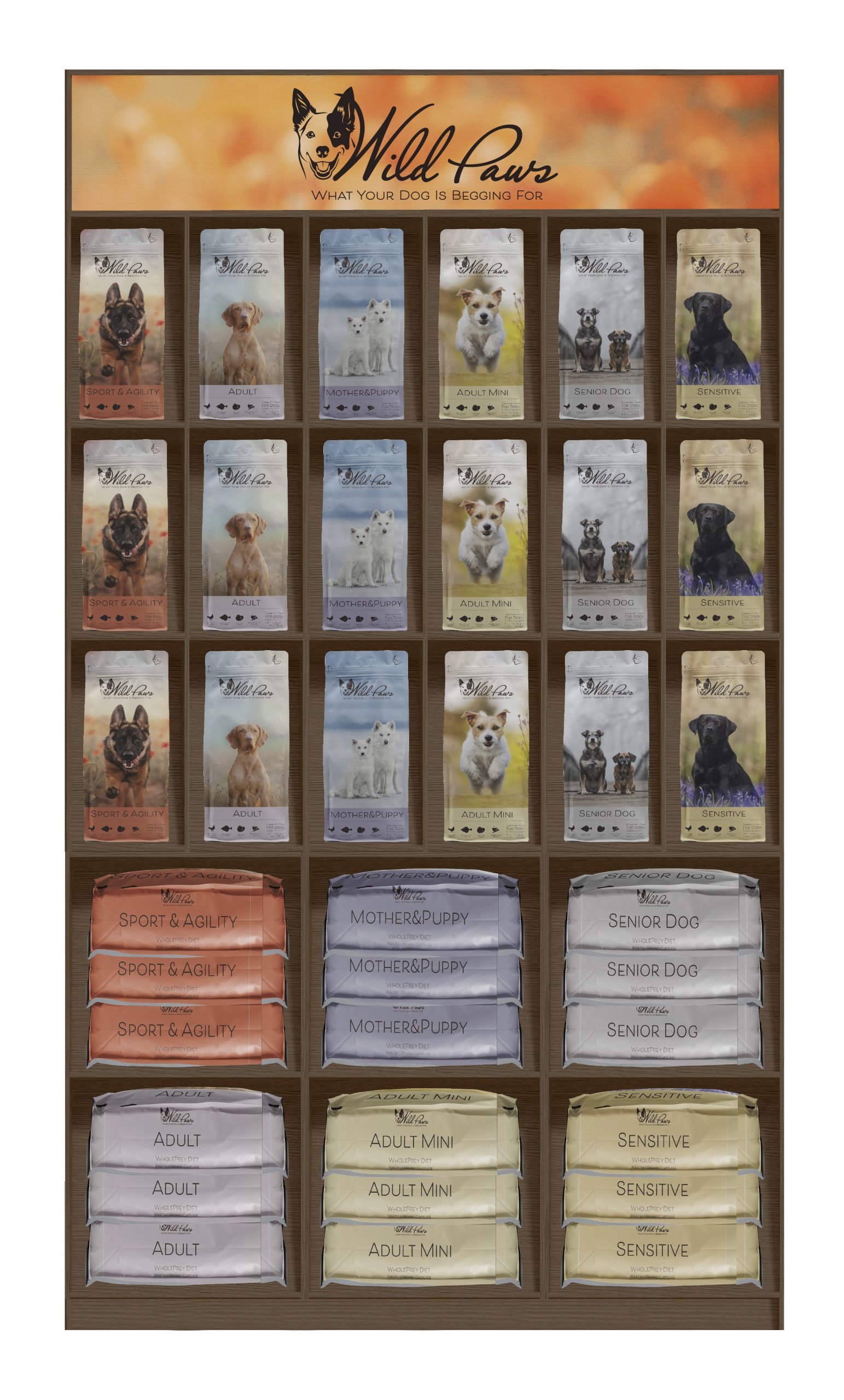
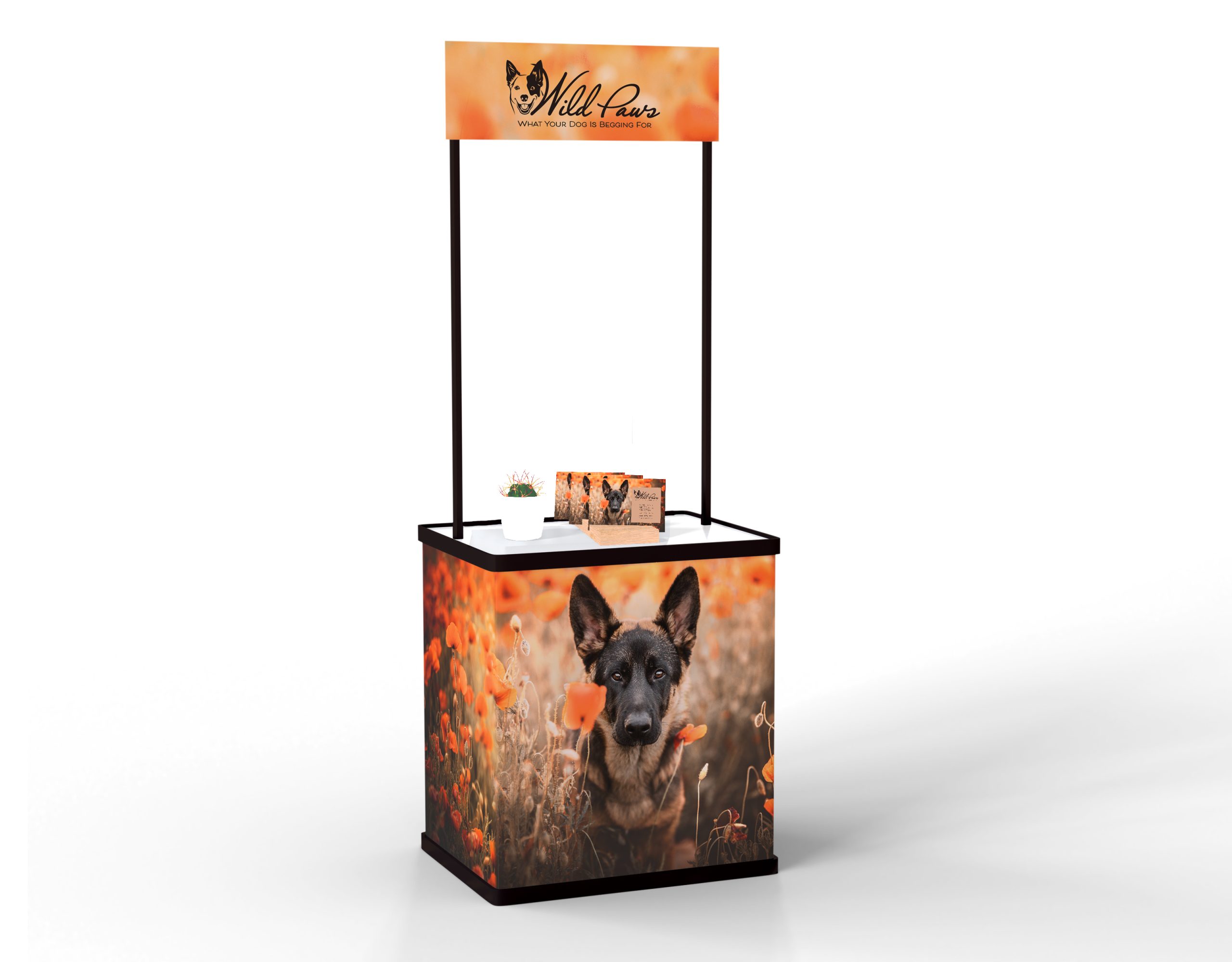
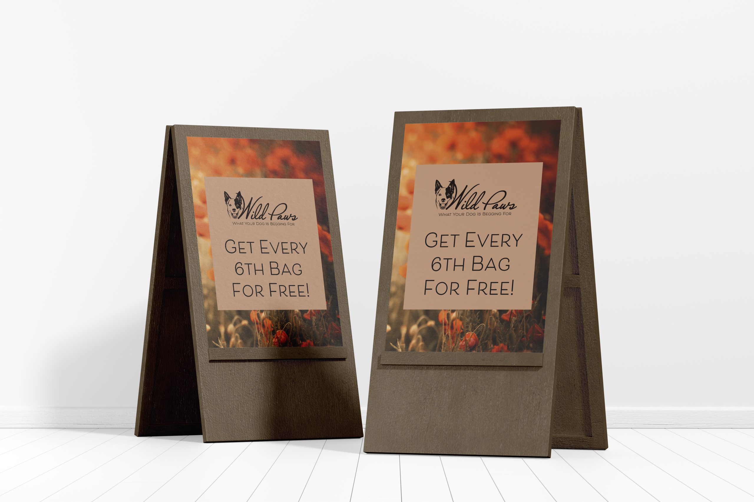
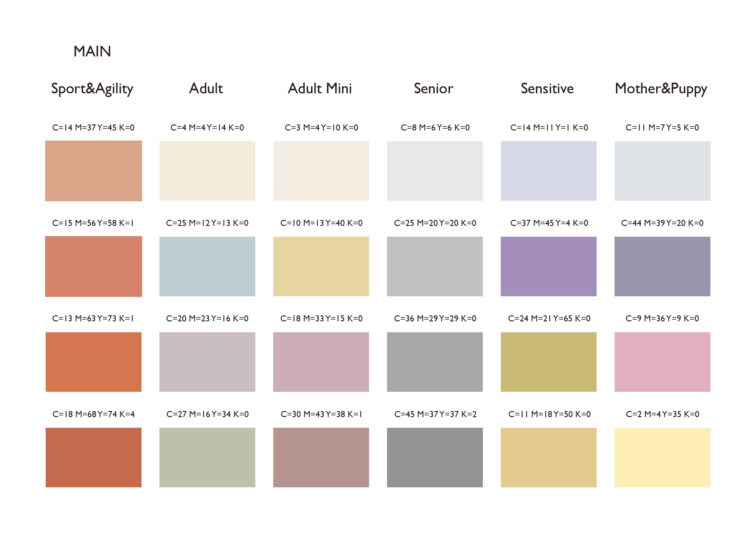
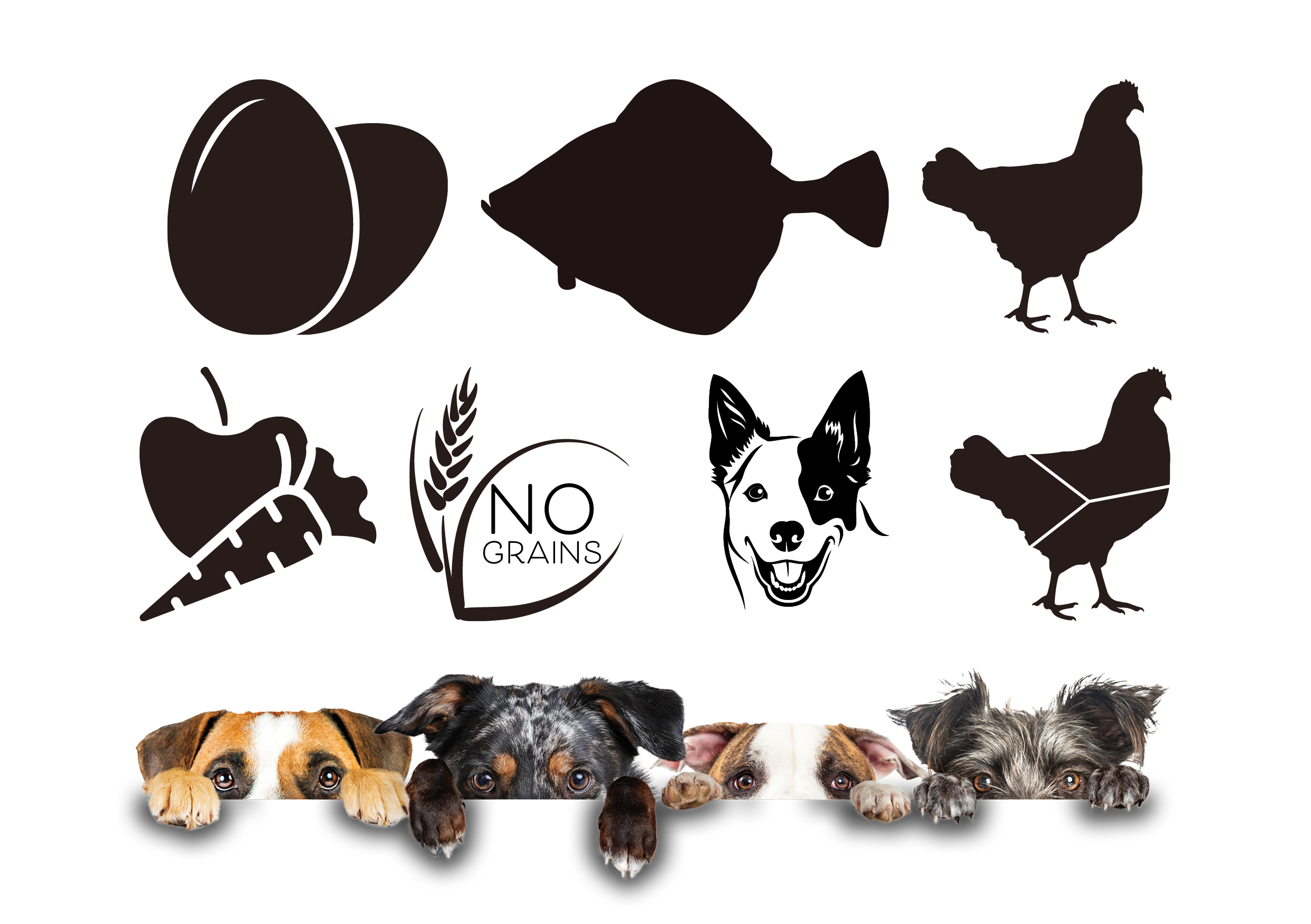
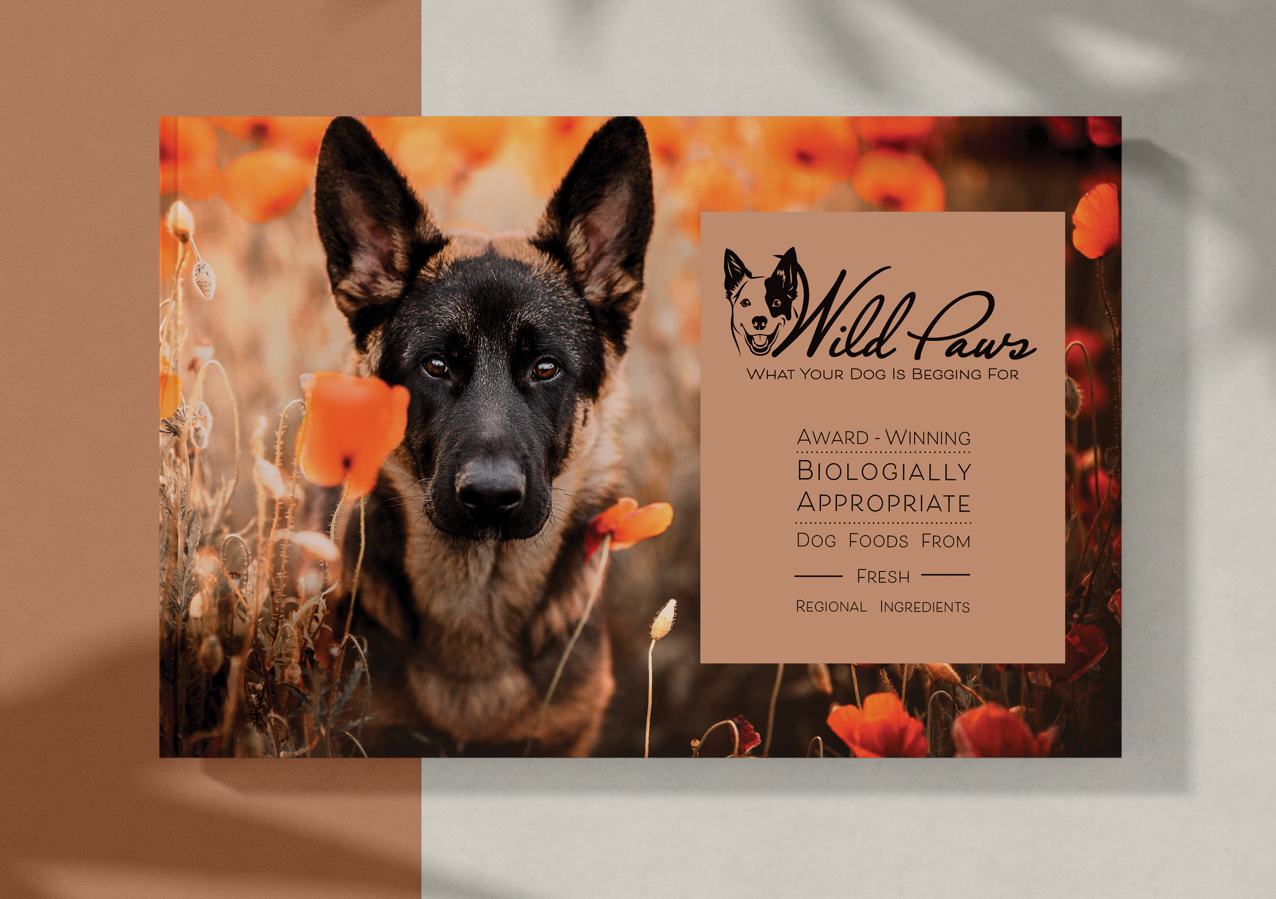
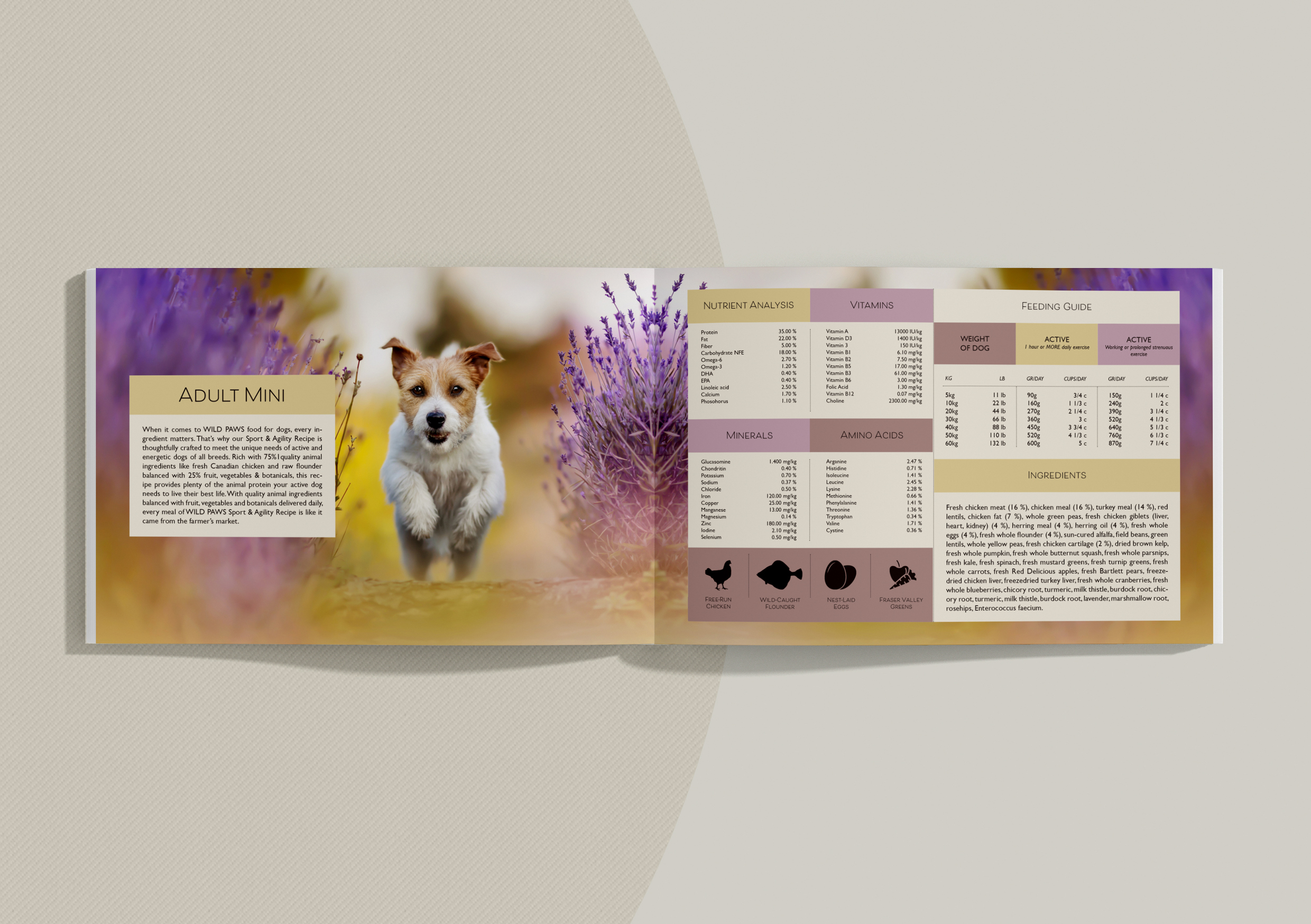
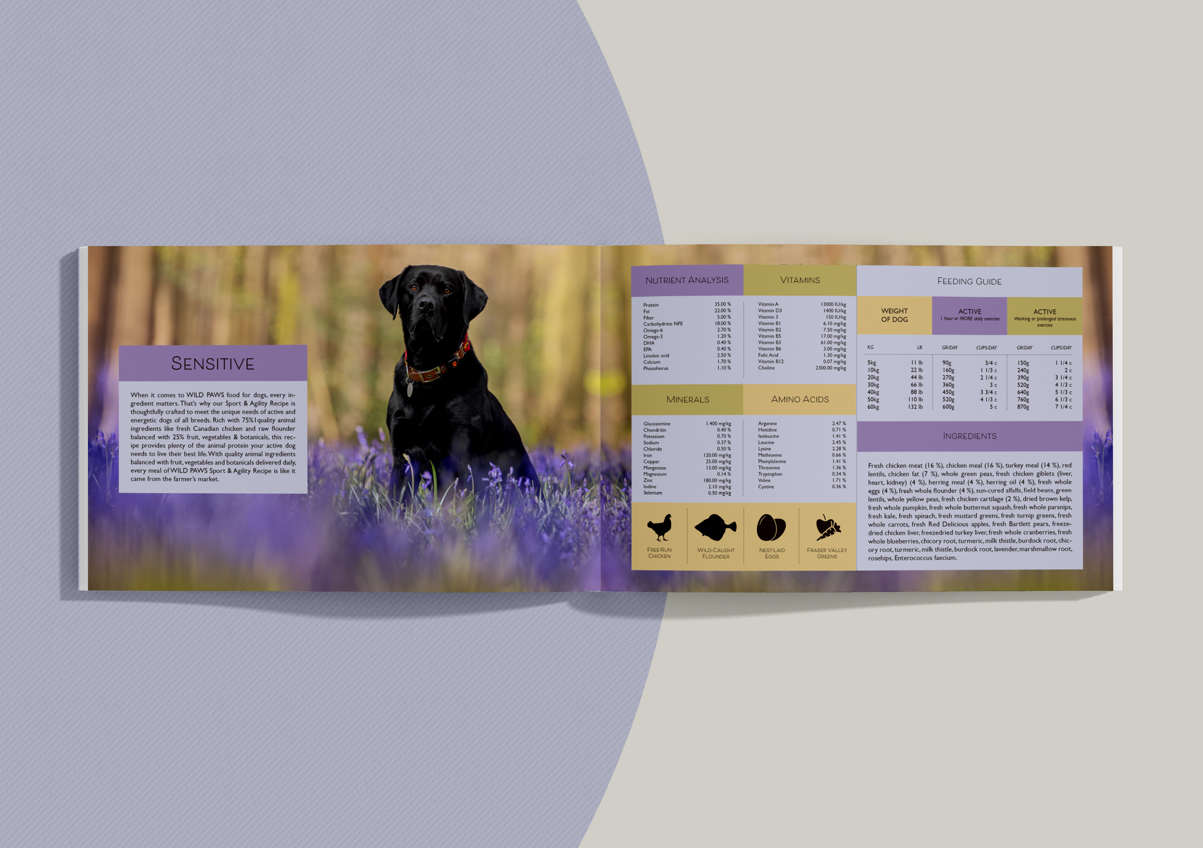
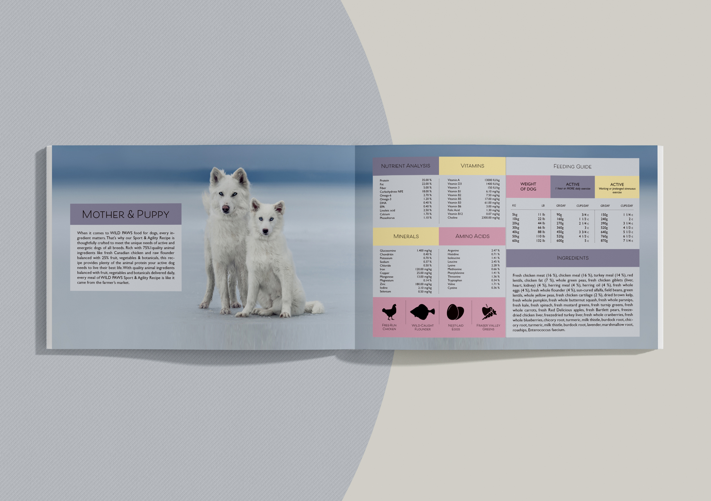
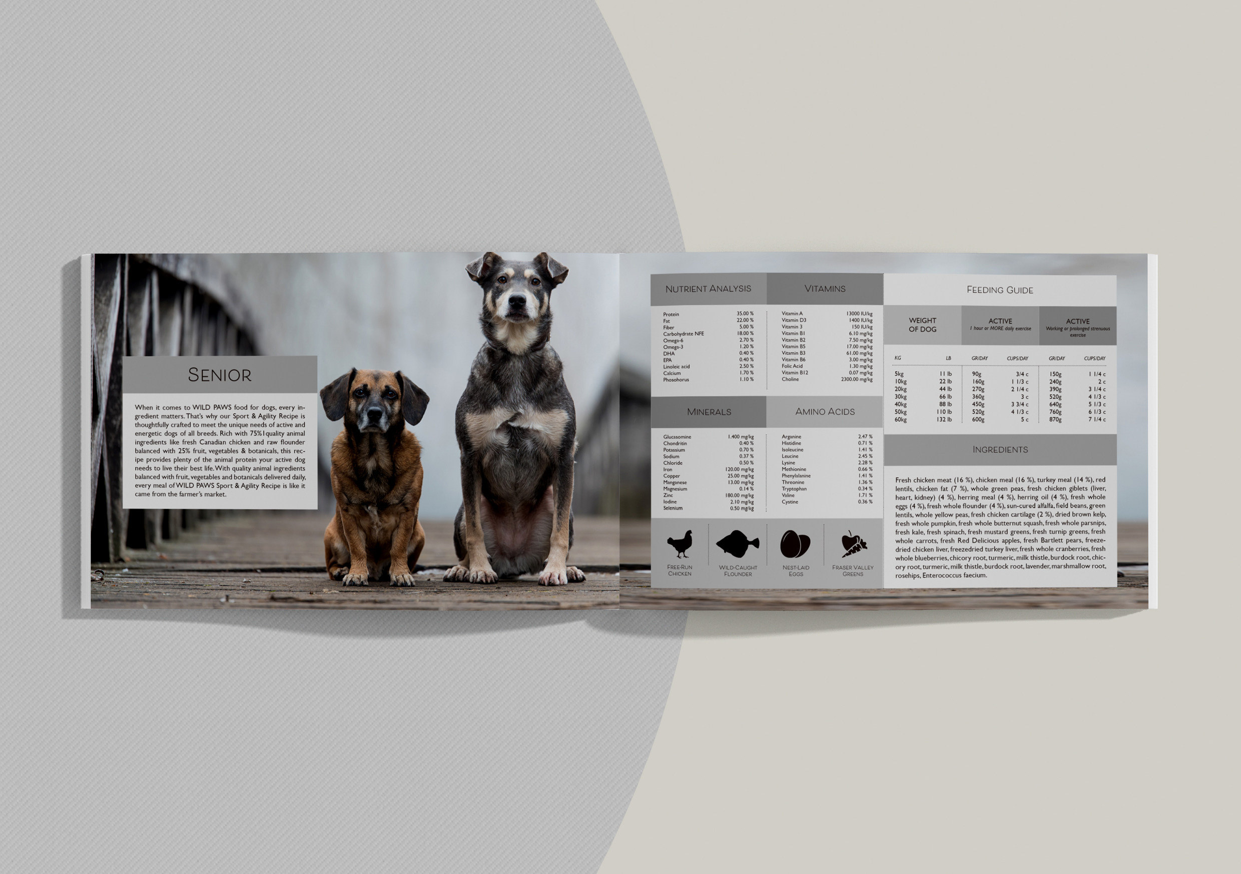
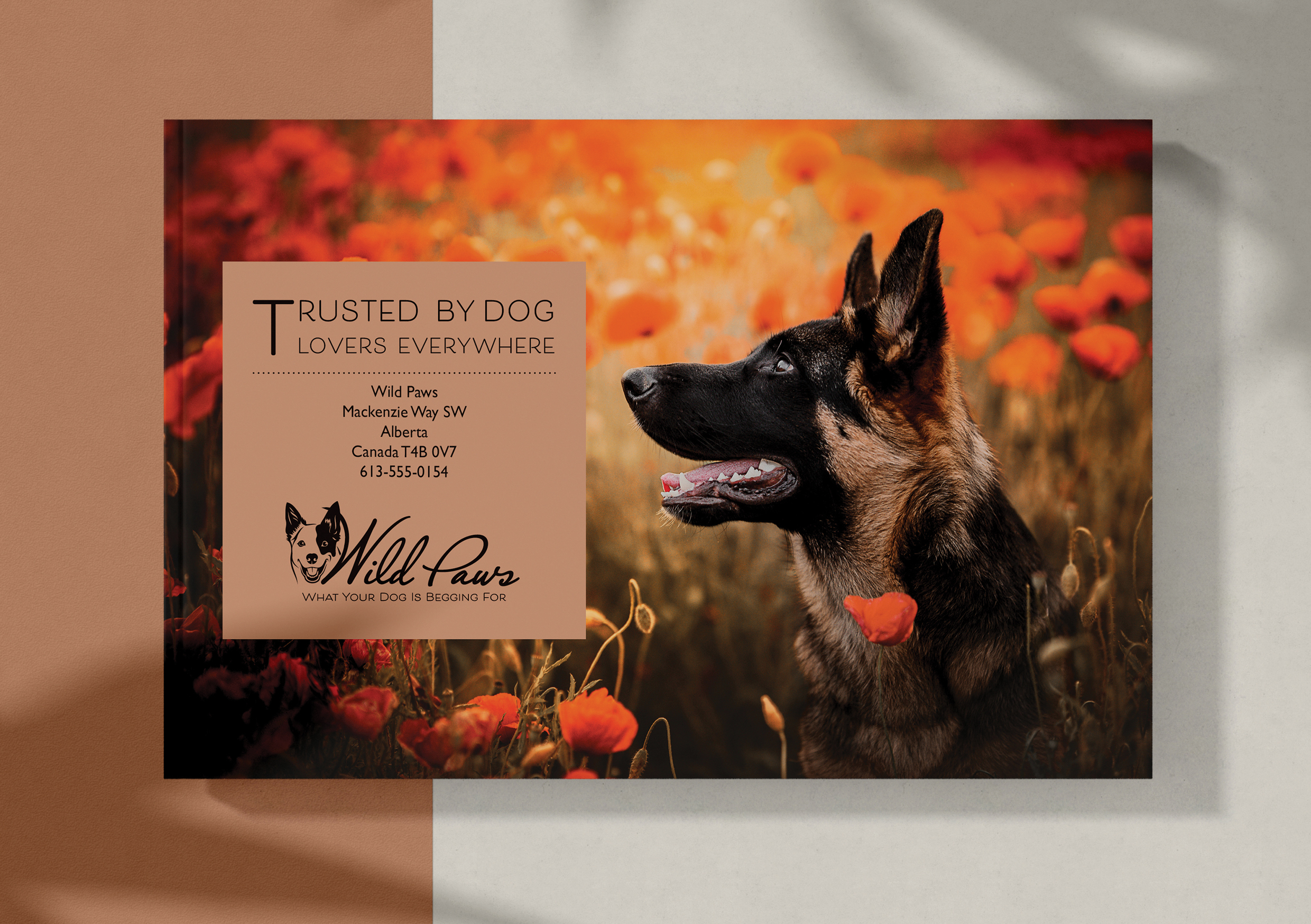
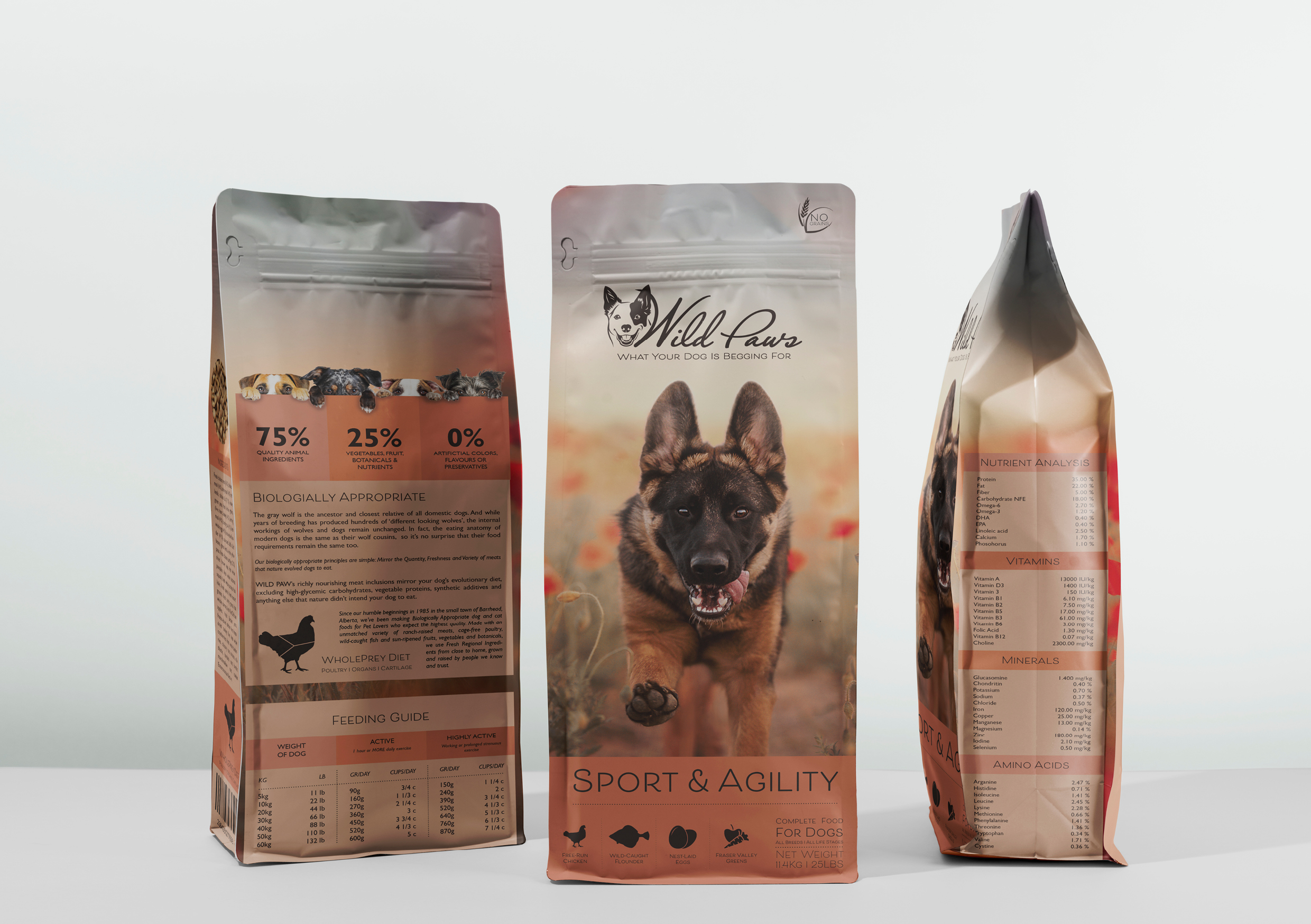
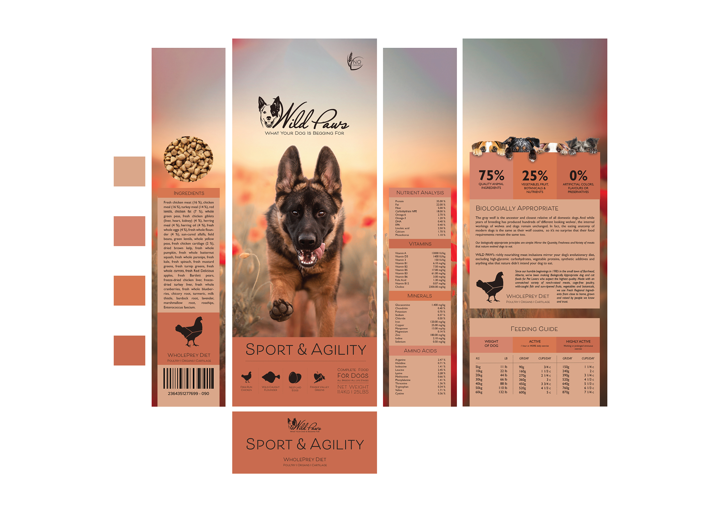
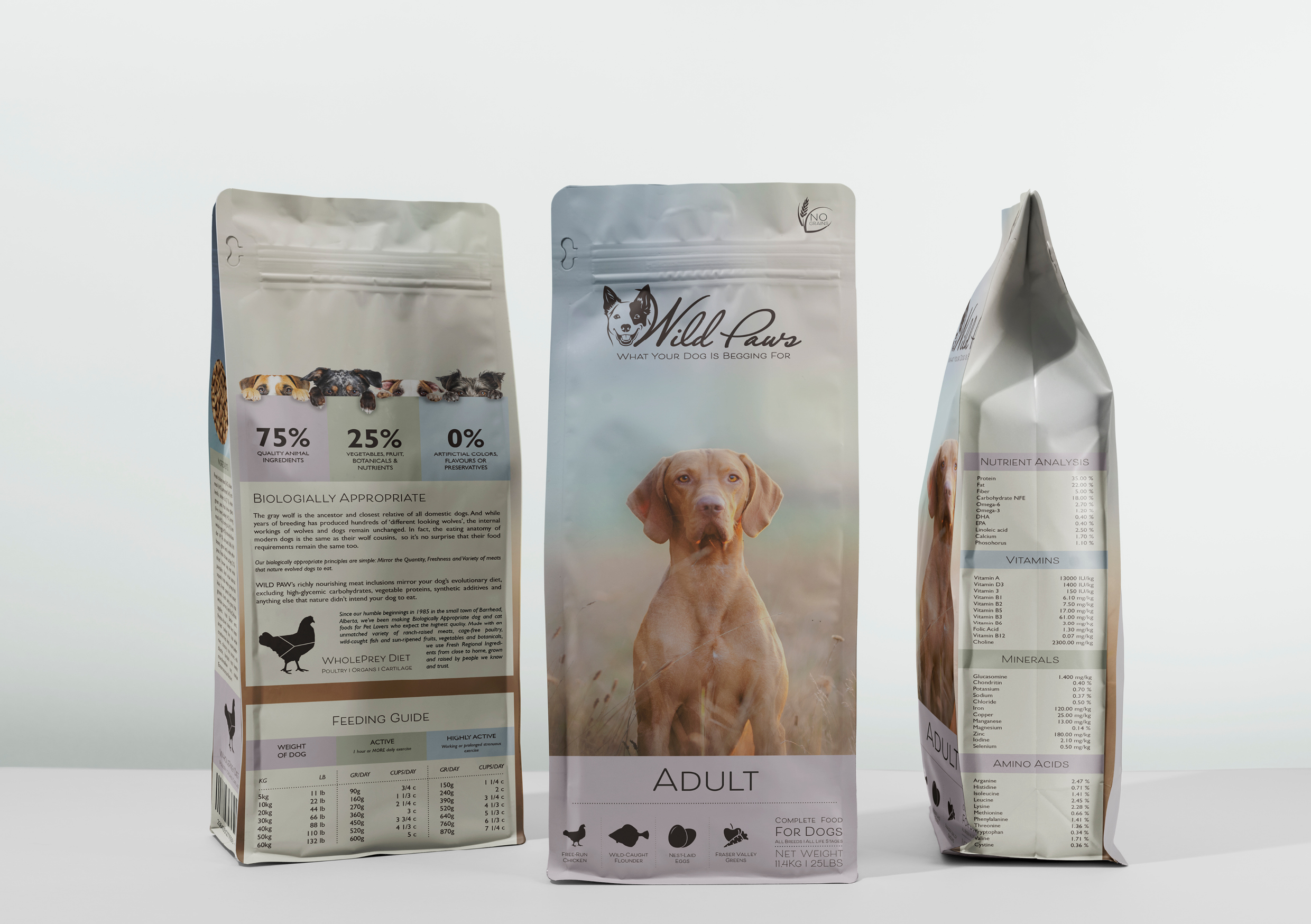
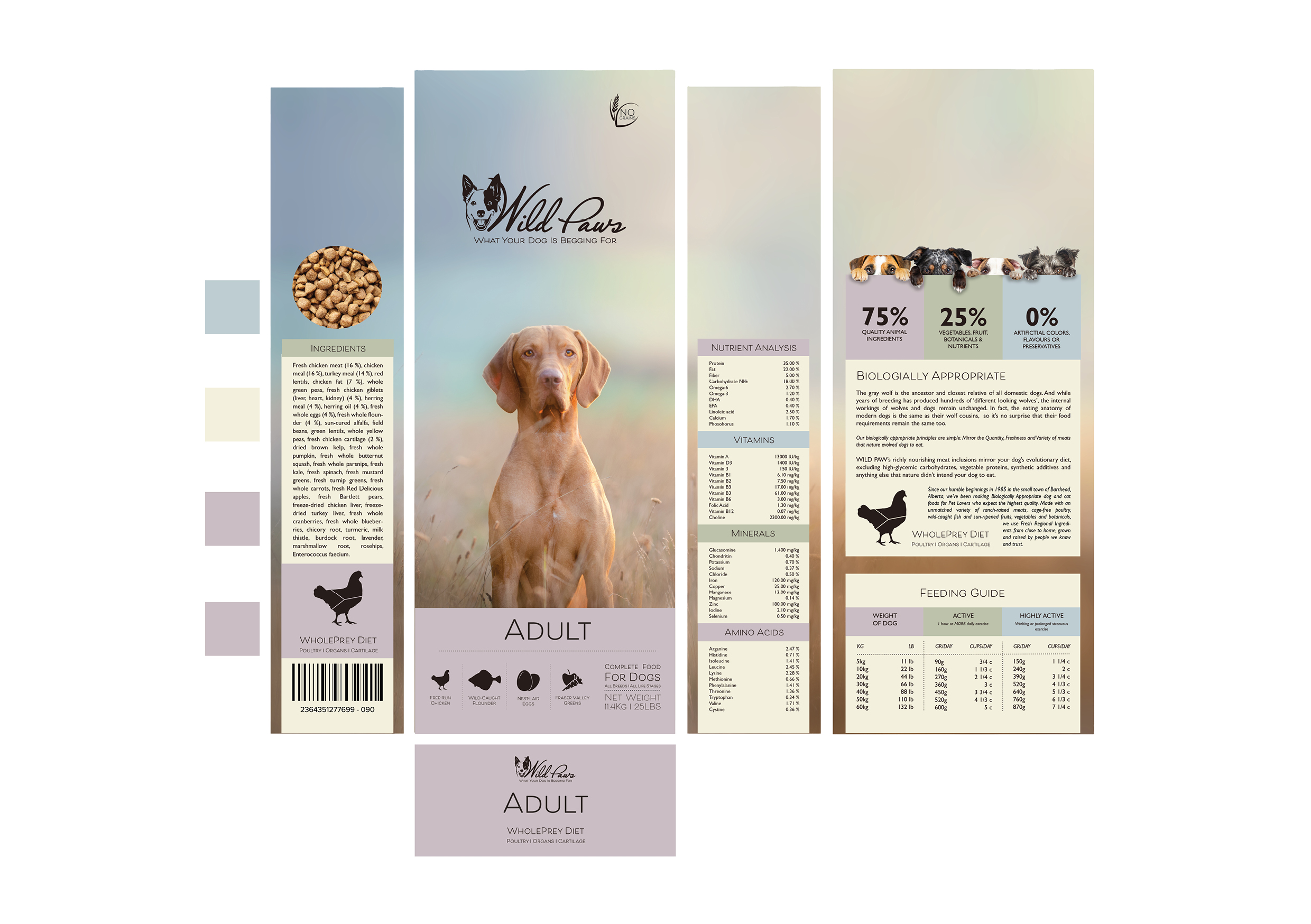
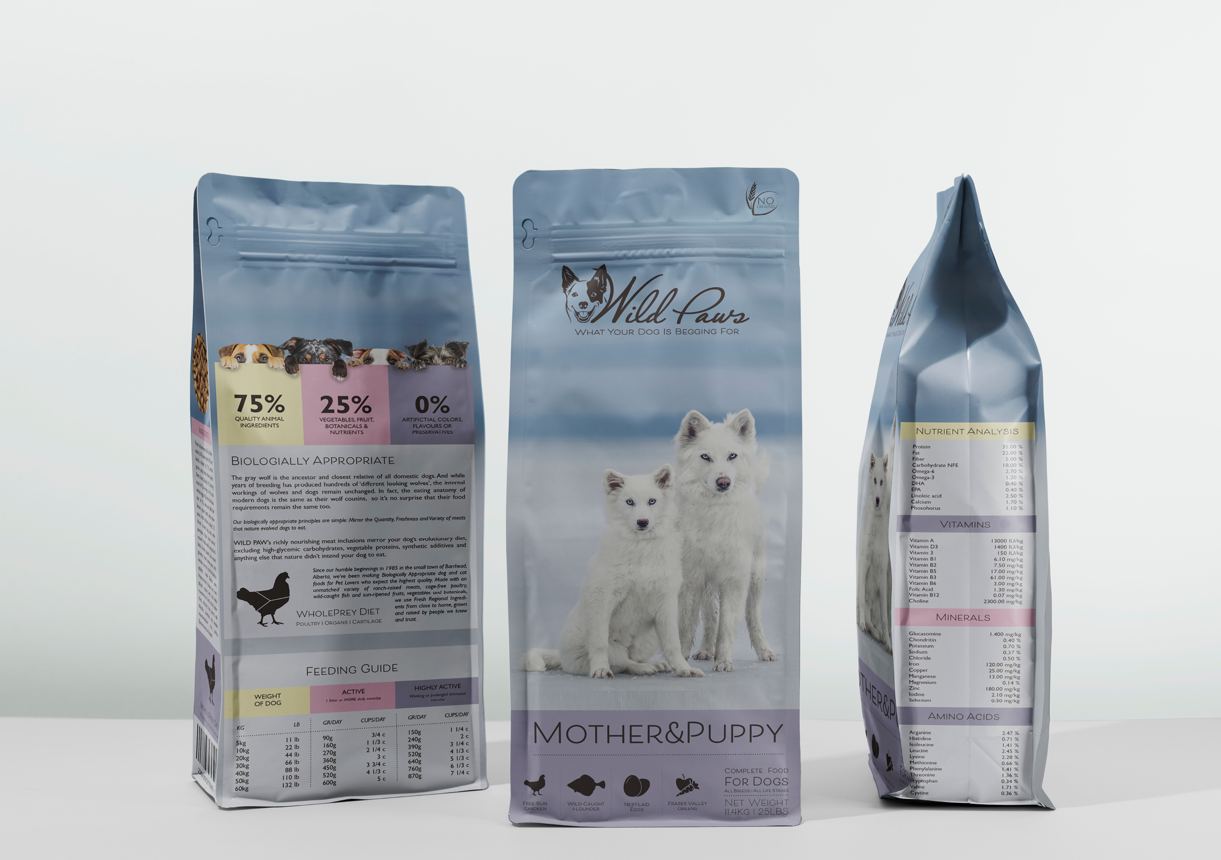
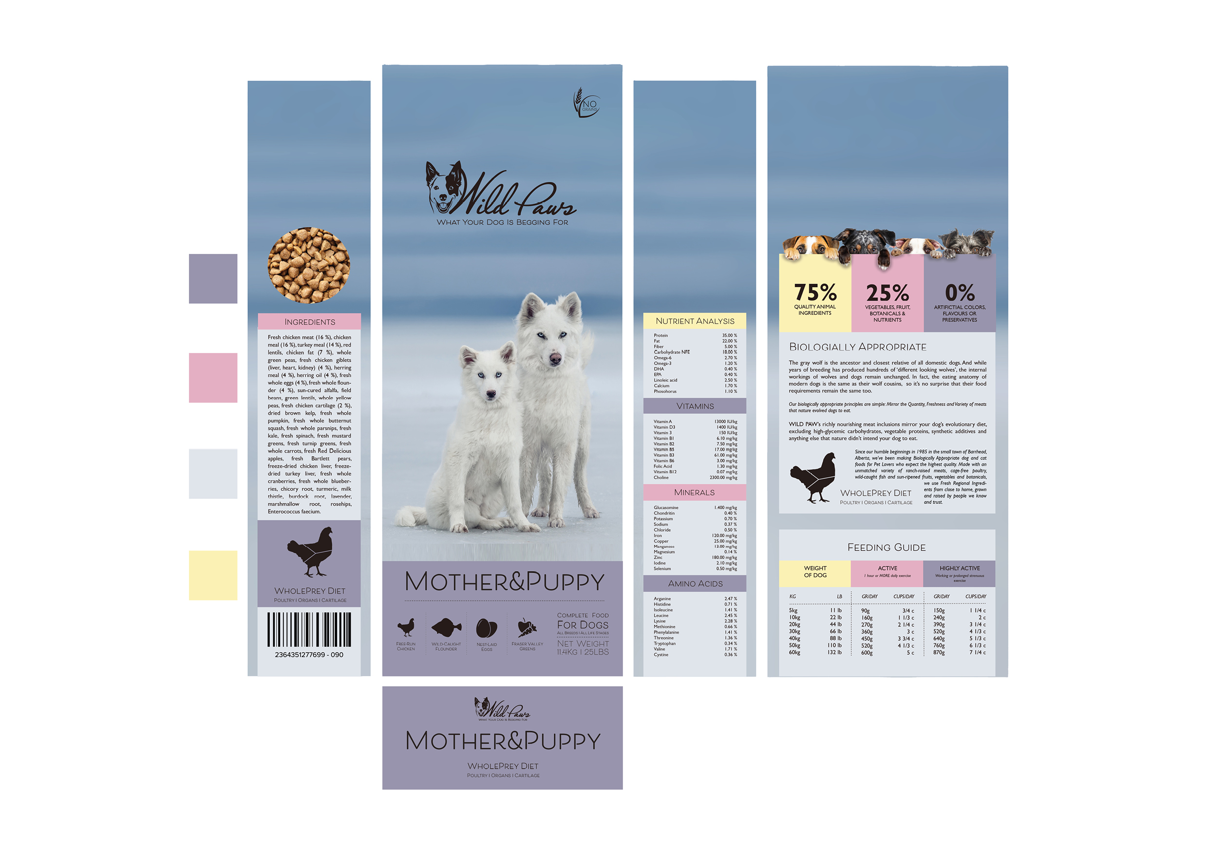
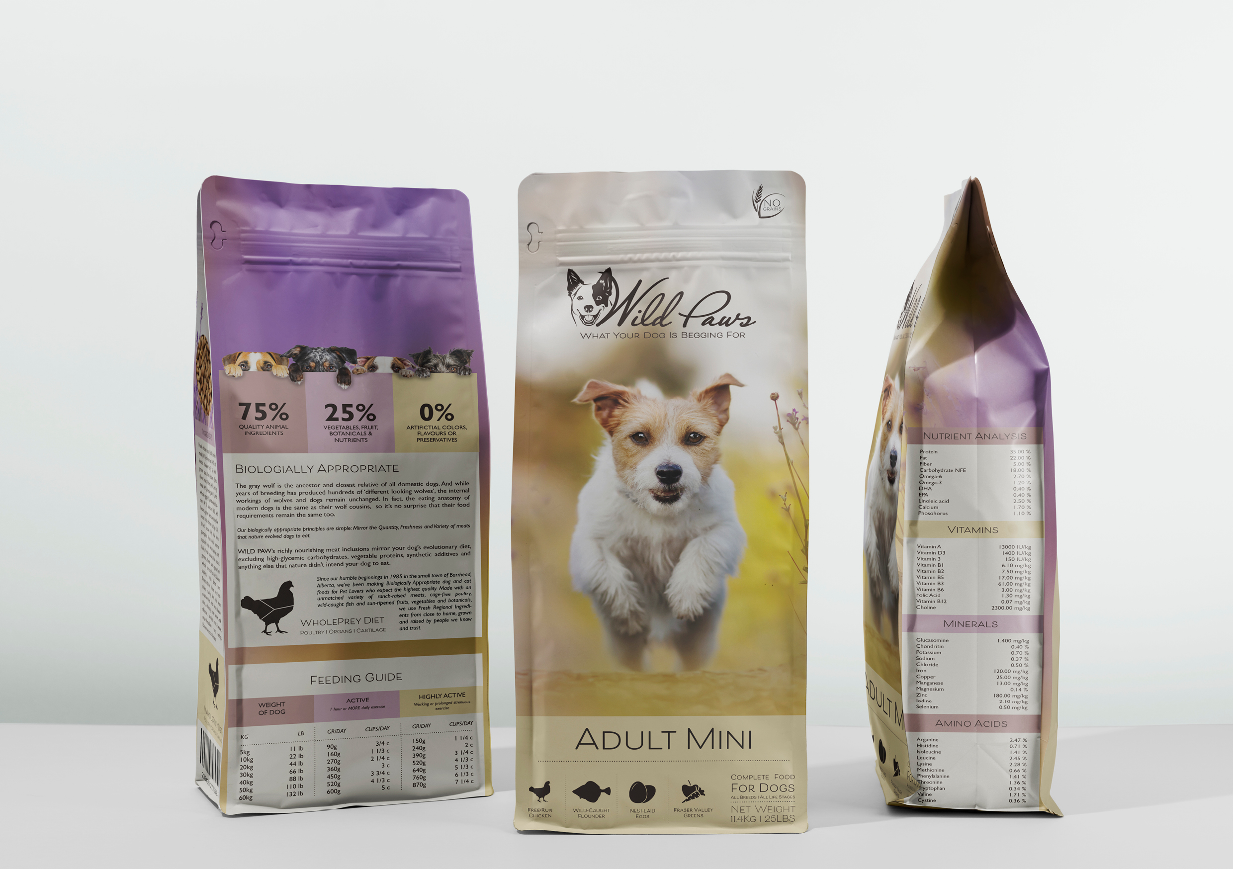
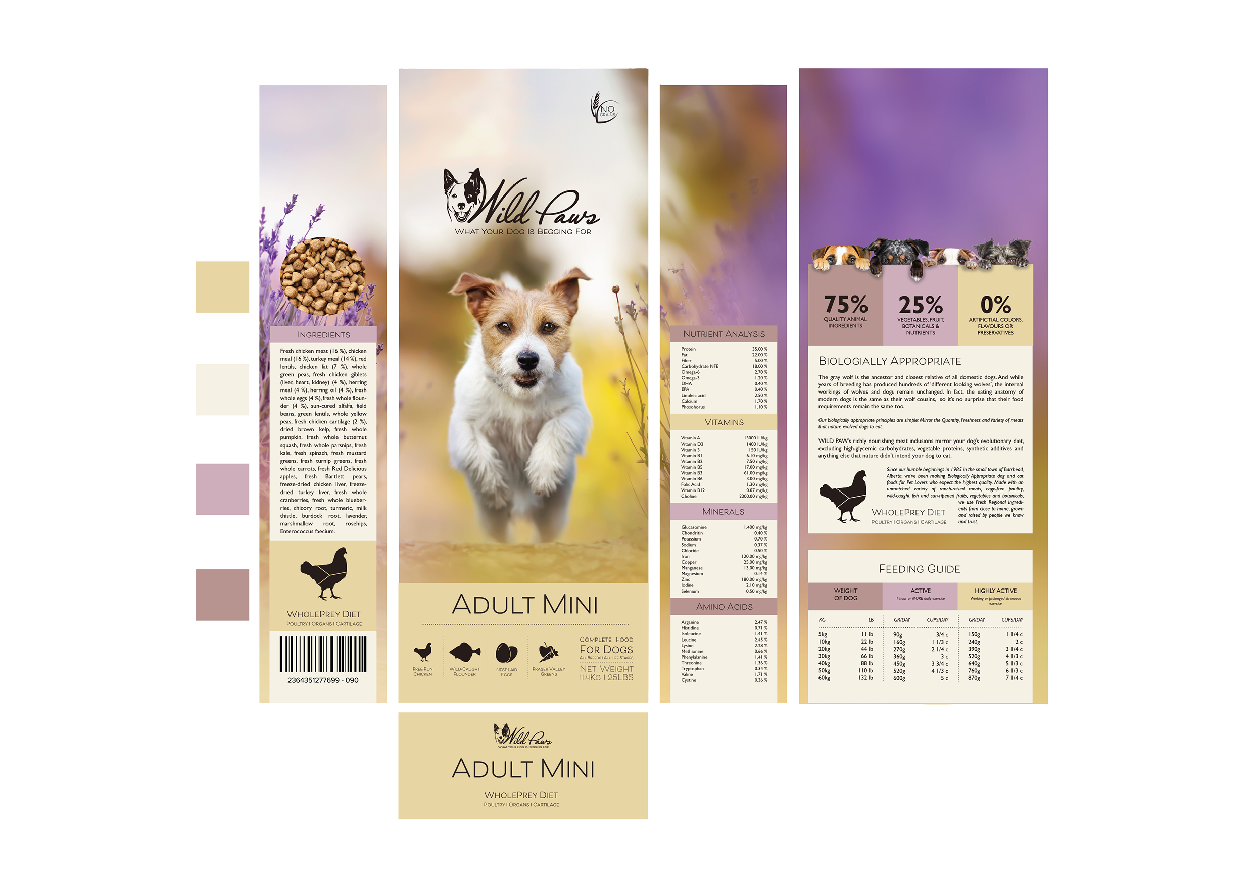
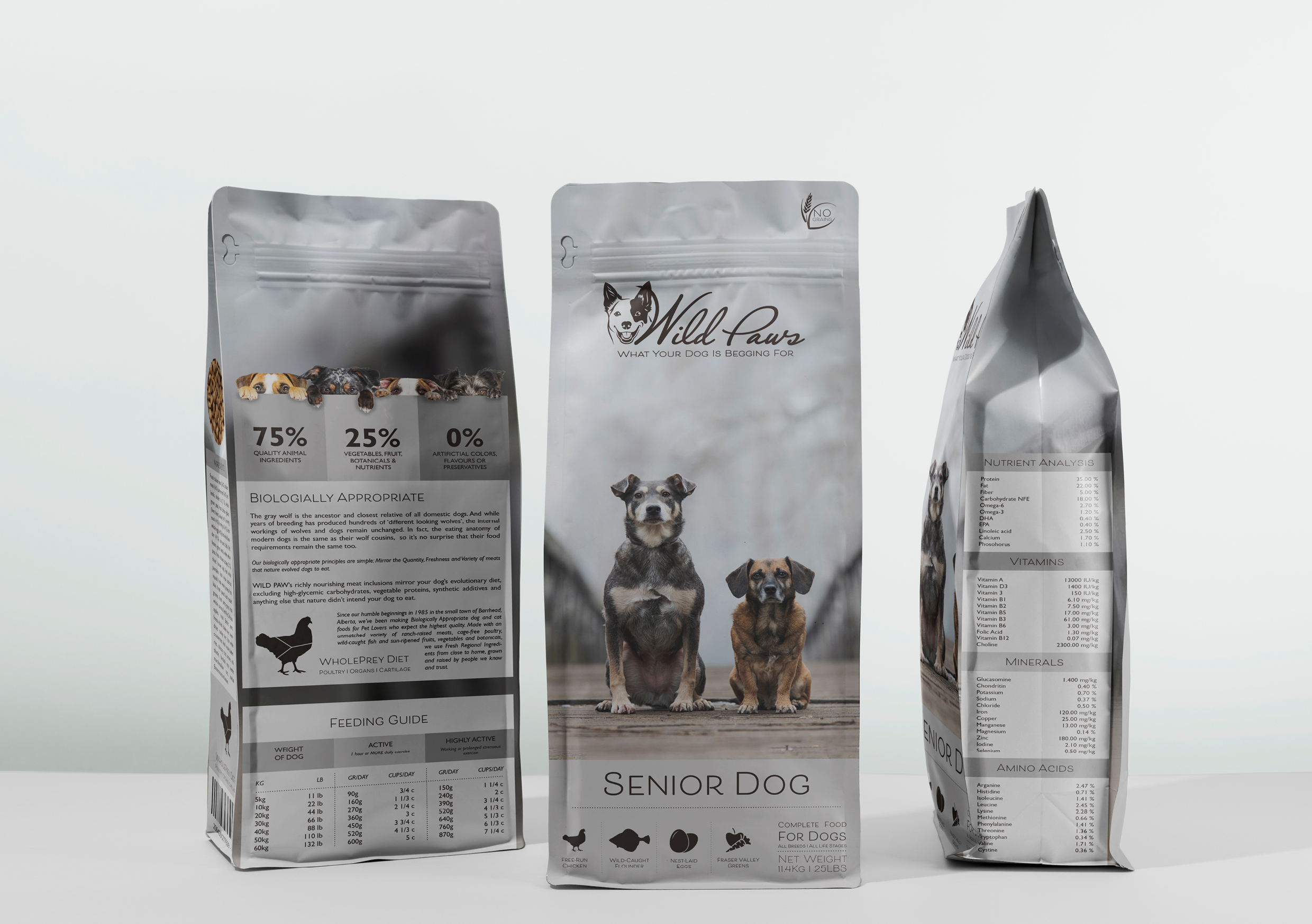
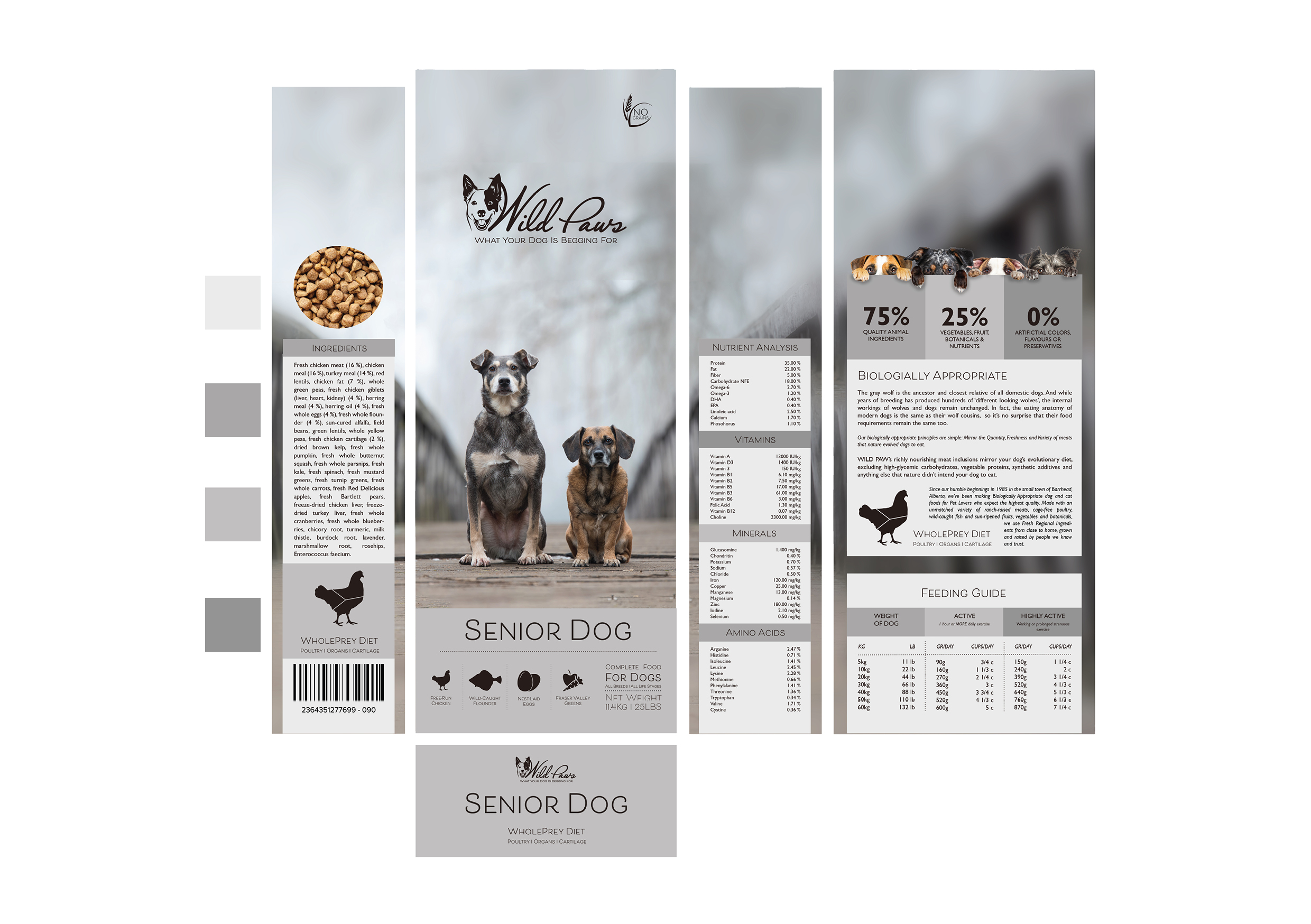
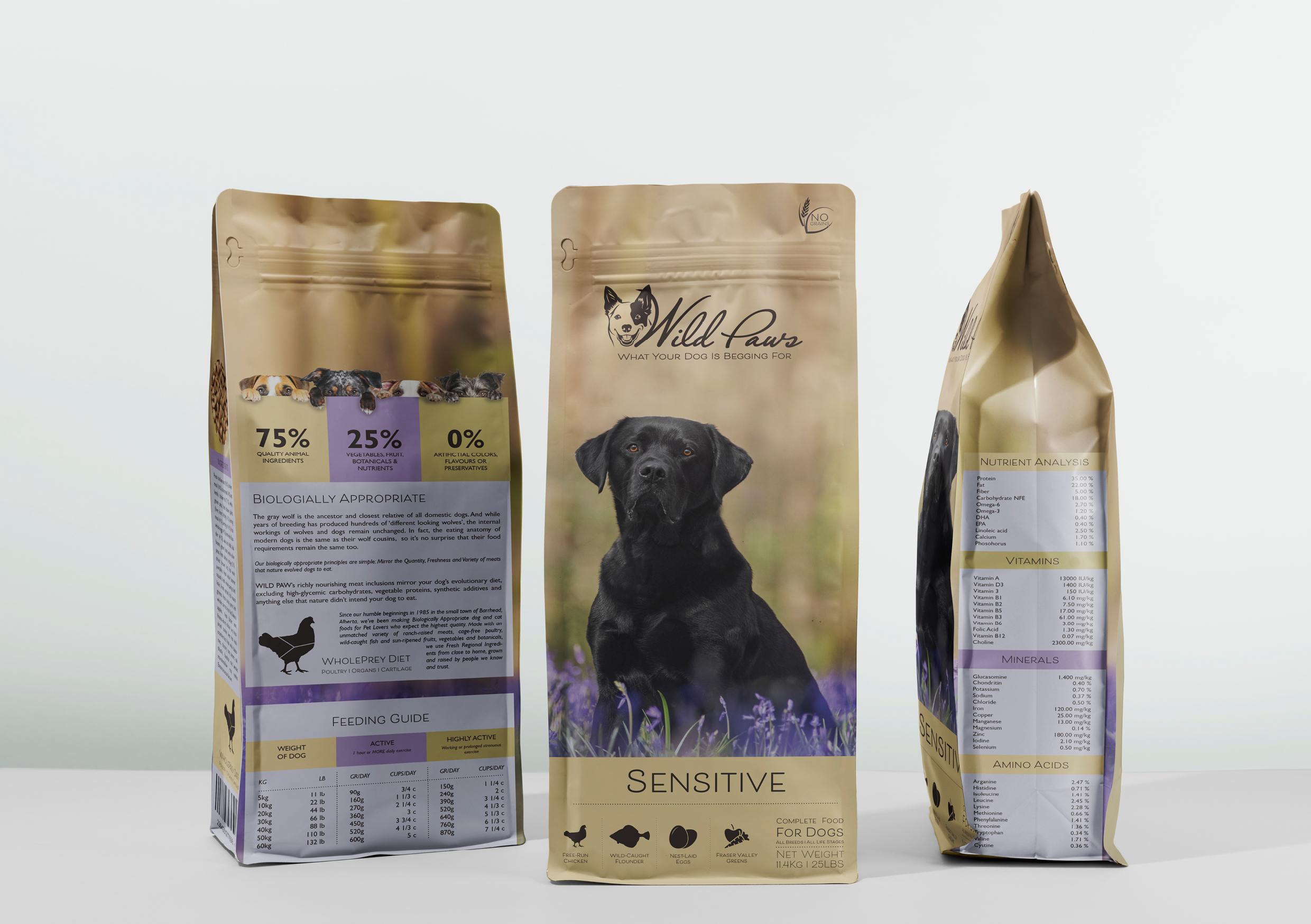
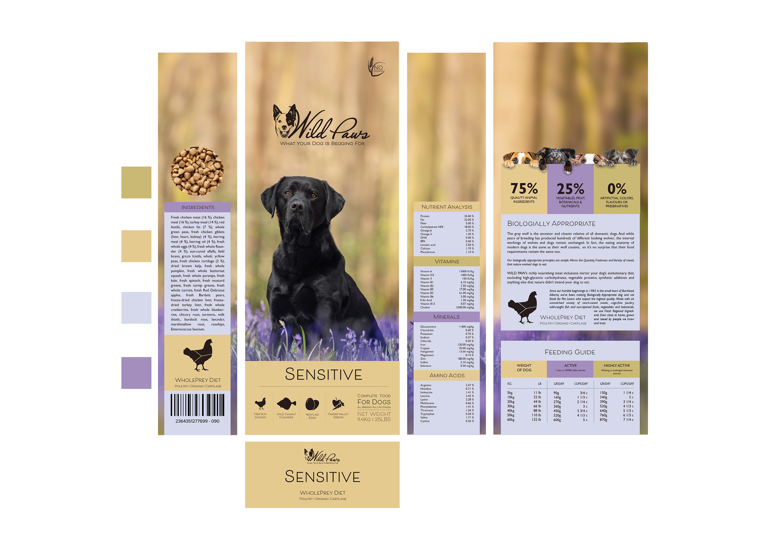
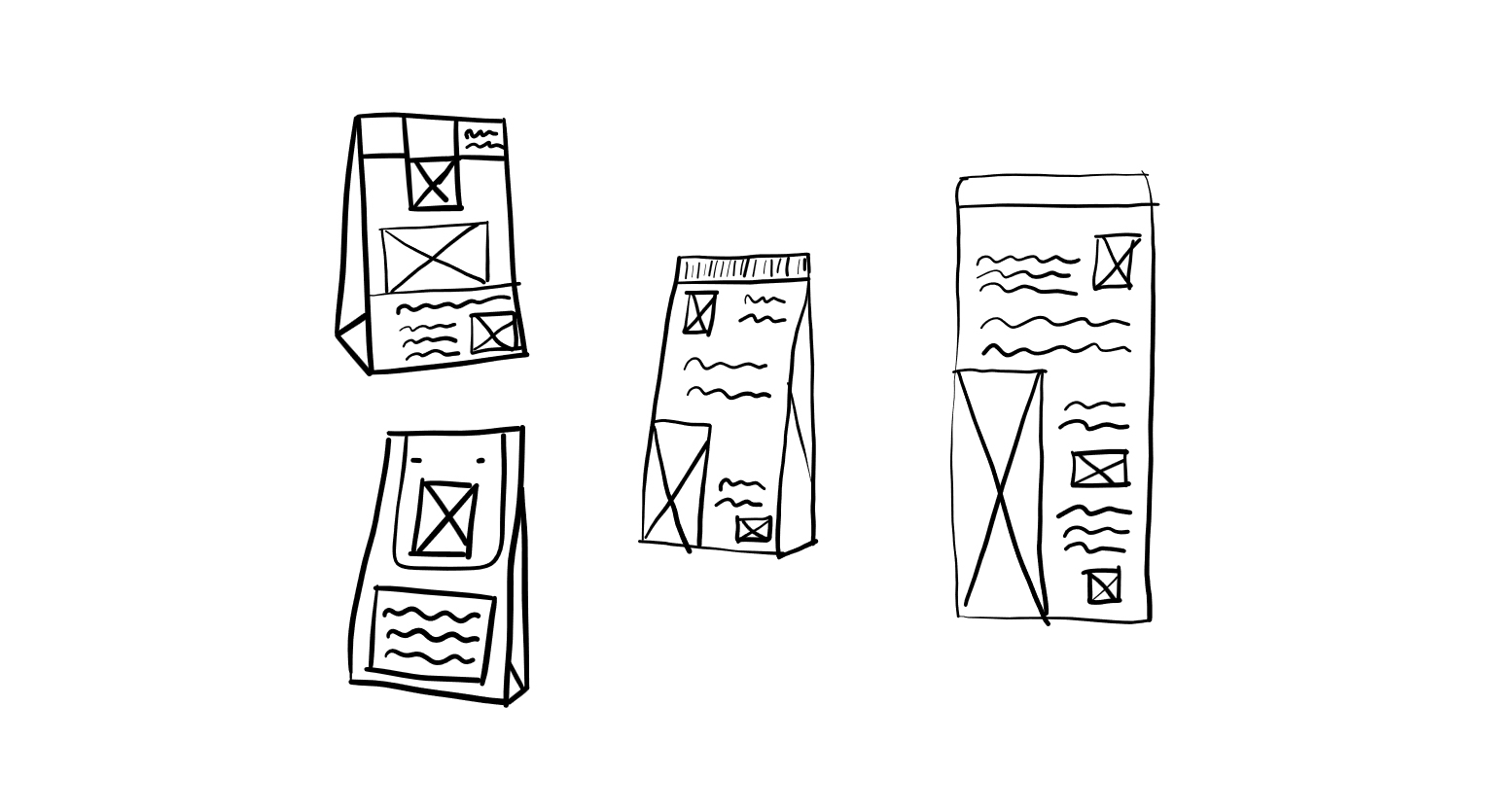
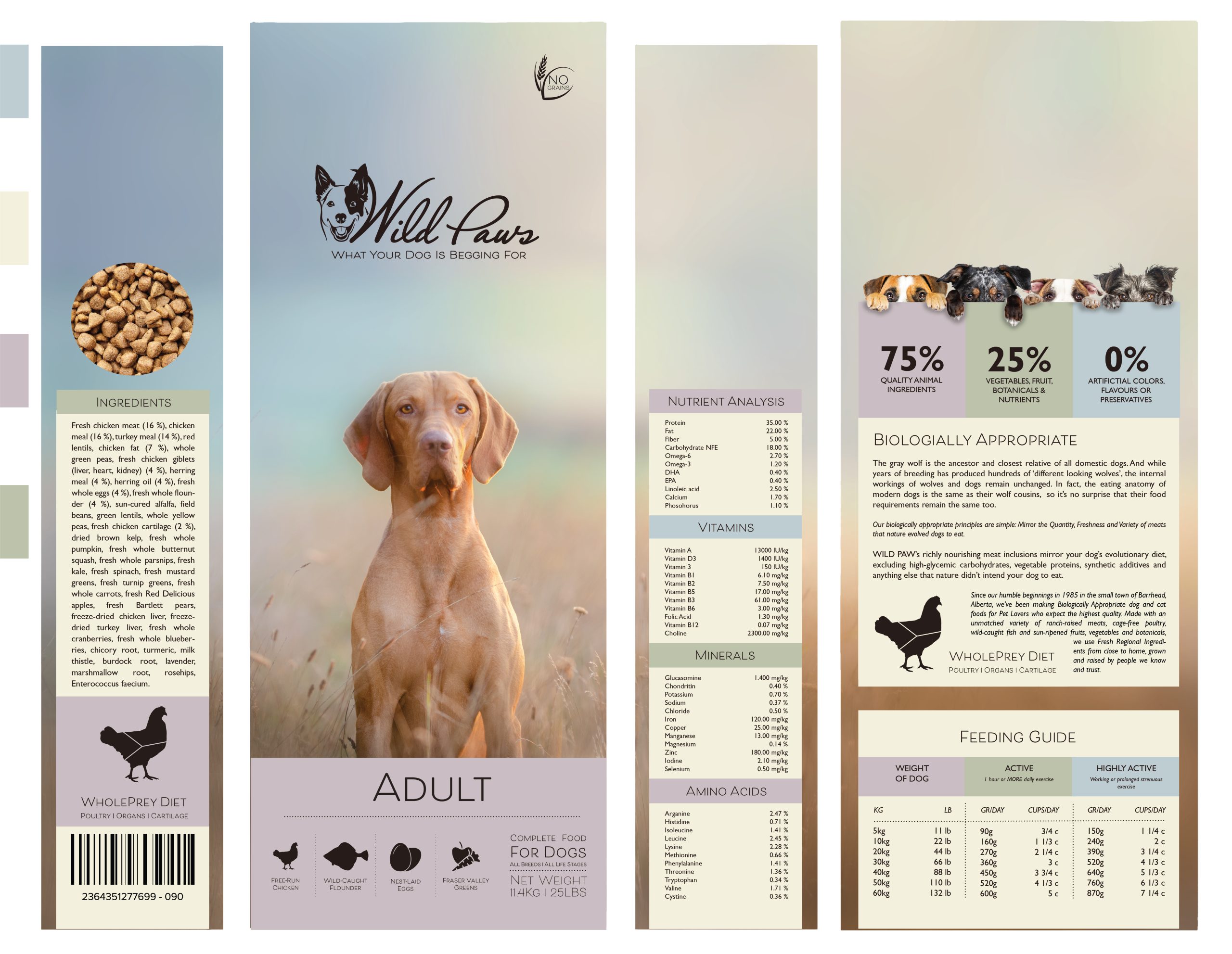
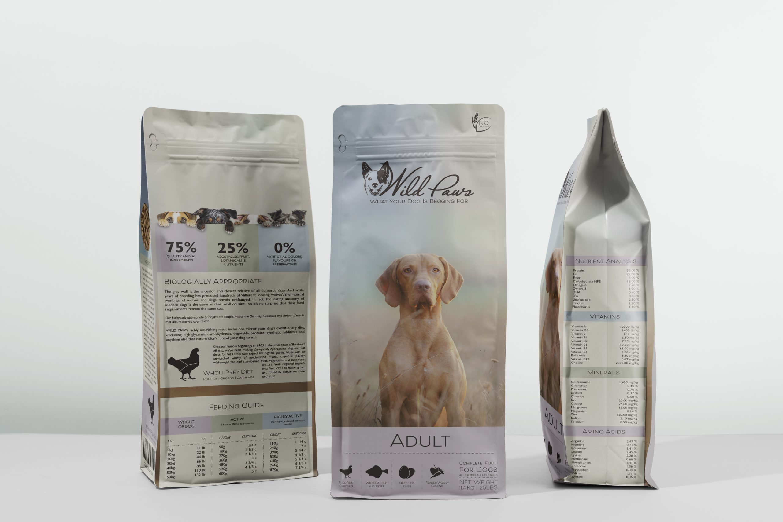
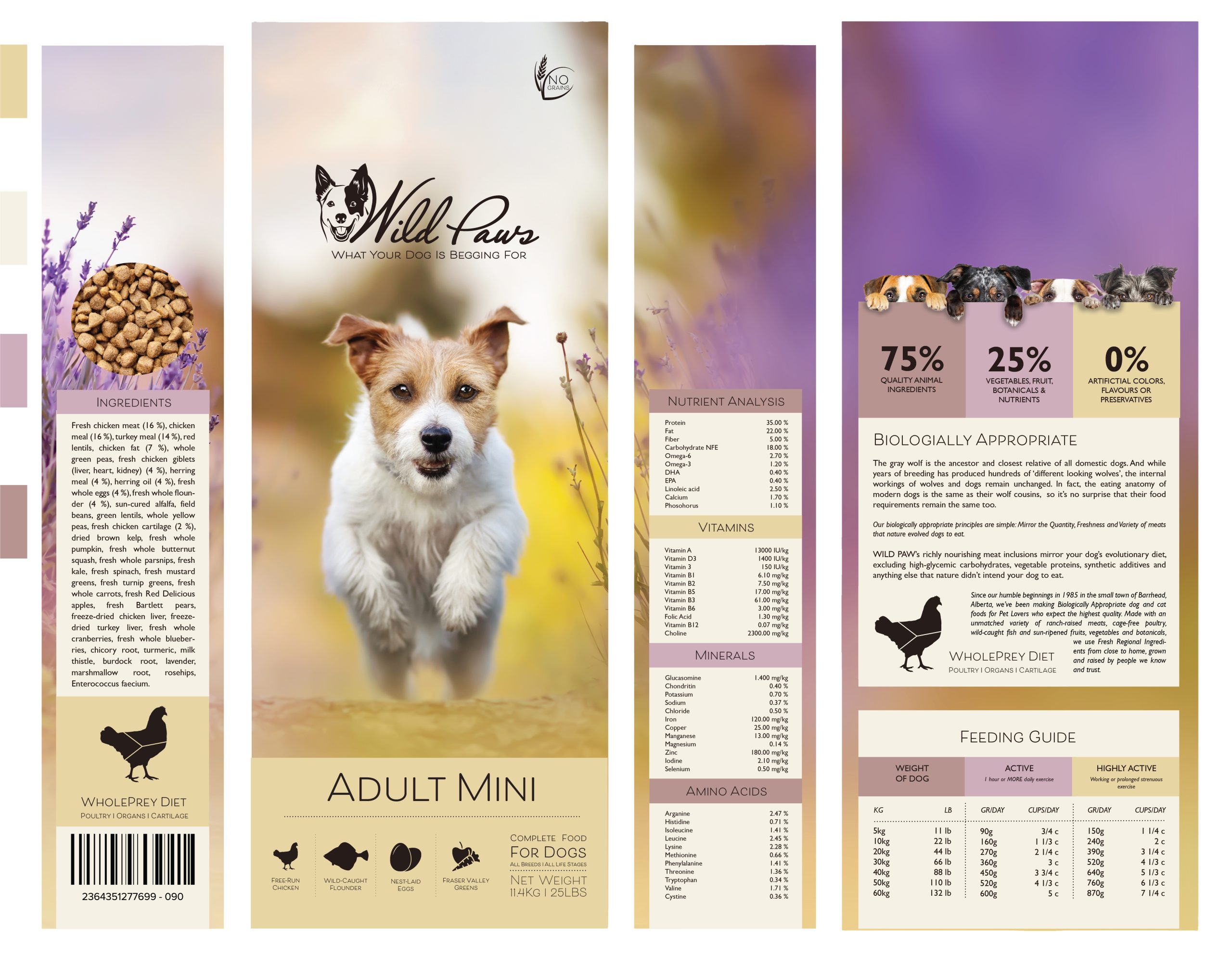
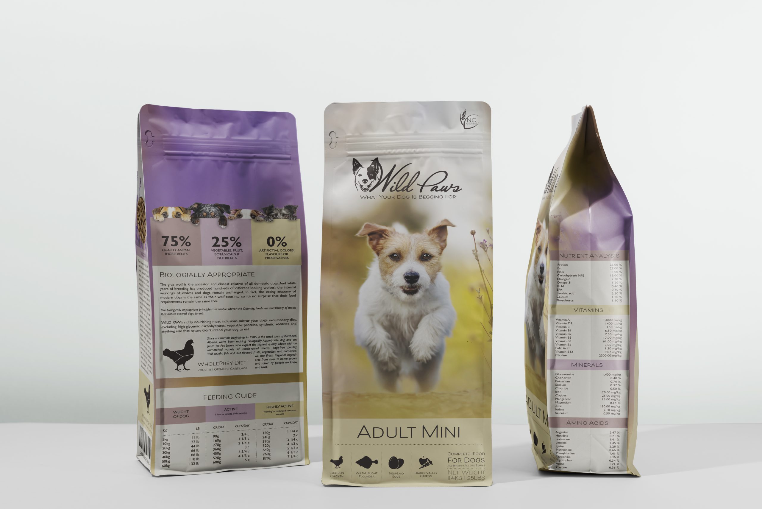
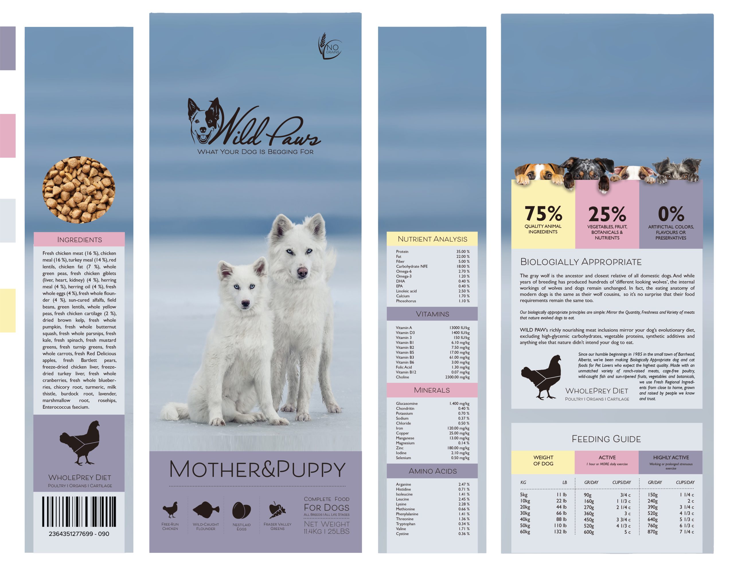
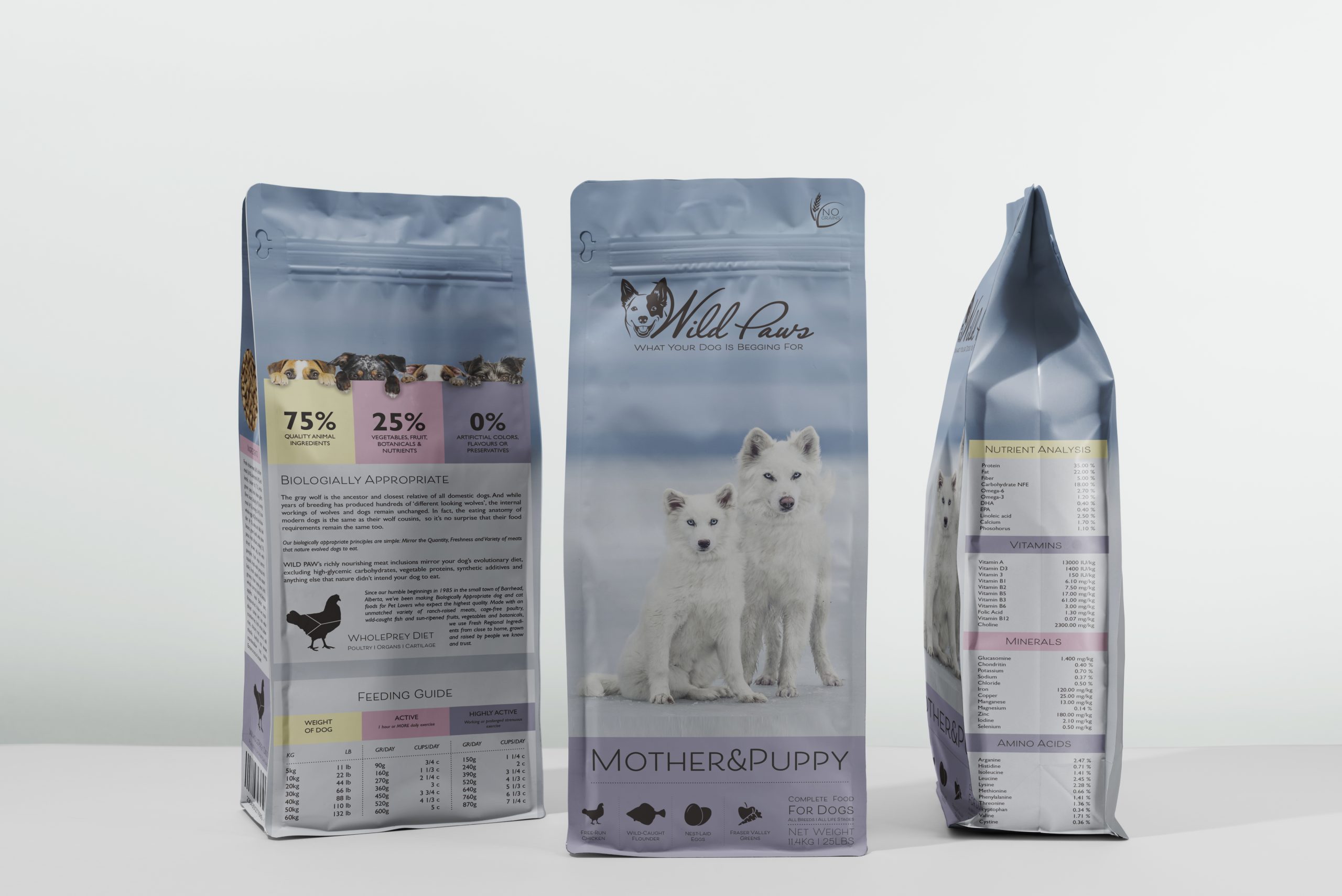
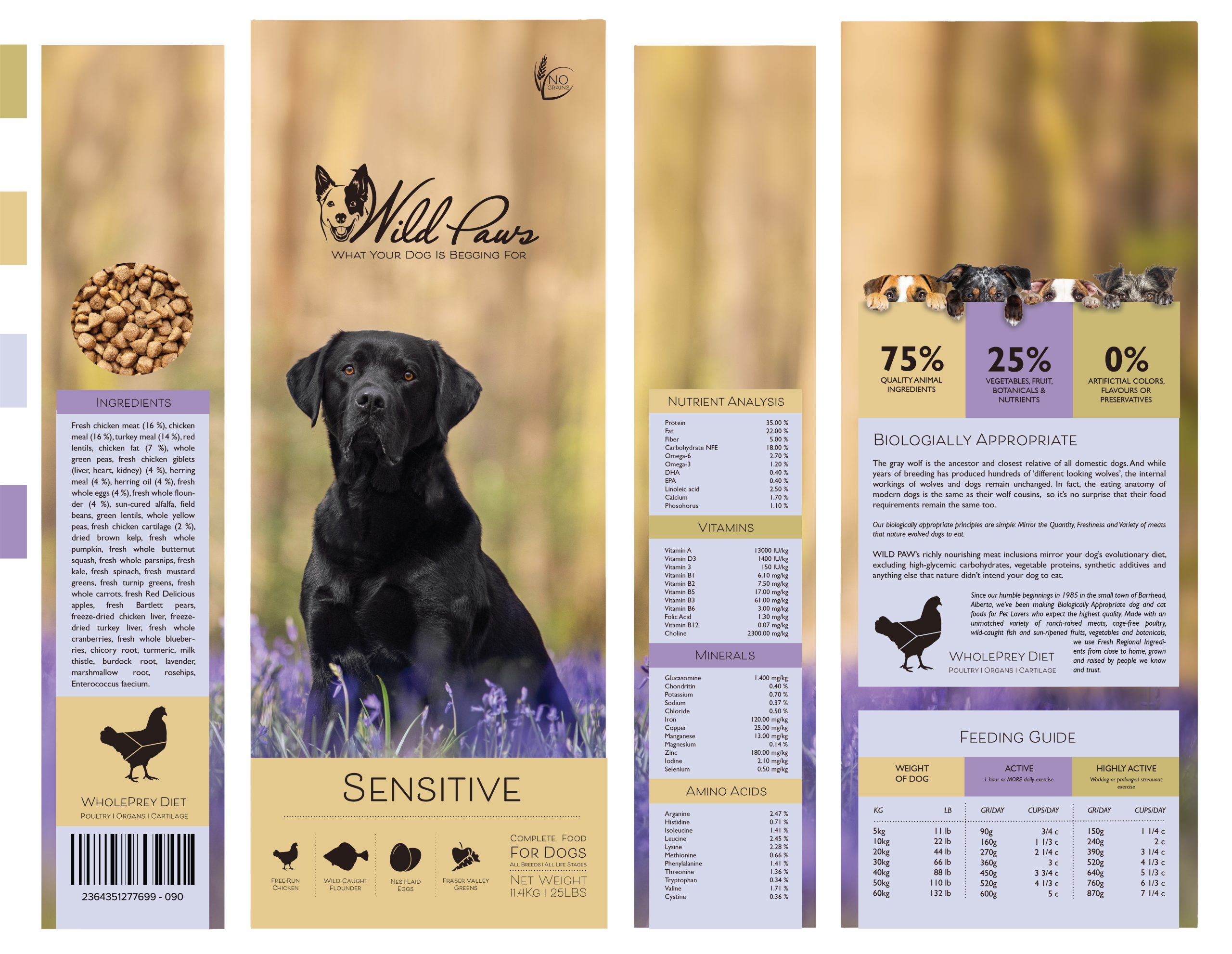
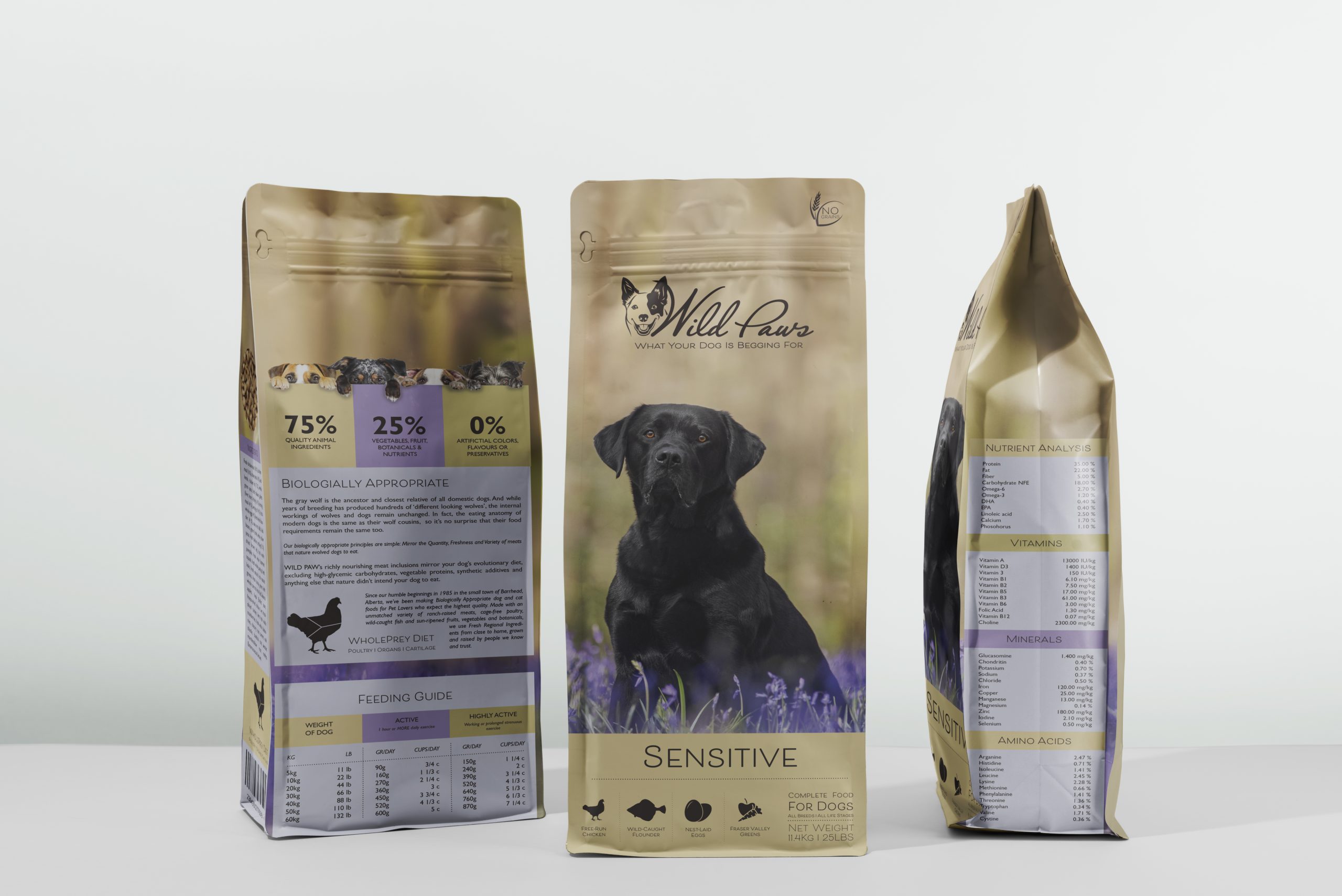
Brief
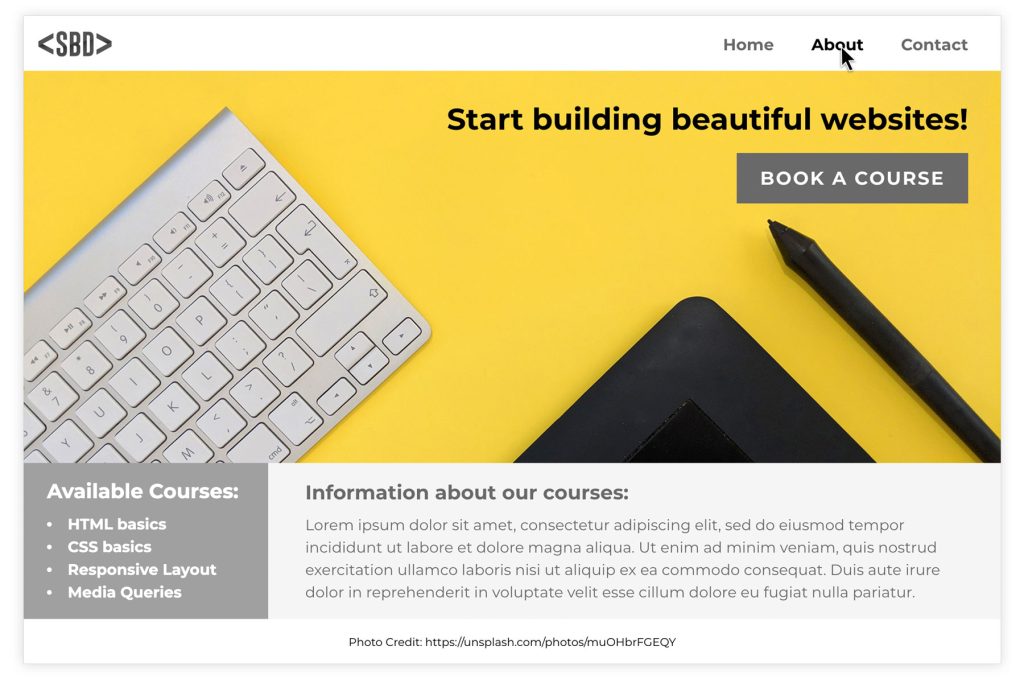
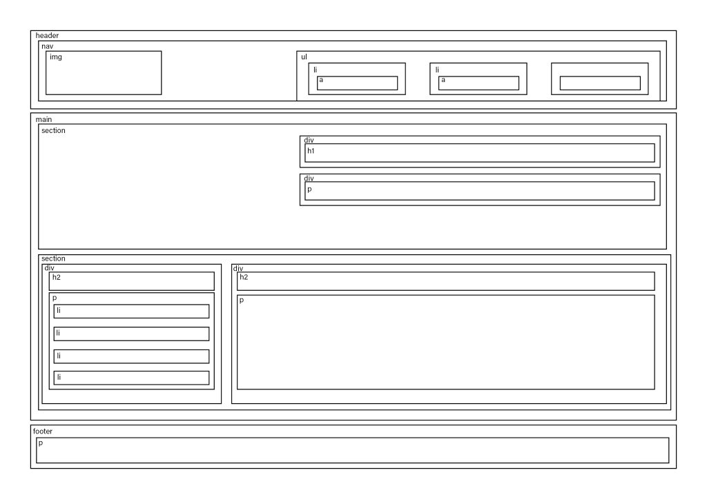
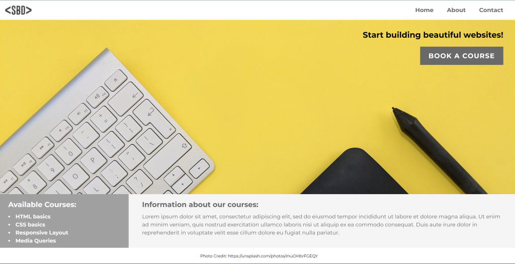
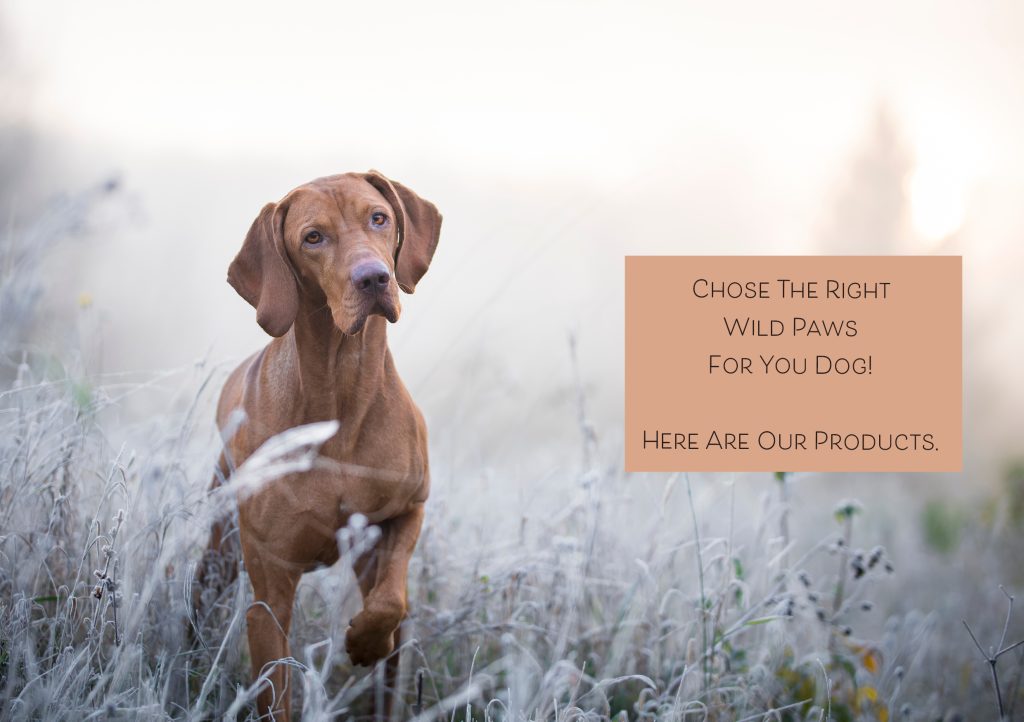
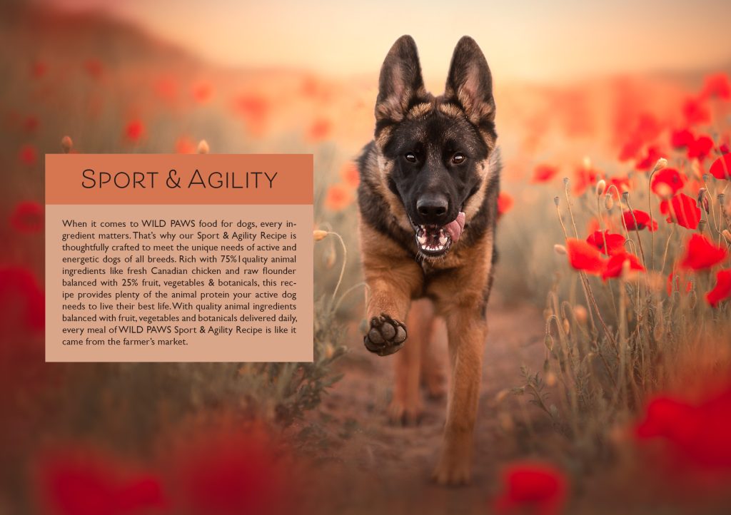
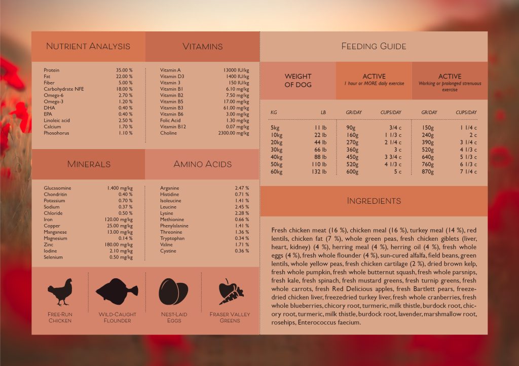
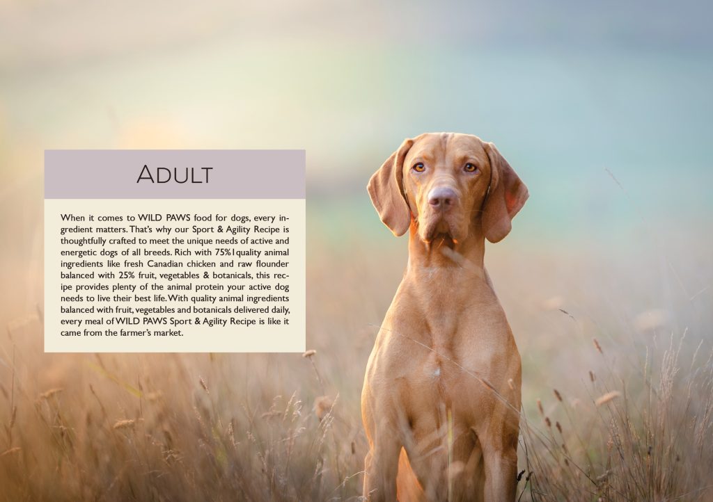
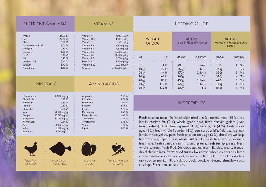
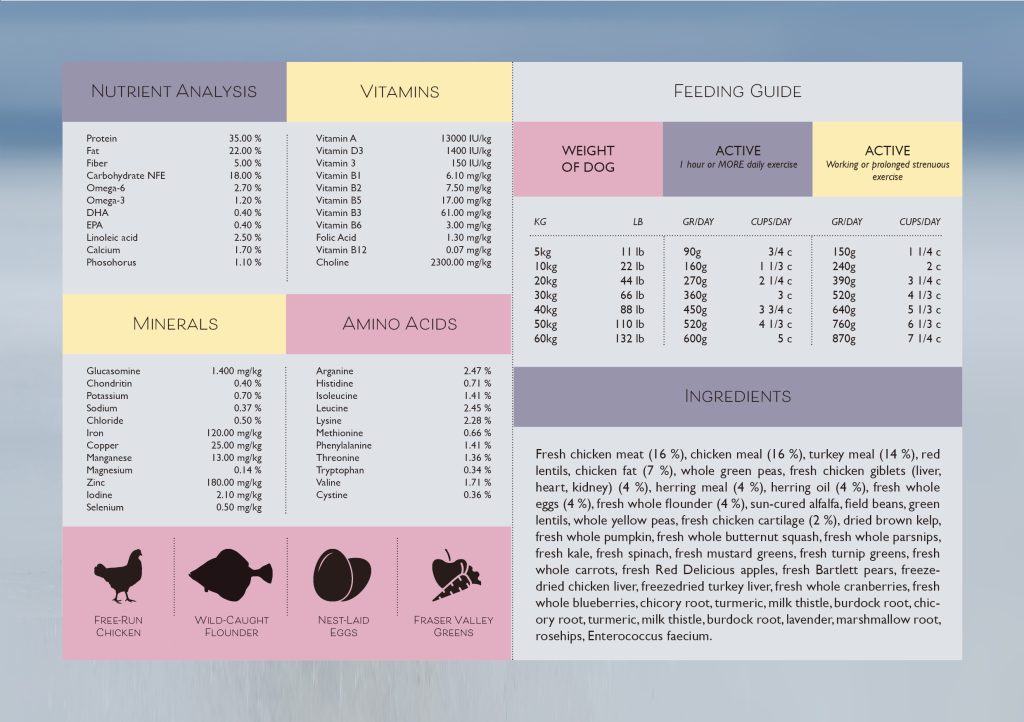
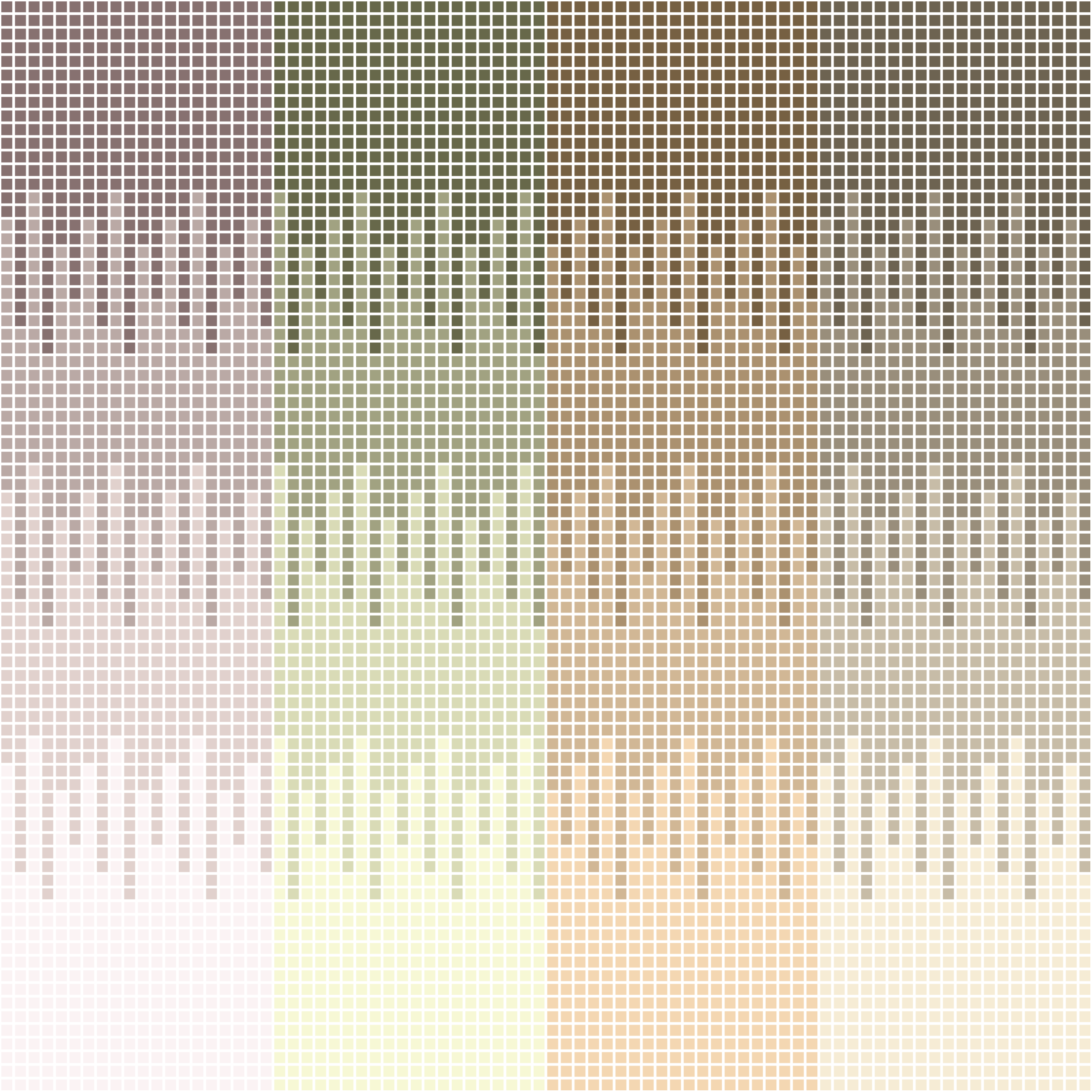
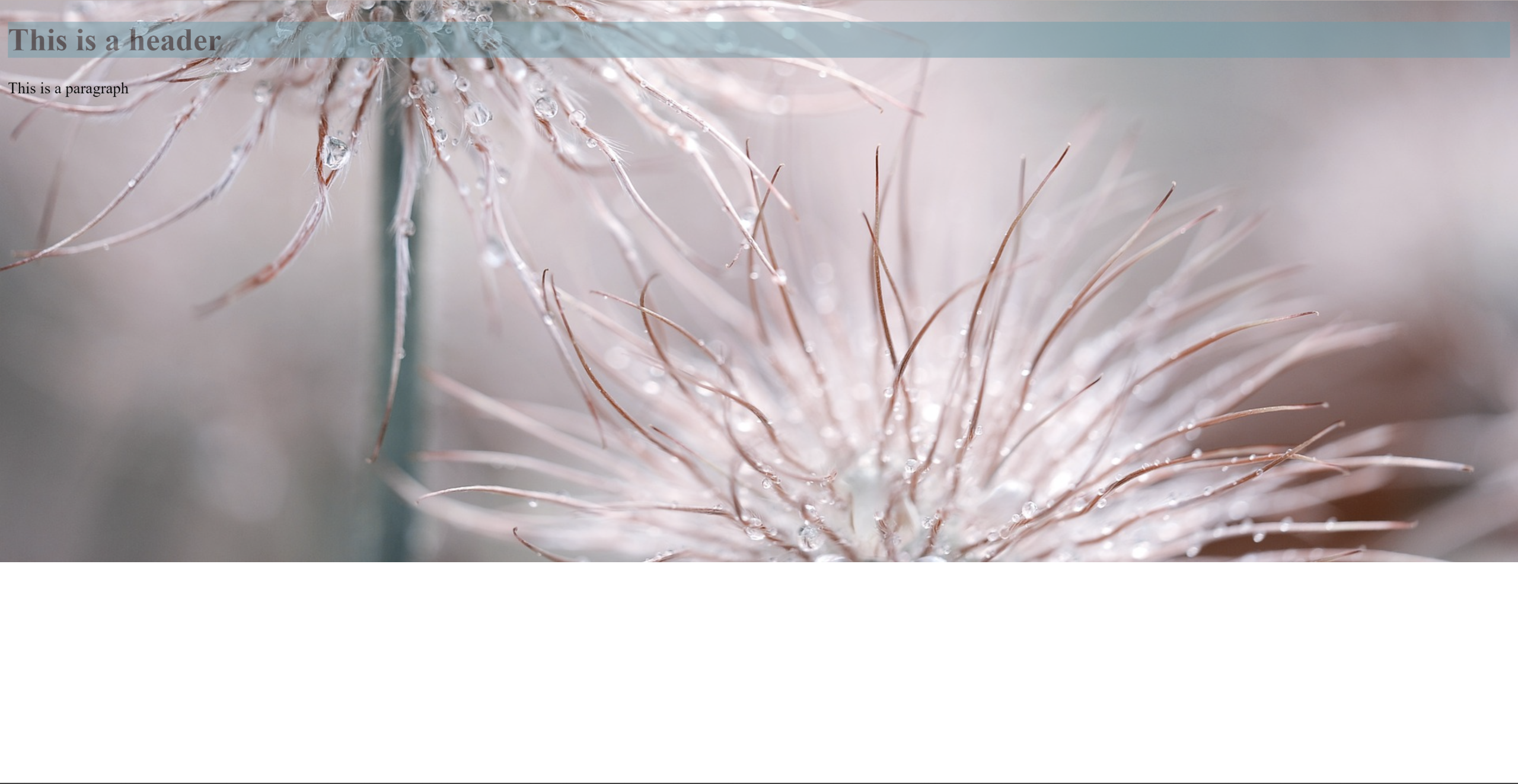
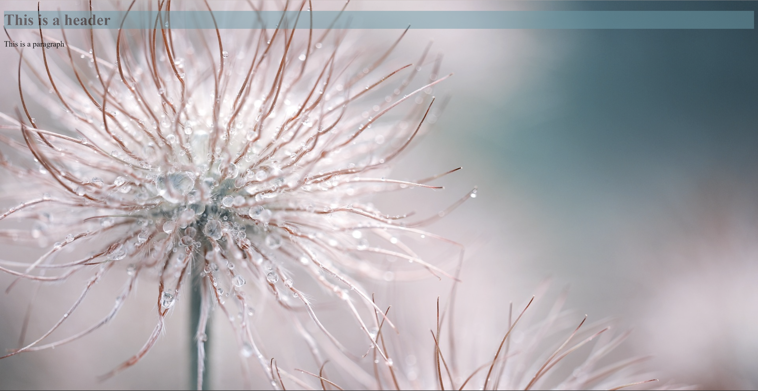
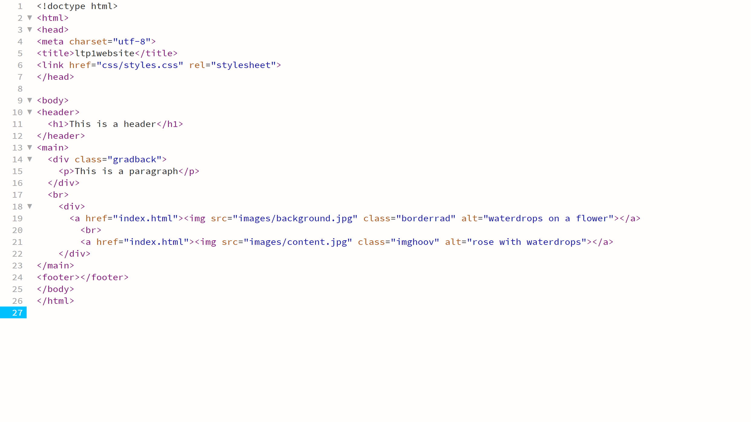
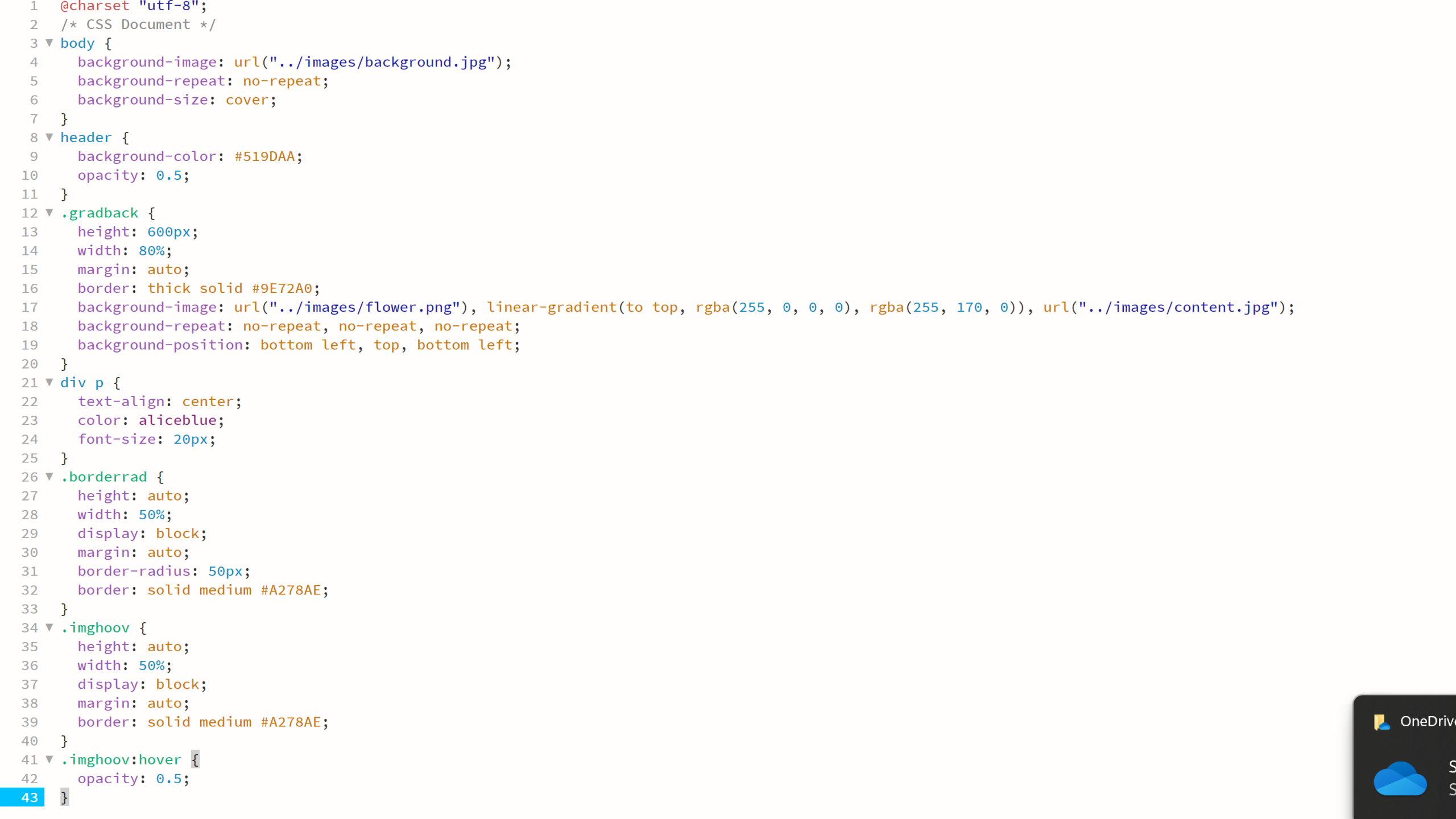
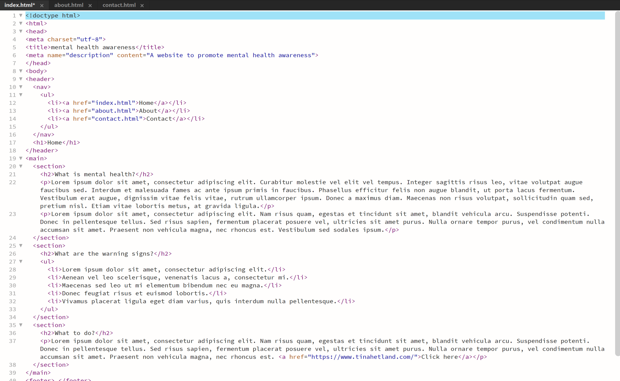
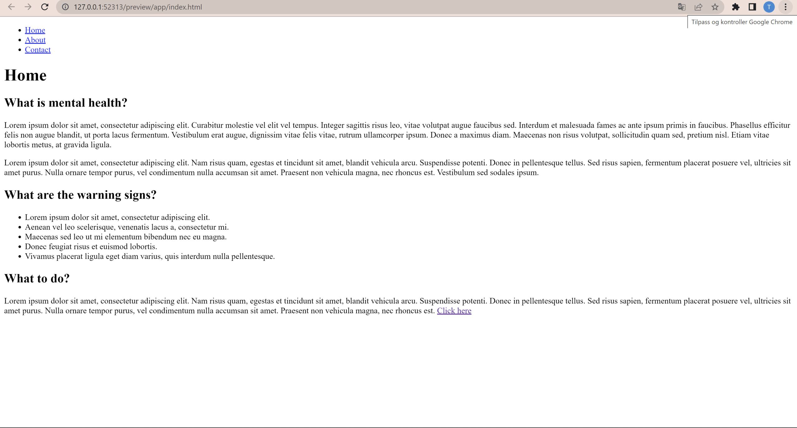
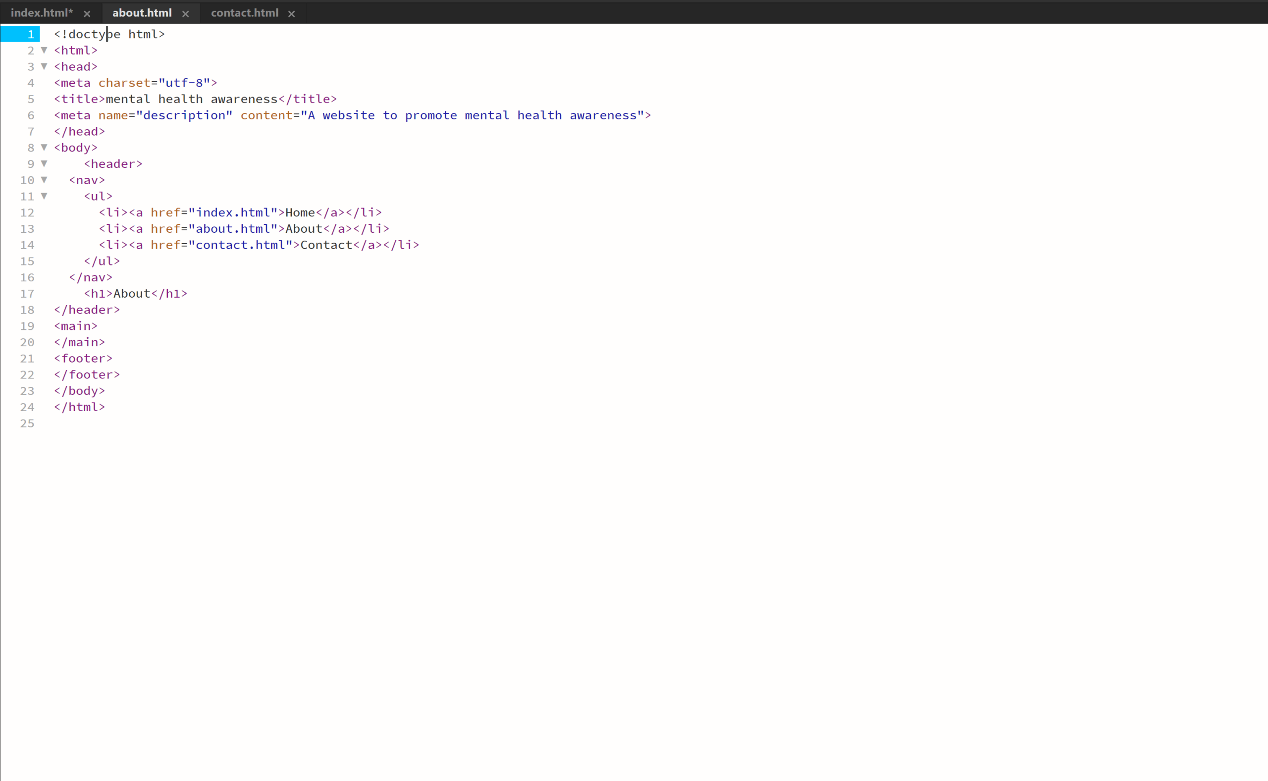
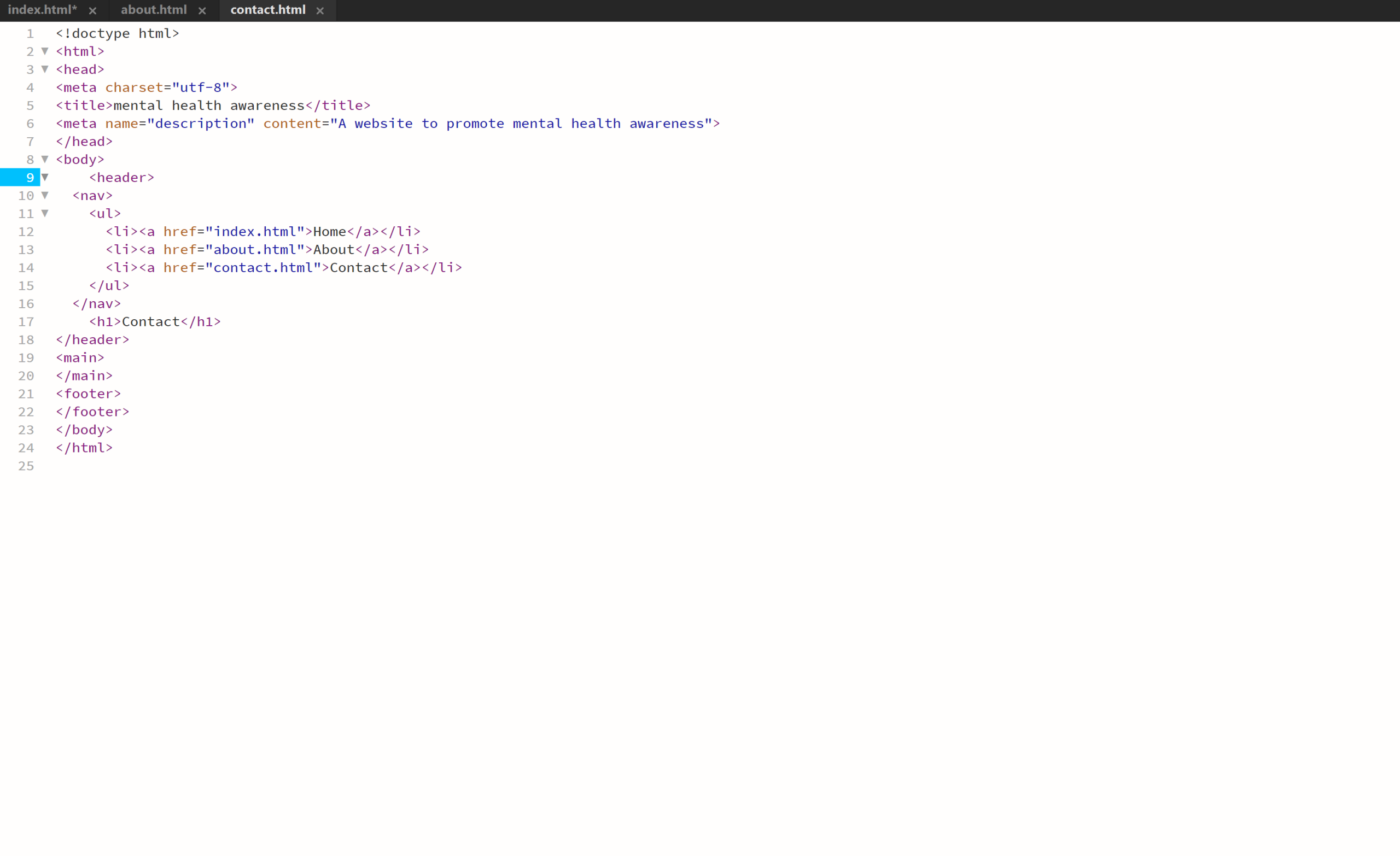
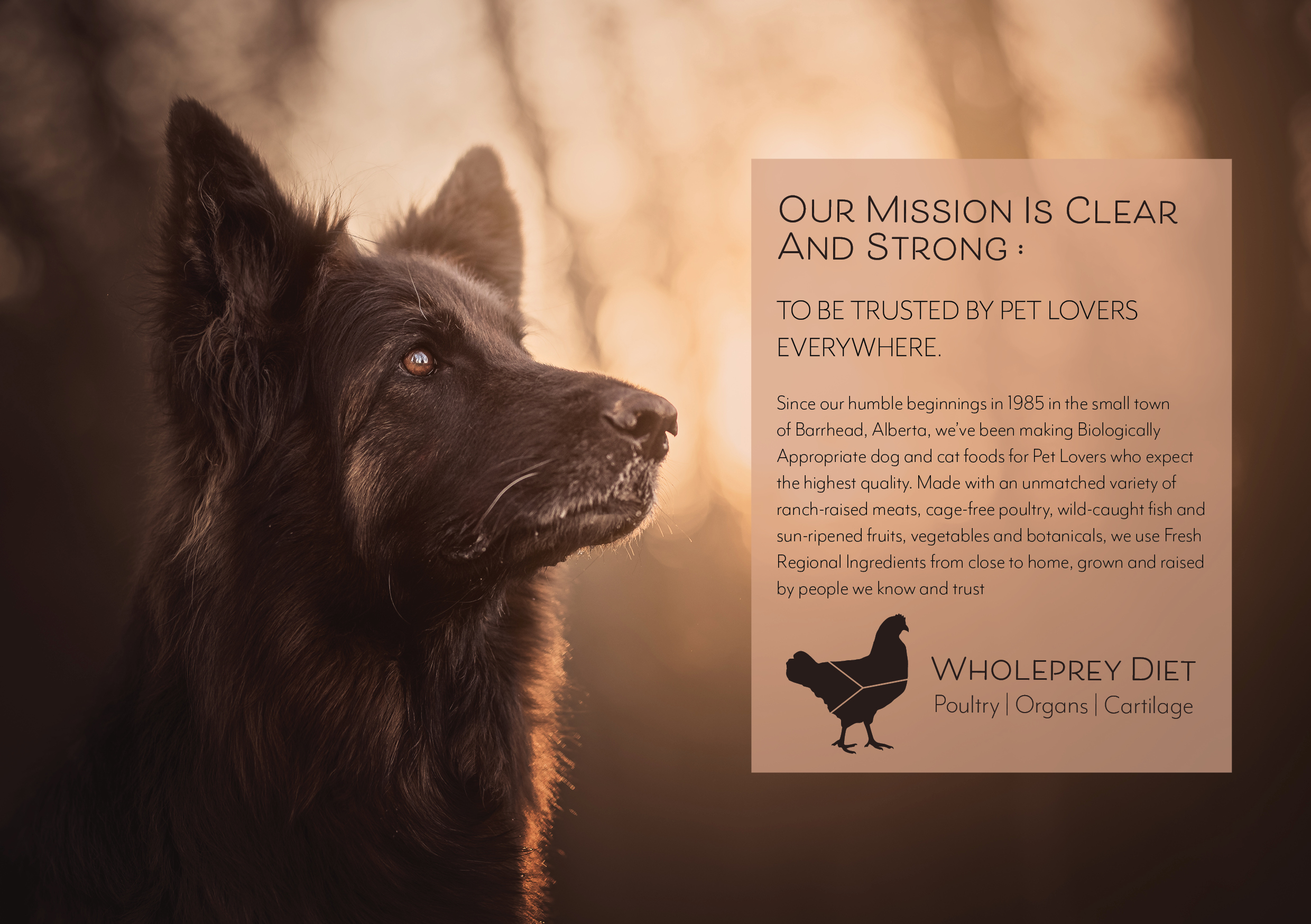
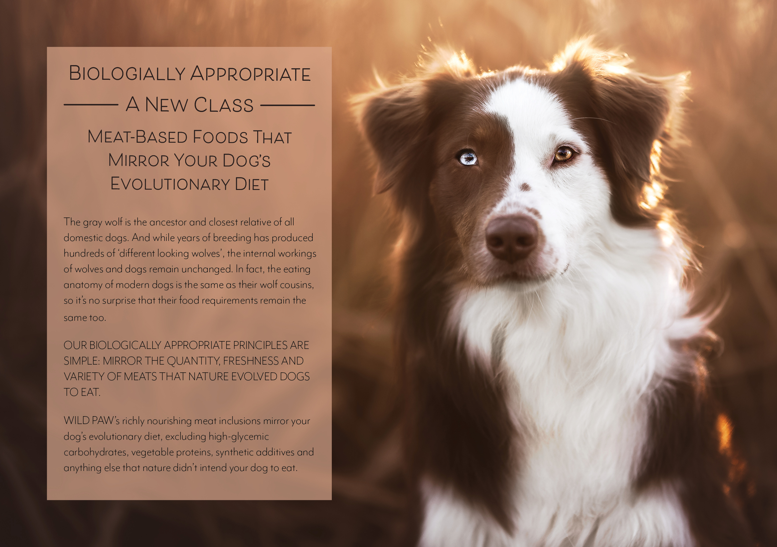
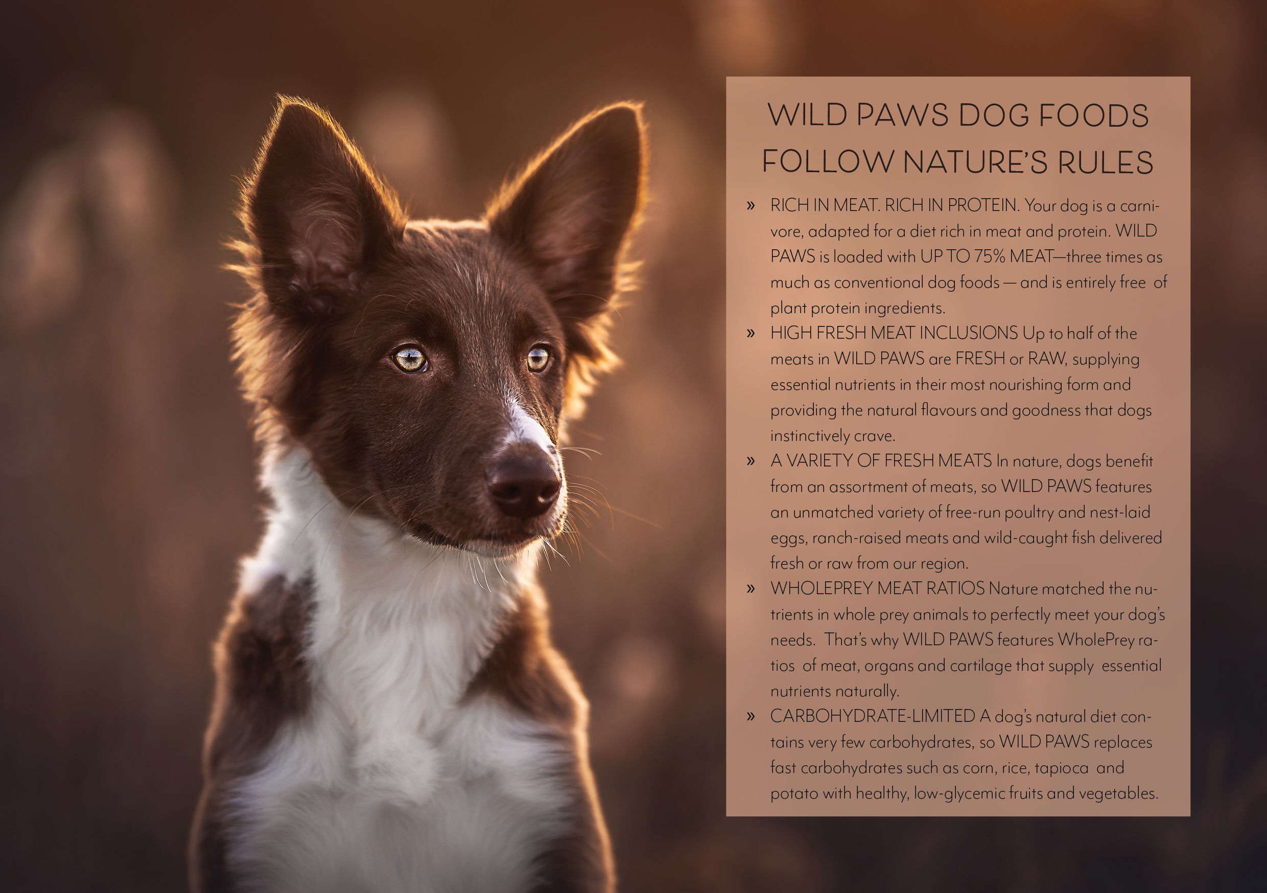
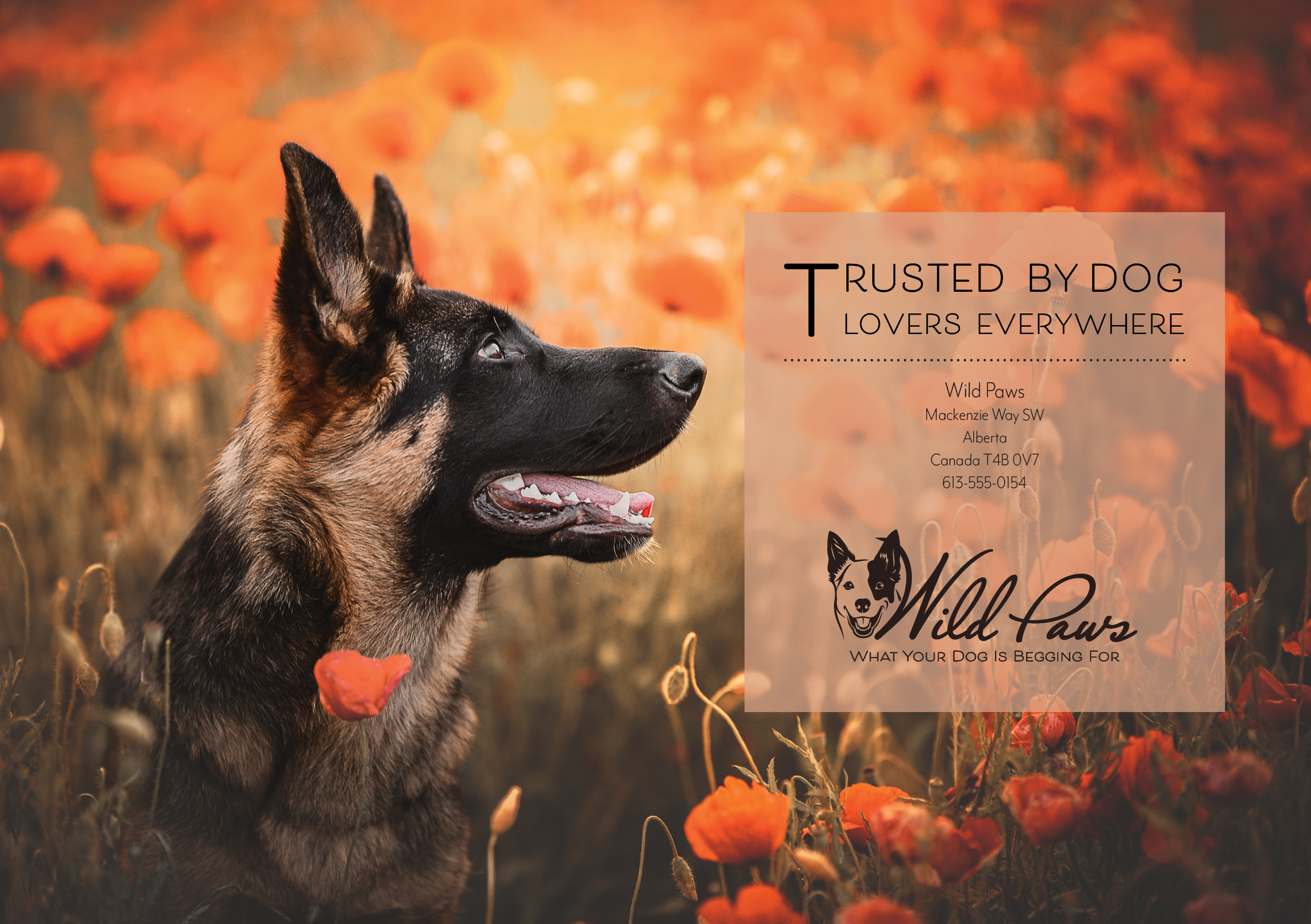
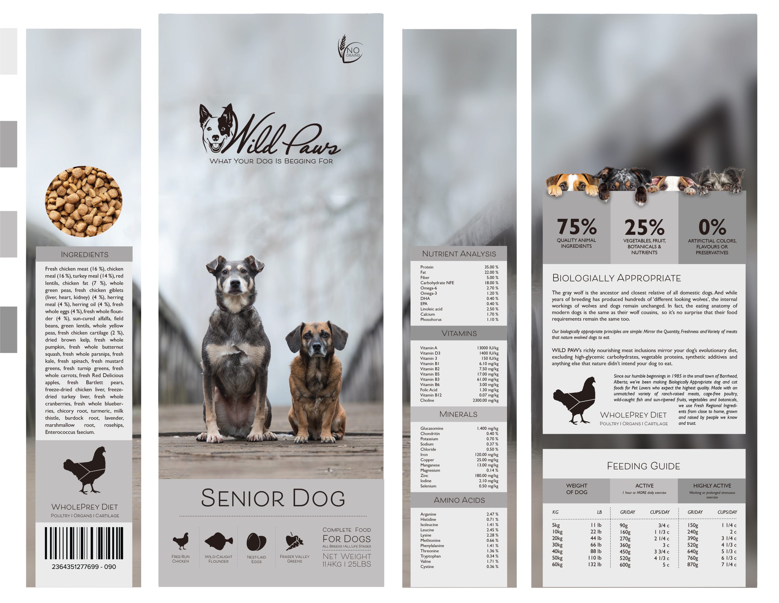
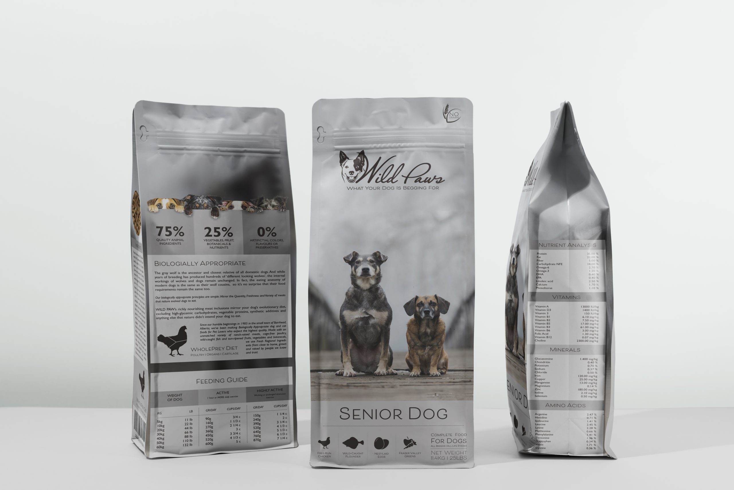
Step 1 – Create a Photoshop or Illustrator document that’s 1920px wide by 2160px high.Step 2 – Ensure all the information provided by the client is in the infographic. You can add as much additional information to your infographic as you want.Step 3 – Find some good references, colour palettes and styles to base your infographic on.Step 4 – Ensure your files and layers are named correctly so that an animator can easily use your design.Step 5 – Upload your finished infographic to your blog.


