AW19 – DESIGN FOR SCREEN 1 : PLANNING – LT – CREATE A WIREFRAME

Now it’s your turn to create your very own website wireframe.In the last task, you had to come up with a list of 10 questions for a briefing form. I would like you to now fill in this briefing form, take the answers and create a wireframe for the site.This wireframe do not have to be a wireframe for your current Course Assignment (Product Website) it’s purely for you to practice your skills.You can choose if you want it to be a lo-tech or hi-tech architecture.  Regardless of which method you choose, I would like to see as much detail as possible. Also, please write a short paragraph to explain why you chose the lo-tech or hi-tech option.

  1. Do you want to build a new website or redesign an existing one? If it’s an existing one, do you have a domain name and a host?
    • I want a new website
  2. Describe your business in a few sentences.
    • I’m a graphic design student, so I want a website for my portfolio and other school work.
  3. Please list the names of three sites that you like and explain what you like about them.
  4. Do you have any existing style guides and guidelines?
    • Not directly a style guide, but I have a logo that have two specific colours.
  5. What kind of visitors are you expecting on your website? (Consider their income, interests, gender and age.)
    • For now I want a site that draw other students to the site, students and other people that is interested in graphic design. So every age, gender and so on.
  6.  What is your deadline for completing the site? How big is the budget?
    • I don’t have a deadline on the site itself, but I have to host the domene before end of this academical week.
  7. Are you active on social media?
    • Yes and no, I have a few different accounts on Instagram, I have one for hetiart as well but haven’t been that active on it.
  8. How do you want to promote your website?
    • I want to promote it through social media.
  9. Would you like us to provide ongoing support and maintenance?
    • I’m going to do that myself.
  10. Who will be the contact person for this project?
    • That will be me.

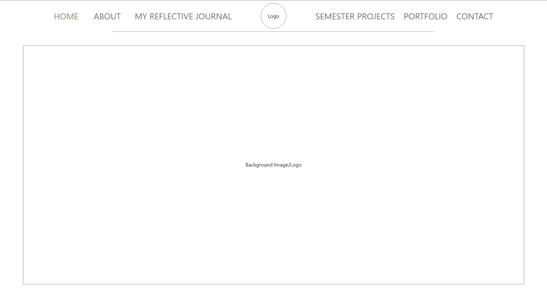
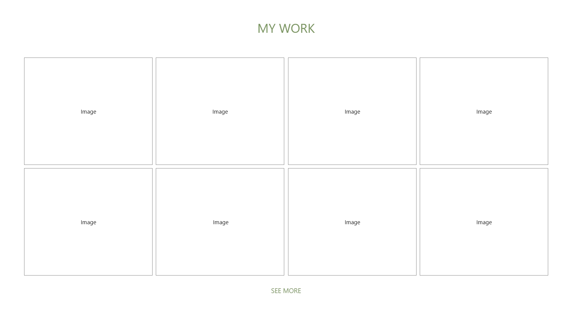
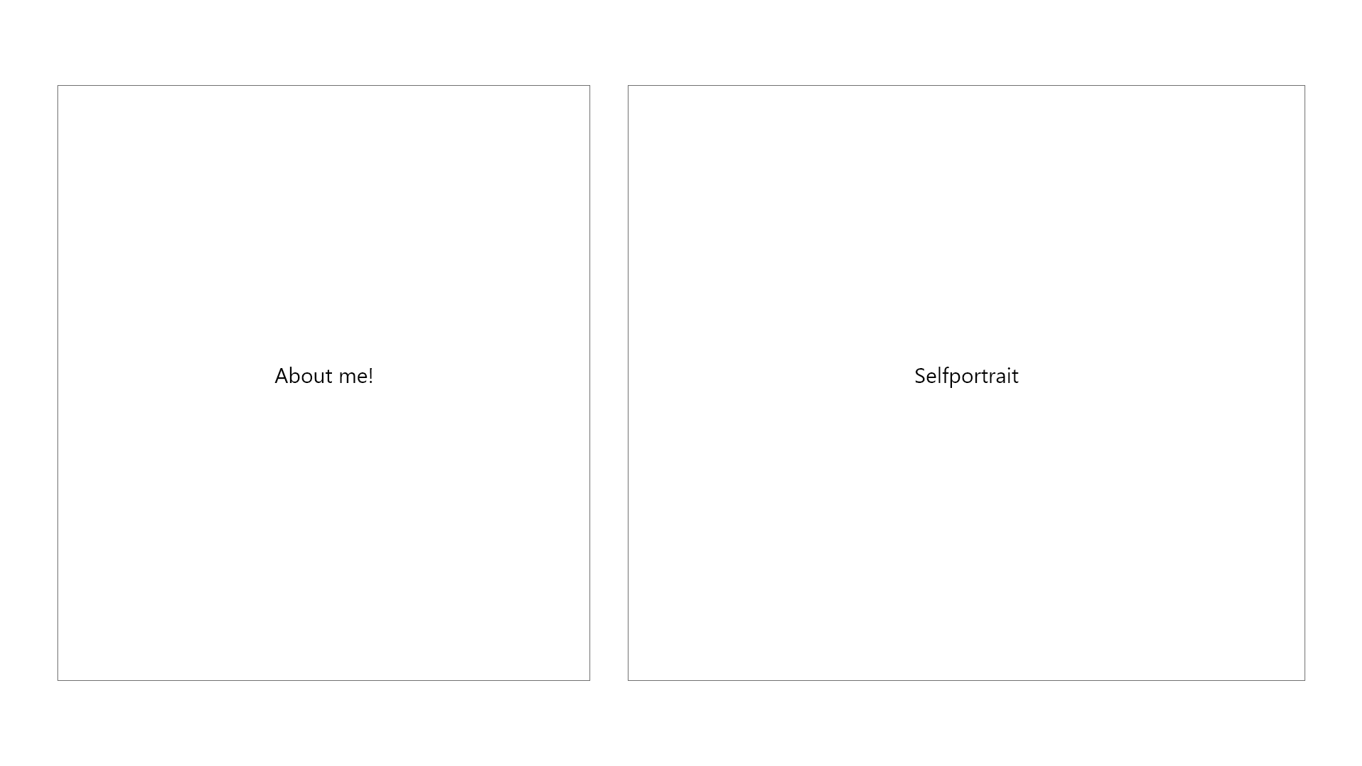
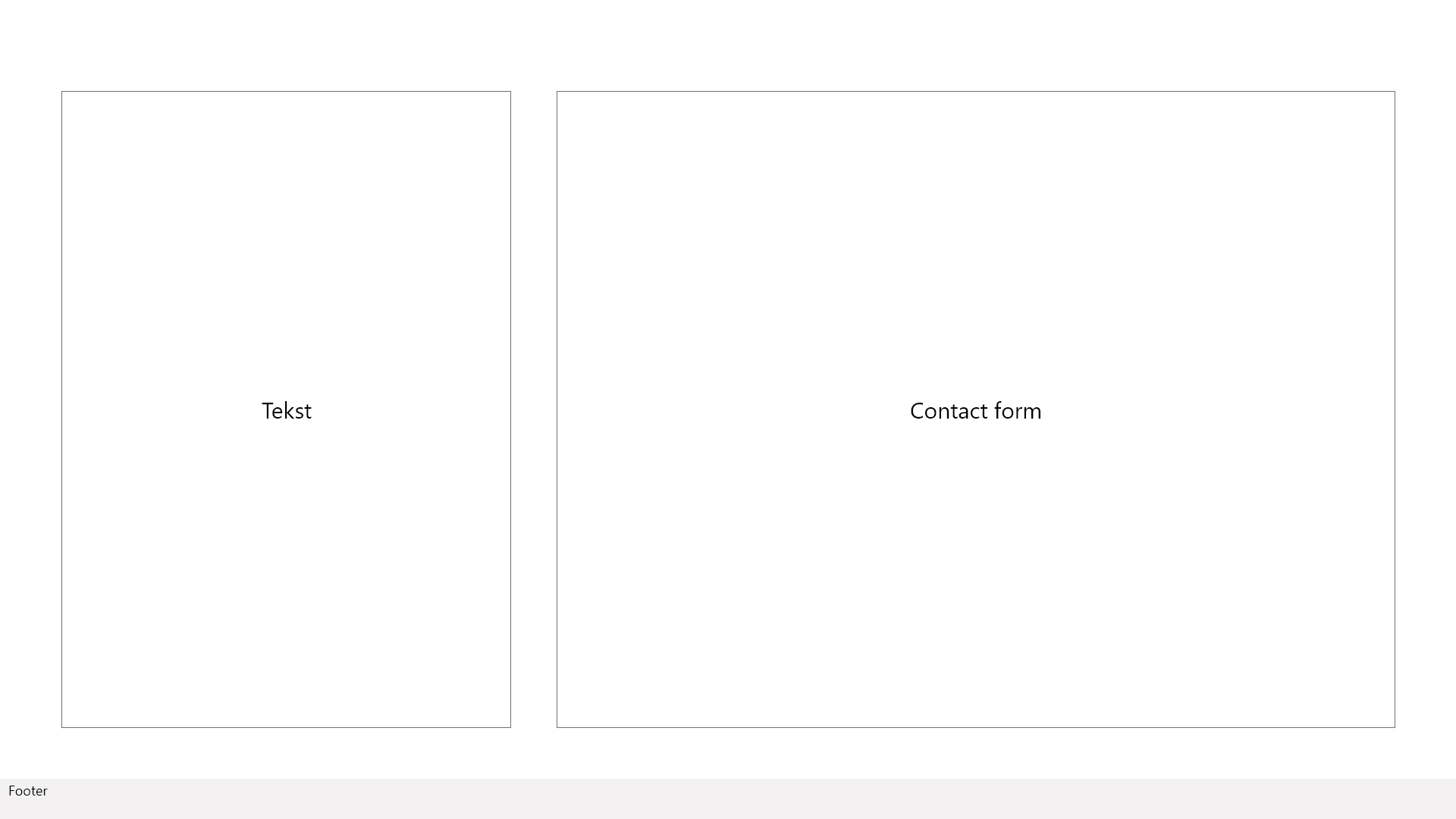
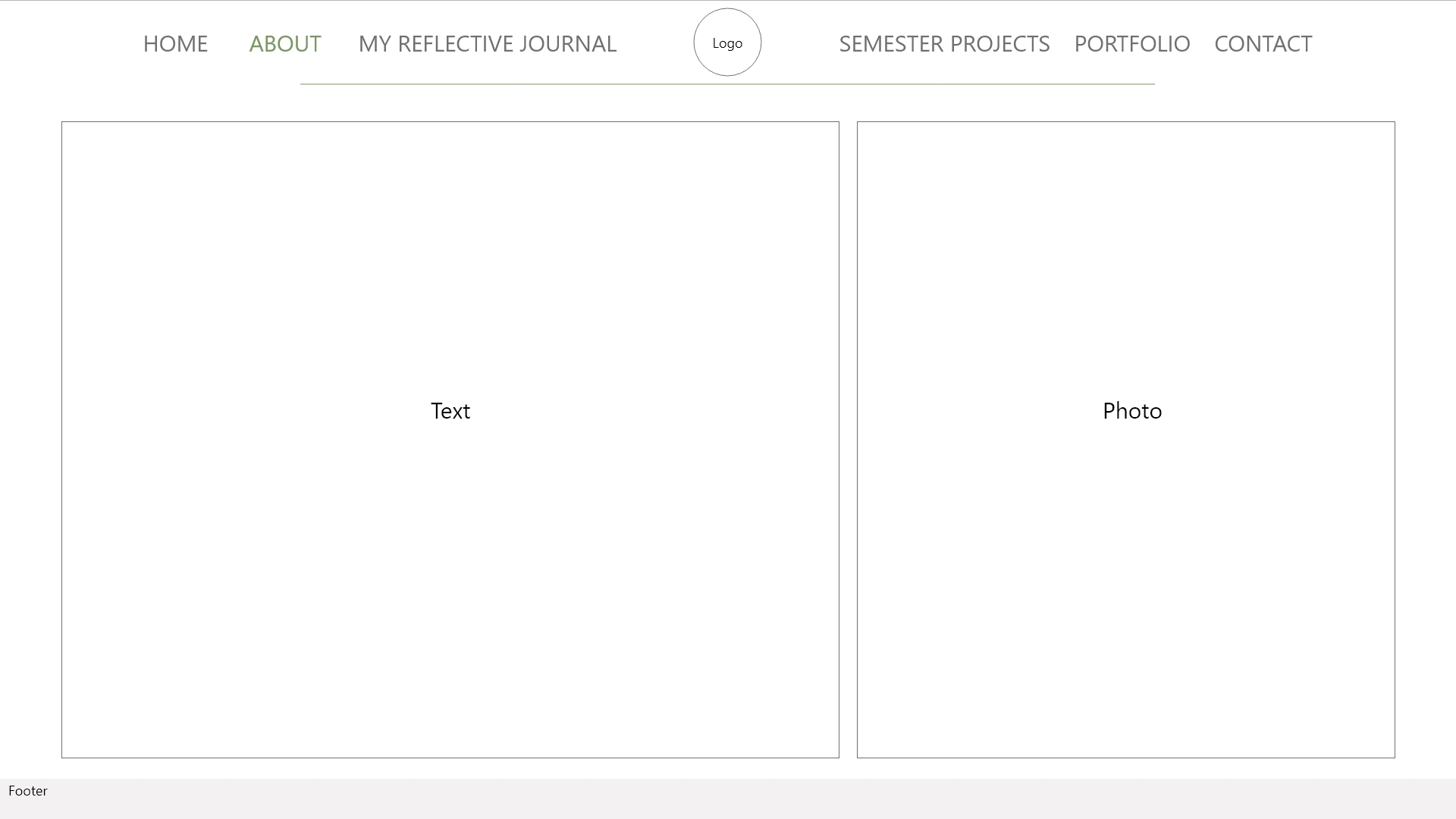
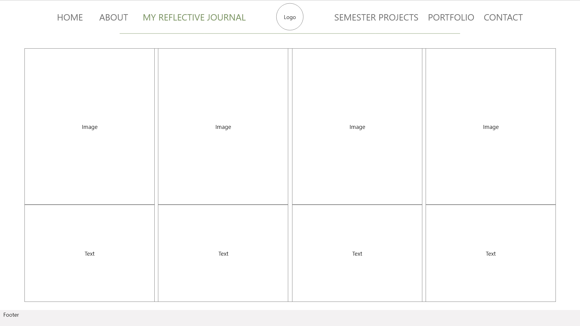
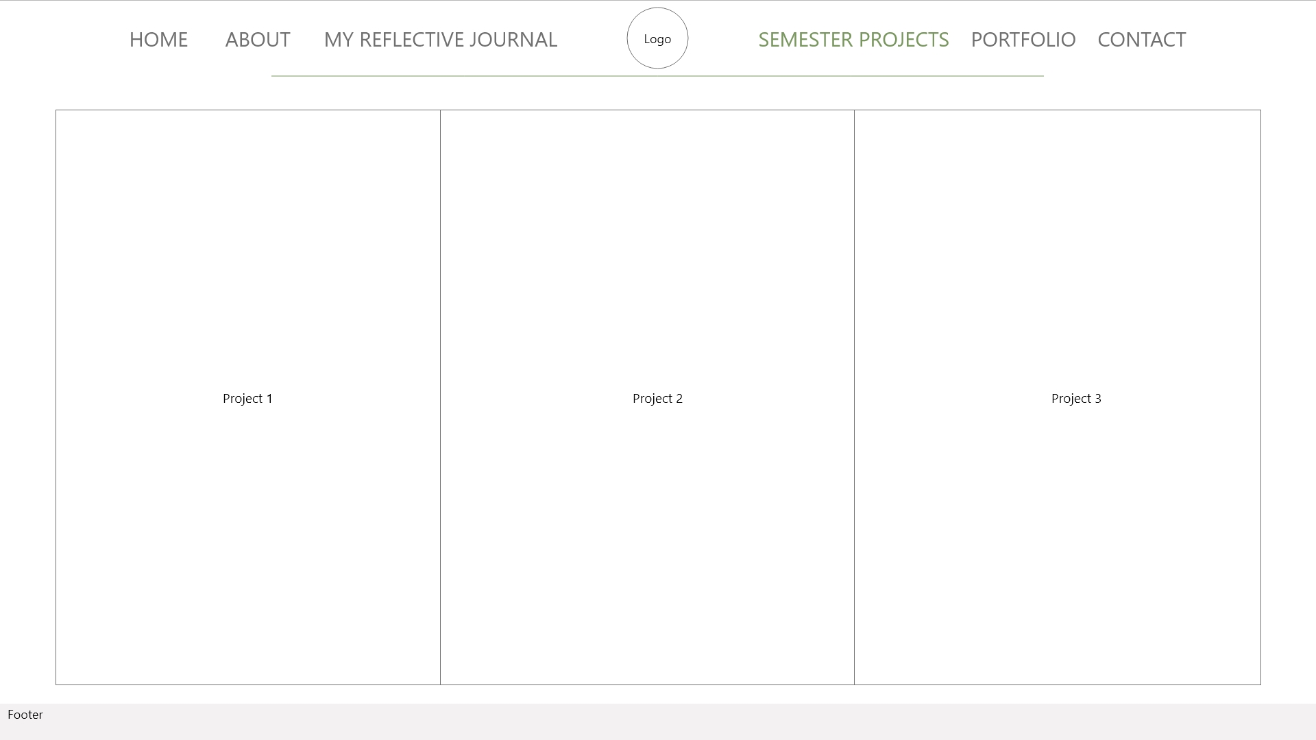
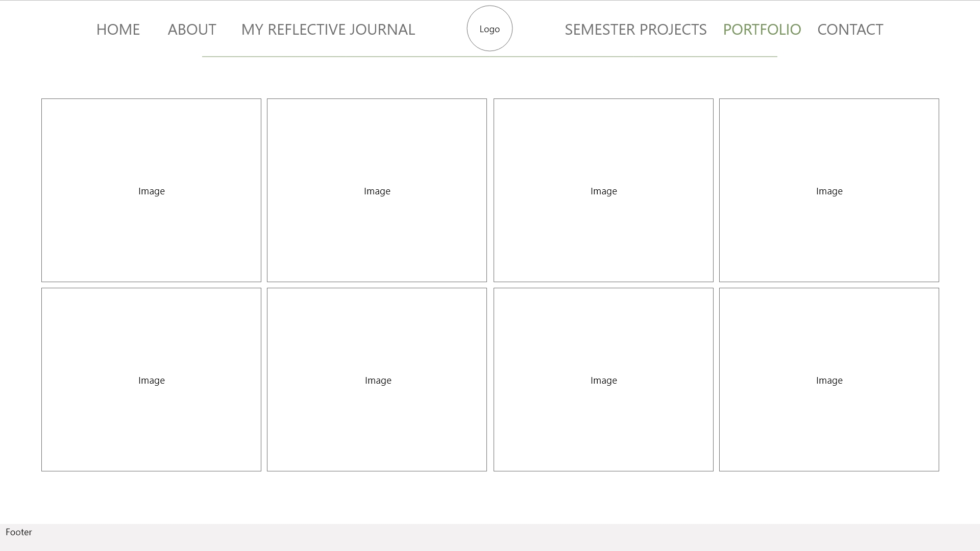
I choose to make a lo-tech wireframe since I’m so new to this, because it’s a quicker way to do it and because it’s good to make a lo-tech wireframe for every project.

AW18 – INTRODUCTION TO DESIGN FOR SCREEN – LT – GET THE BASIC RIGHT – PART 2

Part Two

Surf the web and find 10 sites you would consider to be great websites. Simultaneously, make a list of 10 sites you consider bad web sites. Remember to describe why you would define them as such. Upload your lists on your blog.

10 good websites.

  1. https://sunnivaengen.no/
  2. https://www.etsy.com/
  3. https://www.ikea.com/no/no/
  4. https://www.ellos.no/
  5. https://www.plantasjen.no/
  6. https://guidetoiceland.is/
  7. https://www.anabrandt.net/
  8. https://www.adobe.com/
  9. https://www.instagram.com/
  10. https://www.komplett.no/

Most of these websites have a nice clean design. The colour theme, graphics and the type looks good. And it’s easy to get around on the page.

10 bad websites.

  1. https://solheimgartneri.no/
  2. https://penstore.no/
  3. https://www.japanphoto.no/
  4. https://www.ebay.com/
  5. https://no.pinterest.com/
  6. https://www.hcpet.no/
  7. https://tropehagen.no/
  8. https://www.1001fonts.com/
  9. https://sportoutlet.no/
  10. https://sportnorge.no/

Most of these websites has a mor simple design. And a lot of them is hard to navigate around on. I personally work at sport outlet, their website looks good when you just look at it. But it lacks a lot of navigation, it’s hard to navigate around and they are not on top of it when it comes to categorizing and searching.

AW18 – Introduction to Design for Screen – LT – Get The Basic Right – Part 1

1: Explain the following terms in your own words:

  • The internet
  • HTML
  • Browser
  • Search engine

The Internet.
The internet is a large wire network with computers, cell phones and many other devices that communicate with each other. It’s the fundamental of the Web that makes the Web possible. The internet is that the main function of it is to share information.

HTML.
Html (HyperText Markup Language) is the universal language that is used to retrieve, present and send  information via the internet. The html is the web page’s appearance/presentation, it defines the meaning and the structure of web content.

Browser.
The browser is an application that has been created to view html documents. A browser is an application for accessing the world wide web and to display pages and files on the web

Search Engine.
The search engine work by crawling billions of pages using web crawlers. This mean that it is first crawling to find pages to their database, then the next step is the indexing. This is when the results are organised and added to their database.

2: Please research and add another 10 questions to the briefing process.(See the lesson.)

  1. What kind of visitors are you expecting on your website? (Consider their income, interests, gender and age.)
  2. Who are your competitors and how do you differ from them?
  3. What actions do you want visitors to take on the site?
  4. What is your deadline for completing the site? How big is the budget?
  5. What features should be used on the website? ( This includes things like contact forms, pictures, videos, etc. )
  6. Please list the names of three sites that you like and explain what you like about them.
  7. Do you have any colour preference? What should the look and fell for the website be?
  8. Who will be the contact person for this project?
  9. What do you NOT want on your site in terms of text, content, colour and graphic elements?
  10. Who will be responsible for maintaining the website? Will the person have the time and skills to do so?

My 10 questions.

  1. Do you want to build a new website or redesign an existing one?
  2. Describe your business in a few sentences.
  3. What makes your services unique?
  4. Would you like us to provide ongoing support and maintenance?
  5. Do you have any existing style guides and guidelines?
  6.  Do you have any domain name and host?
  7. Are you active on social media?
  8. Do you require a blog? If so please specific if you know how you want the blog to look like
  9. How do you want to promote your website?
  10. Where do you see your company in five years?

3: From this list of 20 questions (your 10 added to my 10), please create the ultimate list of 10 questions that you would use for clients.

  1. Do you want to build a new website or redesign an existing one? If it’s an exicting one, do you have a domain name and a host?
  2. Describe your business in a few sentences.
  3. Please list the names of three sites that you like and explain what you like about them.
  4. Do you have any existing style guides and guidelines?
  5. What kind of visitors are you expecting on your website? (Consider their income, interests, gender and age.)
  6.  What is your deadline for completing the site? How big is the budget?
  7. Are you active on social media?
  8. How do you want to promote your website?
  9. Would you like us to provide ongoing support and maintenance?
  10. Who will be the contact person for this project?

AW12 – Print Preparation – LT. Question 2

Research, written and practical assignment (problem solving)

  • Use the magazine style brochure that you designed in Module 5. Add a spot varnish to the cover and change the design to use spot colours. (You are welcome also make layout changes if you want to.) For your magazine, use a spot varnish for the cover and design it using two spot colours.
  • Make use of your checklist that you designed and prepare the file for print.
  • Decide what paper weight and type you will use. 
  • Decide what type of binding you will use, for example, saddle stich, perfect bind, etc. (See the printing terms link.)
  • Upload the print-ready PDF to your blog and post screenshots of your packaged files, and instructions.

Make sure to include the instructions (like spot varnish, paper choice and binding) in the file.

Varnish
Spot Color

AW10 – Layout – LT. Design of layout in InDesign

Using InDesign, design a 8-page brochure for a fictitious travel agent.

  • The size of the brochure should be A5 (when it is folded).
  • Design the brochure in full colour.
  • Use fake body copy but create sensible headings.
  • Use titles, headings and images of your choice.
  • Be sure to pay attention to:
  • Choice of type
  • Choice of imagery
  • Use of layout and grid to communicate the content.

This is the best task to now, I really enjoyed doing this task!

For this I wanted to make a travel brochure for Dovre National Park, the wildlife edition. I wanted to make a seasonal edition where you can read about the different seasons, and what you are able to see throughout the four seasons.

I’ve used the same photo for the frontside and the backside, so if you fold it out you can see the whole photo.

Page two is the overall info about exploring the wildlife at Dovre, while the third is more about how important it is to care about the welfare for both the nature and the wildlife. The photo on these two pages is my own photo from my trip there in February.

Page 4-7 is the four seasons with animals. I’ve only used one photo for each season so it wouldn’t get to much photo, what you can see of wildlife will be written under/over the photo. I used a colored rectangle under the type that I dragged into the middle to give it a more interested look.

Now I’m really looking forward to starting on my egg booklet, I really like doing task like this!

All of the photos except the one that I’ve taken is from stock.adobe.

AW10 – Layout – LT. Pace and contrast

Compare the design (in terms of pace and contrast) of an online magazine, blog or website to that of a printed magazine, book or journal.

  • What differences can you see between the kinds of design strategies used in the two formats?
  • Write down your findings and upload it to WordPress.

For this task I used an article from the lasted issue from National Geographics. I wanted to use this article because it is on the digital page and also in the printed version. You can clearly see that there is much more white space on the digital version. The digital version is also a bit more compact since they are using slideshow on the photos.

On the digital version the type runs more throughout the article. But on the printed version it’s only the caption for the photos on the first pages, and on the last page there is the backstory.

The digital version has also some adds on the sides and between the photos and type.

I do prefer the look on the printed version, it feels more complete and clean to look at.

Digital version.

Printed version.

AW10 – Layout – LT. Basic principles of layout

Take a magazine, newspaper or book that includes images and text. Lay tracing paper over the top of three spreads (both left-hand and right-hand pages). Using a pencil and ruler, carefully trace the grid underlying the page layouts. Remember to remove specific text elements or images, and to only draw the grid lines. Note column widths and margin sizes at the top, bottom, and to the left and right of the main body of text. Is your document based on a two-column, three-column, or another type of grid? Which elements stay the same on each page, and which change?

Publish your findings to your WordPress blog and provide photos or scans of your exercise.

So I actually don’t have that many magazines at home, so I used the latest edition of naturfotografen that I get through the photograph club that I’m a part of. It’s not completely straight because I have a injury in my left hand, so it was difficult to use the ruler.

Spread 1-2
Spread 3-4
Spread 5-6

Spread 1-2 and 3-4

Margin top: 1,7cm
Margin bottom: 1,7cm

Left page
Margin left: 1,4cm
Margin right: 0,9cm

Right page
Margin left: 0,9cm
Margin right: 1,4cm

Spread 5-6

Left page
Margin top: 1,9cm
Margin bottom: 2,5cm
Margin left: 1,4cm
Margin right: 0,9cm

Right page
Margin top: 1,9cm
Margin bottom: 3,3cm
Margin left: 1,7cm
Margin right: 1,4cm


These spreads was different and only spread 1-2 and 5-6 had page numbers, these was placed on the bottom and where 0,6cm high. The document is based on a three column grid. And the photos is placed in the top or at the bottom of the pages.

AW10 – Layout – LT. Symmetry/Asymmetry

In this assignment, you will be given the opportunity to also test your idea sketching skills. It is important to start working with basic ideas on paper and develop your concept from there on out.

  • On an A4 landscape page, draw four equal squares. Create 4 more pages in this way. So, you’ll have 5 pages with four squares on each.
  • Draw one or two squares or rectangles in each empty square to achieve the visual effects that you see on the first page of module 3 in Graphic Design School textbook. You can work with the interaction of rectangles and squares to make the balance or imbalance more evident.
  • Entering left
  • Movement to the right
  • Movement to the left
  • Movement downwards
  • Movement upwards
  • Balance
  • Tension
  • Symmetry/asymmetry

Produce at least two different versions of each effect, recording your results each time. Explain in one or two sentences what you wanted to achieve (as shown in your manual).

Entering left: Here I used two different sizes where minimum one is touching the outline, I felt this makes it look like it actually coming in to the frame rather then exiting.

Movement to the right: I placed these shapes, so it looks likes it is exiting on the right side by using a bigger shape to the right, and also just by using one single big square.

Movement to the left: It’s the same principle as the previous, but here is it placed on the left side.

Movement downwards: On the first I used two different sizes, where the largest is nearest the bottom to make it look like its falling/sinking down. On the second one I’ve used to equal sized rectangles to make the same effect.

Movement upwards: It’s the same as the downwards, but I’ve rotated the rectangles, so they are vertical to make it look like it’s floating upwards. I feel the vertical makes it look lighter.

Balance: Here I’ve placed two equal squares with the same margins on the sides and the same top and on the bottom. I have also made just one square where it is centered in the middle.

Tension: Here I made the squares/rectangles touch or overlap each other to make tension between them.

Symmetry: A small square in the left and right corner, placed the same pace to make it symmetrical.

Asymmetry: Two different sizes that is not lined up to each other.